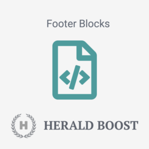
How to make your Moodle’s text editor go fullscreen

When creating course content in Moodle, it’s nice to have the option to make Moodle’s text editor go fullscreen so you have more screen space to work with the content. This is particularly useful when your content is long or needs to be presented in advanced layout format which contains tables/tabbed content/cards.

By default Moodle’s text editor Atto doesn’t come with the fullscreen functionality, however, there is a third-party plugin you can install to add this handy utility to your Moodle text editor so your teachers can use it to help with their course creation process.

moodle-text-editor-fullscreen-mode

In this tutorial we will show you how to install and add the utility to your Moodle text editor.

Step 1

Download the plugin zip file from Moodle’s plugins directory and upload the zip file to Moodle’s plugins page.

Go to the plugins page: Site administration > Plugins > Install plugins

moodle-install-plugin

Step 2

Once installed, you need to add the fullscreen utility to the Moodle text editor’s toolbar so it can be accessed by your users.

Go to the editor config page: Site administration > Plugins > Text editors > Atto HTML editor > Atto toolbar settings

moodle-admin-atto-editor-settings

Add “fullscreen” to the editor toolbar:

moodle-text-editor-configure-fullscreen

That’s it. Now you will see the fullscreen icon is available in your Moodle’s text editor and your users can click the icon to activate the editor fullscreen mode whenever they want to.

Moodle Theme Maker – How to customise the theme to use your brand’s colour scheme

In our latest Boost-based Moodle theme Maker, changing the default colour scheme to meet your own branding needs has never been easier. You just need to pick your brand colours in the theme settings page. It only takes seconds to bring the theme in line with your branding.

Theme Live Demo

Once you have installed the theme, log in as an admin and go to the “General Settings” section under the theme settings page: Site administration > Appearance > Themes > Maker

moodle-theme-maker-theme-settings-page

moodle-theme-maker-theme-branding-colour-settings

Enter your site’s main colour (hex code) in the “Brand primary colour” input field. If you have a secondary colour for your brand you can enter the colour code in the “Brand secondary colour” input field. If you don’t have a secondary colour then you just need to copy and paste your main colour’s hex code into the “Brand secondary colour” field to override the theme’s default.

Example 1

This is an example of using just one colour for the theme (#F88706)

moodle-theme-maker-custom-color-scheme-example-1-final

Example 2

This is an example of using two colours for the theme (Primary colour: #0A23B7 | Secondary colour: #A123B7)

moodle-theme-maker-custom-color-scheme-example-2-final

Don’t have a brand colour? We’ve got you covered. You can still choose from one of the six default colour schemes on Maker’s theme settings page. We hand-picked the colour combinations so they all look beautiful.

moodle-theme-maker-color-schemes-all

Selling online courses? – Learn how to set up paid Moodle courses with Stripe and PayPal payment gateways

Do you want to sell your courses online and take payment via Stripe or PayPal? Moodle could be the perfect learning platform for you to set up and manage your paid courses.

moodle-courses-width-PayPal-Stripe

In this tutorial we will show you how to set up a paid Moodle course. You have the option to configure your course’s payment gateway using Stripe or PayPal.

Set up a course with Stripe enrolment

Step 1 – Install the Moodle Stripe Plugin

Download the Stripe plugin here and upload the downloaded zip file to your Moodle site via the Install plugins page: Site Administration > Plugins > Install plugins. You need to be a site admin to install and use the plugin.

moodle-install-plugin

Step 2 – Enable and configure the plugin

Once installed, go to the plugin management page to enable and set up the plugin: Site Administration > Plugins > Enrolments > Manage enrol plugins

moodle-enable-stripe-paypal-plugins

You need to create an account with Stripe and get the required secret key and publishers key. Please note: you’ll need to verify and activate your Stripe account before you can get the live API keys.

activate-stripe-account

For more information about setting up your Stripe account please see the plugin documentation.

Step 3 – Enable Stripe as the course enrolment method

Go to your desired course as an admin and add “Stripe Payment” as the enrolment method for that course and enable it by clicking the eye icon.

You can set the course price etc via the Stripe Payment settings page in that course.

Now you’ve successfully set up Stripe as the course payment gateway. When a new student visits the course he/she will be asked to make the payment before entering the course as shown in the screenshots below:

Set up a course with PayPal enrolment

Step 1 – Create and Configure PayPal Account

You need to create a PayPal account first. As a course seller it’s recommended to upgrade your account to “Premier” status and get your account “Verified”.

moodle-paypal-account-settings

In your PayPal account please make sure the PayPal button language encoding is set to UTF-8.

You can optionally turn on IPN in PayPal to interact with your Moodle site:

For more info you can reference Moodle’s official documentation.

Step 2 – Enable the PayPal plugin in Moodle

The PayPal plugin comes with Moodle so there is no need to install it. You can just go to the enrolment plugin management page to enable it and configure its settings accordingly.

Please note: For PayPal to work you must make sure the Manual enrolment is enabled too.

Step 3 – Enable PayPal as the course enrolment method

Go to your desired course as an admin and add “PayPal” as the enrolment method for that course.

You can set the course price etc via the PayPal Payment settings page in that course.

Now you’ve successfully set up PayPal as the course payment gateway. When a new student visits the course he/she will be asked to make the payment before entering the course as shown in the screenshots below:

Want to promote your courses and sign up paid users?

Check out our latest responsive Moodle theme Maker (all of the screenshots in this tutorial were taken from Maker), it has everything you need to set up a beautiful and user friendly Moodle site to start selling your courses.

Moodle Theme Maker – How to add course thumbnail/header image and excerpt

In our latest Moodle theme Maker, it’s possible to display your course thumbnail image and course excerpt on the frontpage course list as shown in the figure below. You can also check out our theme demo here for an example. In this tutorial we will show you how to achieve this.

moodle-theme-maker-course-list

Update: Now you have the option to display the course thumbnail image as the course header image as well.

moodle-theme-maker-course-header-image

moodle-theme-maker-course-header-image-settings

Step 1

Log into your Moodle site as a teacher and open your desired course. Go to the course settings page by clicking the “Editing settings” link in the dropdown menu as shown in the figure below:

moodle-theme-maker-edit-course-settings

Step 2 – Add Course Excerpt

On the settings page, enter your course description in the “Course Summary” input field. The content you enter there will be used as the course excerpt on the frontpage.

If the content you entered is more than 200 characters, Maker theme will automatically truncate the rest of the content and replace it with “….”

Step 3 – Add Course Thumbnail

Upload your course image to the “Course summary files” input field. For the best result in theme Maker, please make sure your thumbnail image size is: 880px x 560px.

Save your changes and go back to your site’s frontpage. You should see the course excerpt and thumbnail displayed for that course.

How to add social logins to your Moodle site

Want to make the signup/login process of your Moodle site simple, easy and fast for your users? In this tutorial, we will walk you through how to add social login options (eg. Facebook/Google/Linkedin/Microsoft) to your Moodle’s login page.

We’ve set up a live demo using our Moodle theme Maker for this tutorial:

moodle-theme-maker-login-page

Step 1

You need to enable social login (OAuth 2) as one of your site’s authentication methods. Log into your Moodle site as an admin and navigate to the “Manage authentication” page: Site administration > Plugins > Authentication > Manage authentication

Find the “OAuth 2” option on the page and enable it by clicking the closed-eye icon.

moodle-admin-enable-oauth2-with-nav

Step 2

Navigate to the “OAuth 2 services” page to add your desired social logins: Site administration > Server > OAuth 2 services

moodle-oauth2-services

1. Add Facebook Login

You can follow our latest guide here (updated for Moodle 4.0+)

2. Add Linkedin Login

You can follow our latest guide here (updated for Moodle 4.0+).

3. Add Google Login

Click the “Create new Google service” button and enter your Client ID and Client secret on the settings page as shown in the figure below and save the changes.

moodle-oauth-google-settings

You can follow the instructions here to obtain your Google Client ID and secret.

4. Add Microsoft Login

Click the “Create new Microsoft service” button and enter your Client ID and Client secret on the settings page as shown in the figure below and save the changes.

moodle-oauth-microsoft-settings

You can follow the instructions here to obtain your Microsoft Client ID and secret.

That’s it. Now your site users should be able to log into your site using their existing social media accounts without going through the long signup form.

Maker – a Boost based Moodle Theme (Main Features)

We’re excited to introduce our premium Moodle theme, Maker. Built on Moodle’s core Boost theme, Maker takes full advantage of Moodle’s modern features to deliver a clean, responsive, and user-friendly experience. It’s fully compatible with Moodle 4.x and the latest Moodle 5.x, and comes packed with flexible configuration options to match your branding and will help make your Moodle site truly stand out.

Live Demo Theme Details

Below are some of the main features Maker offers:

1. Branding

You can upload your own logo image, select your branding colours and Google fonts. For advanced users, you can also add your custom CSS/SCSS to override the default theme styling.

moodle-theme-maker-branding-settings

moodle-theme-maker-custom-css-settings

2. Frontpage

There are 8 configurable theme sections you can use to design your Moodle’s frontpage. All of the sections can be turned on or off based on your needs.

Slideshow Section

In this section, you can add up to 10 slide images and a course search box. You can also add your site headline, summary, call-to-action button and a video link. If you want to make the slideshow section occupy less or more screen space you can adjust the height accordingly.

moodle-theme-maker-slideshow

moodle-theme-maker-slideshow

Benefits Section

In this section, you can add up to 6 blocks. This section is designed for you to list benefits/features you offer to your users to convince them why they should take your courses. There are 900+ Google material icons available for you to use.

moodle-theme-maker-benefits

moodle-theme-maker-benefits-settings

Featured Section

This section is designed for you to promote your top courses/pages. You can add up to 12 blocks and customise the thumbnail image, title, content and link for each block. If you’d like to draw visitors’ attention to a particular course/page item you can add a label on top of the thumbnail image.

moodle-theme-maker-featured-blocks

moodle-theme-maker-featured-blocks-settings

Promo Carousel Section

You can add up to 6 items in this section. It’s designed as a content marketing tool. If you have some promotional Youtube/Vimeo videos, this is the perfect place to add them.

moodle-theme-maker-promo-carousel

moodle-theme-maker-promo-carousel-settings

Logos Section

You can use this section to display your users/awards/press mentions/partnerships etc. You can add up to 6 logo images. If you don’t want to use this section, you can simply turn it off.

moodle-theme-maker-logos-section

moodle-theme-maker-logos-section-settings

Categories Section

You can enable this section to list up to 20 course categories. This section is a new feature in Maker theme for Moodle 3.8+. Learn more

moodle-theme-maker-categories-section-without-desc-text

moodle-maker-theme-categories-with-desc-text

Teachers Section

You can add up to 20 teachers or course instructors in this section. Although this section is designed for displaying teachers but you can also use it for other content.

Please note: this feature is only available in Maker theme for Moodle 3.6+.

moodle-theme-maker-teachers-section-preview

moodle-maker-theme-teachers-section-admin-settings

Testimonial Section

You can use this section to add up to 6 testimonials. It’s a great way to add social proof to your site.

img-responsive moodle-theme-maker-testimonials

moodle-theme-maker-testimonials-settings

FAQ Section

You can use this section to address frequently asked questions about your courses, business or organisation. It’s a great way to earn users’ trust by providing extra info about your learning platform or business model. You can add up to 10 Q&A in this section. If you have more Q&A you can add them in a Moodle Static Page and provide a link from the frontpage FAQ section as shown on our demo.

moodle-theme-maker-frontpage-faq-section

moodle-theme-maker-faq-settings

Call-To-Action Section

This section is just above the site footer. You can use this section to further promote your site and persuade users to take actions.

moodle-theme-maker-cta-section

moodle-theme-maker-cta-settings

You can also add a data box widget in Maker theme for Moodle 3.8+. Learn more

moodle-theme-maker-frontpage-data-box-view

Course List

From Maker v2.1 (for Moodle 3.5) you can configure the frontpage course list layout. Learn more

moodle-theme-maker-course-list-layout-styles-banner

3. Site Alert

You have an option to add a site alert to the frontpage. It’s located just above the slideshow section. This can be very useful when you need to announce something new to your visitors for a short period of time. You can change the alert background colour to suit your brand colour.

moodle-theme-maker-alert

moodle-theme-maker-alert-settings

4. Header Dropdown Menu

You can add a mobile-friendly dropdown menu to the header top bar area. This feature is new in Maker theme for Moodle 3.8+. Learn more.

moodle-maker-theme-header-dropdown-menu-gif

5. Login Page

You have the option to add a background image to the login page.

moodle-theme-maker-login-page

moodle-theme-maker-login-page-settings

6. Social Media Links

You can choose to display your social media links on the site header and footer area. Maker has all of the major social media options built-in.

Available options:
Website, Twitter, Facebook, Google+, Linkedin, YouTube, Vimeo, Instagram, Pinterest, Flickr, Tumblr, SlideShare, Skype, Weibo, RSS Feed.

Want to display something not in the list above? You can add your custom links too:

moodle-theme-maker-socialmedia-settings

7. Footer Area

In the footer area, you have the option to add 4 content blocks (read the tutorial), 1 footer widget area and your site copyright info.

moodle-theme-maker-footer

moodle-theme-maker-footer-settings-1

moodle-theme-maker-footer-settings-2

8. Course Page

You have the option to display a course header image on the course page. Learn more

moodle-theme-maker-course-header-image

moodle-theme-maker-course-header-image-settings

9. Course Design

You can easily add Bootstrap 4 UI components to enhance your Moodle course design. Read the tutorial

10. Google Analytics

You can monitor your site traffic by adding your Google Analytics ID.

Moodle Theme Maker – Useful HTML code for the footer content blocks

We have released a Boost based Moodle theme “Maker”. In this tutorial we will share the HTML code we used in our demo’s footer content blocks. If you are using Maker, you can easily take the code and edit the text and links for your site.

What the footer content blocks will look like:

moodle-theme-maker-footer-blocks

How to add the code:

Step 1

Log into your Moodle site as an administrator and navigate to the theme settings page: Site administration > Appearances > Themes > Maker > Footer

moodle-theme-maker-theme-settings

Step 2

Activate the HTML code editor in the Moodle text editor as shown in the screenshot below:

moodle-theme-maker-html-code-editor

HTML Code

Footer content block 1

<h4 class="footer-block-title">About Us</h4>
<ul class="footer-links list-unstyled">
	<li class="link-item"><i class="fa fa-caret-right"></i><a href="#">Company</a></li>
	<li class="link-item"><i class="fa fa-caret-right"></i><a href="#">Blog</a></li>
	<li class="link-item"><i class="fa fa-caret-right"></i><a href="#">Teachers</a></li>
	<li class="link-item"><i class="fa fa-caret-right"></i><a href="#">Press</a></li>
</ul>

Footer content block 2

<h4 class="footer-block-title">Learning</h4>
<ul class="footer-links list-unstyled">
	<li class="link-item"><i class="fa fa-caret-right"></i><a href="#">e-Portal</a></li>
	<li class="link-item"><i class="fa fa-caret-right"></i><a href="#">Reports</a></li>
	<li class="link-item"><i class="fa fa-caret-right"></i><a href="#">Policies</a></li>
	<li class="link-item"><i class="fa fa-caret-right"></i><a href="#">Terms</a></li>
</ul>

Footer content block 3

<h4 class="footer-block-title">Useful Links</h4>
<ul class="footer-links list-unstyled">
	<li class="link-item"><i class="fa fa-caret-right"></i><a href="#">Contact</a></li>
	<li class="link-item"><i class="fa fa-caret-right"></i><a href="#">FAQs</a></li>
	<li class="link-item"><i class="fa fa-caret-right"></i><a href="#">Privacy Policy</a></li>
	<li class="link-item"><i class="fa fa-caret-right"></i><a href="#">Terms and Conditions</a></li>
</ul>

Footer content block 4

<h4 class="footer-block-title">Get in Touch</h4>
<div class="footer-contact-info">                  
    <p class="tel has-icon"><i class="fa fa-phone icon"></i>0800 123 4567</p>
    <p class="email has-icon"><i class="fa fa-envelope icon"></i><a href="mailto:support@website.com">support@website.com</a></p>
    <p class="adr has-icon">
        <i class="fa fa-map-marker icon"></i>        
        <span class="adr-group">       
            <span>College Green</span><br>
            <span>56 College Green Road</span><br>
            <span>BS16 AP18</span><br>
            <span>UK</span>
        </span>
    </p>  
</div>

Custom CSS for Changing Moodle Theme Labland’s Colour Scheme

This product is deprecated and no longer available.
Looking for a Boost-based Moodle theme? Checkout our new products.

Responsive Moodle theme Labland is designed for corporations/businesses. It comes with 4 default colour schemes. If the default colour scheme doesn’t fit your branding needs, you can write your custom CSS to override the default colour. In this tutorial we are showing you an example CSS code snippet to change the default colour scheme. You can easily use the example as a template to do your own colour customisations.

Where to enter the custom CSS?

Under the Labland theme settings there is an input field called “Custom CSS” where you can enter the CSS. By doing so you won’t lose any CSS customisations if the theme is updated as the data is stored in your database.

Example custom CSS

In the example we use three colours: 1) primary colour #9A58BA 2) secondary colour #FF6780 3) accent colour #59AFFE

/* Links */
a,
a:hover,
a:active, 
a:focus {
  color: #9A58BA;
}
/* Buttons */
a.btn-primary,
.btn-primary {
  background: #9A58BA;
  border: 2px solid #9A58BA;
}
a.btn-primary:hover,
.btn-primary:hover,
a.btn-primary:active,
.btn-primary:active,
a.btn-primary:focus,
.btn-primary:focus {
  background: #834CA4; /* slightly darker than #9A58BA */
  border: 2px solid #9A58BA;
}

.btn-secondary, a.btn-secondary {
  background: #59AFFE;
  border: 2px solid #59AFFE;
}
.btn-secondary:active, .btn-secondary:focus, .btn-secondary:hover, a.btn-secondary:active, a.btn-secondary:focus, a.btn-secondary:hover {
  background: #478FD6; /* slightly darker than #59AFFE */
  border: 2px solid #59AFFE;
}

.btn-cta, a.btn-cta {
  background: #9A58BA;
  border: 2px solid #9A58BA;
}


.btn-cta:active, .btn-cta:focus, .btn-cta:hover, a.btn-cta:active, a.btn-cta:focus, a.btn-cta:hover {
  background: #834CA4; /* slightly darker than #9A58BA */
  border: 2px solid #9A58BA;
}

button,
input.form-submit,
input[type="button"],
input[type="submit"],
input[type="reset"],
input#id_submitbutton,
input#id_submitbutton2,
.path-admin .buttons input[type="submit"],
td.submit input {
  background: #9A58BA;
  border: 2px solid #9A58BA;
}
button:hover,
input.form-submit:hover,
input[type="button"]:hover,
input[type="submit"]:hover,
input[type="reset"]:hover,
input#id_submitbutton:hover,
input#id_submitbutton2:hover,
.path-admin .buttons input[type="submit"]:hover,
td.submit input:hover,
button:active,
input.form-submit:active,
input[type="button"]:active,
input[type="submit"]:active,
input[type="reset"]:active,
input#id_submitbutton:active,
input#id_submitbutton2:active,
.path-admin .buttons input[type="submit"]:active,
td.submit input:active,
button:focus,
input.form-submit:focus,
input[type="button"]:focus,
input[type="submit"]:focus,
input[type="reset"]:focus,
input#id_submitbutton:focus,
input#id_submitbutton2:focus,
.path-admin .buttons input[type="submit"]:focus,
td.submit input:focus {
  background: #834CA4; /* slightly darker than #9A58BA */
  border: 2px solid #9A58BA;
}
/* Tabs */
.nav-tabs > li.active a,
.nav-tabs > li.active a:hover,
.nav-tabs > li.active a:active,
.nav-tabs > li.active a:focus {
  border-top: 2px solid #9A58BA;
}

/* Tables */
#page #region-main .table>thead>tr>th {
    border-bottom-color: #9A58BA;
}

#page #region-main .table.table-boxed>thead>tr>th {
    background: #9A58BA;
}

/* Forms */
textarea:focus,
input[type="text"]:focus,
input[type="password"]:focus,
input[type="datetime"]:focus,
input[type="datetime-local"]:focus,
input[type="date"]:focus,
input[type="month"]:focus,
input[type="time"]:focus,
input[type="week"]:focus,
input[type="number"]:focus,
input[type="email"]:focus,
input[type="url"]:focus,
input[type="search"]:focus,
input[type="tel"]:focus,
input[type="color"]:focus,
.uneditable-input:focus {
  border-color: #9A58BA;
}

/* Topbar */
.branding {
  background: #9A58BA;
}

/* Notifications dropdown */
.site-header .top-bar .popover-region .popover-region-header-text {
  color: #9A58BA;
}
/* Messages dropdown */
.site-header .top-bar .popover-region a {
  color: #9A58BA;
}

/* Hero slideshow overlays */
.hero-overlay .overlay-upper {
  background: rgba(89, 175, 254, 0.8);
  /* #59AFFE = rgba(89, 175, 254, 1) */
  /* You can use online tool here http://www.hexcolortool.com/ to convert hext colour to rgba colour */
}
.hero-overlay .overlay-lower {
  background: rgba(255, 103, 128, 0.9);
  /* #FF6780 = rgba(255, 103, 128, 1) */
}
/* Hero slideshow promo badge */
.hero-badge {
  background: #FF6780;
}
/* Hero slideshow active slide indicator */
.hero-slider-wrapper .flexslider .flex-control-nav li a.flex-active {
  background: #FF6780;
}
/* News section */
.news-section .item-icon {
  background: #59AFFE;
}
/* review section */
.reviews-section {
  background: #FF6780;
}
/* CTA section */
.cta-section {
  background: #9A58BA;
}
/* Home course category section */
.course_category_tree .category > .info > .categoryname {
  background-color: #9A58BA;
}
/* Course blocks */
#page .block-region .block .header {
  background: #9A58BA;
}
#page .block-region .block .header {
  background: #9A58BA;
}

/* Bootstrap components */
.panel-group .panel .panel-heading .panel-title a {
  color: #9A58BA;
}
.panel-group .panel .panel-heading .panel-title a:hover,
.panel-group .panel .panel-heading .panel-title a:focus {
  color: #9A58BA;
}
.custom-quote {
  border-color: #9A58BA;
}
.custom-quote .fa {
  color: #9A58BA;
}
.custom-quote .people .name {
  color: #9A58BA;
}
.box.box-border {
  border-color: #9A58BA;
}
.box.box-theme {
  background: #9A58BA;
}
.label.label-theme {
  background: #9A58BA;
}
.panel-theme > .panel-heading,
.panel-theme > .panel-footer {
  border-color: #9A58BA;
  background: #9A58BA;
}
.panel-theme {
  border-color: #9A58BA;
}
.color-theme {
  color: #9A58BA;
}

Below is a screenshot of what Labland theme looks like after applying the example code:

Custom CSS for Changing Moodle Theme Impression’s Colour Scheme

This product is deprecated and no longer available.
Looking for a Boost-based Moodle theme? Checkout our new products.

Our best-selling Moodle theme Impression comes with 6 hand-picked colour schemes. It’s really easy to switch between the 6 colour schemes via the theme settings page. For customers who want to have a unique colour scheme to match their existing websites, we’ve complied useful custom CSS code to help you change the theme colour scheme to meet your specific needs.

First of all, you need to pick two colours. The first colour should be your site’s primary colour and the second colour is a darker shade of the primary colour.

For demo purpose, we are using an indigo colour (#6964C1) as the primary colour and a darker shade of primary colour (#5C58AF) as the secondary colour. You can easily substitute the colours in the code with your own primary and secondary colours.

Custom CSS Code

/* Change Impression Colour Scheme */
/* Primary Colour: #6964C1 */
/* Secondary Colour: #5C58AF */
 
/* Links and buttons */
a {
    color: #6964C1;
}
a:hover, a:active, a:focus {
    color: #5C58AF;
}
 
.btn-cta, a.btn-cta {
    background: #6964C1;
}
 
.btn-cta:hover, a.btn-cta:hover, .btn-cta:active, a.btn-cta:active, .btn-cta:focus, a.btn-cta:focus {
    background: #5C58AF;
}
 
.btn-primary, a.btn-primary {
    background: #6964C1;
}
 
.btn-primary:active, .btn-primary:focus, .btn-primary:hover, a.btn-primary:active, a.btn-primary:focus, a.btn-primary:hover {
    background: #5C58AF !important;
}
 
.btn-reversed, a.btn-reversed {
    color: #6964C1 !important;
}
 
.path-admin .buttons input[type=submit], button, input#id_submitbutton, input#id_submitbutton2, input.form-submit, input[type=submit], input[type=button], input[type=reset], td.submit input {
    background: #6964C1;
}
 
.path-admin .buttons input[type=submit]:active, .path-admin .buttons input[type=submit]:focus, .path-admin .buttons input[type=submit]:hover, button:active, button:focus, button:hover, input#id_submitbutton2:active, input#id_submitbutton2:focus, input#id_submitbutton2:hover, input#id_submitbutton:active, input#id_submitbutton:focus, input#id_submitbutton:hover, input.form-submit:active, input.form-submit:focus, input.form-submit:hover, input[type=submit]:active, input[type=submit]:focus, input[type=submit]:hover, input[type=button]:active, input[type=button]:focus, input[type=button]:hover, input[type=reset]:active, input[type=reset]:focus, input[type=reset]:hover, td.submit input:active, td.submit input:focus, td.submit input:hover {
    background: #5C58AF;
}
 
/* Topbar */
.site-header .top-bar {
    background: #6964C1;
}

/* Notifications dropdown */
.site-header .top-bar .popover-region .popover-region-header-text{
  color: #6964C1;
}
/* Messages dropdown */
.site-header .top-bar .popover-region a {
  color: #6964C1;
}

/* Forms */
textarea:focus,
input[type="text"]:focus,
input[type="password"]:focus,
input[type="datetime"]:focus,
input[type="datetime-local"]:focus,
input[type="date"]:focus,
input[type="month"]:focus,
input[type="time"]:focus,
input[type="week"]:focus,
input[type="number"]:focus,
input[type="email"]:focus,
input[type="url"]:focus,
input[type="search"]:focus,
input[type="tel"]:focus,
input[type="color"]:focus,
.uneditable-input:focus {
  border-color: #6964C1;
}
 
/* Main Menu */
.site-header .main-nav .nav li a:hover {
    color: #6964C1;
}
.site-header .main-nav .nav .dropdown-menu {
    border-top-color: #6964C1;
}
.site-header .main-nav .nav .dropdown-menu:before {
    border-bottom-color: #6964C1;
}
 
.site-header .main-nav .nav .dropdown-menu a:hover {
    color: #6964C1;
}
 
/* Frontpage carousel */
 
.promo-section .carousel-indicators li.active {
    background-color: #6964C1;
}
 
/* Frontpage why section */
.why-section .figure-holder {
    color: #6964C1;
}
 
.why-section .item-title {
    color: #6964C1;
}
 
/* Frontpage testimonials section */
.reviews-section .review-title {
    color: #6964C1;
}
 
/* Frontpage CTA section */
.cta-section-inner {
    background: #6964C1;
}
 
/* Frontpage courses */
#page #region-main #frontpage-course-list h2, #page #region-main #site-news-forum h2 {
    background: #6964C1;
}
 
.course_category_tree .category>.info>.categoryname {
    background-color: #6964C1;
}
 
/* Footer */
.site-footer .footer-content {
    background: #6964C1;
}
 
/* Back to top control */
#topcontrol {
    background: #6964C1;
}
 
#topcontrol:hover {
    background: #5C58AF;
}
 
/* Moodle courses */
#page #region-main .loginbox {
    border-top-color:  #6964C1;
}
 
#page #region-main .region-main-inner {
    border-top-color:  #6964C1;
}
 
#page .block-region .block .header {
    background: #6964C1;
}
 
#page #region-main h3.sectionname {
    color: #6964C1;
}
 
.uneditable-input:focus, input[type=datetime]:focus, input[type=datetime-local]:focus, input[type=date]:focus, input[type=month]:focus, input[type=time]:focus, input[type=week]:focus, input[type=number]:focus, input[type=url]:focus, input[type=search]:focus, input[type=tel]:focus, input[type=color]:focus, input[type=text]:focus, input[type=email]:focus, input[type=password]:focus, textarea:focus {
    border-color: #6964C1;
}
 
/* Bootstrap Components */
.color-theme {
    color: #6964C1;
}
 
#page #region-main .table.table-boxed>thead>tr>th {
    background: #6964C1;
}
 
.nav-tabs>li.active a, .nav-tabs>li.active a:active, .nav-tabs>li.active a:focus, .nav-tabs>li.active a:hover {
    border-top-color: #6964C1;
}
 
.custom-quote {
    border-color: #6964C1;
}
 
.custom-quote .fa {
    color: #6964C1;
}
 
.custom-quote .people .name {
    color: #6964C1;
}
 
.box.box-border {
    border-color: #6964C1;
}
 
.box.box-theme {
    background: #6964C1;
}
 
.panel-group .panel .panel-heading .panel-title a {
    color: #6964C1;
}
.panel-group .panel .panel-heading .panel-title a:hover {
    color: #5C58AF;
}
 
#page #region-main .table>thead>tr>th {
    border-bottom-color: #6964C1;
}
 
.label.label-theme {
    background: #6964C1;
}
 
.list-group-item.active, .list-group-item.active:focus, .list-group-item.active:hover, a.thumbnail.active, a.thumbnail:focus, a.thumbnail:hover {
    border-color: #6964C1;
    background: #6964C1;
}
 
.panel-theme {
    border-color: #6964C1;
}
 
.panel-theme>.panel-footer, .panel-theme>.panel-heading {
    border-color: #6964C1;
    background: #6964C1;
}
 
.list-group-item.active, .list-group-item.active:focus, .list-group-item.active:hover, a.thumbnail.active, a.thumbnail:focus, a.thumbnail:hover {
    border-color: #6964C1;
    background: #6964C1;
}


Once you’ve substituted the colours with your own, you can copy and paste the code into the “Custom CSS” input field under the theme settings page as shown below.

moodle-theme-impression-custom-css

Save the changes and your Impression theme should have a new colour scheme now:

moodle-theme-impression-change-colour-scheme

Custom CSS for Changing Moodle Theme Herald’s Colour Scheme

This product is deprecated and no longer available.
Looking for a Boost-based Moodle theme? Checkout our new products.

Our popular responsive Moodle theme Herald is designed for businesses and universities. It has 4 default colour schemes to get you started. However, if you’d like to customise the colour to suit your own needs it’s easy to do so by writing your own CSS rules to override the theme defaults. In this tutorial we will share a custom CSS code example with you to help you with the colour customisations. You can use the code example as a template to speed things up.

Where you should enter the custom CSS

There is a “Custom CSS” input field under the Herald theme settings. You need to enter your custom CSS code there so you don’t lose any CSS changes if you update the theme in the future.

/* Herald Custom CSS */
/* Links */
a {
  color: #FF6066;
}
a:hover,
a:focus {
  color: #DF5760;
  /* Slightly darker than #FF6066 */
}
/* Buttons */
.btn-cta,
a.btn-cta {
  background: #FF6066;
  border-color: #FF6066;
}
.btn-cta:hover,
a.btn-cta:hover {
  background: #DF5760;
  /* Slightly darker than #FF6066 */
  border-color: #DF5760;
}
a.btn-cta-secondary,
.btn-cta-secondary {
  color: #FF6066;
  border: 2px solid #FF6066;
  background: none;
}
a.btn-cta-secondary:hover,
.btn-cta-secondary:hover,
a.btn-cta-secondary:focus,
.btn-cta-secondary:focus,
a.btn-cta-secondary:active,
.btn-cta-secondary:active {
  color: #fff;
  border-color: #FF6066;
  background: #FF6066;
}
button,
input.form-submit,
input[type="button"],
input[type="submit"],
input[type="reset"],
input#id_submitbutton,
input#id_submitbutton2,
.path-admin .buttons input[type="submit"],
td.submit input {
  background: #FF6066;
  border-color: #FF6066;
}
button:active,
input.form-submit:active,
input[type="button"]:active,
input[type="submit"]:active,
input[type="reset"]:active,
input#id_submitbutton:active,
input#id_submitbutton2:active,
.path-admin .buttons input[type="submit"]:active,
td.submit input:active,
button:hover,
input.form-submit:hover,
input[type="button"]:hover,
input[type="submit"]:hover,
input[type="reset"]:hover,
input#id_submitbutton:hover,
input#id_submitbutton2:hover,
.path-admin .buttons input[type="submit"]:hover,
td.submit input:hover,
button:focus,
input.form-submit:focus,
input[type="button"]:focus,
input[type="submit"]:focus,
input[type="reset"]:focus,
input#id_submitbutton:focus,
input#id_submitbutton2:focus,
.path-admin .buttons input[type="submit"]:focus,
td.submit input:focus {
  background: #DF5760;
  /* Slightly darker than #FF6066 */
  border-color: #DF5760;
}
/* Tables */
#page #region-main .table>thead>tr>th {
    border-bottom-color: #FF6066;
}

#page #region-main .table.table-boxed>thead>tr>th {
    background: #FF6066;
}
/* Forms */
textarea:focus,
input[type="text"]:focus,
input[type="password"]:focus,
input[type="datetime"]:focus,
input[type="datetime-local"]:focus,
input[type="date"]:focus,
input[type="month"]:focus,
input[type="time"]:focus,
input[type="week"]:focus,
input[type="number"]:focus,
input[type="email"]:focus,
input[type="url"]:focus,
input[type="search"]:focus,
input[type="tel"]:focus,
input[type="color"]:focus,
.uneditable-input:focus {
  border-color: #FF6066;
}
/* Main nav */
.header .main-nav .nav .dropdown-menu a:hover {
  color: #FF6066;
}
.dropdown-submenu > a:hover:after {
  border-left-color: #FF6066 !important;
}
/* Notifications dropdown */
.branding .popover-region .popover-region-header-text {
  color: #FF6066;
}
/* Messages dropdown */
.branding .popover-region a {
  color: #FF6066;
}
/* Home slideshow */
#page-site-index .bg-slider-wrapper .flexslider .flex-caption .caption-box {
  background: rgba(255, 96, 102, 0.8);
  /* #FF6066 = rgba(255, 96, 102, 1) */
  /* You can use online tool here http://www.hexcolortool.com/ to convert hext colour to rgba colour */
}
#page-site-index .bg-slider-wrapper .flexslider .flex-caption .caption-box .btn-cta-primary {
  background: #B04A51;
  /* Darker than #FF6066 */
  border-color: #B04A51;
}
#page-site-index .bg-slider-wrapper .flexslider .flex-caption .caption-box .btn-cta-primary:hover {
  background: #B04A51;
  border-color: #B04A51;
}
.flexslider .flex-control-paging li a.flex-active {
  background: #B04A51;
  /* Darker than #FF6066 */
}
/* Home benefits section */
#page-site-index .benefits .item .icon .fa {
  color: #FF6066;
}
/* Home vide section */
#page-site-index .video {
  background-color: #FF6066;
}
/* courses block */
#page #region-main .coursebox {
  border-color: #FF6066;
}
/* Social media icons */
#page-site-index .social-section .social li a {
  background: #FF6066;
}
/* Bootstrap components */
.panel-group .panel .panel-heading .panel-title a {
  color: #FF6066;
}
.panel-group .panel .panel-heading .panel-title a:hover,
.panel-group .panel .panel-heading .panel-title a:focus {
  color: #FF6066;
}
.custom-quote {
  border-color: #FF6066;
}
.custom-quote .fa {
  color: #FF6066;
}
.custom-quote .people .name {
  color: #FF6066;
}
.box.box-border {
  border-color: #FF6066;
}
.box.box-theme {
  background: #FF6066;
}
.label.label-theme {
  background: #FF6066;
}
.nav-tabs > li.active a,
.nav-tabs > li.active a:hover,
.nav-tabs > li.active a:active,
.nav-tabs > li.active a:focus {
  border-top: 2px solid #FF6066;
}
.panel-theme > .panel-heading,
.panel-theme > .panel-footer {
  border-color: #FF6066;
  background: #FF6066;
}
.panel-theme {
  border-color: #FF6066;
}
.color-theme {
  color: #FF6066;
}

Below is a screenshot of what the Herald theme looks like after applying the example code:

Why is my newly installed Moodle theme not showing up in the theme selector page?

So you have just installed a new Moodle theme, but when you go to the theme selector page your theme is not showing up there and you are stuck. In this tutorial we will show you some simple steps you can take to make the Moodle theme appear in the theme selector page.

Step 1 – Check your Moodle theme is installed correctly

It’s recommended to use an FTP program to upload the unzipped theme folder to your server. For more details about installing a new theme you can check out our tutorial here.

Tip: Do NOT upload the theme zip file and unzip on your server directly as this may cause problems.

Once uploading is finished, on your server you should see the uploaded theme folder right under the Moodle theme folder as shown in the figure below: moodle > theme > [theme name].

Please also remember to check all the individual files inside of the theme folder are uploaded.

moodle-theme-folder-on-server

Step 2 – Check your Moodle theme file permissions

Make sure the uploaded theme folder and its files/folders have the correct permissions on your server. They should all have permission 755. If you are not sure how to change file permissions on your server please consult your server provider/support.

moodle-theme-folder-file-permission

Step 3 – Purge Moodle cache

Purge Moodle cache to make sure all the changes on your server are picked up by your Moodle site.

Step 4 – Visit the admin notifications page

Visit your Moodle site’s admin notifications page: http://www.yourmoodlesite/admin/ This step should trigger the newly installed theme if you have followed the previous three steps correctly.

moodle-theme-admin-notifications

Hopefully by now you should see your new theme appear in the theme selector page!

How to enable PayPal enrolment for your Moodle course

If you are planning to charge your users for taking your Moodle course you can enable PayPal enrolment for the course to take the payment. This feature is available to Moodle 3.1/3.2. In this tutorial we will show you how to set it up step by step.

Step 1

Log into your Moodle site as an admin user, and navigate to the “Manage enrol plugins ” option under the Administration block: Site administration > Plugins > Enrolments > Manage enrol plugins

Install the “PayPal” plugin and configure the settings on the plugin settings page as shown in the figures below. You will need to enter your business PayPal email on the settings page.

Step 2

Navigate to the course you’d like to setup PayPal enrolment for.

Once you are inside of the course, go to Course administration > Users > Enrolment methods

.

Select the “PayPal” option in the “Add method” dropdown menu as shown in the figure below.

Step 3

After selecting the “PayPal” option, you will be prompted to configure some basic settings as shown in the figure below. You can set your course price and currency there.

Step 4

Now you should see the “PayPal” option activated in the table. The open eye icon means “activated”, shut eye icon means “disabled”.

Tip: Make sure you don’t have the Self enrolment/Guest access method activated at the same time otherwise users can access your course without paying!

That’s all you need to do to set up a paid Moodle course. When a new student tries to access the course he/she will be asked to make the payment via PayPal before enrolling to the course: