⚠️ Important Notice:
This tutorial is designed for Moodle 4.x sites that use Bootstrap 4. If you’re using Moodle 5 or later, this tutorial may not work as expected since Moodle 5 uses Bootstrap 5. Make sure to check your Moodle version before following this guide.
For Moodle 5 sites, please see our Bootstrap 5 for Moodle 5 guide.
Our popular Moodle theme Maker is based on the Moodle Boost theme and you can use lots of great Bootstrap 4 UI components to enhance the design of your Moodle courses. You can easily utilise the components to present your course content in a professional and attractive way.
In this tutorial we will show you how to add the components to your course. Some basic HTML/CSS knowledge is required as you need to know how to edit the code for your own content. You can find a live demo here.
How to add the components in a Moodle course
There are two ways to add the components. You can either add the components code to a course Section Summary or to a Label (Moodle resource). Below are some steps you need to take to add the code.
1. Add code to a Section Summary
1) Log into your course as a teacher and turn editing on.
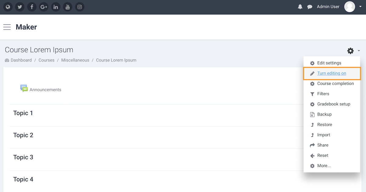
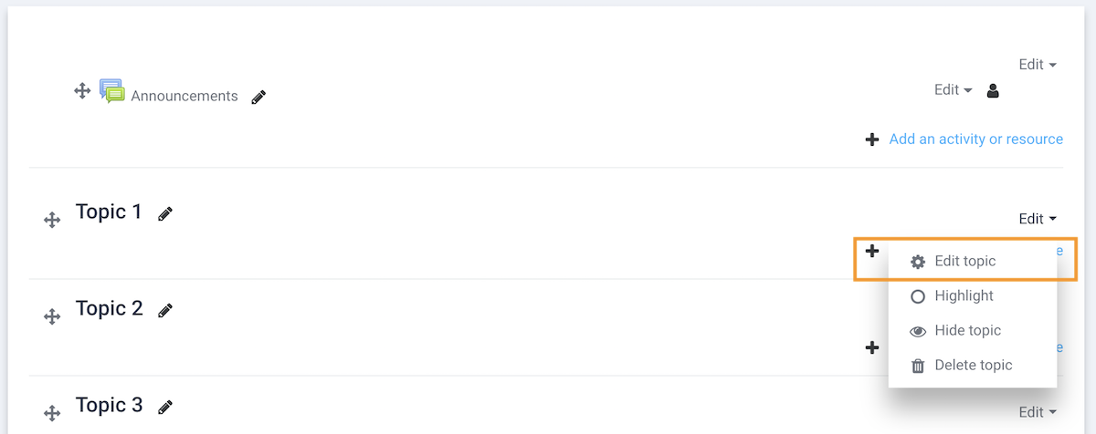
2) Go to the section settings page
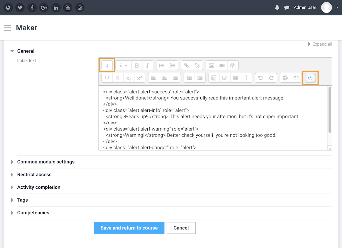
3) Enter the code into the Summary input field. You need to activate the HTML code editor before entering the code.
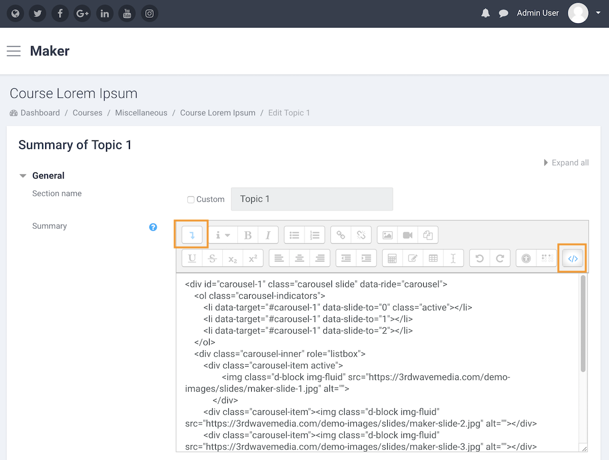
4) Save changes.
2. Add code to a Label
1) Log into your course as a teacher and turn editing on.
2) Add a Label to the course.
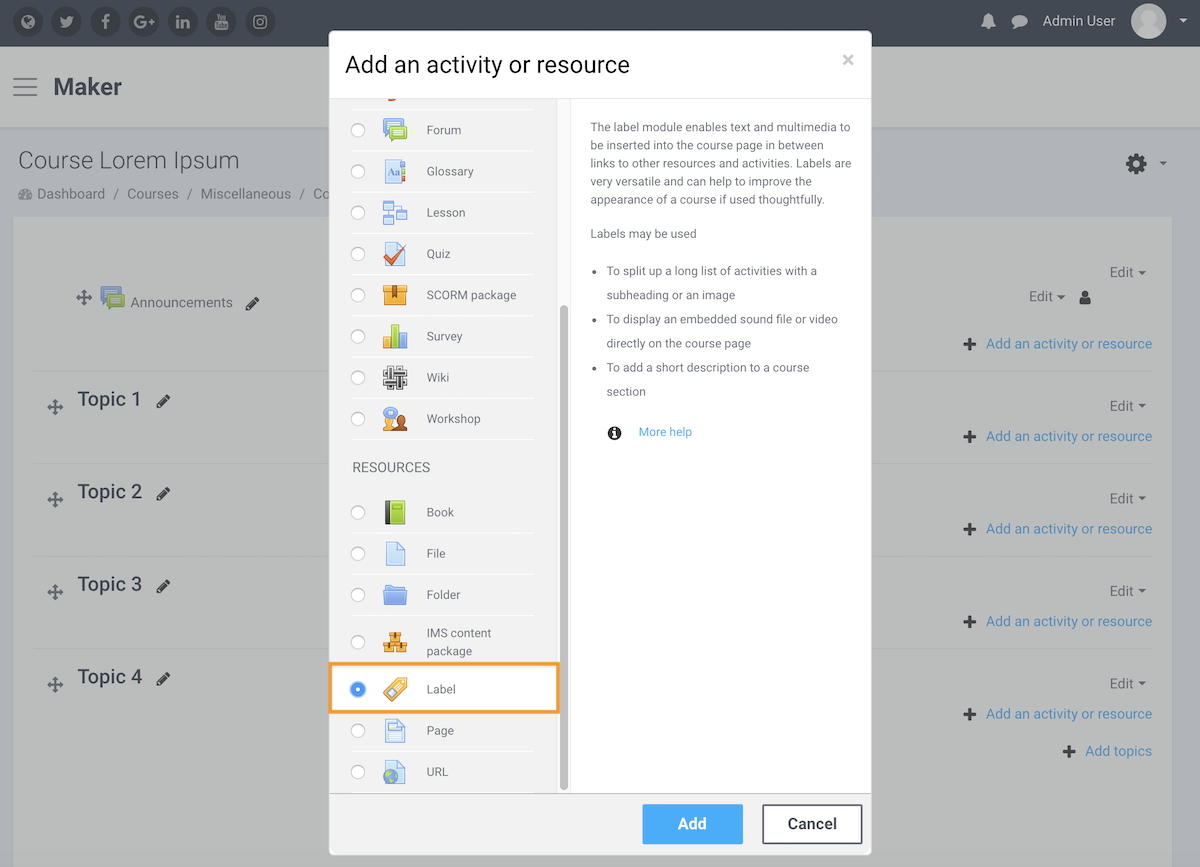
3) Enter the code into the Label text input field. You need to activate the HTML code editor before entering the code.
4) Save changes.
Components code
Below are all of the components we used in the live demo. You can simply take the code snippets and start building your course.
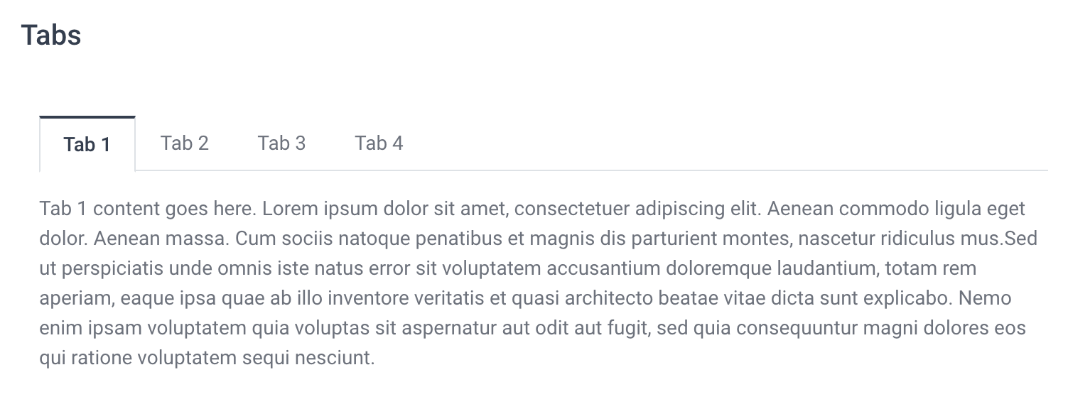
Tabs NEW
<!-- Nav tabs -------------- -->
<ul class="nav nav-tabs" role="tablist">
    <li class="nav-item">
        <a class="nav-link active" data-toggle="tab" href="#tab1" role="tab" aria-expanded="true">Tab 1</a>
    </li>
    <li class="nav-item">
        <a class="nav-link" data-toggle="tab" href="#tab2" role="tab" aria-expanded="false">Tab 2</a>
    </li>
    <li class="nav-item">
        <a class="nav-link" data-toggle="tab" href="#tab3" role="tab" aria-expanded="false">Tab 3</a>
    </li>
    <li class="nav-item">
        <a class="nav-link" data-toggle="tab" href="#tab4" role="tab" aria-expanded="false">Tab 4</a>
    </li>
</ul>

<!-- Tab panes -------------- -->
<div class="tab-content">
    <div class="tab-pane active" id="tab1" role="tabpanel" aria-expanded="true">
        Tab 1 content goes here. Lorem ipsum dolor sit amet, consectetuer adipiscing elit. Aenean commodo ligula eget dolor. Aenean massa. Cum sociis natoque penatibus et magnis dis parturient montes, nascetur ridiculus mus.
    </div>
    <div class="tab-pane" id="tab2" role="tabpanel" aria-expanded="false">
        Tab 2 content goes here. Lorem ipsum dolor sit amet, consectetuer adipiscing elit. Aenean commodo ligula eget dolor. Aenean massa. Cum sociis natoque penatibus et magnis dis parturient montes, nascetur ridiculus mus.
    </div>
    <div class="tab-pane" id="tab3" role="tabpanel" aria-expanded="false">
        Tab 3 content goes here. Lorem ipsum dolor sit amet, consectetuer adipiscing elit. Aenean commodo ligula eget dolor. Aenean massa. Cum sociis natoque penatibus et magnis dis parturient montes, nascetur ridiculus mus.
    </div>
    <div class="tab-pane" id="tab4" role="tabpanel" aria-expanded="false">
        Tab 4 content goes here. Lorem ipsum dolor sit amet, consectetuer adipiscing elit. Aenean commodo ligula eget dolor. Aenean massa. Cum sociis natoque penatibus et magnis dis parturient montes, nascetur ridiculus mus.
    </div>
</div>
Slideshow
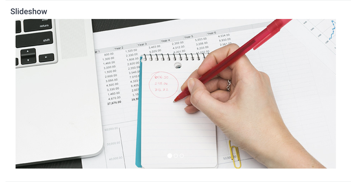
Tip: It’s best to give the carousel a max width in the code (eg. style="max-width: 760px"). The value should be equal or lower than the width of your image.
<div id="carousel-1" class="carousel slide" data-ride="carousel">
    <ol class="carousel-indicators">
        <li data-target="#carousel-1" data-slide-to="0" class="active"></li>
        <li data-target="#carousel-1" data-slide-to="1"></li>
        <li data-target="#carousel-1" data-slide-to="2"></li>
    </ol>
    <div class="carousel-inner" role="listbox">
        <div class="carousel-item active">
	        <img class="d-block img-fluid" src="https://3rdwavemedia.com/demo-images/slides/maker-slide-1.jpg" alt="" />
	    </div>
        <div class="carousel-item"><img class="d-block img-fluid" src="https://3rdwavemedia.com/demo-images/slides/maker-slide-2.jpg" alt="" /></div>
        <div class="carousel-item"><img class="d-block img-fluid" src="https://3rdwavemedia.com/demo-images/slides/maker-slide-3.jpg" alt="" /></div>
    </div>
	<a class="carousel-control-prev" href="#carousel-1" role="button" data-slide="prev">
		<span class="carousel-control-prev-icon" aria-hidden="true"></span>
		<span class="sr-only">Previous</span>
	</a>
	<a class="carousel-control-next" href="#carousel-1" role="button" data-slide="next">
		<span class="carousel-control-next-icon" aria-hidden="true"></span>
		<span class="sr-only">Next</span>
	</a>
</div>
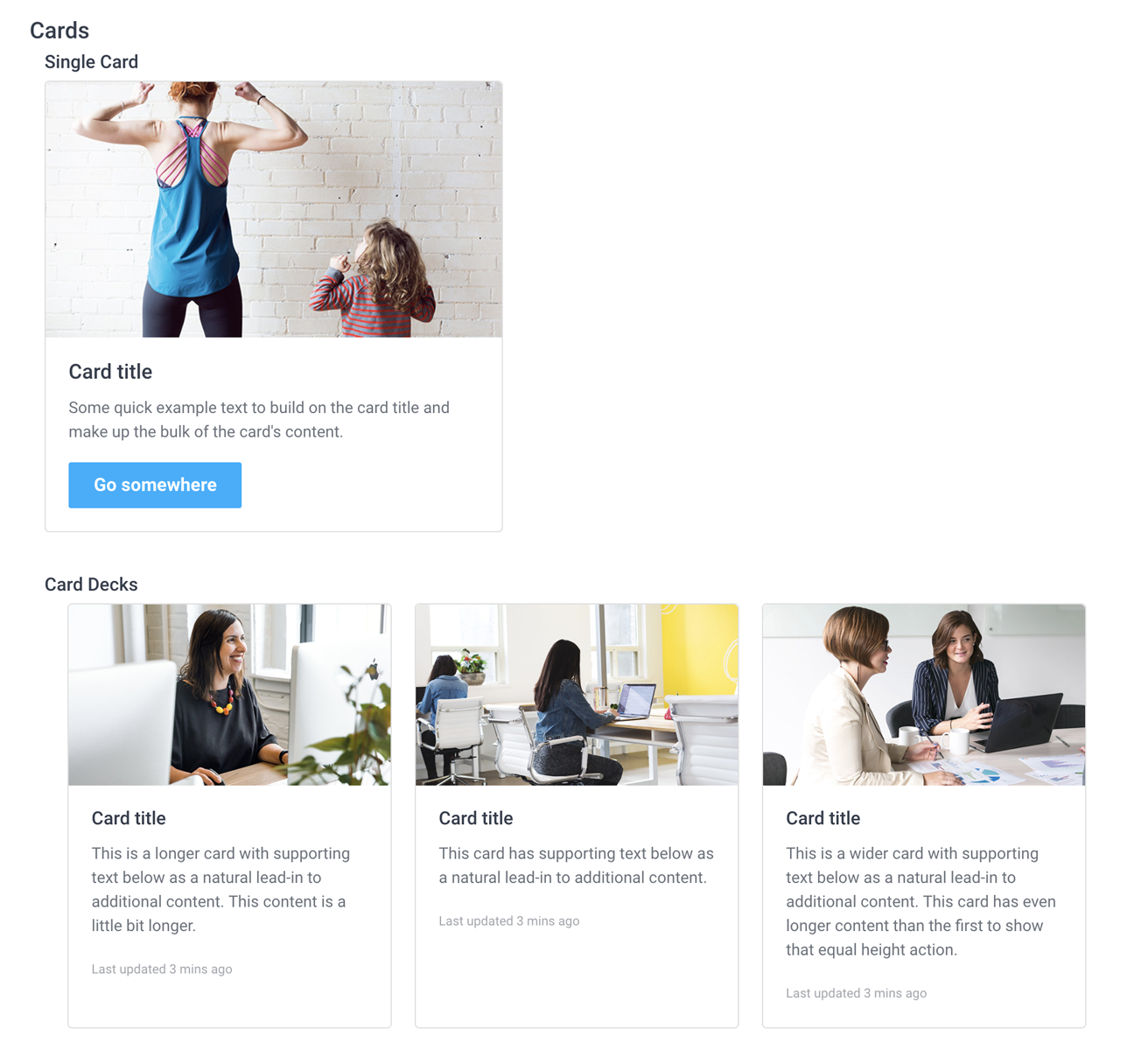
Cards
<div class="card" style="width: 400px;">
  <img class="card-img-top" src="https://3rdwavemedia.com/demo-images/slides/maker-card-1.jpg" alt="Card image cap" />
  <div class="card-block">
    <h4 class="card-title">Card title</h4>
    <p class="card-text">Some quick example text to build on the card title and make up the bulk of the card's content.</p>
    <a href="#" class="btn btn-primary">Go somewhere</a>
  </div>
</div>
<div class="card-deck">
  <div class="card">
    <img class="card-img-top" src="https://3rdwavemedia.com/demo-images/slides/maker-card-0.jpg" alt="Card image cap" />
    <div class="card-body">
      <h5 class="card-title">Card title</h5>
      <p class="card-text">This is a longer card with supporting text below as a natural lead-in to additional content. This content is a little bit longer.</p>
      <p class="card-text"><small class="text-muted">Last updated 3 mins ago</small></p>
    </div>
  </div>
  <div class="card">
    <img class="card-img-top" src="https://3rdwavemedia.com/demo-images/slides/maker-card-2.jpg" alt="Card image cap" />
    <div class="card-body">
      <h5 class="card-title">Card title</h5>
      <p class="card-text">This card has supporting text below as a natural lead-in to additional content.</p>
      <p class="card-text"><small class="text-muted">Last updated 3 mins ago</small></p>
    </div>
  </div>
  <div class="card">
    <img class="card-img-top" src="https://3rdwavemedia.com/demo-images/slides/maker-card-3.jpg" alt="Card image cap" />
    <div class="card-body">
      <h5 class="card-title">Card title</h5>
      <p class="card-text">This is a wider card with supporting text below as a natural lead-in to additional content. This card has even longer content than the first to show that equal height action.</p>
      <p class="card-text"><small class="text-muted">Last updated 3 mins ago</small></p>
    </div>
  </div>
</div>
Tabs
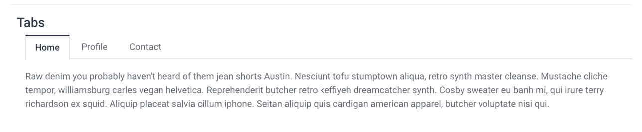
<ul class="nav nav-tabs" id="myTab" role="tablist">
  <li class="nav-item">
    <a class="nav-link active" id="home-tab" data-toggle="tab" href="#home" role="tab" aria-controls="home" aria-selected="true">Home</a>
  </li>
  <li class="nav-item">
    <a class="nav-link" id="profile-tab" data-toggle="tab" href="#profile" role="tab" aria-controls="profile" aria-selected="false">Profile</a>
  </li>
  <li class="nav-item">
    <a class="nav-link" id="contact-tab" data-toggle="tab" href="#contact" role="tab" aria-controls="contact" aria-selected="false">Contact</a>
  </li>
</ul>
<div class="tab-content" id="myTabContent">
  <div class="tab-pane active" id="home" role="tabpanel" aria-labelledby="home-tab">
	  <p>Raw denim you probably haven't heard of them jean shorts Austin. Nesciunt tofu stumptown aliqua, retro synth master cleanse. Mustache cliche tempor, williamsburg carles vegan helvetica. Reprehenderit butcher retro keffiyeh dreamcatcher synth. Cosby sweater eu banh mi, qui irure terry richardson ex squid. Aliquip placeat salvia cillum iphone. Seitan aliquip quis cardigan american apparel, butcher voluptate nisi qui.</p>
    </div>
  <div class="tab-pane fade" id="profile" role="tabpanel" aria-labelledby="profile-tab">
	  <p>Food truck fixie locavore, accusamus mcsweeney's marfa nulla single-origin coffee squid. Exercitation +1 labore velit, blog sartorial PBR leggings next level wes anderson artisan four loko farm-to-table craft beer twee. Qui photo booth letterpress, commodo enim craft beer mlkshk aliquip jean shorts ullamco ad vinyl cillum PBR. </p>
	</div>
  <div class="tab-pane fade" id="contact" role="tabpanel" aria-labelledby="contact-tab">
	  <p>Etsy mixtape wayfarers, ethical wes anderson tofu before they sold out mcsweeney's organic lomo retro fanny pack lo-fi farm-to-table readymade. Messenger bag gentrify pitchfork tattooed craft beer, iphone skateboard locavore carles etsy salvia banksy hoodie helvetica. DIY synth PBR banksy irony. Leggings gentrify squid 8-bit cred pitchfork.</p>
  </div>
</div>
Jumbotron
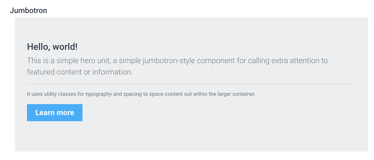
<!---Jumbotron-->
<div class="jumbotron">
  <h1 class="display-4">Hello, world!</h1>
  <p class="lead">This is a simple hero unit, a simple jumbotron-style component for calling extra attention to featured content or information.</p>
  <hr class="my-4">
  <p>It uses utility classes for typography and spacing to space content out within the larger container.</p>
  <p class="lead">
    <a class="btn btn-primary btn-lg" href="#" role="button">Learn more</a>
  </p>
</div>
Tables
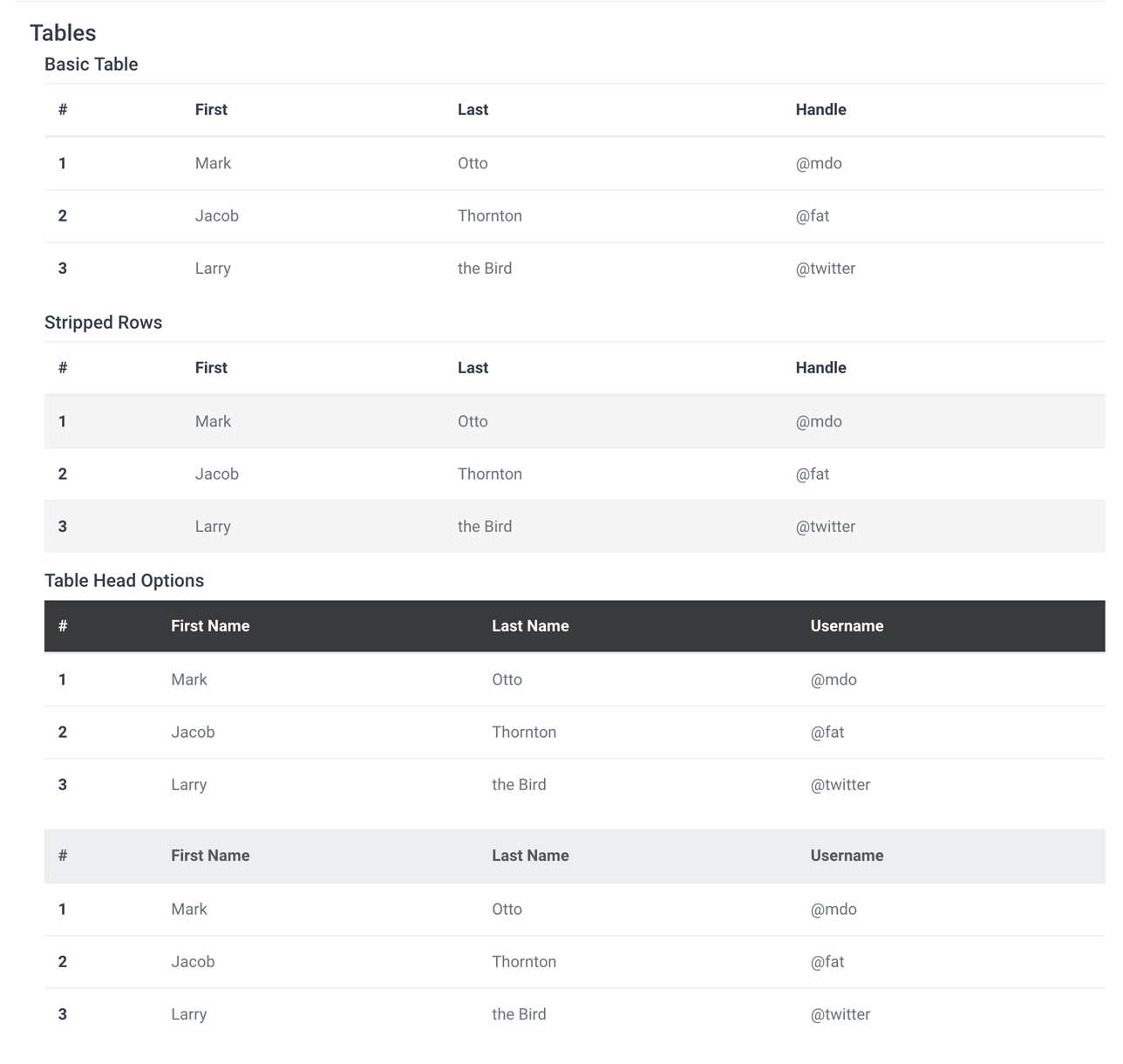
<!--//Basic Table-->
<table class="table">
  <thead>
    <tr>
      <th scope="col">#</th>
      <th scope="col">First</th>
      <th scope="col">Last</th>
      <th scope="col">Handle</th>
    </tr>
  </thead>
  <tbody>
    <tr>
      <th scope="row">1</th>
      <td>Mark</td>
      <td>Otto</td>
      <td>@mdo</td>
    </tr>
    <tr>
      <th scope="row">2</th>
      <td>Jacob</td>
      <td>Thornton</td>
      <td>@fat</td>
    </tr>
    <tr>
      <th scope="row">3</th>
      <td>Larry</td>
      <td>the Bird</td>
      <td>@twitter</td>
    </tr>
  </tbody>
</table>
<!--//Stripped Rows-->
<table class="table table-striped">
  <thead>
    <tr>
      <th scope="col">#</th>
      <th scope="col">First</th>
      <th scope="col">Last</th>
      <th scope="col">Handle</th>
    </tr>
  </thead>
  <tbody>
    <tr>
      <th scope="row">1</th>
      <td>Mark</td>
      <td>Otto</td>
      <td>@mdo</td>
    </tr>
    <tr>
      <th scope="row">2</th>
      <td>Jacob</td>
      <td>Thornton</td>
      <td>@fat</td>
    </tr>
    <tr>
      <th scope="row">3</th>
      <td>Larry</td>
      <td>the Bird</td>
      <td>@twitter</td>
    </tr>
  </tbody>
</table>
<!--//Table Head Options-->
<table class="table">
  <thead class="thead-inverse thead-dark">
    <tr>
      <th>#</th>
      <th>First Name</th>
      <th>Last Name</th>
      <th>Username</th>
    </tr>
  </thead>
  <tbody>
    <tr>
      <th scope="row">1</th>
      <td>Mark</td>
      <td>Otto</td>
      <td>@mdo</td>
    </tr>
    <tr>
      <th scope="row">2</th>
      <td>Jacob</td>
      <td>Thornton</td>
      <td>@fat</td>
    </tr>
    <tr>
      <th scope="row">3</th>
      <td>Larry</td>
      <td>the Bird</td>
      <td>@twitter</td>
    </tr>
  </tbody>
</table>

<table class="table">
  <thead class="thead-default thead-light">
    <tr>
      <th>#</th>
      <th>First Name</th>
      <th>Last Name</th>
      <th>Username</th>
    </tr>
  </thead>
  <tbody>
    <tr>
      <th scope="row">1</th>
      <td>Mark</td>
      <td>Otto</td>
      <td>@mdo</td>
    </tr>
    <tr>
      <th scope="row">2</th>
      <td>Jacob</td>
      <td>Thornton</td>
      <td>@fat</td>
    </tr>
    <tr>
      <th scope="row">3</th>
      <td>Larry</td>
      <td>the Bird</td>
      <td>@twitter</td>
    </tr>
  </tbody>
</table>
Alerts
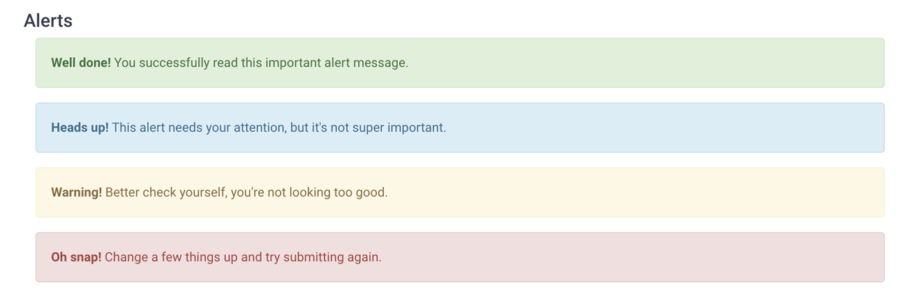
<div class="alert alert-success" role="alert">
  <strong>Well done!</strong> You successfully read this important alert message.
</div>
<div class="alert alert-info" role="alert">
  <strong>Heads up!</strong> This alert needs your attention, but it's not super important.
</div>
<div class="alert alert-warning" role="alert">
  <strong>Warning!</strong> Better check yourself, you're not looking too good.
</div>
<div class="alert alert-danger" role="alert">
  <strong>Oh snap!</strong> Change a few things up and try submitting again.
</div>
Buttons
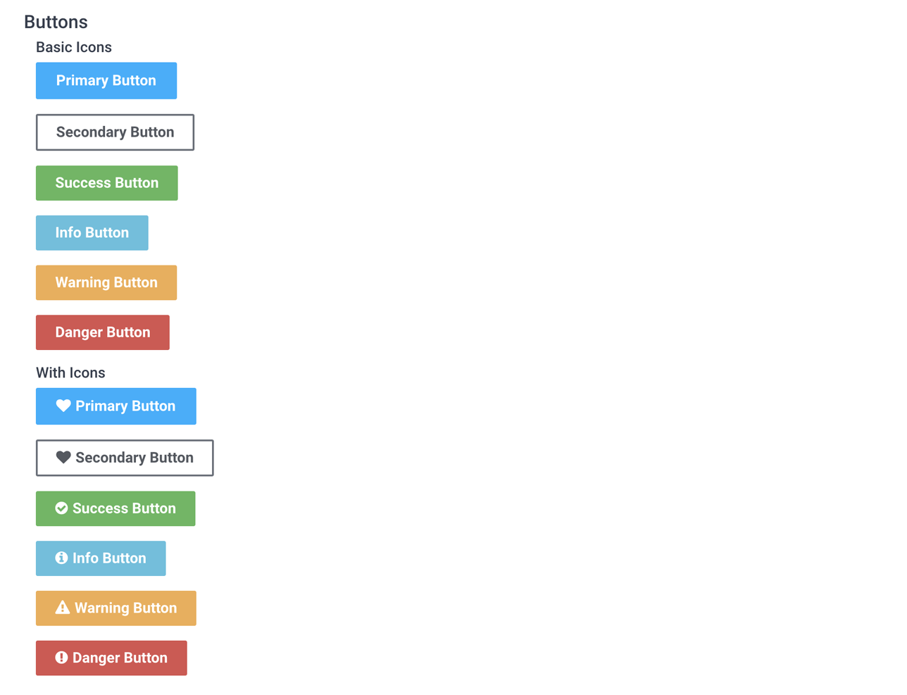
<!--//Basic Buttons-->
<p><a class="btn btn-primary" href="http://elearning.3rdwavemedia.com/">Primary Button</a></p>
<p><a class="btn btn-secondary" href="http://elearning.3rdwavemedia.com/">Secondary Button</a></p>
<p><a class="btn btn-success" href="http://elearning.3rdwavemedia.com/">Success Button</a></p>
<p><a class="btn btn-info" href="http://elearning.3rdwavemedia.com/">Info Button</a></p>
<p><a class="btn btn-warning" href="http://elearning.3rdwavemedia.com/">Warning Button</a></p>
<p><a class="btn btn-danger" href="http://elearning.3rdwavemedia.com/">Danger Button</a></p>
<!--//With Icons-->
<p><a href="http://elearning.3rdwavemedia.com/" class="btn btn-primary has-icon"><i class="fa fa-heart"></i>Primary Button</a></p>
<p><a href="http://elearning.3rdwavemedia.com/" class="btn btn-secondary has-icon"><i class="fa fa-heart"></i>Secondary Button</a></p>
<p><a href="http://elearning.3rdwavemedia.com/" class="btn btn-success has-icon"><i class="fa fa-check-circle"></i>Success Button</a></p>
<p><a href="http://elearning.3rdwavemedia.com/" class="btn btn-info has-icon"><i class="fa fa-info-circle"></i>Info Button</a></p>
<p><a href="http://elearning.3rdwavemedia.com/" class="btn btn-warning has-icon"><i class="fa fa-warning"></i>Warning Button</a></p>
<p><a href="http://elearning.3rdwavemedia.com/" class="btn btn-danger has-icon"><i class="fa fa-exclamation-circle"></i>Danger Button</a></p>
Badges
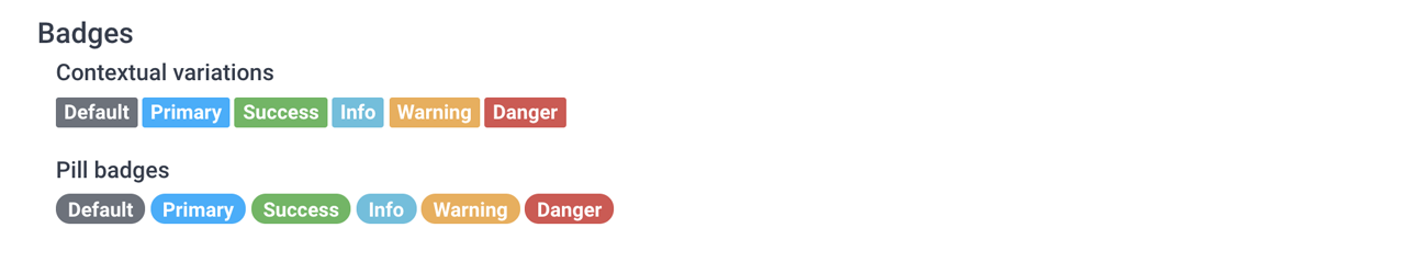
<!--//Contextual variations-->
<span class="badge badge-default">Default</span>
<span class="badge badge-primary">Primary</span>
<span class="badge badge-success">Success</span>
<span class="badge badge-info">Info</span>
<span class="badge badge-warning">Warning</span>
<span class="badge badge-danger">Danger</span>
<!--//Pill badges-->
<span class="badge badge-pill badge-default">Default</span>
<span class="badge badge-pill badge-primary">Primary</span>
<span class="badge badge-pill badge-success">Success</span>
<span class="badge badge-pill badge-info">Info</span>
<span class="badge badge-pill badge-warning">Warning</span>
<span class="badge badge-pill badge-danger">Danger</span>
Modal
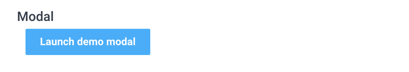
<!-- Button trigger modal -->
<button type="button" class="btn btn-primary" data-toggle="modal" data-target="#exampleModal">
Launch demo modal
</button>
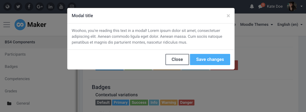
<!-- Modal -->
<div class="modal fade" id="exampleModal" tabindex="-1" role="dialog" aria-labelledby="exampleModalLabel" aria-hidden="true">
<div class="modal-dialog" role="document">
<div class="modal-content">
<div class="modal-header">
<h5 class="modal-title" id="exampleModalLabel">Modal title</h5>
<button type="button" class="close" data-dismiss="modal" aria-label="Close">
<span aria-hidden="true">×</span>
</button>
</div>
<div class="modal-body">
Woohoo, you're reading this text in a modal!
</div>
<div class="modal-footer">
<button type="button" class="btn btn-secondary" data-dismiss="modal">Close</button>
<button type="button" class="btn btn-primary">Save changes</button>
</div>
</div>
</div>
</div>
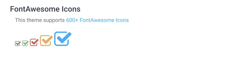
FontAwesome Icons
You can use 600+ FontAwesome icons in your course.
Tip: Use classnames fa-1, fa-2, fa-3, fa-4 and fa-5 to control the size of the icon
<div>
    <i class="fa fa-check-square-o fa-1"></i>
    <i class="fa fa-check-square-o fa-2 text-success"></i>
    <i class="fa fa-check-square-o fa-3 text-danger"></i>
    <i class="fa fa-check-square-o fa-4 text-warning"></i>
    <i class="fa fa-check-square-o fa-5 text-info"></i>
</div>
Google Material Design Icons
You can use 900+ Google material design icons in your course.
Tip: Use classnames md-16, md-18, md-24, md-36 and md-48 to control the size of the icon.
<div>
	<i class="material-icons md-16">backup</i>
	<i class="material-icons md-18 text-success">backup</i>
	<i class="material-icons md-24 text-danger">backup</i>
	<i class="material-icons md-36 text-warning">backup</i>
	<i class="material-icons md-48 text-info">backup</i>
</div>