6 Premium Moodle Themes Based on Moodle’s Boost Theme Of 2024

Moodle’s theme development is evolving rapidly and the new Boost theme for Moodle 4.x has a modern new look and provides a better user experience. Moodle themes built on the core Boost theme can inherit all of the best features from its latest version. Using a boost-based Moodle theme for your Moodle LMS site can future proof your site and make sure it can evolve with Moodle in the future.

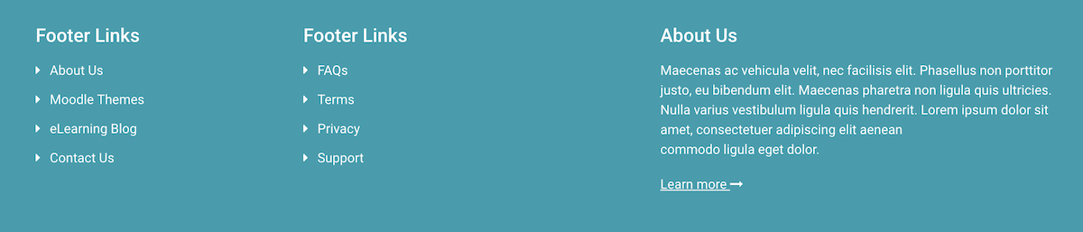
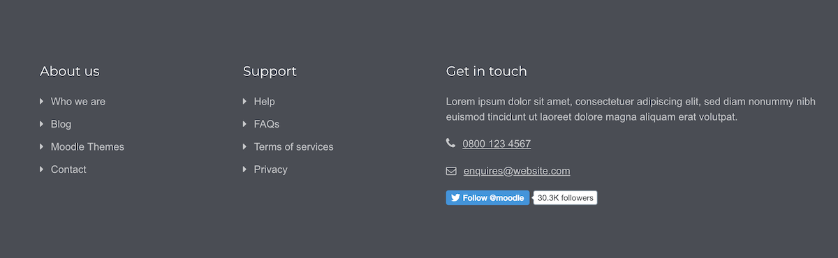
Want to find the best Boost-based premium theme to transform your Moodle site? We’ve got 6 professionally designed Moodle themes for you to choose from and they’re all built based on the latest Boost theme.

1. Edutor Theme (Moodle 4.x)

moodle-4-theme-edutor-frontpage

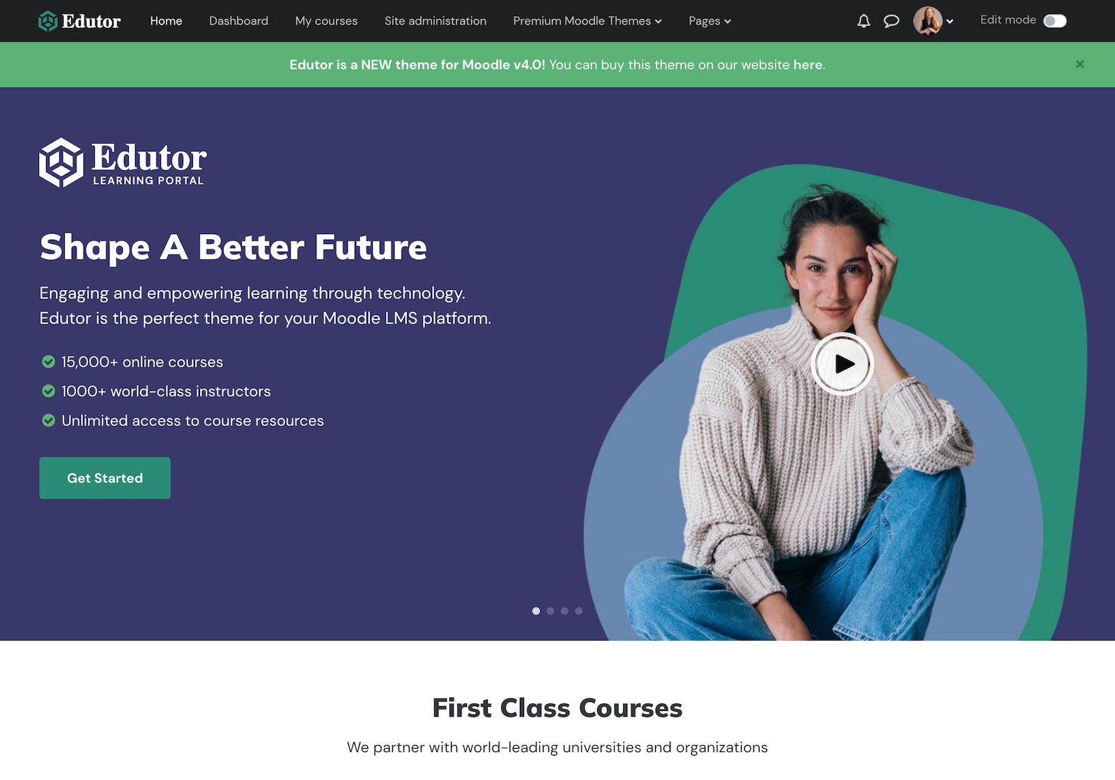
Moodle theme Edutor is a brand new Moodle theme developed for Moodle 4.0+ in 2022. The theme design is super modern, on-trend and highly customisable. This theme is tailored for corporate and higher education sites. It can transform your organisation’s Moodle LMS into a bespoke online learning/training platform instantly.

Edutor theme is compatible with Moodle 4.x

Want to learn more about this theme? Check out the Edutor theme’s main features & settings. You can also find useful tutorials to help you configure the theme on the theme details page under the right sidebar area.

Edutor Theme Demo Theme Details

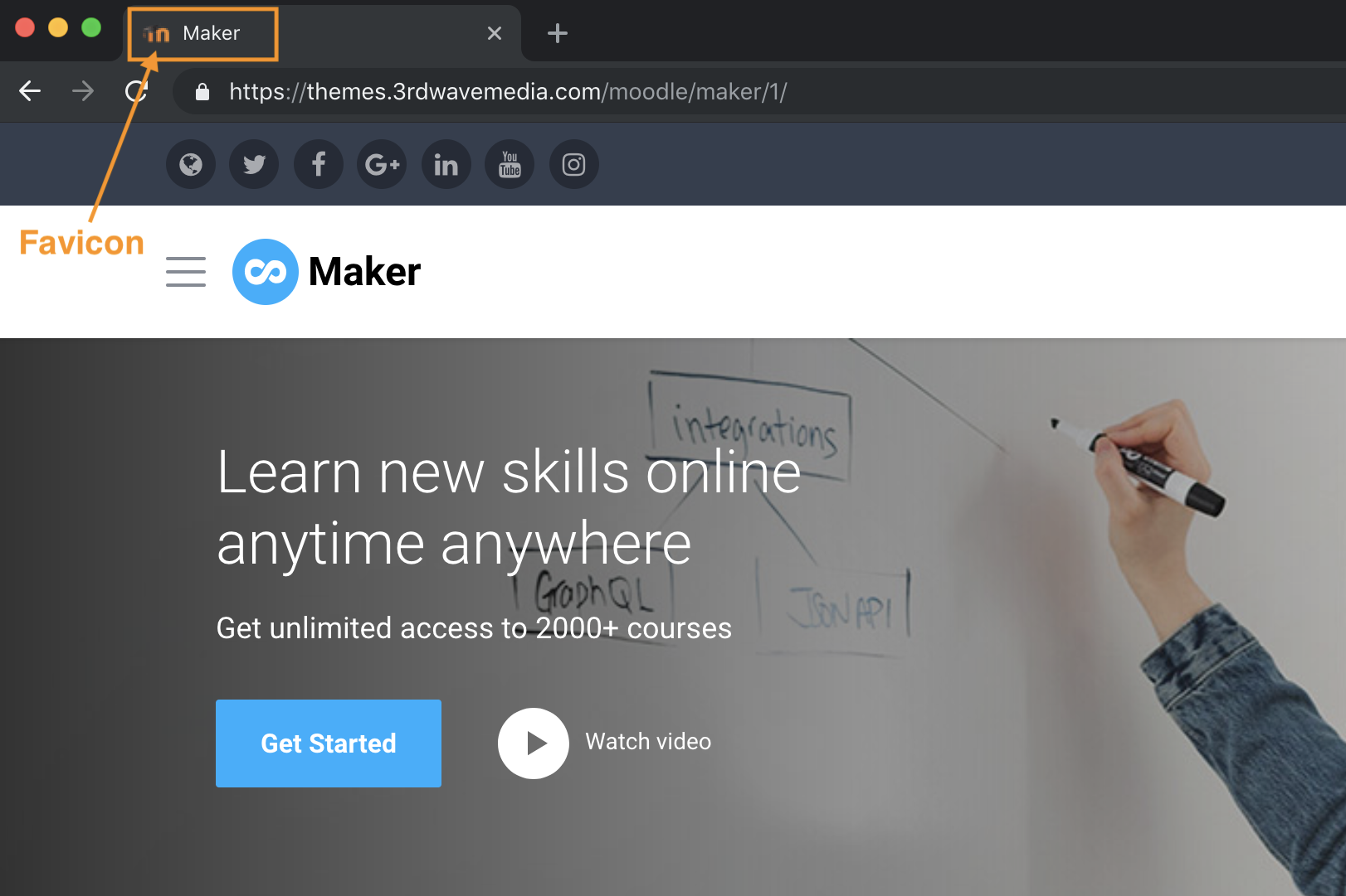
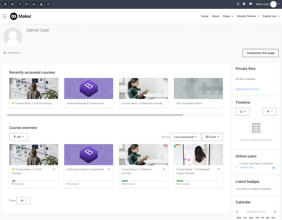
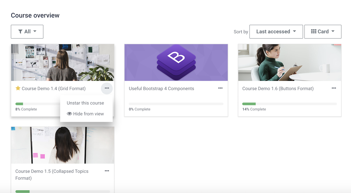
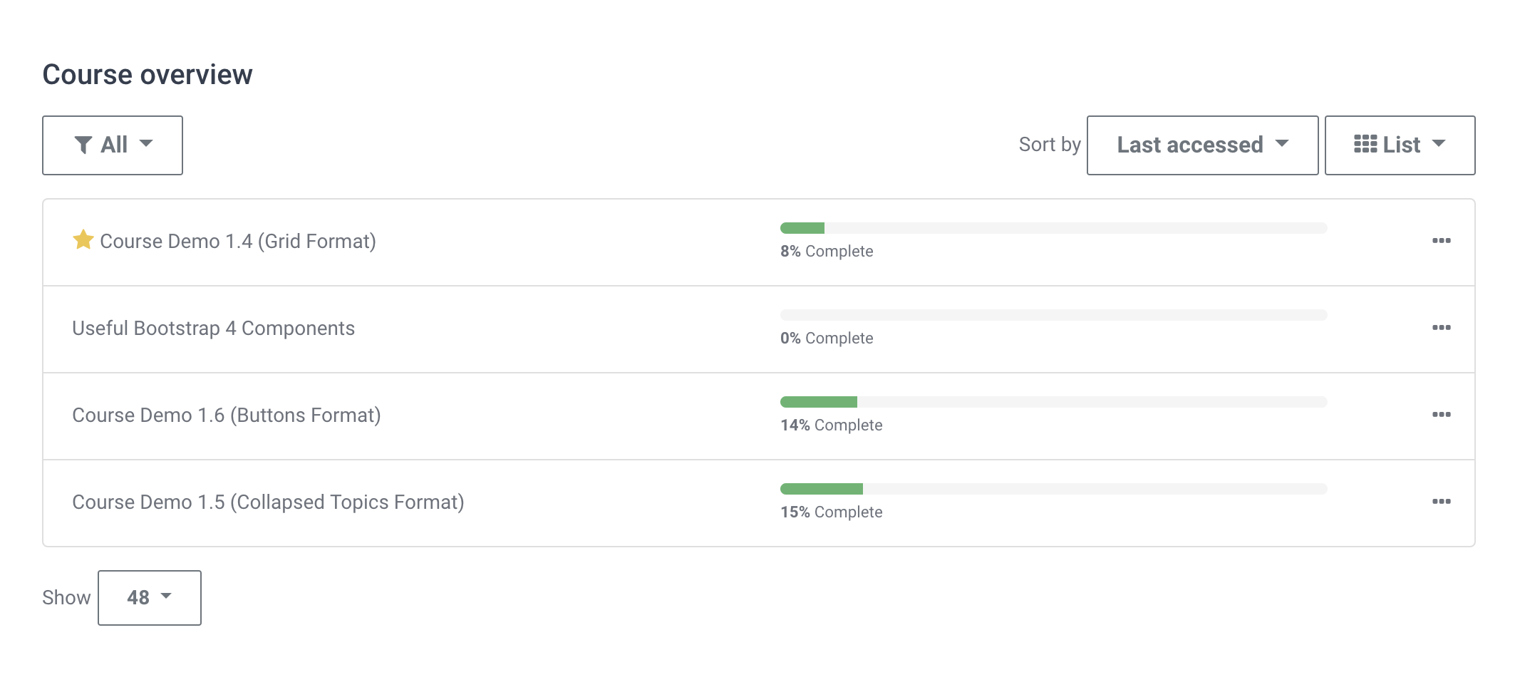
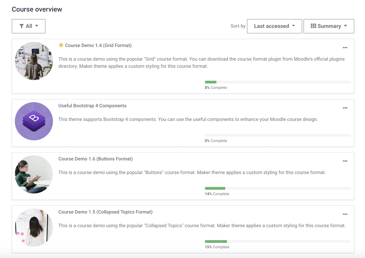
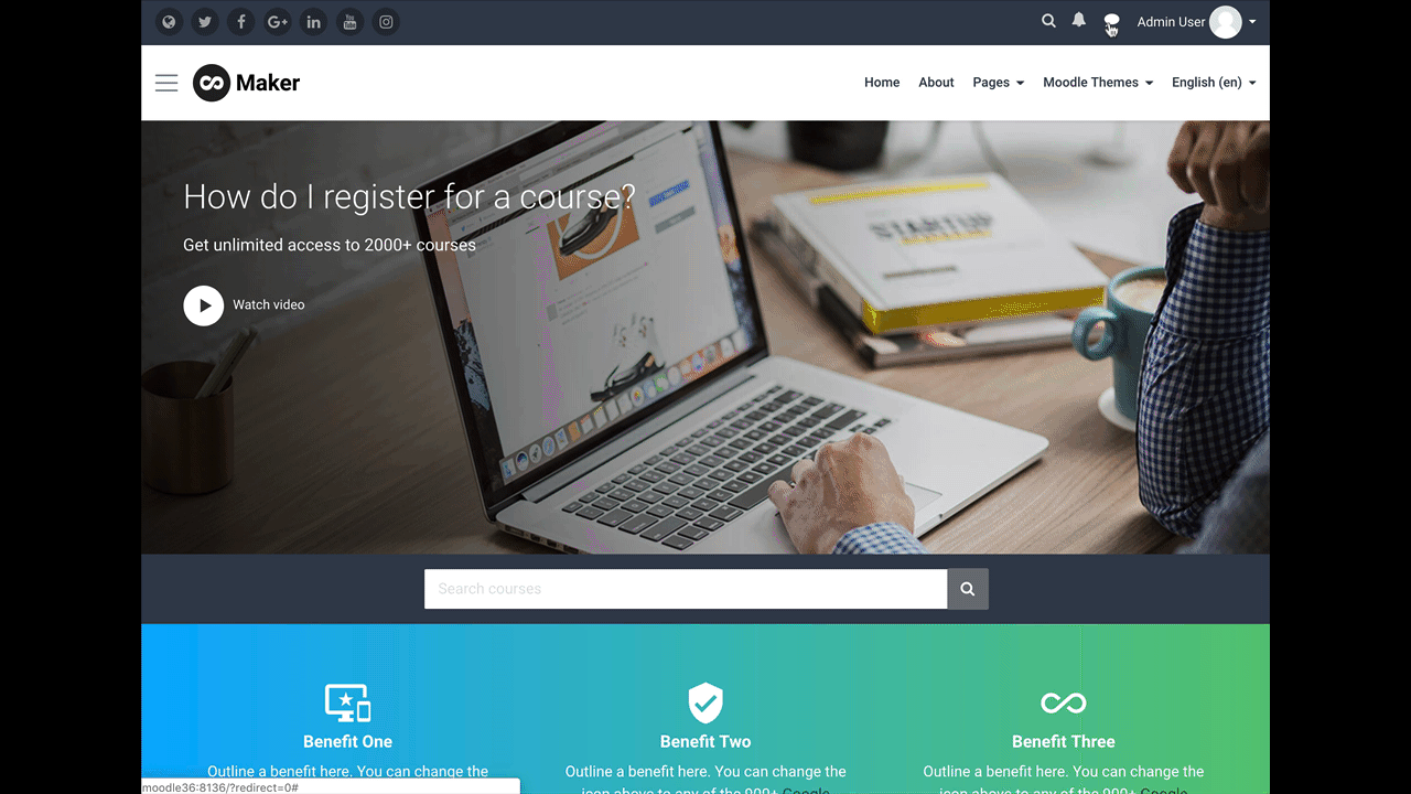
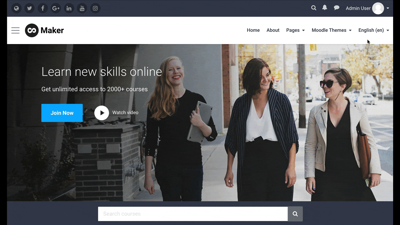
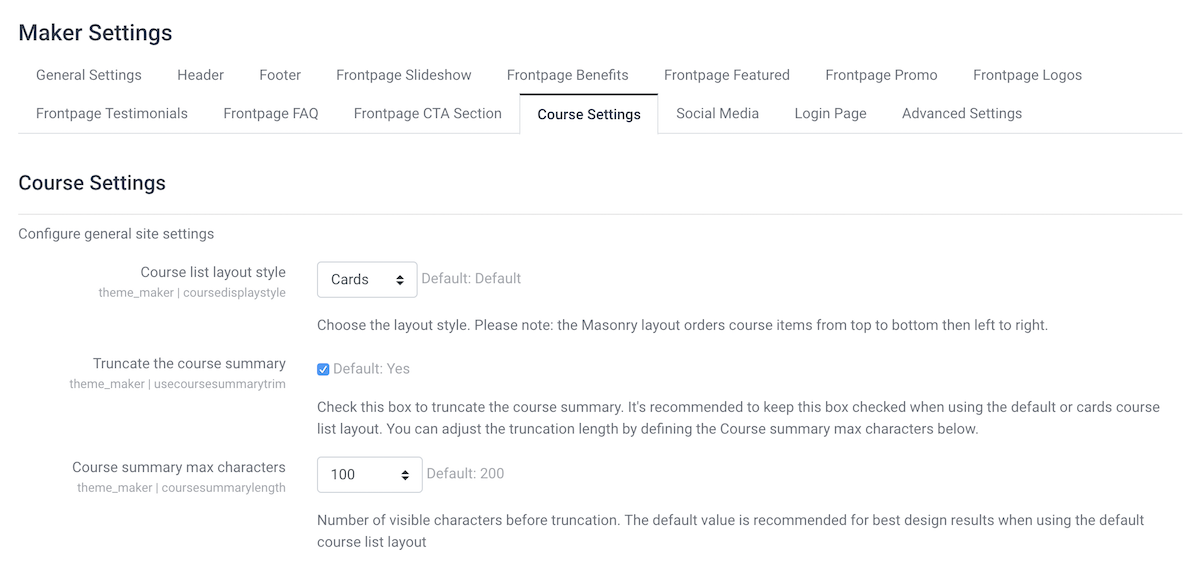
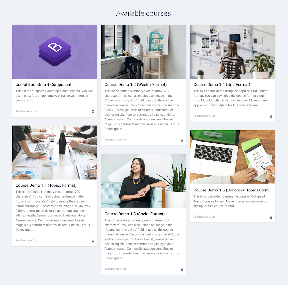
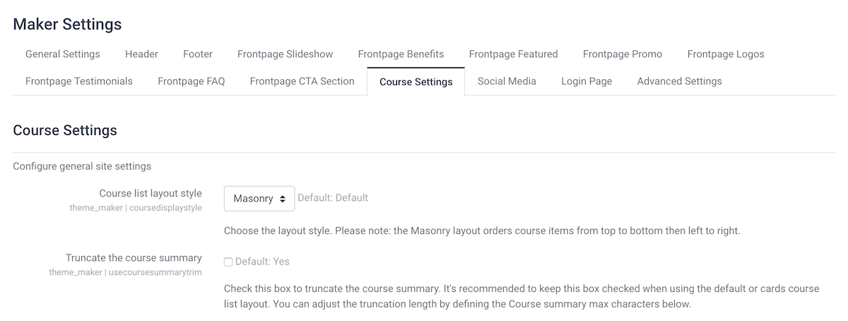
2. Maker Theme (Moodle 4.x & Moodle 3.x)

moodle-theme-maker-screenshot

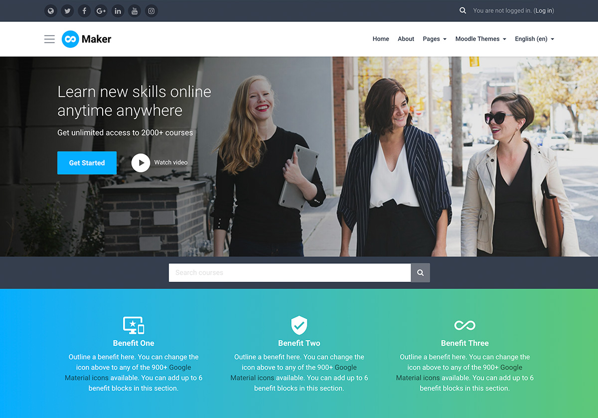
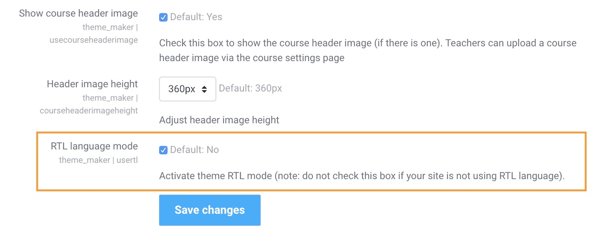
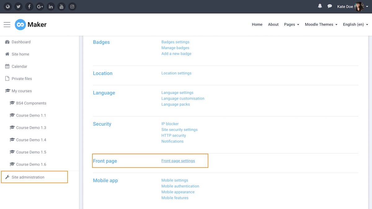
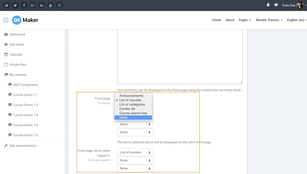
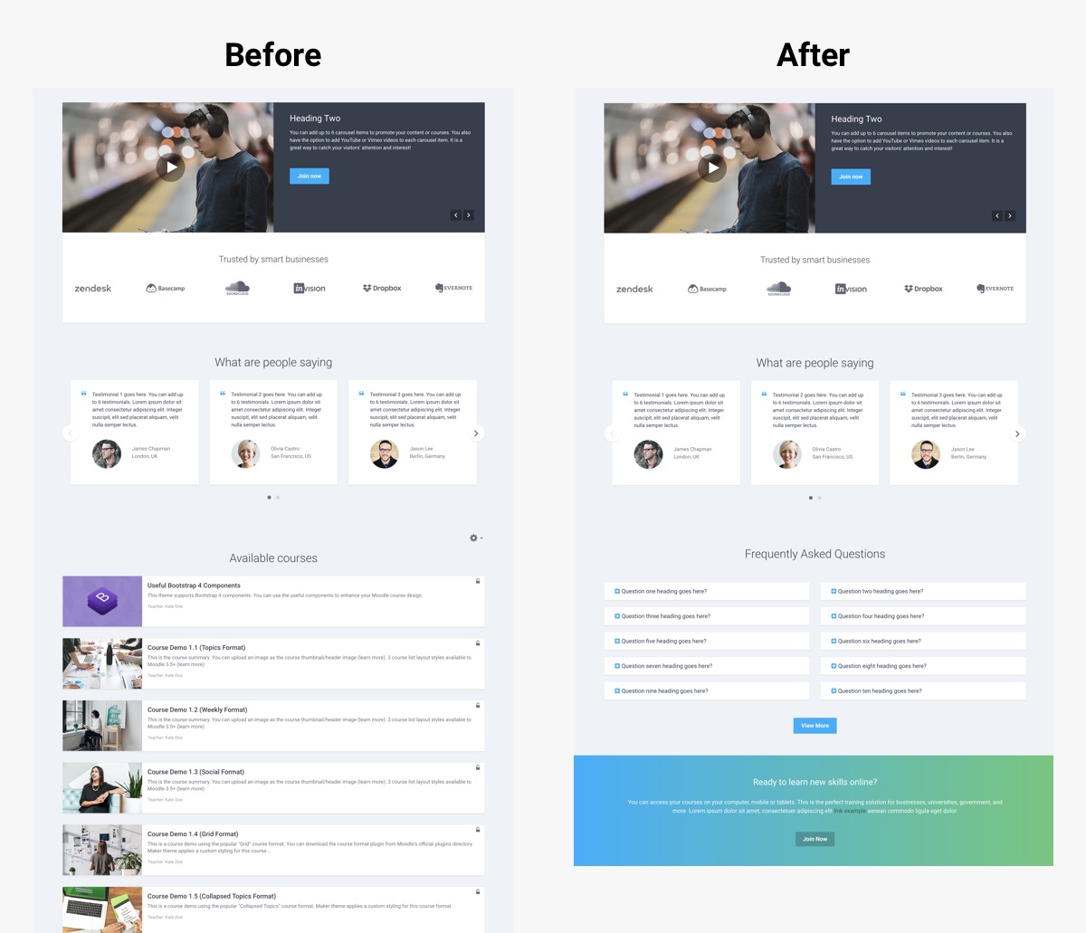
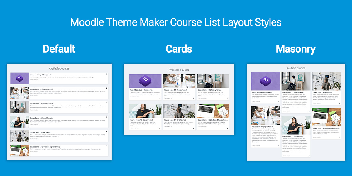
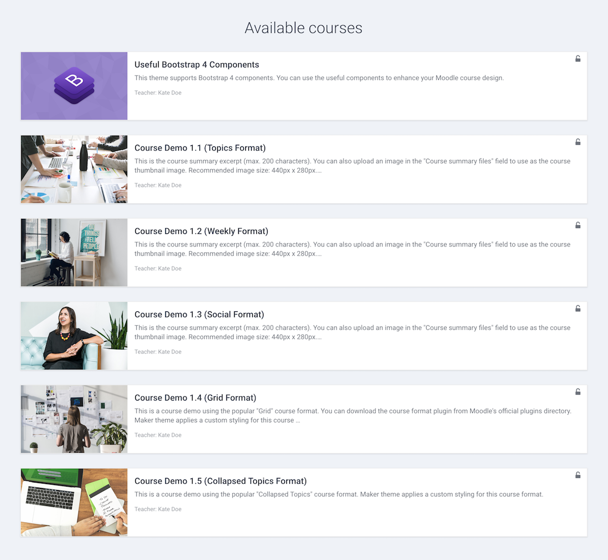
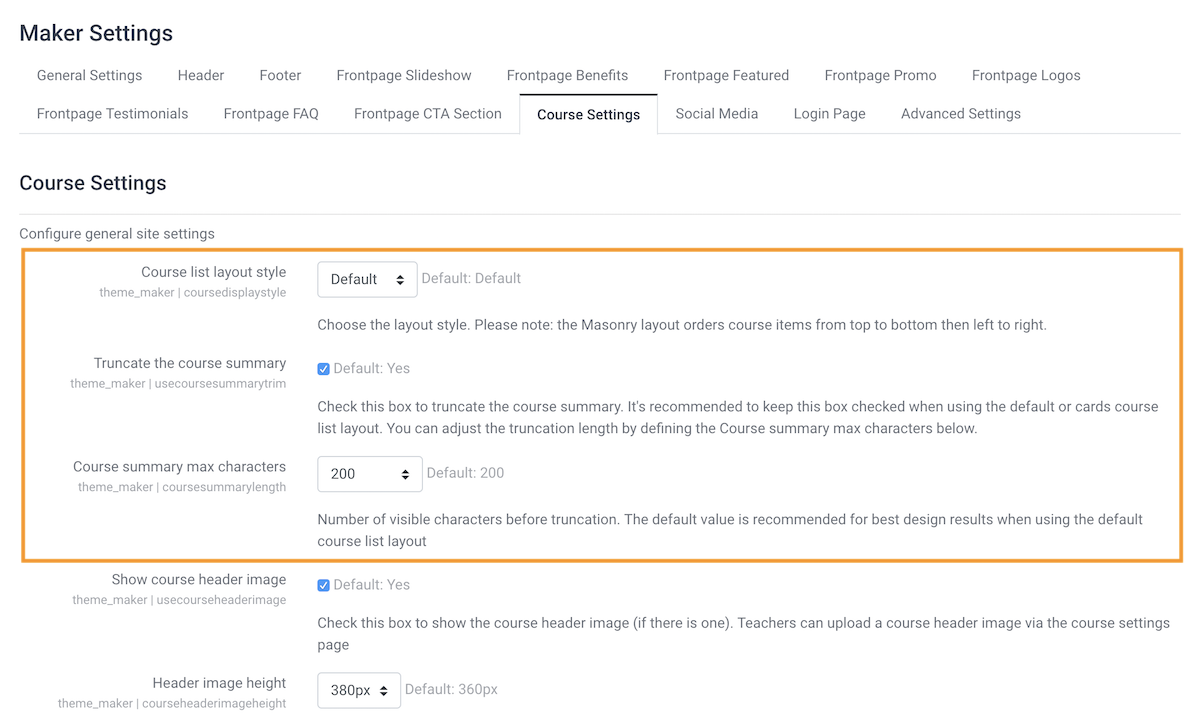
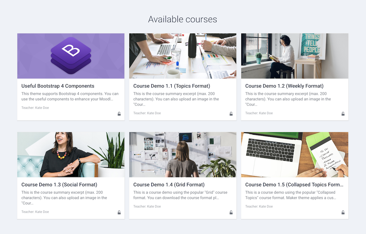
Moodle theme Maker is our best selling Moodle theme so far. It’s very popular with universities and businesses. You can check out the customer reviews on the theme details page.

Want to learn more about the Maker theme? Check out the theme main features here. You can also find useful tutorials to help you configure the theme on the theme details page under the right sidebar area.

Maker Theme Demo Theme Details


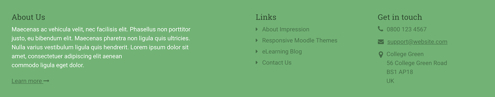
3. Impression Boost (Moodle 4.x & Moodle 3.x)

moodle-theme-impression-boost-screenshot

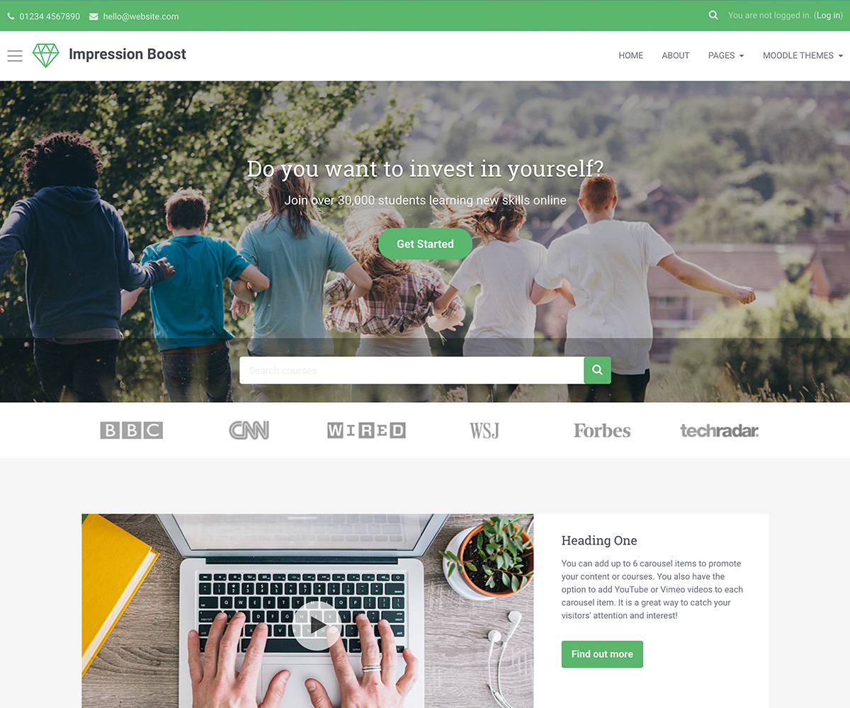
Impression Boost’s design is based on our popular Bootstrapbase-based theme Impression but it has been completely re-developed to use Moodle’s Boost theme as its base so the overall UX/UI is very different from Impression.

Impression Boost theme is compatible with Moodle 4.x and 3.x

Impression Boost Theme Demo Theme Details


4. Herald Boost Theme (Moodle 4.x & Moodle 3.x)

moodle-theme-herald-boost-screenshot

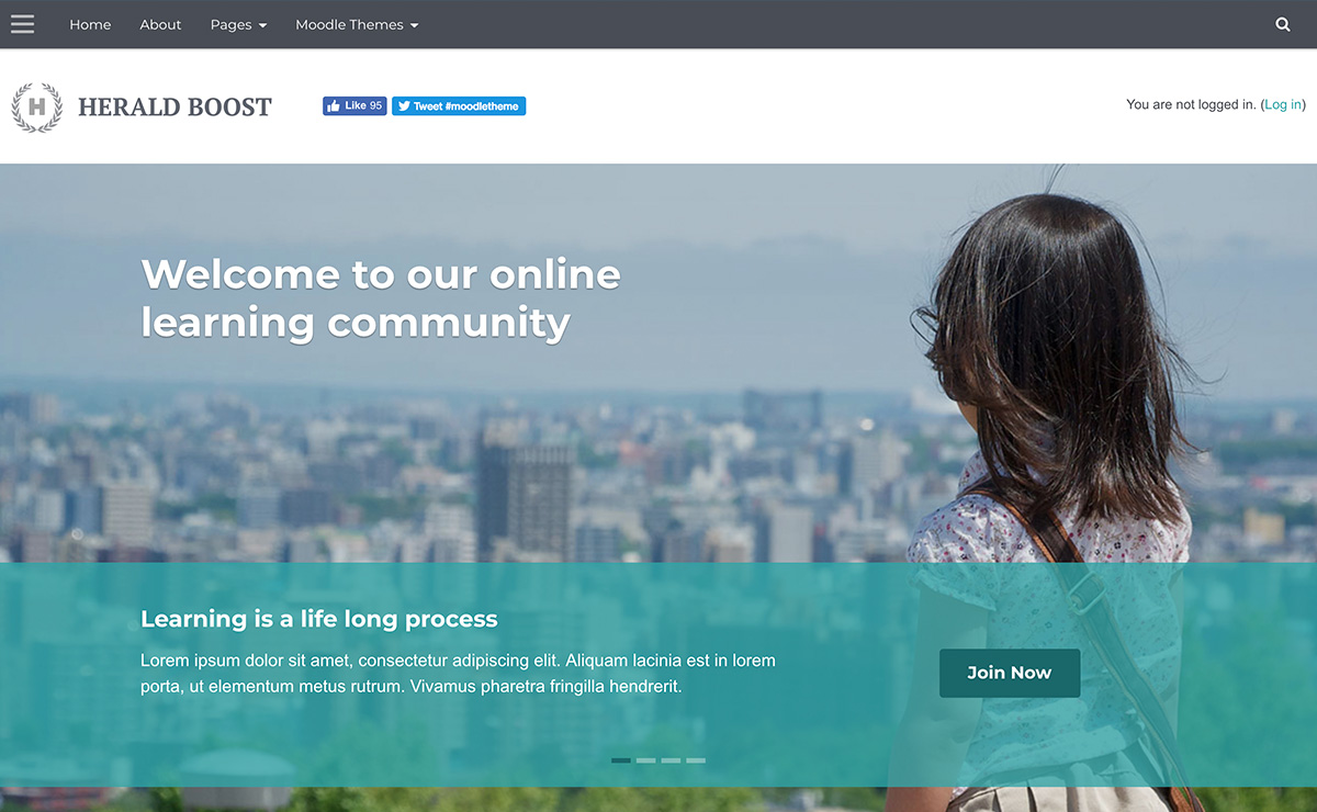
Herald Boost’s design is based on our Bootstrapbase-based theme Herald but it has been completely re-developed to use Moodle’s Boost theme as its base so the overall UX/UI is very different from Herald.

Herald Boost is compatible with Moodle 4.x and 3.x

Herald Boost Demo Theme Details


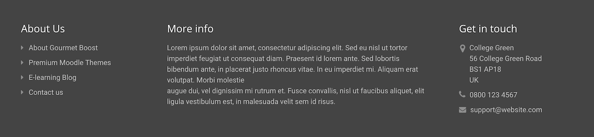
5. Gourmet Boost Theme (Moodle 4.x & Moodle 3.x)

moodle-theme-gourmet-boost-screenshot

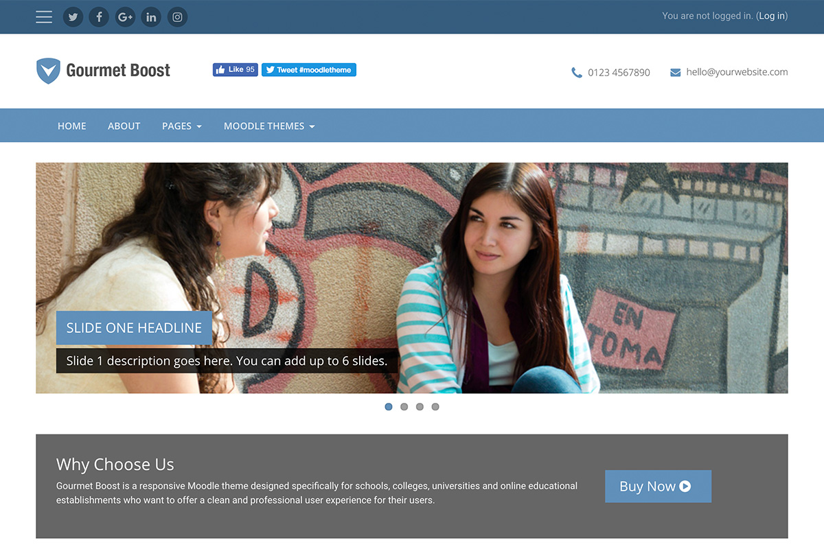
Gourmet Boost’s design is based on our Bootstrapbase-based theme Gourmet but it has been completely re-developed to use Moodle’s Boost theme as its base so the overall UX/UI is very different from Gourmet.

Gourmet Boost theme is compatible with Moodle 4.x and 3.x

Gourmet Boost Demo Theme Details


6. Material Boost (Moodle 4.x & Moodle 3.x)

moodle-theme-material-boost-screenshot

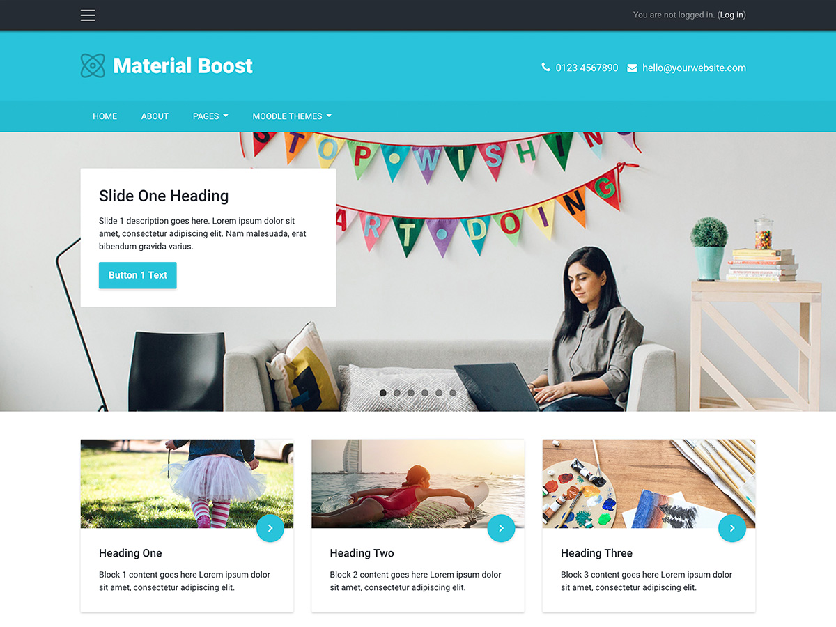
Material Boost’s design is inspired by Google Material design and is similar to our Bootstrapbase-based theme Element. It has been completely re-developed/re-designed to use Moodle’s Boost theme as its base so the overall user experience is very different from Element.

Material Boost is compatible with Moodle 4.x and 3.x

Material Boost Demo Theme Details

Moodle theme Material Boost – Useful HTML code for the footer content blocks

We have released a Moodle theme Material Boost. In this tutorial we will share the HTML code used in our demo site’s footer content blocks. If you are using Material Boost, you can use the code below as a base for your own content blocks.

What the footer content blocks will look like:

material-boost-footer-blocks

HTML code for footer content block 1

<h3 class="title">Footer Links</h3>
<ul class="list-unstyled">
    <li><a href="#" target="_blank"><i class="fa fa-caret-right"></i>About Us</a></li>
    <li><a href="#" target="_blank"><i class="fa fa-caret-right"></i>Moodle Themes</a></li>
    <li><a href="#" target="_blank"><i class="fa fa-caret-right"></i>eLearning Blog</a></li>
    <li><a href="#" target="_blank"><i class="fa fa-caret-right"></i>Contact Us</a></li>
</ul>

HTML code for footer content block 2

<h3 class="title">Footer Links</h3>
<ul class="list-unstyled">
    <li><a href="#" target="_blank"><i class="fa fa-caret-right"></i>FAQs</a></li>
    <li><a href="#" target="_blank"><i class="fa fa-caret-right"></i>Terms</a></li>
    <li><a href="#" target="_blank"><i class="fa fa-caret-right"></i>Privacy</a></li>
    <li><a href="#" target="_blank"><i class="fa fa-caret-right"></i>Support</a></li>
</ul>

HTML code for footer content block 3

<h3 class="title">About Us</h3>
<p>Maecenas ac vehicula velit, nec facilisis elit. Phasellus non porttitor justo, eu bibendum elit. Maecenas pharetra non ligula quis ultricies. Nulla varius vestibulum ligula quis hendrerit. Lorem ipsum dolor sit amet, consectetuer adipiscing elit aenean
    commodo ligula eget dolor. </p>
<p><a class="more" href="#" target="_blank">Learn more <i class="fa fa-long-arrow-right"></i></a></p>

Moodle theme Gourmet Boost – Useful HTML code for the footer content blocks

We have released a Moodle theme Gourmet Boost. In this tutorial we will share the HTML code used in our demo site’s footer content blocks. If you are using Gourmet Boost, you can use the code below as a base for your own content blocks.

What the footer content blocks will look like:

moodle-theme-gourmet-boost-footer-blocks

HTML code for footer content block 1


<h3 class="title">About Us</h3>
<ul class="list-unstyled">
    <li class="mb-2"><a href="#" target="_blank"><i class="fa fa-caret-right"></i>About Gourmet Boost</a></li>
    <li class="mb-2"><a href="#" target="_blank"><i class="fa fa-caret-right"></i>Premium Moodle Themes</a></li>
    <li class="mb-2"><a href="#" target="_blank"><i class="fa fa-caret-right"></i>E-learning Blog</a></li>
    <li class="mb-2"><a href="#" target="_blank"><i class="fa fa-caret-right"></i>Contact us</a></li>
</ul>

HTML code for footer content block 2

<h3 class="title">More info</h3>
<p>Lorem ipsum dolor sit amet, consectetur adipiscing elit. Sed eu nisl ut tortor imperdiet feugiat ut consequat diam. Praesent id lorem ante. Sed lobortis bibendum ante, in placerat justo rhoncus vitae. In eu imperdiet mi. Aliquam erat volutpat. Morbi molestie
    augue dui, vel dignissim mi rutrum et. Fusce convallis, nisl ut faucibus aliquet, elit ligula vestibulum est, in malesuada velit sem id risus.</p>

HTML code for footer content block 3

<h3 class="title">Get in touch</h3>
<div class="footer-contact">
    <div class="footer-address mb-2 clearfix">
        <i class="fa fa-map-marker d-inline-block float-left mr-2"></i>
        <div class="adr-group d-inline-block float-left">
            <div>College Green</div>
            <div>56 College Green Road</div>
            <div>BS1 AP18</div>
            <div>UK</div>
        </div>
    </div>
    <div class="mb-2"><i class="fa fa-phone mr-2"></i>0800 123 4567</div>
    <div><i class="fa fa-envelope mr-2"></i><a href="mailto:support@website.com">support@website.com</a></div>

</div>

Moodle theme Herald Boost – Useful HTML code for the footer content blocks

We have released a Moodle theme Herald Boost. In this tutorial we will share the HTML code used in our demo site’s footer content blocks. If you are using Herald Boost, you can use the code below as a base for your own content blocks.

What the footer content blocks will look like:

moodle-theme-herald-boost-footer-blocks

HTML code for footer content block 1


<h3 class="title">About us</h3>
<ul class="list-unstyled">
    <li><a href="#" target="_blank"><i class="fa fa-caret-right"></i>Who we are</a></li>
    <li><a href="#" target="_blank"><i class="fa fa-caret-right"></i>Blog</a></li>
    <li><a href="#" target="_blank"><i class="fa fa-caret-right"></i>Moodle Themes</a></li>
    <li><a href="#" target="_blank"><i class="fa fa-caret-right"></i>Contact</a></li>
</ul>

HTML code for footer content block 2


<h3 class="title">Support</h3>
<ul class="list-unstyled">
    <li><a href="#"><i class="fa fa-caret-right"></i>Help</a></li>
    <li><a href="#"><i class="fa fa-caret-right"></i>FAQs</a></li>
    <li><a href="#"><i class="fa fa-caret-right"></i>Terms of services</a></li>
    <li><a href="#"><i class="fa fa-caret-right"></i>Privacy</a></li>
</ul>

HTML code for footer content block 3


<h3 class="title">Get in touch</h3>
<p>Lorem ipsum dolor sit amet, consectetuer adipiscing elit, sed diam nonummy nibh euismod tincidunt ut laoreet dolore magna aliquam erat volutpat.</p>
<p class="tel"><i class="fa fa-phone"></i><a href="tel:08001234567">0800 123 4567</a></p>
<p class="email"><i class="fa fa-envelope-o"></i><a href="#">enquires@website.com</a></p>

<a href="https://twitter.com/moodle?ref_src=twsrc%5Etfw" class="twitter-follow-button" data-show-count="false">Follow @moodle</a>
<script async="" src="https://platform.twitter.com/widgets.js" charset="utf-8"></script>

Tip: You can generate your own twitter follow button via https://publish.twitter.com/

Moodle theme Impression Boost – Useful HTML code for the footer content blocks

We have released a Moodle theme Impression Boost. In this tutorial we will share the HTML code used in our demo site’s footer content blocks. If you are using Impression Boost, you can use the code below as a base for your own content blocks.

What the footer content blocks will look like:

moodle-theme-impression-boost-footer-blocks

HTML code for footer content block 1

<h3 class="title">About Us</h3>
<p>Maecenas ac vehicula velit, nec facilisis elit. Phasellus non porttitor justo, eu bibendum elit. Maecenas pharetra non ligula quis ultricies. Nulla varius vestibulum ligula quis hendrerit. Lorem ipsum dolor sit amet, consectetuer adipiscing elit aenean commodo ligula eget dolor. </p>
<p><a class="more" href="#" target="_blank">Learn more <i class="fa fa-long-arrow-right"></i></a></p>


HTML code for footer content block 2

<h3 class="title">Links</h3>
<ul class="list-unstyled">
    <li><a href="#" target="_blank"><i class="fa fa-caret-right"></i>About Impression</a></li>
    <li><a href="#" target="_blank"><i class="fa fa-caret-right"></i>Responsive Moodle Themes</a></li>
    <li><a href="#" target="_blank"><i class="fa fa-caret-right"></i>eLearning Blog</a></li>
    <li><a href="#" target="_blank"><i class="fa fa-caret-right"></i>Contact Us</a></li>
</ul>

HTML code for footer content block 3

<h3 class="title">Get in touch</h3>
<div class="footer-contact">
    <div class="mb-2"><i class="fa fa-phone mr-2"></i>0800 123 4567</div>
    <div class="mb-2"><i class="fa fa-envelope mr-2"></i><a href="mailto:support@website.com">support@website.com</a></div>
    <div class="footer-address clearfix">
        <i class="fa fa-map-marker d-inline-block float-left mr-2"></i>
        <div class="adr-group d-inline-block float-left">
            <div>College Green</div>
            <div>56 College Green Road</div>
            <div>BS1 AP18</div>
            <div>UK</div>
        </div>
    </div>
</div>

How to change your Moodle theme’s favicon

A website favicon is the icon displayed in the address bar of a browser as shown in the figure below. Most of the Moodle themes use the Moodle logo as the default favicon. Want to use your own icon instead? In this post, we’ll show you how to do so.

Moodle Theme Favicon

Step 1 – Prepare your favicon

You can use a free online favicon generator such as https://favicon.io/ to export your own favicon. Once you have your exported icon file, you should rename the file to favicon.ico.

Step 2 – Replace the favicon in your Moodle theme

Find a folder called “pix” under your Moodle theme folder:

Your Moodle Installation > theme > your moodle theme > pix > favicon.ico

Replace the favicon.ico with your new one.

That’s it. Remember to purge your Moodle theme cache, clear browser cache and hard refresh your browser to see the changes.

Moodle Theme Maker for Moodle 3.6 – Main UI Changes

We’ve released a new Maker theme for Moodle 3.6. Maker theme is built based on Moodle’s core theme Boost so any Moodle changes applied to the Boost theme will be reflected in our Maker theme.

There are two major interface changes in Moodle 3.6 for Boost and Maker:

1) Dashboard

The dashboard design in Moodle 3.6 has been revamped to improve the general user experience.

Now, users will see a list of recently accessed courses on top of the course overview section.

Moodle Theme Maker - Moodle 3.6 Dashboard

In the course overview section, now users can star courses and have the option to view the course list as “card”, “list” or “summary”.


Card View

Moodle Theme Maker Moodle 3.6 - Course Overview Card View


List View

Moodle Theme Maker Moodle 3.6 - Course Overview List View


Summary View

Moodle Theme Maker Moodle 3.6 - Course Overview List View


2) Messaging Panel

This is a new feature in Moodle 3.6. Now users can toggle a messaging panel by clicking the message icon on the top bar.

Moodle Theme Maker Moodle 3.6 Messaging Panel

If you want to know about this feature, you can refer to Moodle’s official video below:

Moodle Theme Maker – How to translate theme settings

By default our Moodle theme Maker’s settings are in English. If your Moodle site is using a different language you can translate the theme settings from English to your language. In this tutorial we’ll show you how to translate the theme settings.

Step 1

Say you want to translate the theme settings into Dutch. You first need to find the “en” folder (maker > lang > en) and then make a duplication of the folder and rename it into “nl” (nl is Moodle short name for the dutch language pack).

moodle-theme-maker-lang-folder

Step 2

Open file: maker > lang > nl > theme_maker.php and replace all the English strings into Dutch.

Below is a comparison of the original English language file and the dutch language file:

moodle-maker-theme-translation-comparison

Step 3

Once you’ve finished all your changes, you need to purge the Moodle cache to see the translations take effect on your site.

Moodle Theme Edutor and Maker – How to make your Moodle site multilingual

Want to make your Moodle site display its content in more than one languages? If you’re using our Boost-based Moodle theme Edutor or Maker, you can make your site multilingual by following the easy steps in this tutorial.

Step 1 – Add plugin Multi-Language Content (v2)

Download the Multi-Language Content (v2) plugin via Moodle’s official plugin library. Then install the plugin to your site and enable it.

Step 2 – Add your content in multiple languages

You can add your content using the syntax below. Where XX and YY are the Moodle short names for the language packs (i.e., en, fr, de, es, etc.)

{mlang XX}content in language XX{mlang}
{mlang YY}content in language YY{mlang}

Example

For demo purpose, we’ll use an example to show you how that works. Say your Moodle site needs to serve users who speak English and Spanish and you’ve installed Moodle’s language packs for both languages. Now you need to make your site’s content switch between English and Spanish based on which language your visitor selects in the language dropdown menu.

In Maker theme, to make the site headline display in English and Spanish you can enter the following into your theme settings:

{mlang en}Learn new skills online{mlang}
{mlang es}Aprende nuevas habilidades en línea{mlang}

Theme settings

moodle-theme-maker-muti-language-content-format

Save your changes and go to your Moodle site’s frontpage. You should see your content switching between English and Spanish as shown in the screen capture below:

maker-theme-multilang-screen-capture

Moodle Theme Maker for Moodle: RTL Support

We’ve added RTL language support in our Moodle theme Maker. If your Modole site is in an RTL language (eg. Arabic), you can now use the beautiful Maker theme for your site.

Below are the simple steps you can follow to enable the RTL support:

Step 1

Log in as an admin and go to the theme setting page:

Site administration > Appearance > Themes > Maker Settings

Step 2

Under the “General Settings” tab, you’ll find an option called “RTL language mode”. Tick the check box for that option and save your changes.

moodle-theme-maker-rtl-support-setting

Note: if you switch your site to a non-RTL language you need to disable the RTL language mode in the settings. 

Moodle Tip: How to Hide Available Courses Section on the Front Page

Is there a way to hide the “Available Courses” section on my Moodle site’s front page? This is an often asked question by customers who bought the Maker theme. In this tutorial, we’ll show you how to do that in Moodle.

Step 1

Log in as an admin and navigate to:

Site Administration > Front page > Front Page Settings

moodle-hide-course-list-on-frontpage-settings-path

Step 2

Find the options “Front page” and “Front page items when logged in“. Remove “List of courses” from the relevant dropdown menu by selecting option “None”. Save your changes.

moodle-hide-course-list-on-frontpage-settings

That’s it, now the course list is no longer displayed on your site’s front page.

Below is a before and after comparison figure. The theme used in the figure is our Maker theme and you can view the demo site here.

moodle-hide-course-list-on-frontpage-before-after

Moodle Theme Maker for Moodle: New course list layout styles for your Moodle site’s frontpage

moodle-theme-maker-course-list-layout-styles-banner

In the latest Maker theme we’ve added more options for you to configure the layout of your Moodle course list on your site’s frontpage. In this tutorial we’ll show you the available options so you can make a more informed decision in choosing the best option for your Moodle site.

To configure the options you need to go to the theme settings page and select the “Course settings” tab: Site administration > Appearance > Themes > Maker Settings

Style 1 – Default

By default the course list will be shown as a list of blocks. This style works best if you make sure the course summary is truncated to max 200 characters and your course image size is 440px x 280px, or 880px x 560px if you are going to use the image as the course header image as well.

Output:

moodle-theme-maker-course-list-layout-style-default-output

Configurations:

moodle-theme-maker-course-list-layout-style-default-config

Style 2 – Cards

This style shows your list of courses as cards with equal heights. This style works best with a truncated course summary (you can set the truncation length based on your needs). If you are going to use this style, it’s recommended to have at least 3 available courses on your site, otherwise the layout will look a bit odd.

Output:

moodle-theme-maker-course-list-layout-style-cards-output

Configurations:

moodle-theme-maker-course-list-layout-style-cards-config

Style 3 – Masonry

This style shows your list of courses as cards with their auto heights. It places the cards in optimal position based on available vertical space. You don’t need to truncate the course summary when using this style as the course items with various heights will automatically stack to each other and fit into the available space.

One thing to note is that this layout orders your course items from top to bottom then left to right.

Again, if you are going to use this style, it’s recommended to have at least 3 available courses on your site, otherwise the layout will look a bit odd.

Output:

moodle-theme-maker-course-list-layout-style-masonry-output

Configurations:

moodle-theme-maker-course-list-layout-style-masonry-config