How to show your Moodle course’s progress on the dashboard

In the latest Moodle you can show progress bars on the dashboard page as a visual way to let your students keep track of their course progress. However, by default this feature is not enabled in Moodle. In this tutorial we will show you how to enable this feature so your students can track their course progress.

Below is a screenshot taken from our Moodle theme demo site. You need to log in here as a student to see the student dashboard page demo.

moodle-theme-maker-course-progress-bars

Step 1 – Enable the feature at the site level

Log in as an admin and go to: Site administration > Advanced features
Find an option called “Enable completion tracking” and tick the checkbox.

moodle-enable-course-completion-tracking

Step – 2 – Enable the feature at the course level

Go to your desired course’s settings page as a teacher and find a section called “Completion tracking”. Make sure you select “Yes” from the dropdown menu as shown in the figure below.

moodle-enable-course-completion-tracking-course-settings

Step – 3 – Enable the feature at the course activity level

A course teacher can configure the course activities/resource settings to enable the activity completion according to his/her criteria.

Activity/Resource setting

A checkbox will be displayed next to the activity/resource if its completion tracking is enabled

Now you’ve successfully enabled the course progress feature and a progress donut chart should be displayed next to the course name on the dashboard.

How to make useful Moodle course layout/component templates available to your teachers in Moodle’s text editor

Want to provide predefined and preformatted course layout/component templates such as tables, cards, badges and buttons for your teachers to easily drop into courses they are creating? We’ve found the perfect solution for you – you can install a Moodle plugin called “Templates” to achieve that. This could be a great way to empower your teachers to create engaging courses with beautiful layouts and useful components. You can even use this to make fully-fledged course templates for teachers to choose from.

In this tutorial we will walk you through the whole process of making a template available for your teachers to use in Moodle’s text editor.

Step 1 – Install Plugin

Download the “Templates” plugin from Moodle’s plugins directory and upload the downloaded zip file to your Moodle’s plugins page: Site administration > Plugins > Install plugins

moodle-install-plugin

Step 2 – Create Templates

Go to the plugins’ settings page to add your templates: Site administration > Plugins > Text editors > Atto HTML editor > Template settings

By default, you can add 3 templates but you can add as many templates as you want by increasing the number in the “Template count” field.

To define a template, you need to enter the template name (plain text) and content (raw HTML code). For this tutorial, we created three templates called “tables”, “cards” and “buttons”. The HTML code used in the templates was taken from the built-in Bootstrap components in our Moodle theme Maker (Maker is the theme used for the demo site)

If you are using our premium Moodle themes, there are lots of built-in Bootstrap components you can utilise to create your templates. You might find the tutorials below useful:

Maker Theme: Tutorial
Labland/Impression/Herald/Gourmet/Element Theme: Tutorial 1 | Tutorial 2

moodle-text-editor-create-templates

Step 3 – Add “Templates” to the Moodle text editor’s toolbar

After creating your templates, you also need to add the “templates” utility to the Moodle text editor’s toolbar so your users can access the templates.

Go to the text editor’s settings page to configure: Site administration>Plugins>Text editors>Atto HTML editor

moodle-text-editor-plugin-add-templates

Now your teachers should be able to access all of the available templates in the text editor by clicking the “templates” icon in the text editor:

moodle-text-editor-templates-icon

Tip: When working with templates it’s very helpful to make the text editor go fullscreen so there is plenty of screen space for previewing and editing the inserted templates.

Learn more

Below are some screen captures to show you how to insert the templates to your desired course:

Add a label to a course so you can add content to the course:

moodle-course-add-a-label

Insert “Tables”:

moodle-text-editor-insert-template-tables

Insert “Cards:

moodle-text-editor-insert-template-cards

Insert “Buttons”

moodle-text-editor-insert-template-buttons

How to make your Moodle’s text editor go fullscreen

When creating course content in Moodle, it’s nice to have the option to make Moodle’s text editor go fullscreen so you have more screen space to work with the content. This is particularly useful when your content is long or needs to be presented in advanced layout format which contains tables/tabbed content/cards.

By default Moodle’s text editor Atto doesn’t come with the fullscreen functionality, however, there is a third-party plugin you can install to add this handy utility to your Moodle text editor so your teachers can use it to help with their course creation process.

moodle-text-editor-fullscreen-mode

In this tutorial we will show you how to install and add the utility to your Moodle text editor.

Step 1

Download the plugin zip file from Moodle’s plugins directory and upload the zip file to Moodle’s plugins page.

Go to the plugins page: Site administration > Plugins > Install plugins

moodle-install-plugin

Step 2

Once installed, you need to add the fullscreen utility to the Moodle text editor’s toolbar so it can be accessed by your users.

Go to the editor config page: Site administration > Plugins > Text editors > Atto HTML editor > Atto toolbar settings

moodle-admin-atto-editor-settings

Add “fullscreen” to the editor toolbar:

moodle-text-editor-configure-fullscreen

That’s it. Now you will see the fullscreen icon is available in your Moodle’s text editor and your users can click the icon to activate the editor fullscreen mode whenever they want to.

Moodle Theme Maker – How to customise the theme to use your brand’s colour scheme

In our latest Boost-based Moodle theme Maker, changing the default colour scheme to meet your own branding needs has never been easier. You just need to pick your brand colours in the theme settings page. It only takes seconds to bring the theme in line with your branding.

Theme Live Demo

Once you have installed the theme, log in as an admin and go to the “General Settings” section under the theme settings page: Site administration > Appearance > Themes > Maker

moodle-theme-maker-theme-settings-page

moodle-theme-maker-theme-branding-colour-settings

Enter your site’s main colour (hex code) in the “Brand primary colour” input field. If you have a secondary colour for your brand you can enter the colour code in the “Brand secondary colour” input field. If you don’t have a secondary colour then you just need to copy and paste your main colour’s hex code into the “Brand secondary colour” field to override the theme’s default.

Example 1

This is an example of using just one colour for the theme (#F88706)

moodle-theme-maker-custom-color-scheme-example-1-final

Example 2

This is an example of using two colours for the theme (Primary colour: #0A23B7 | Secondary colour: #A123B7)

moodle-theme-maker-custom-color-scheme-example-2-final

Don’t have a brand colour? We’ve got you covered. You can still choose from one of the six default colour schemes on Maker’s theme settings page. We hand-picked the colour combinations so they all look beautiful.

moodle-theme-maker-color-schemes-all

Selling online courses? – Learn how to set up paid Moodle courses with Stripe and PayPal payment gateways

Do you want to sell your courses online and take payment via Stripe or PayPal? Moodle could be the perfect learning platform for you to set up and manage your paid courses.

moodle-courses-width-PayPal-Stripe

In this tutorial we will show you how to set up a paid Moodle course. You have the option to configure your course’s payment gateway using Stripe or PayPal.

Set up a course with Stripe enrolment

Step 1 – Install the Moodle Stripe Plugin

Download the Stripe plugin here and upload the downloaded zip file to your Moodle site via the Install plugins page: Site Administration > Plugins > Install plugins. You need to be a site admin to install and use the plugin.

moodle-install-plugin

Step 2 – Enable and configure the plugin

Once installed, go to the plugin management page to enable and set up the plugin: Site Administration > Plugins > Enrolments > Manage enrol plugins

moodle-enable-stripe-paypal-plugins

You need to create an account with Stripe and get the required secret key and publishers key. Please note: you’ll need to verify and activate your Stripe account before you can get the live API keys.

activate-stripe-account

For more information about setting up your Stripe account please see the plugin documentation.

Step 3 – Enable Stripe as the course enrolment method

Go to your desired course as an admin and add “Stripe Payment” as the enrolment method for that course and enable it by clicking the eye icon.

You can set the course price etc via the Stripe Payment settings page in that course.

Now you’ve successfully set up Stripe as the course payment gateway. When a new student visits the course he/she will be asked to make the payment before entering the course as shown in the screenshots below:

Set up a course with PayPal enrolment

Step 1 – Create and Configure PayPal Account

You need to create a PayPal account first. As a course seller it’s recommended to upgrade your account to “Premier” status and get your account “Verified”.

moodle-paypal-account-settings

In your PayPal account please make sure the PayPal button language encoding is set to UTF-8.

You can optionally turn on IPN in PayPal to interact with your Moodle site:

For more info you can reference Moodle’s official documentation.

Step 2 – Enable the PayPal plugin in Moodle

The PayPal plugin comes with Moodle so there is no need to install it. You can just go to the enrolment plugin management page to enable it and configure its settings accordingly.

Please note: For PayPal to work you must make sure the Manual enrolment is enabled too.

Step 3 – Enable PayPal as the course enrolment method

Go to your desired course as an admin and add “PayPal” as the enrolment method for that course.

You can set the course price etc via the PayPal Payment settings page in that course.

Now you’ve successfully set up PayPal as the course payment gateway. When a new student visits the course he/she will be asked to make the payment before entering the course as shown in the screenshots below:

Want to promote your courses and sign up paid users?

Check out our latest responsive Moodle theme Maker (all of the screenshots in this tutorial were taken from Maker), it has everything you need to set up a beautiful and user friendly Moodle site to start selling your courses.

How to add pages to Moodle using the Static Pages Plugin

Unlike WordPress, you can’t add “Pages” in Moodle as it only allows you to add “Courses”. Luckily, there is a brilliant Moodle third party plugin called “Static Pages” which can help you add HTML pages to your Moodle site with ease. It’s a great way to add some essential pages to your Moodle site to make it complete as a learning platform.

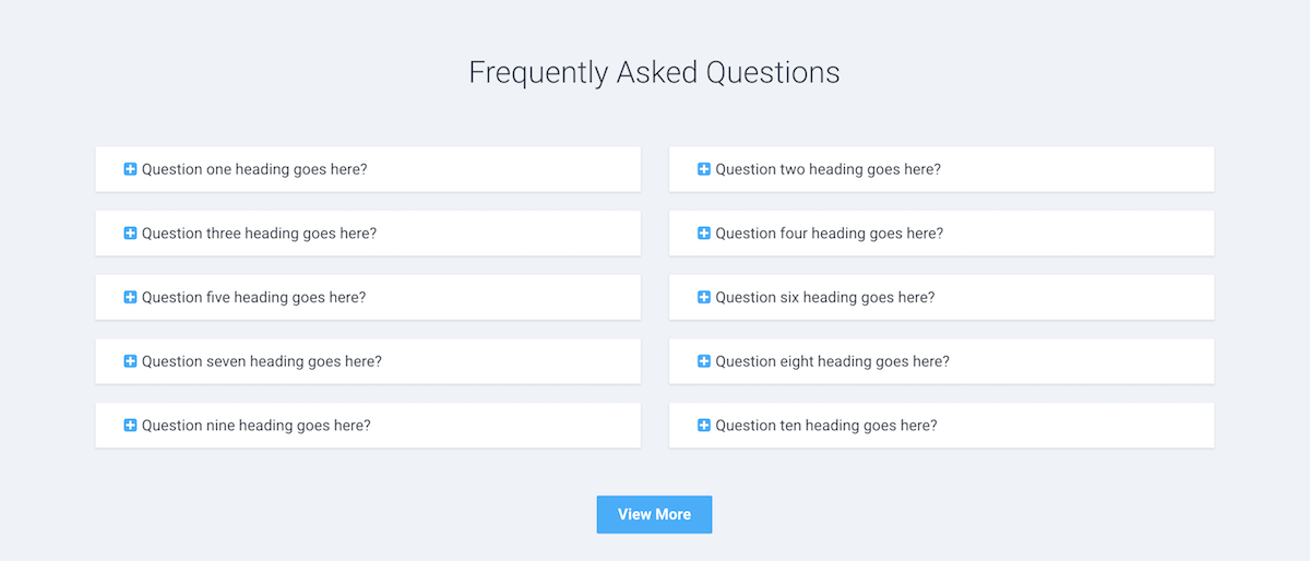
We’ve used the plugin to add “About Us”, “Contact Us”, “FAQ”, “Privacy Policy” and “Terms and Conditions” to our Moodle theme demo for Maker. In this tutorial we will show you how to add the pages as shown in our demo and you can download the relevant HTML page templates at the end of the tutorial.
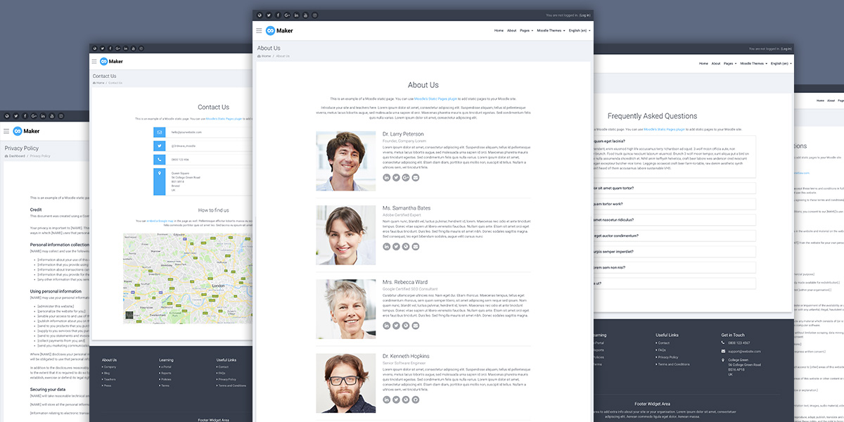
moodle-static-page-promo

Live Demo

Want to add a contact form page as well? Learn more.

Step 1 – Install the plugin

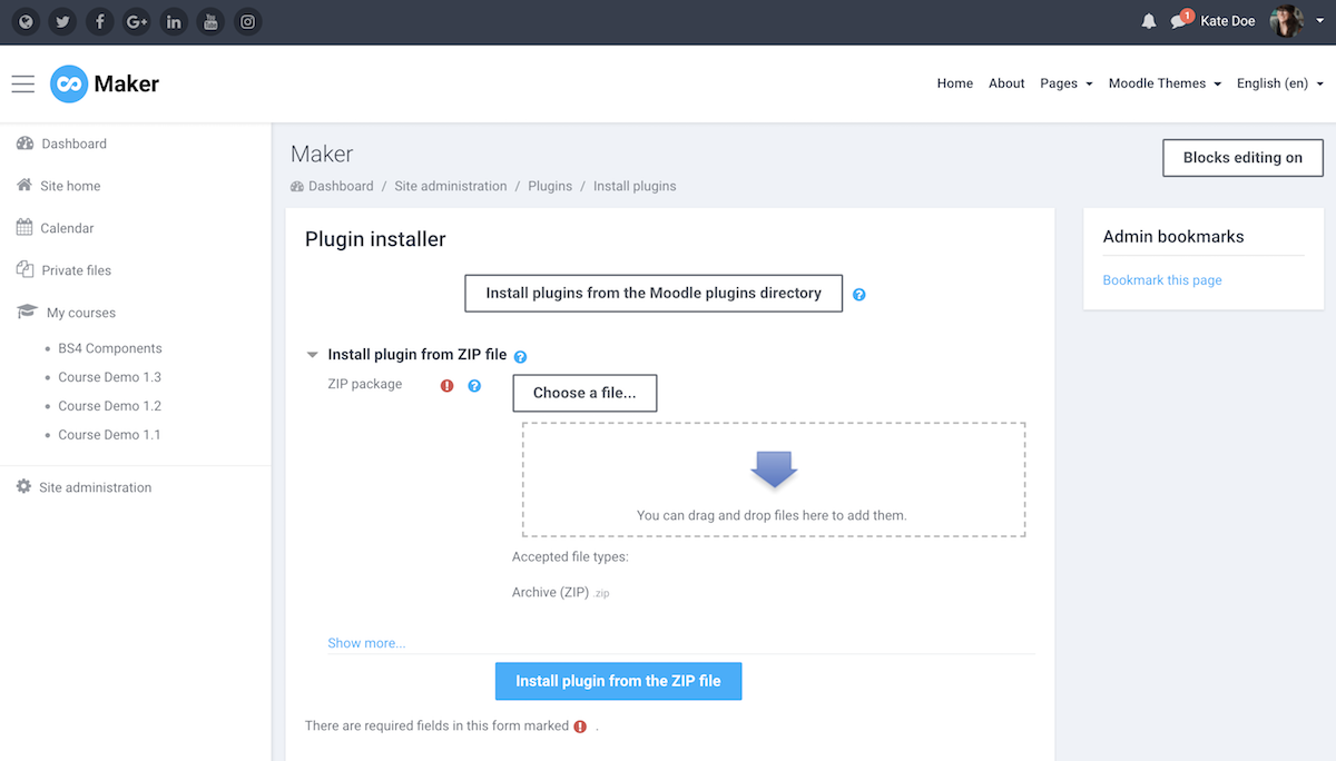
Download the Static Page plugin and upload the downloaded zip file to your Moodle site via the Install plugins page: Site Administration > Plugins > Install plugins. You need to be a site admin to install and use the plugin.

moodle-install-plugin

Step 2 – Configure the plugin

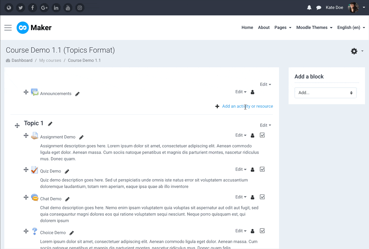
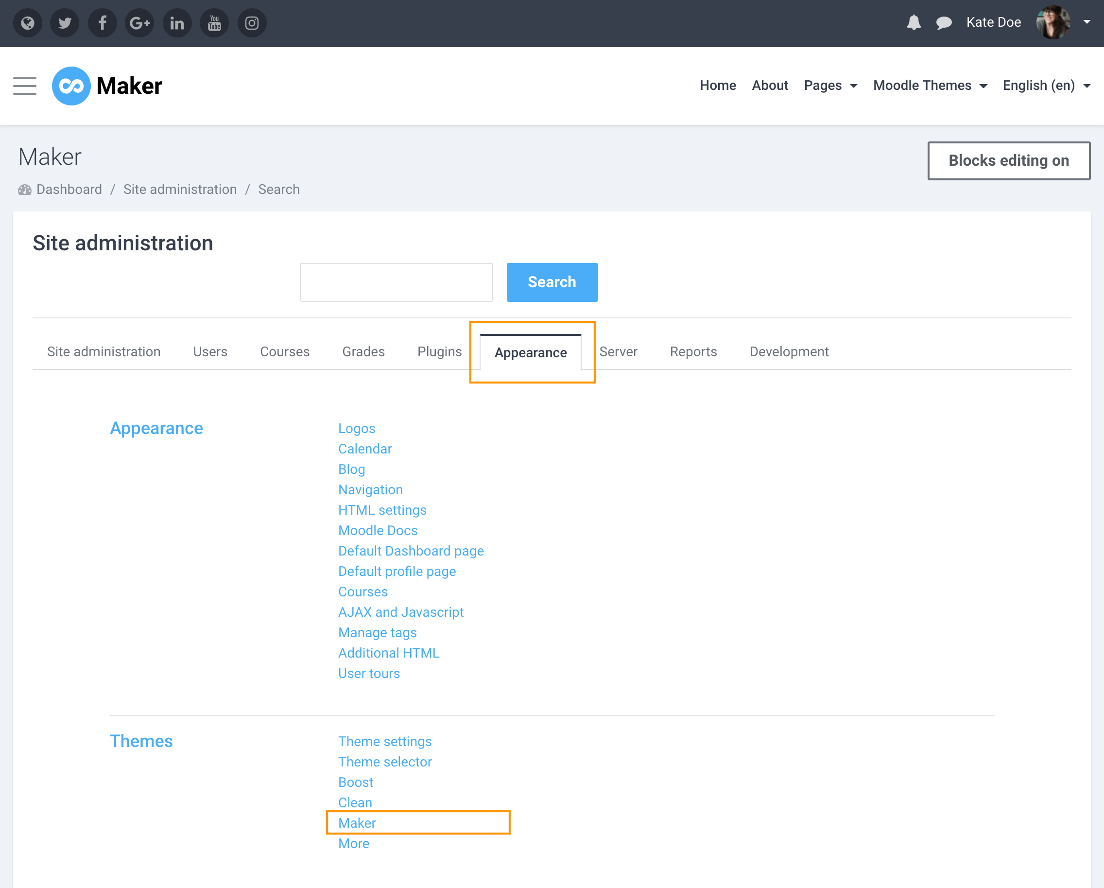
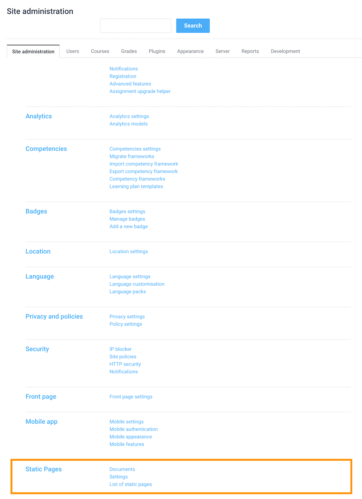
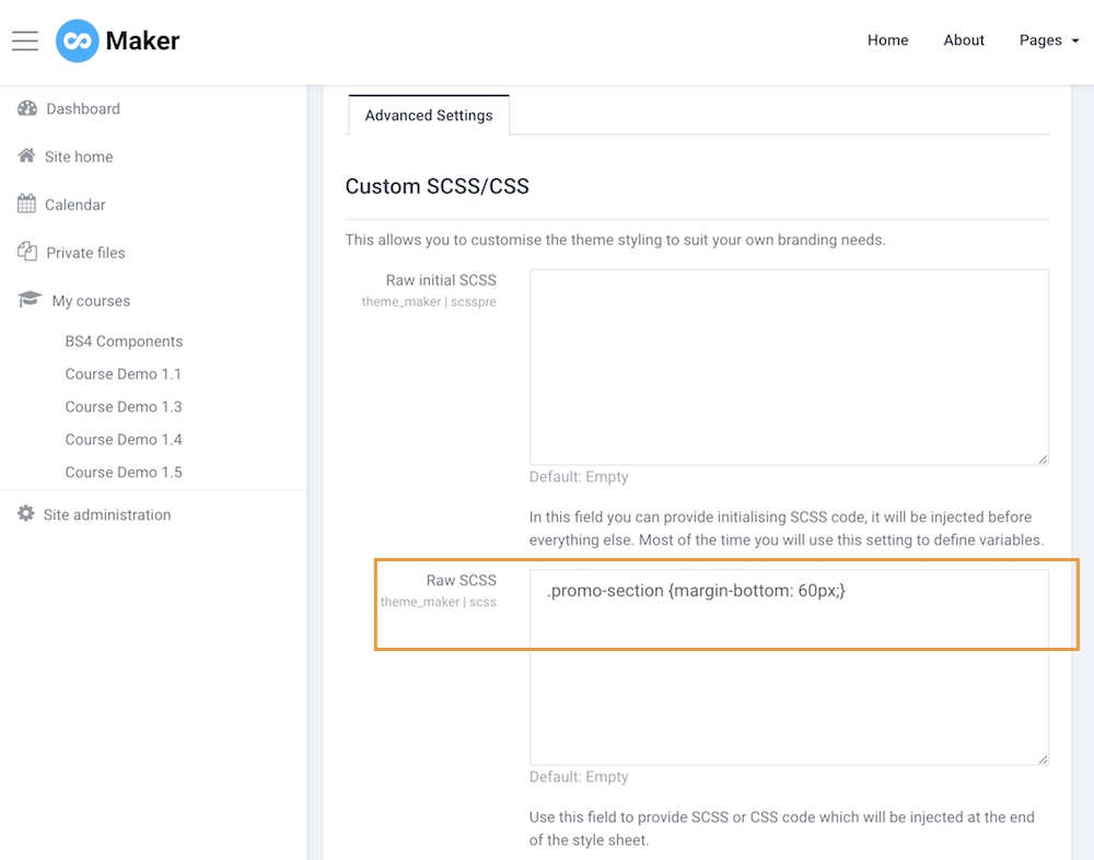
After installing the plugin, you can see the “Static Pages” option under the “Site Administration” section as shown in the figure below.

moodle-staticpages-option

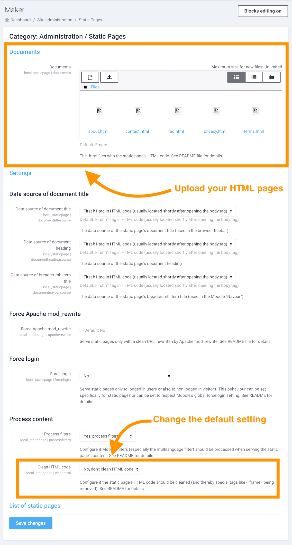
Click the “Static Pages” link and you will be able to upload your HTML files and configure the relevant settings. You can find detailed explanations of each setting from the plugin’s online documentation here.

For setting up our demo, we changed the “Clean HTML code” option from default “Yes, clean HTML code” to “No, don’t clean HTML code”. Make sure you do the same if you’d like to use our HTML templates and embed iframe content such as Youtube/Vimeo video and Google maps in your pages.

moodle-static-pages-plugin-page

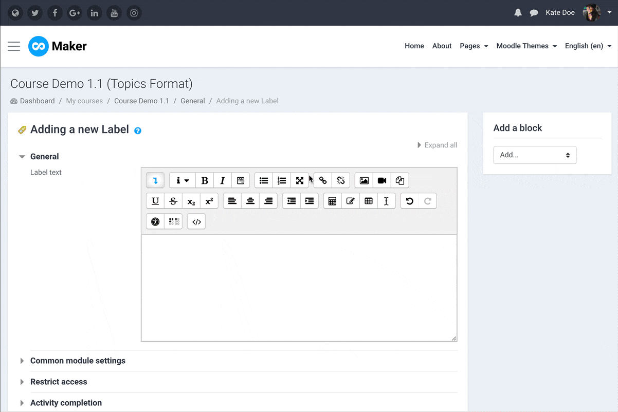
Step 3 – Add HTML Pages

Upload your HTML pages to the documents input field and save the changes. To make your HTML pages you can reference the plugin documentation here.

Basic code structure:

<html>
<head>
        <meta http-equiv="Content-Type" content="text/html; charset=utf-8" />
        <title>Imprint</title>
</head>
<body>
        <h1>Imprint</h1>
        [Your content goes here]
</body>
</html>

You can download the HTML pages we used in our demo below and edit the page content to suit your own needs.

Free Download (11228 downloads)

If you are using our Moodle theme Maker, there is no need to style the pages as all of the styling for the pages is included in the Maker theme.

If you are using a different Moodle theme you will need to add custom styling to the pages. You can either add your CSS to your theme’s Custom CSS option (if it has one) or include a <style> tag into the <head>> section of your HTML document as shown below:

<html>
<head>
        <meta http-equiv="Content-Type" content="text/html; charset=utf-8" />
        <title>Imprint</title>
        <style>
        [Your custom css code goes here]
        </style>
</head>
<body>
        <h1>Imprint</h1>
        [Your content goes here]
</body>
</html>

Step 4 – Link the Pages

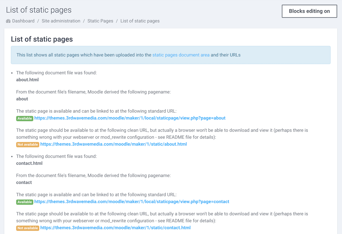
After adding your pages, you can get the page URLs from the “List of static pages” page.

moodle-staticpage-page-list

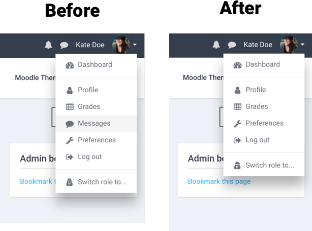
In our demo, we used Moodle’s custom menu to link the pages (Learn how). If you’re using our Maker theme you can also add the page links in the header dropdown menu for easy access on mobile devices.

We hope you find this tutorial and the HTML page templates useful. If you think there are any other types of static pages that could be useful for a Moodle site please leave a comment below.


Want to add a contact form page as well? Learn more.

Moodle Theme Maker – How to add course thumbnail/header image and excerpt

In our latest Moodle theme Maker, it’s possible to display your course thumbnail image and course excerpt on the frontpage course list as shown in the figure below. You can also check out our theme demo here for an example. In this tutorial we will show you how to achieve this.

moodle-theme-maker-course-list

Update: Now you have the option to display the course thumbnail image as the course header image as well.

moodle-theme-maker-course-header-image

moodle-theme-maker-course-header-image-settings

Step 1

Log into your Moodle site as a teacher and open your desired course. Go to the course settings page by clicking the “Editing settings” link in the dropdown menu as shown in the figure below:

moodle-theme-maker-edit-course-settings

Step 2 – Add Course Excerpt

On the settings page, enter your course description in the “Course Summary” input field. The content you enter there will be used as the course excerpt on the frontpage.

If the content you entered is more than 200 characters, Maker theme will automatically truncate the rest of the content and replace it with “….”

Step 3 – Add Course Thumbnail

Upload your course image to the “Course summary files” input field. For the best result in theme Maker, please make sure your thumbnail image size is: 880px x 560px.

Save your changes and go back to your site’s frontpage. You should see the course excerpt and thumbnail displayed for that course.

How to add social logins to your Moodle site

Want to make the signup/login process of your Moodle site simple, easy and fast for your users? In this tutorial, we will walk you through how to add social login options (eg. Facebook/Google/Linkedin/Microsoft) to your Moodle’s login page.

We’ve set up a live demo using our Moodle theme Maker for this tutorial:

moodle-theme-maker-login-page

Step 1

You need to enable social login (OAuth 2) as one of your site’s authentication methods. Log into your Moodle site as an admin and navigate to the “Manage authentication” page: Site administration > Plugins > Authentication > Manage authentication

Find the “OAuth 2” option on the page and enable it by clicking the closed-eye icon.

moodle-admin-enable-oauth2-with-nav

Step 2

Navigate to the “OAuth 2 services” page to add your desired social logins: Site administration > Server > OAuth 2 services

moodle-oauth2-services

1. Add Facebook Login

You can follow our latest guide here (updated for Moodle 4.0+)

2. Add Linkedin Login

You can follow our latest guide here (updated for Moodle 4.0+).

3. Add Google Login

Click the “Create new Google service” button and enter your Client ID and Client secret on the settings page as shown in the figure below and save the changes.

moodle-oauth-google-settings

You can follow the instructions here to obtain your Google Client ID and secret.

4. Add Microsoft Login

Click the “Create new Microsoft service” button and enter your Client ID and Client secret on the settings page as shown in the figure below and save the changes.

moodle-oauth-microsoft-settings

You can follow the instructions here to obtain your Microsoft Client ID and secret.

That’s it. Now your site users should be able to log into your site using their existing social media accounts without going through the long signup form.

Maker – a Boost based Moodle Theme (Main Features)

We are excited to announce the release of a new Moodle theme “Maker“. Maker is built based on Moodle’s latest core theme “Boost” which means it utilises all of the latest features available to Moodle and provides the best overall user experience for your Moodle site. It’s packed with awesome configurable features to work with your branding and will make your Moodle site truly outstanding.

Live Demo Theme Details

Below are some of the main features Maker offers:

1. Branding

You can upload your own logo image, select your branding colours and Google fonts. For advanced users, you can also add your custom CSS/SCSS to override the default theme styling.

moodle-theme-maker-branding-settings

moodle-theme-maker-custom-css-settings

2. Frontpage

There are 8 configurable theme sections you can use to design your Moodle’s frontpage. All of the sections can be turned on or off based on your needs.

Slideshow Section

In this section, you can add up to 10 slide images and a course search box. You can also add your site headline, summary, call-to-action button and a video link. If you want to make the slideshow section occupy less or more screen space you can adjust the height accordingly.

moodle-theme-maker-slideshow

moodle-theme-maker-slideshow

Benefits Section

In this section, you can add up to 6 blocks. This section is designed for you to list benefits/features you offer to your users to convince them why they should take your courses. There are 900+ Google material icons available for you to use.

moodle-theme-maker-benefits

moodle-theme-maker-benefits-settings

Featured Section

This section is designed for you to promote your top courses/pages. You can add up to 12 blocks and customise the thumbnail image, title, content and link for each block. If you’d like to draw visitors’ attention to a particular course/page item you can add a label on top of the thumbnail image.

moodle-theme-maker-featured-blocks

moodle-theme-maker-featured-blocks-settings

Promo Carousel Section

You can add up to 6 items in this section. It’s designed as a content marketing tool. If you have some promotional Youtube/Vimeo videos, this is the perfect place to add them.

moodle-theme-maker-promo-carousel

moodle-theme-maker-promo-carousel-settings

Logos Section

You can use this section to display your users/awards/press mentions/partnerships etc. You can add up to 6 logo images. If you don’t want to use this section, you can simply turn it off.

moodle-theme-maker-logos-section

moodle-theme-maker-logos-section-settings

Categories Section

You can enable this section to list up to 20 course categories. This section is a new feature in Maker theme for Moodle 3.8+. Learn more

moodle-theme-maker-categories-section-without-desc-text

moodle-maker-theme-categories-with-desc-text

Teachers Section

You can add up to 20 teachers or course instructors in this section. Although this section is designed for displaying teachers but you can also use it for other content.

Please note: this feature is only available in Maker theme for Moodle 3.6+.

moodle-theme-maker-teachers-section-preview

moodle-maker-theme-teachers-section-admin-settings

Testimonial Section

You can use this section to add up to 6 testimonials. It’s a great way to add social proof to your site.

img-responsive moodle-theme-maker-testimonials

moodle-theme-maker-testimonials-settings

FAQ Section

You can use this section to address frequently asked questions about your courses, business or organisation. It’s a great way to earn users’ trust by providing extra info about your learning platform or business model. You can add up to 10 Q&A in this section. If you have more Q&A you can add them in a Moodle Static Page and provide a link from the frontpage FAQ section as shown on our demo.

moodle-theme-maker-frontpage-faq-section

moodle-theme-maker-faq-settings

Call-To-Action Section

This section is just above the site footer. You can use this section to further promote your site and persuade users to take actions.

moodle-theme-maker-cta-section

moodle-theme-maker-cta-settings

You can also add a data box widget in Maker theme for Moodle 3.8+. Learn more

moodle-theme-maker-frontpage-data-box-view

Course List

From Maker v2.1 (for Moodle 3.5) you can configure the frontpage course list layout. Learn more

moodle-theme-maker-course-list-layout-styles-banner

3. Site Alert

You have an option to add a site alert to the frontpage. It’s located just above the slideshow section. This can be very useful when you need to announce something new to your visitors for a short period of time. You can change the alert background colour to suit your brand colour.

moodle-theme-maker-alert

moodle-theme-maker-alert-settings

4. Header Dropdown Menu (Moodle 3.8+)

You can add a mobile-friendly dropdown menu to the header top bar area. This feature is new in Maker theme for Moodle 3.8+. Learn more.

moodle-maker-theme-header-dropdown-menu-gif

5. Login Page

You have the option to add a background image to the login page.

moodle-theme-maker-login-page

moodle-theme-maker-login-page-settings

6. Social Media Links

You can choose to display your social media links on the site header and footer area. Maker has all of the major social media options built-in.

Available options:
Website, Twitter, Facebook, Google+, Linkedin, YouTube, Vimeo, Instagram, Pinterest, Flickr, Tumblr, SlideShare, Skype, Weibo, RSS Feed.

Want to display something not in the list above? You can add your custom links too:

moodle-theme-maker-socialmedia-settings

7. Footer Area

In the footer area, you have the option to add 4 content blocks (read the tutorial), 1 footer widget area and your site copyright info.

moodle-theme-maker-footer

moodle-theme-maker-footer-settings-1

moodle-theme-maker-footer-settings-2

8. Course Page

You have the option to display a course header image on the course page. Learn more

moodle-theme-maker-course-header-image

moodle-theme-maker-course-header-image-settings

9. Course Design

You can easily add Bootstrap 4 UI components to enhance your Moodle course design. Read the tutorial

10. Google Analytics

You can monitor your site traffic by adding your Google Analytics ID.

Moodle Theme Maker – Useful HTML code for the footer content blocks

We have released a Boost based Moodle theme “Maker”. In this tutorial we will share the HTML code we used in our demo’s footer content blocks. If you are using Maker, you can easily take the code and edit the text and links for your site.

What the footer content blocks will look like:

moodle-theme-maker-footer-blocks

How to add the code:

Step 1

Log into your Moodle site as an administrator and navigate to the theme settings page: Site administration > Appearances > Themes > Maker > Footer

moodle-theme-maker-theme-settings

Step 2

Activate the HTML code editor in the Moodle text editor as shown in the screenshot below:

moodle-theme-maker-html-code-editor

HTML Code

Footer content block 1

<h4 class="footer-block-title">About Us</h4>
<ul class="footer-links list-unstyled">
	<li class="link-item"><i class="fa fa-caret-right"></i><a href="#">Company</a></li>
	<li class="link-item"><i class="fa fa-caret-right"></i><a href="#">Blog</a></li>
	<li class="link-item"><i class="fa fa-caret-right"></i><a href="#">Teachers</a></li>
	<li class="link-item"><i class="fa fa-caret-right"></i><a href="#">Press</a></li>
</ul>

Footer content block 2

<h4 class="footer-block-title">Learning</h4>
<ul class="footer-links list-unstyled">
	<li class="link-item"><i class="fa fa-caret-right"></i><a href="#">e-Portal</a></li>
	<li class="link-item"><i class="fa fa-caret-right"></i><a href="#">Reports</a></li>
	<li class="link-item"><i class="fa fa-caret-right"></i><a href="#">Policies</a></li>
	<li class="link-item"><i class="fa fa-caret-right"></i><a href="#">Terms</a></li>
</ul>

Footer content block 3

<h4 class="footer-block-title">Useful Links</h4>
<ul class="footer-links list-unstyled">
	<li class="link-item"><i class="fa fa-caret-right"></i><a href="#">Contact</a></li>
	<li class="link-item"><i class="fa fa-caret-right"></i><a href="#">FAQs</a></li>
	<li class="link-item"><i class="fa fa-caret-right"></i><a href="#">Privacy Policy</a></li>
	<li class="link-item"><i class="fa fa-caret-right"></i><a href="#">Terms and Conditions</a></li>
</ul>

Footer content block 4

<h4 class="footer-block-title">Get in Touch</h4>
<div class="footer-contact-info">                  
    <p class="tel has-icon"><i class="fa fa-phone icon"></i>0800 123 4567</p>
    <p class="email has-icon"><i class="fa fa-envelope icon"></i><a href="mailto:support@website.com">support@website.com</a></p>
    <p class="adr has-icon">
        <i class="fa fa-map-marker icon"></i>        
        <span class="adr-group">       
            <span>College Green</span><br>
            <span>56 College Green Road</span><br>
            <span>BS16 AP18</span><br>
            <span>UK</span>
        </span>
    </p>  
</div>

Custom CSS for Changing Moodle Theme Labland’s Colour Scheme

This product is deprecated and no longer available.
Looking for a Boost-based Moodle theme? Checkout our new products.

Responsive Moodle theme Labland is designed for corporations/businesses. It comes with 4 default colour schemes. If the default colour scheme doesn’t fit your branding needs, you can write your custom CSS to override the default colour. In this tutorial we are showing you an example CSS code snippet to change the default colour scheme. You can easily use the example as a template to do your own colour customisations.

Where to enter the custom CSS?

Under the Labland theme settings there is an input field called “Custom CSS” where you can enter the CSS. By doing so you won’t lose any CSS customisations if the theme is updated as the data is stored in your database.

Example custom CSS

In the example we use three colours: 1) primary colour #9A58BA 2) secondary colour #FF6780 3) accent colour #59AFFE

/* Links */
a,
a:hover,
a:active, 
a:focus {
  color: #9A58BA;
}
/* Buttons */
a.btn-primary,
.btn-primary {
  background: #9A58BA;
  border: 2px solid #9A58BA;
}
a.btn-primary:hover,
.btn-primary:hover,
a.btn-primary:active,
.btn-primary:active,
a.btn-primary:focus,
.btn-primary:focus {
  background: #834CA4; /* slightly darker than #9A58BA */
  border: 2px solid #9A58BA;
}

.btn-secondary, a.btn-secondary {
  background: #59AFFE;
  border: 2px solid #59AFFE;
}
.btn-secondary:active, .btn-secondary:focus, .btn-secondary:hover, a.btn-secondary:active, a.btn-secondary:focus, a.btn-secondary:hover {
  background: #478FD6; /* slightly darker than #59AFFE */
  border: 2px solid #59AFFE;
}

.btn-cta, a.btn-cta {
  background: #9A58BA;
  border: 2px solid #9A58BA;
}


.btn-cta:active, .btn-cta:focus, .btn-cta:hover, a.btn-cta:active, a.btn-cta:focus, a.btn-cta:hover {
  background: #834CA4; /* slightly darker than #9A58BA */
  border: 2px solid #9A58BA;
}

button,
input.form-submit,
input[type="button"],
input[type="submit"],
input[type="reset"],
input#id_submitbutton,
input#id_submitbutton2,
.path-admin .buttons input[type="submit"],
td.submit input {
  background: #9A58BA;
  border: 2px solid #9A58BA;
}
button:hover,
input.form-submit:hover,
input[type="button"]:hover,
input[type="submit"]:hover,
input[type="reset"]:hover,
input#id_submitbutton:hover,
input#id_submitbutton2:hover,
.path-admin .buttons input[type="submit"]:hover,
td.submit input:hover,
button:active,
input.form-submit:active,
input[type="button"]:active,
input[type="submit"]:active,
input[type="reset"]:active,
input#id_submitbutton:active,
input#id_submitbutton2:active,
.path-admin .buttons input[type="submit"]:active,
td.submit input:active,
button:focus,
input.form-submit:focus,
input[type="button"]:focus,
input[type="submit"]:focus,
input[type="reset"]:focus,
input#id_submitbutton:focus,
input#id_submitbutton2:focus,
.path-admin .buttons input[type="submit"]:focus,
td.submit input:focus {
  background: #834CA4; /* slightly darker than #9A58BA */
  border: 2px solid #9A58BA;
}
/* Tabs */
.nav-tabs > li.active a,
.nav-tabs > li.active a:hover,
.nav-tabs > li.active a:active,
.nav-tabs > li.active a:focus {
  border-top: 2px solid #9A58BA;
}

/* Tables */
#page #region-main .table>thead>tr>th {
    border-bottom-color: #9A58BA;
}

#page #region-main .table.table-boxed>thead>tr>th {
    background: #9A58BA;
}

/* Forms */
textarea:focus,
input[type="text"]:focus,
input[type="password"]:focus,
input[type="datetime"]:focus,
input[type="datetime-local"]:focus,
input[type="date"]:focus,
input[type="month"]:focus,
input[type="time"]:focus,
input[type="week"]:focus,
input[type="number"]:focus,
input[type="email"]:focus,
input[type="url"]:focus,
input[type="search"]:focus,
input[type="tel"]:focus,
input[type="color"]:focus,
.uneditable-input:focus {
  border-color: #9A58BA;
}

/* Topbar */
.branding {
  background: #9A58BA;
}

/* Notifications dropdown */
.site-header .top-bar .popover-region .popover-region-header-text {
  color: #9A58BA;
}
/* Messages dropdown */
.site-header .top-bar .popover-region a {
  color: #9A58BA;
}

/* Hero slideshow overlays */
.hero-overlay .overlay-upper {
  background: rgba(89, 175, 254, 0.8);
  /* #59AFFE = rgba(89, 175, 254, 1) */
  /* You can use online tool here http://www.hexcolortool.com/ to convert hext colour to rgba colour */
}
.hero-overlay .overlay-lower {
  background: rgba(255, 103, 128, 0.9);
  /* #FF6780 = rgba(255, 103, 128, 1) */
}
/* Hero slideshow promo badge */
.hero-badge {
  background: #FF6780;
}
/* Hero slideshow active slide indicator */
.hero-slider-wrapper .flexslider .flex-control-nav li a.flex-active {
  background: #FF6780;
}
/* News section */
.news-section .item-icon {
  background: #59AFFE;
}
/* review section */
.reviews-section {
  background: #FF6780;
}
/* CTA section */
.cta-section {
  background: #9A58BA;
}
/* Home course category section */
.course_category_tree .category > .info > .categoryname {
  background-color: #9A58BA;
}
/* Course blocks */
#page .block-region .block .header {
  background: #9A58BA;
}
#page .block-region .block .header {
  background: #9A58BA;
}

/* Bootstrap components */
.panel-group .panel .panel-heading .panel-title a {
  color: #9A58BA;
}
.panel-group .panel .panel-heading .panel-title a:hover,
.panel-group .panel .panel-heading .panel-title a:focus {
  color: #9A58BA;
}
.custom-quote {
  border-color: #9A58BA;
}
.custom-quote .fa {
  color: #9A58BA;
}
.custom-quote .people .name {
  color: #9A58BA;
}
.box.box-border {
  border-color: #9A58BA;
}
.box.box-theme {
  background: #9A58BA;
}
.label.label-theme {
  background: #9A58BA;
}
.panel-theme > .panel-heading,
.panel-theme > .panel-footer {
  border-color: #9A58BA;
  background: #9A58BA;
}
.panel-theme {
  border-color: #9A58BA;
}
.color-theme {
  color: #9A58BA;
}

Below is a screenshot of what Labland theme looks like after applying the example code:

Custom CSS for Changing Moodle Theme Impression’s Colour Scheme

This product is deprecated and no longer available.
Looking for a Boost-based Moodle theme? Checkout our new products.

Our best-selling Moodle theme Impression comes with 6 hand-picked colour schemes. It’s really easy to switch between the 6 colour schemes via the theme settings page. For customers who want to have a unique colour scheme to match their existing websites, we’ve complied useful custom CSS code to help you change the theme colour scheme to meet your specific needs.

First of all, you need to pick two colours. The first colour should be your site’s primary colour and the second colour is a darker shade of the primary colour.

For demo purpose, we are using an indigo colour (#6964C1) as the primary colour and a darker shade of primary colour (#5C58AF) as the secondary colour. You can easily substitute the colours in the code with your own primary and secondary colours.

Custom CSS Code

/* Change Impression Colour Scheme */
/* Primary Colour: #6964C1 */
/* Secondary Colour: #5C58AF */
 
/* Links and buttons */
a {
    color: #6964C1;
}
a:hover, a:active, a:focus {
    color: #5C58AF;
}
 
.btn-cta, a.btn-cta {
    background: #6964C1;
}
 
.btn-cta:hover, a.btn-cta:hover, .btn-cta:active, a.btn-cta:active, .btn-cta:focus, a.btn-cta:focus {
    background: #5C58AF;
}
 
.btn-primary, a.btn-primary {
    background: #6964C1;
}
 
.btn-primary:active, .btn-primary:focus, .btn-primary:hover, a.btn-primary:active, a.btn-primary:focus, a.btn-primary:hover {
    background: #5C58AF !important;
}
 
.btn-reversed, a.btn-reversed {
    color: #6964C1 !important;
}
 
.path-admin .buttons input[type=submit], button, input#id_submitbutton, input#id_submitbutton2, input.form-submit, input[type=submit], input[type=button], input[type=reset], td.submit input {
    background: #6964C1;
}
 
.path-admin .buttons input[type=submit]:active, .path-admin .buttons input[type=submit]:focus, .path-admin .buttons input[type=submit]:hover, button:active, button:focus, button:hover, input#id_submitbutton2:active, input#id_submitbutton2:focus, input#id_submitbutton2:hover, input#id_submitbutton:active, input#id_submitbutton:focus, input#id_submitbutton:hover, input.form-submit:active, input.form-submit:focus, input.form-submit:hover, input[type=submit]:active, input[type=submit]:focus, input[type=submit]:hover, input[type=button]:active, input[type=button]:focus, input[type=button]:hover, input[type=reset]:active, input[type=reset]:focus, input[type=reset]:hover, td.submit input:active, td.submit input:focus, td.submit input:hover {
    background: #5C58AF;
}
 
/* Topbar */
.site-header .top-bar {
    background: #6964C1;
}

/* Notifications dropdown */
.site-header .top-bar .popover-region .popover-region-header-text{
  color: #6964C1;
}
/* Messages dropdown */
.site-header .top-bar .popover-region a {
  color: #6964C1;
}

/* Forms */
textarea:focus,
input[type="text"]:focus,
input[type="password"]:focus,
input[type="datetime"]:focus,
input[type="datetime-local"]:focus,
input[type="date"]:focus,
input[type="month"]:focus,
input[type="time"]:focus,
input[type="week"]:focus,
input[type="number"]:focus,
input[type="email"]:focus,
input[type="url"]:focus,
input[type="search"]:focus,
input[type="tel"]:focus,
input[type="color"]:focus,
.uneditable-input:focus {
  border-color: #6964C1;
}
 
/* Main Menu */
.site-header .main-nav .nav li a:hover {
    color: #6964C1;
}
.site-header .main-nav .nav .dropdown-menu {
    border-top-color: #6964C1;
}
.site-header .main-nav .nav .dropdown-menu:before {
    border-bottom-color: #6964C1;
}
 
.site-header .main-nav .nav .dropdown-menu a:hover {
    color: #6964C1;
}
 
/* Frontpage carousel */
 
.promo-section .carousel-indicators li.active {
    background-color: #6964C1;
}
 
/* Frontpage why section */
.why-section .figure-holder {
    color: #6964C1;
}
 
.why-section .item-title {
    color: #6964C1;
}
 
/* Frontpage testimonials section */
.reviews-section .review-title {
    color: #6964C1;
}
 
/* Frontpage CTA section */
.cta-section-inner {
    background: #6964C1;
}
 
/* Frontpage courses */
#page #region-main #frontpage-course-list h2, #page #region-main #site-news-forum h2 {
    background: #6964C1;
}
 
.course_category_tree .category>.info>.categoryname {
    background-color: #6964C1;
}
 
/* Footer */
.site-footer .footer-content {
    background: #6964C1;
}
 
/* Back to top control */
#topcontrol {
    background: #6964C1;
}
 
#topcontrol:hover {
    background: #5C58AF;
}
 
/* Moodle courses */
#page #region-main .loginbox {
    border-top-color:  #6964C1;
}
 
#page #region-main .region-main-inner {
    border-top-color:  #6964C1;
}
 
#page .block-region .block .header {
    background: #6964C1;
}
 
#page #region-main h3.sectionname {
    color: #6964C1;
}
 
.uneditable-input:focus, input[type=datetime]:focus, input[type=datetime-local]:focus, input[type=date]:focus, input[type=month]:focus, input[type=time]:focus, input[type=week]:focus, input[type=number]:focus, input[type=url]:focus, input[type=search]:focus, input[type=tel]:focus, input[type=color]:focus, input[type=text]:focus, input[type=email]:focus, input[type=password]:focus, textarea:focus {
    border-color: #6964C1;
}
 
/* Bootstrap Components */
.color-theme {
    color: #6964C1;
}
 
#page #region-main .table.table-boxed>thead>tr>th {
    background: #6964C1;
}
 
.nav-tabs>li.active a, .nav-tabs>li.active a:active, .nav-tabs>li.active a:focus, .nav-tabs>li.active a:hover {
    border-top-color: #6964C1;
}
 
.custom-quote {
    border-color: #6964C1;
}
 
.custom-quote .fa {
    color: #6964C1;
}
 
.custom-quote .people .name {
    color: #6964C1;
}
 
.box.box-border {
    border-color: #6964C1;
}
 
.box.box-theme {
    background: #6964C1;
}
 
.panel-group .panel .panel-heading .panel-title a {
    color: #6964C1;
}
.panel-group .panel .panel-heading .panel-title a:hover {
    color: #5C58AF;
}
 
#page #region-main .table>thead>tr>th {
    border-bottom-color: #6964C1;
}
 
.label.label-theme {
    background: #6964C1;
}
 
.list-group-item.active, .list-group-item.active:focus, .list-group-item.active:hover, a.thumbnail.active, a.thumbnail:focus, a.thumbnail:hover {
    border-color: #6964C1;
    background: #6964C1;
}
 
.panel-theme {
    border-color: #6964C1;
}
 
.panel-theme>.panel-footer, .panel-theme>.panel-heading {
    border-color: #6964C1;
    background: #6964C1;
}
 
.list-group-item.active, .list-group-item.active:focus, .list-group-item.active:hover, a.thumbnail.active, a.thumbnail:focus, a.thumbnail:hover {
    border-color: #6964C1;
    background: #6964C1;
}


Once you’ve substituted the colours with your own, you can copy and paste the code into the “Custom CSS” input field under the theme settings page as shown below.

moodle-theme-impression-custom-css

Save the changes and your Impression theme should have a new colour scheme now:

moodle-theme-impression-change-colour-scheme