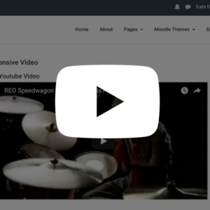
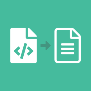
How to setup a user tour in Moodle

User Tours is a new feature in Moodle 3.2. It’s typically used to onboard and engage new users by guiding them through essential parts of the site. In this tutorial we will show you how to setup a basic tour.

Step 1

Log into your Moodle site as an admin user, and navigate to the “User tours” option under the Administration block: Site administration > Appearance > Themes > User tours

Step 2

On the Tours page click the “Create a new tour” link.

You will be prompted to enter some basic settings about the tour you are creating. You can get help about each setting by clicking the question mark icon next to it.

For this tutorial, the tour we are creating is going to be displayed on the “My dashboard” page for all users.

Step 3

Now you’ve created the tour, you should see it listed in the Tours table. However, at this point the tour is empty so you still need to add some steps to it.

Click the Tour name or the magnifying glass icon and you will arrive on the tour’s settings page where you can add steps.

For the demo, we are going to add 3 steps as shown in the figures below. You can compare the step settings with the final results.

Tour Step 1 – A welcome modal displayed in the middle of the “My Dashboard” page

Tour Step 1 Settings

Tour Step 1 Modal

Tour Step 2 – A modal displayed right under the CSS selector “.usermenu”

Tour Step 2 Settings

Tour Step 2 Modal

Tour Step 3 – A modal displayed under the “Navigation” block

Tour Step 3 Settings

Tour Step 3 Modal

Hopefully this tutorial gives you some idea of how the tours feature works. By default the tour will be shown to your user only once and you need to manually force the tour to be shown again by clicking the “force the tour to be displayed” link as shown in the figure below:

Labland – A responsive Moodle theme designed for businesses and government organisations

This product is deprecated and no longer available.
Looking for a Boost-based Moodle theme? Checkout our new products.

Are you looking for a professionally designed Moodle theme? We just released a brand new Moodle theme “Labland” which is designed for businesses and government organisations. Like our other premium themes, Labland is built based on the popular Bootstrap 3.x framework so you can take advantage of all the useful components/widgets provided by Bootstrap.


Live Demo


Below are some main features of the theme:

Logo and tagline

You can upload your own logo and provide a tagline as shown in our demo.

Theme frontend: Theme settings:

Frontpage Fullscreen hero slideshow

You can add up to 4 hero images with relevant content text and links. Hero images are a great way to capture your visitor’s attention and provide a great first impression.

On top of the hero images you also have the option to overlay useful links and information:

Promo badge:

This is an eye catcher. You can use it for announcing news or course sales Theme frontend: Theme settings:

Upper overlay:

This overlay can accommodate your site’s contact info and social media links.

Theme frontend: Theme settings:

Lower overlay:

This overlay allows you to add up to 4 quick links with icons. You can choose from 600+ FontAwesome icons. It’s a great way to provide quick access points to other parts of your site.

Theme settings:

News and updates section

You can add up to 3 items. This is a good area to list site news or announcements. Again there are 600+ FontAwesome icons available for you to use.

Theme frontend: Theme settings:

Featured Blocks

You can add up to 6 blocks with relevant images, titles, content text and URLs. It’s a good section to promote your popular courses.

Theme frontend: Theme settings:

Testimonials section

You can add up to 5 testimonials, which is a great way to add social proof to your site. You can disable the profile images if you can’t source images.

Theme frontend: Theme settings:

Logos section

You can add up to 6 logos in this section. You can use this section to show your awards, achievements, partners or press endorsements.

Theme frontend: Theme settings:

Call-To-Action and Video Section

You can use this section to persuade users to take actions (eg. signup, take courses). It also allows you to add a YouTube/Vimeo video – simply provide the relevant video ID and you are good to go.

Theme frontend: Theme settings:

Footer Content Blocks

You can add up to 3 blocks in the footer area. If you’d like to create something similar to our demo site you can check out the tutorial here.

Theme frontend: Theme settings:

Custom CSS

Want to customise the look and feel of the theme to suit your branding? For advanced users you can always use the “Custom CSS” input field to override the default theme styling.

Tip: Please do NOT change the css files in the theme folder directly as you will lose all of the changes when a new version of the theme is out. The best way to do any customisations is to use the “Custom CSS” field. That way you won’t lose your customisations after upgrading the theme in the future as all the data is stored in your database.

We have only listed some major features of the theme in this post. For a comprehensive list please check out to the theme details page.

Moodle theme Labland – Useful HTML code for the footer content blocks

This product is deprecated and no longer available.
Looking for a Boost-based Moodle theme? Checkout our new products.

We have released a new responsive Moodle theme “Labland” for 2017. In this tutorial we will share the HTML code used in our demo site’s footer content blocks. If you are using Labland, you can customise the text/links in the code and use it in your Moodle site.

What the footer content blocks will look like:

HTML code for footer content block 1

<h4 class="col-title">About Us</h4>
<ul class="footer-links list-unstyled">
    <li class="link-item"><a href="#">The School</a></li>
    <li class="link-item"><a href="#">Governors</a></li>
    <li class="link-item"><a href="#">Teachers</a></li>
    <li class="link-item"><a href="#">Admissions</a></li>
</ul>

HTML code for footer content block 2

<h4 class="col-title">Learning</h4>
<ul class="footer-links list-unstyled">
    <li class="link-item"><a href="#">e-Portal</a></li>
    <li class="link-item"><a href="#">Reports</a></li>
    <li class="link-item"><a href="#">Policies</a></li>
    <li class="link-item"><a href="#">Terms</a></li>
</ul>

HTML code for footer content block 3

<h4 class="col-title">Useful Links</h4>
<ul class="footer-links list-unstyled">
    <li class="link-item"><a href="#">Contact</a></li>
    <li class="link-item"><a href="#">FAQs</a></li>
    <li class="link-item"><a href="#">Privacy Policy</a></li>
    <li class="link-item"><a href="#">Terms and Conditions</a></li>
</ul>

How to make Moodle custom menu link open a new browser window

By default Moodle will open custom menu links in the current browser window, which works well if all of your custom menu links point to pages inside your Moodle site. However, if you’d like to point to an external link (eg. your organisation’s official website), it’s best to make the link open a new browser window/tab. That way your users are not being taken away from your Moodle site after clicking the link.

Below are the steps you can follow to make your custom menu links open in a new browser window.

Step 1

Log in to your Moodle site as an admin user, and navigate to the “Theme Settings” option under the Administration block: Administration > Site administration > Appearance > Themes > Theme settings

Step 2

Find the Custom menu items section and add "target="_blank after the desired link target URL.

The figure below shows how we make all of the external links in our Moodle demo open new windows.

moodle-custom-menu-links

You can try our Moodle demo to see the menu behaviour yourself.

moodle-custom-menu-links-demo

How to add Google Analytics to your Mahara site

Adding Google Analytics to your Mahara site is very easy – you can follow the 3 simple steps below to do so.

Step 1

Get your tracking code from your Google Analytics account.

mahara-google-analytics-tracking-code

Step 2

Go to your Mahara’s installation folder and open “config.php” with a text editor. Go to the end of the file and add

$cfg->additionalhtmlhead = " ". 

Step 3

Paste your tracking code into the “addionalhtmlhead” as shown in the figure below.

mahara-google-analytics

Looking for a professional Mahara theme?

Take a look at our responsive Mahara themes for Mahara 15.10. They all have their matching Moodle themes too.

Moodle theme Impression – Useful HTML code for the footer content blocks

This product is deprecated and no longer available.
Looking for a Boost-based Moodle theme? Checkout our new products.

We have released a new responsive Moodle theme “Impression” for 2016. In this tutorial we will share the HTML code used in our demo site’s footer content blocks. If you are using Impression, you can customise the text/links in the code and use it in your Moodle site.

What the footer content blocks will look like:

moodle-theme-impression-footer

HTML code for footer content block 1

<h3 class="title">About Us</h3>
<p>Maecenas ac vehicula velit, nec facilisis elit. Phasellus non porttitor justo, eu bibendum elit. Maecenas pharetra non ligula quis ultricies. Nulla varius vestibulum ligula quis hendrerit. Lorem ipsum dolor sit amet, consectetuer adipiscing elit aenean commodo ligula eget dolor. </p>
<p><a class="more" href="#" target="_blank">Learn more <i class="fa fa-long-arrow-right"></i></a></p>

HTML code for footer content block 2

<h3 class="title">Links</h3>
<ul class="list-unstyled">
    <li><a href="#" target="_blank"><i class="fa fa-caret-right"></i>About Impression</a></li>
    <li><a href="#" target="_blank"><i class="fa fa-caret-right"></i>Responsive Moodle Themes</a></li>
    <li><a href="#" target="_blank"><i class="fa fa-caret-right"></i>eLearning Blog</a></li>
    <li><a href="#" target="_blank"><i class="fa fa-caret-right"></i>Contact Us</a></li>
</ul>

HTML code for footer content block 3

<h3 class="title">Get in touch</h3>
<div class="row">
    
    <p class="tel col-md-12 col-sm-12"><i class="fa fa-phone"></i>0800 123 4567</p>
    <p class="email col-md-12 col-sm-12"><i class="fa fa-envelope"></i><a href="mailto:support@website.com">support@website.com</a></p>
    <p class="adr clearfix col-md-12 col-sm-12">
        <i class="fa fa-map-marker pull-left"></i>        
        <span class="adr-group pull-left">       
            <span class="street-address">College Green</span><br>
            <span class="region">56 College Green Road</span><br>
            <span class="postal-code">BS16 AP18</span><br>
            <span class="country-name">UK</span>
        </span>
    </p>  
</div>

Advanced Bootstrap Components for Moodle Theme Impression/Labland/Herald/Gourmet/Element

The products listed in this blog post are deprecated and no longer available.
Looking for a Boost-based Moodle theme? Checkout our new products.

In our latest Bootstrap-based Moodle theme “Impression”, there are more advanced components you can use to design your courses. In this tutorial we will list all of the relevant HTML code snippets used in the theme demo.

Demo: Link
Level: Intermediate
Pre-requirement: Basic HTML/CSS knowledge
Related tutorial: Useful Bootstrap Components for Moodle themes

Jumbotron

moodle-theme-bootstrap-components-media-jumbotron

<div class="jumbotron">
  <h1>Hello, world!</h1>
  <p>This is a simple hero unit, a simple jumbotron-style component for calling extra attention to featured content or information.</p>
  <p><a class="btn btn-primary btn-lg" href="#" role="button">Learn more</a></p>
</div>  

Tabs

moodle-theme-bootstrap-components-tabs

<div class="overflow-hidden">

  <!-- Nav tabs -->
  <ul class="nav nav-tabs" role="tablist" style="margin-bottom: 0;">
    <li role="presentation" class=""><a href="#tab-1" aria-controls="home" role="tab" data-toggle="tab" aria-expanded="false">Tab 1</a></li>
    <li role="presentation"><a href="#tab-2" aria-controls="profile" role="tab" data-toggle="tab">Tab 2</a></li>
    <li role="presentation"><a href="#tab-3" aria-controls="messages" role="tab" data-toggle="tab">Tab 3</a></li>
    <li role="presentation" class="active"><a href="#tab-4" aria-controls="settings" role="tab" data-toggle="tab" aria-expanded="true">Tab 4</a></li>
  </ul>

  <!-- Tab panes -->
  <div class="tab-content">
    <div role="tabpanel" class="tab-pane" id="tab-1">Tab 1 content goes here. Lorem ipsum dolor sit amet, consectetuer adipiscing elit. Aenean commodo ligula eget dolor.</div>
    <div role="tabpanel" class="tab-pane" id="tab-2">Tab 2 content goes here. Lorem ipsum dolor sit amet, consectetuer adipiscing elit. Aenean commodo ligula eget dolor.</div>
    <div role="tabpanel" class="tab-pane" id="tab-3">Tab 3 content goes here. Lorem ipsum dolor sit amet, consectetuer adipiscing elit. Aenean commodo ligula eget dolor.</div>
    <div role="tabpanel" class="tab-pane active" id="tab-4">Tab 4 content goes here. Lorem ipsum dolor sit amet, consectetuer adipiscing elit. Aenean commodo ligula eget dolor.</div>
  </div>

</div>

Thumbnails

moodle-theme-bootstrap-components-thumbnails-basic

<div class="row overflow-hidden">
  <div class="col-xs-6 col-md-3">
    <a href="#" class="thumbnail">
      <img src="http://dummyimage.com/171x180/5cb85c/fff.png&amp;text=thumbnail" alt="image" style="width:100%;">
    </a>
  </div>
  <div class="col-xs-6 col-md-3">
    <a href="#" class="thumbnail">
      <img src="http://dummyimage.com/171x180/5bc0de/fff.png&amp;text=thumbnail" alt="image" style="width:100%">
    </a>
  </div>
  <div class="col-xs-6 col-md-3">
    <a href="#" class="thumbnail">
      <img src="http://dummyimage.com/171x180/f0ad4e/fff.png&amp;text=thumbnail" alt="image" style="width:100%">
    </a>
  </div>
  <div class="col-xs-6 col-md-3">
    <a href="#" class="thumbnail">
      <img src="http://dummyimage.com/171x180/d9534f/fff.png&amp;text=thumbnail" alt="image" style="width:100%">
    </a>
  </div>
</div>

moodle-theme-bootstrap-components-thumbnails-custom

<div class="row overflow-hidden">
  <div class="col-sm-6 col-md-3">
    <div class="thumbnail">
      <img src="http://dummyimage.com/242x200/5cb85c/fff.png&amp;text=thumbnail" alt="image" style="width:100%">
      <div class="caption">
        <h3>Thumbnail label</h3>
        <p>Cras justo odio, dapibus ac facilisis in, egestas eget quam. Donec id elit non mi porta gravida at eget metus.</p>
        <p><a href="#" class="btn btn-primary" role="button">Button</a></p>
      </div>
    </div>
  </div>
  <div class="col-sm-6 col-md-3">
    <div class="thumbnail">
      <img src="http://dummyimage.com/242x200/5bc0de/fff.png&amp;text=thumbnail" alt="image" style="width:100%">
      <div class="caption">
        <h3>Thumbnail label</h3>
        <p>Cras justo odio, dapibus ac facilisis in, egestas eget quam. Donec id elit non mi porta gravida at eget metus.</p>
        <p><a href="#" class="btn btn-primary" role="button">Button</a></p>
      </div>
    </div>
  </div>
  <div class="col-sm-6 col-md-3">
    <div class="thumbnail">
      <img src="http://dummyimage.com/242x200/f0ad4e/fff.png&amp;text=thumbnail" alt="image" style="width:100%">
      <div class="caption">
        <h3>Thumbnail label</h3>
        <p>Cras justo odio, dapibus ac facilisis in, egestas eget quam. Donec id elit non mi porta gravida at eget metus.</p>
        <p><a href="#" class="btn btn-primary" role="button">Button</a></p>
      </div>
    </div>
  </div>
  <div class="col-sm-6 col-md-3">
    <div class="thumbnail">
      <img src="http://dummyimage.com/242x200/d9534f/fff.png&amp;text=thumbnail" alt="image" style="width:100%">
      <div class="caption">
        <h3>Thumbnail label</h3>
        <p>Cras justo odio, dapibus ac facilisis in, egestas eget quam. Donec id elit non mi porta gravida at eget metus.</p>
        <p><a href="#" class="btn btn-primary" role="button">Button</a></p>
      </div>
    </div>
  </div>
</div>

Media object

moodle-theme-bootstrap-components-media-items

<h3>Default Example</h3>
<div class="media">
  <div class="media-left">
    <a href="#">
      <img class="media-object" src="http://dummyimage.com/64x64/5cb85c/fff.png" alt="image">
    </a>
  </div>
  <div class="media-body">
    <h4 class="media-heading">Media heading</h4>
    <p>Cras sit amet nibh libero, in gravida nulla. Nulla vel metus scelerisque ante sollicitudin commodo. Cras purus odio, vestibulum in vulputate at, tempus viverra turpis. Fusce condimentum nunc ac nisi vulputate fringilla. Donec lacinia congue felis in faucibus.Donec sed odio dui. Nullam quis risus eget urna mollis ornare vel eu leo. Cum sociis natoque penatibus et magnis dis parturient montes, nascetur ridiculus mus.</p>
    
  </div>
</div>

<div class="media">
  <div class="media-left">
    <a href="#">
      <img class="media-object" src="http://dummyimage.com/64x64/5cb85c/fff.png" alt="image">
    </a>
  </div>
  <div class="media-body">
    <h4 class="media-heading">Media heading</h4>
    <p>Cras sit amet nibh libero, in gravida nulla. Nulla vel metus scelerisque ante sollicitudin commodo. Cras purus odio, vestibulum in vulputate at, tempus viverra turpis. Fusce condimentum nunc ac nisi vulputate fringilla. Donec lacinia congue felis in faucibus.Donec sed odio dui. Nullam quis risus eget urna mollis ornare vel eu leo. Cum sociis natoque penatibus et magnis dis parturient montes, nascetur ridiculus mus.</p>
    <div class="media">
      <div class="media-left">
        <a href="#">
          <img class="media-object" src="http://dummyimage.com/64x64/5bc0de/fff.png" alt="image">
        </a>
      </div>
      <div class="media-body">
        <h4 class="media-heading">Media heading</h4>
        <p>Cras sit amet nibh libero, in gravida nulla. Nulla vel metus scelerisque ante sollicitudin commodo. Cras purus odio, vestibulum in vulputate at, tempus viverra turpis. Fusce condimentum nunc ac nisi vulputate fringilla. Donec lacinia congue felis in faucibus.Donec sed odio dui. Nullam quis risus eget urna mollis ornare vel eu leo. Cum sociis natoque penatibus et magnis dis parturient montes, nascetur ridiculus mus.</p>
        
      </div>
    </div>
    
  </div>
</div>

moodle-theme-bootstrap-components-media-alignment

<h3>Alignment Example</h3>
<div class="media">
  <div class="media-left">
    <a href="#">
      <img class="media-object" src="http://dummyimage.com/64x64/5cb85c/fff.png" alt="image">
    </a>
  </div>
  <div class="media-body">
    <h4 class="media-heading">Top aligned media</h4>
    <p>Cras sit amet nibh libero, in gravida nulla. Nulla vel metus scelerisque ante sollicitudin commodo. Cras purus odio, vestibulum in vulputate at, tempus viverra turpis. Fusce condimentum nunc ac nisi vulputate fringilla. Donec lacinia congue felis in faucibus.</p>

    <p>Donec sed odio dui. Nullam quis risus eget urna mollis ornare vel eu leo. Cum sociis natoque penatibus et magnis dis parturient montes, nascetur ridiculus mus.</p>
  </div>
</div>

<div class="media">
  <div class="media-left media-middle">
    <a href="#">
      <img class="media-object" src="http://dummyimage.com/64x64/5bc0de/fff.png" alt="image">
    </a>
  </div>
  <div class="media-body">
    <h4 class="media-heading">Middle aligned media</h4>
    <p>Cras sit amet nibh libero, in gravida nulla. Nulla vel metus scelerisque ante sollicitudin commodo. Cras purus odio, vestibulum in vulputate at, tempus viverra turpis. Fusce condimentum nunc ac nisi vulputate fringilla. Donec lacinia congue felis in faucibus.</p>

    <p>Donec sed odio dui. Nullam quis risus eget urna mollis ornare vel eu leo. Cum sociis natoque penatibus et magnis dis parturient montes, nascetur ridiculus mus.</p>
  </div>
</div>

<div class="media">
  <div class="media-left media-bottom">
    <a href="#">
      <img class="media-object" src="http://dummyimage.com/64x64/f0ad4e/fff.png" alt="image">
    </a>
  </div>
  <div class="media-body">
    <h4 class="media-heading">Bottom aligned media</h4>
    <p>Cras sit amet nibh libero, in gravida nulla. Nulla vel metus scelerisque ante sollicitudin commodo. Cras purus odio, vestibulum in vulputate at, tempus viverra turpis. Fusce condimentum nunc ac nisi vulputate fringilla. Donec lacinia congue felis in faucibus.</p>

    <p>Donec sed odio dui. Nullam quis risus eget urna mollis ornare vel eu leo. Cum sociis natoque penatibus et magnis dis parturient montes, nascetur ridiculus mus.</p>
  </div>
</div>

Panels

moodle-theme-bootstrap-components-panels

<div class="panel panel-default">
    <div class="panel-heading">
        <h3 class="panel-title">Panel title</h3>
    </div>
    <div class="panel-body">
        Lorem ipsum dolor sit amet, consectetur adipiscing elit. Proin
        luctus pharetra faucibus. Cras leo dui, tempor vitae lacus sit
        amet, lacinia porta eros. Aliquam et mauris vitae arcu sollicitudin
        vehicula quis ac nisl. Pellentesque sapien sapien, pharetra nec
        metus vel, tincidunt pretium elit.
    </div>
</div>
<div class="panel panel-theme">
    <div class="panel-heading">
        <h3 class="panel-title">Panel title</h3>
    </div>
    <div class="panel-body">
        Lorem ipsum dolor sit amet, consectetur adipiscing elit. Proin
        luctus pharetra faucibus. Cras leo dui, tempor vitae lacus sit
        amet, lacinia porta eros. Aliquam et mauris vitae arcu sollicitudin
        vehicula quis ac nisl. Pellentesque sapien sapien, pharetra nec
        metus vel, tincidunt pretium elit.
    </div>
</div>
<div class="panel panel-primary">
    <div class="panel-heading">
        <h3 class="panel-title">Panel title</h3>
    </div>
    <div class="panel-body">
        Lorem ipsum dolor sit amet, consectetur adipiscing elit. Proin
        luctus pharetra faucibus. Cras leo dui, tempor vitae lacus sit
        amet, lacinia porta eros. Aliquam et mauris vitae arcu sollicitudin
        vehicula quis ac nisl. Pellentesque sapien sapien, pharetra nec
        metus vel, tincidunt pretium elit.
    </div>
</div>
<div class="panel panel-success">
    <div class="panel-heading">
        <h3 class="panel-title">Panel title</h3>
    </div>
    <div class="panel-body">
        Lorem ipsum dolor sit amet, consectetur adipiscing elit. Proin
        luctus pharetra faucibus. Cras leo dui, tempor vitae lacus sit
        amet, lacinia porta eros. Aliquam et mauris vitae arcu sollicitudin
        vehicula quis ac nisl. Pellentesque sapien sapien, pharetra nec
        metus vel, tincidunt pretium elit.
    </div>
</div>
<div class="panel panel-info">
    <div class="panel-heading">
        <h3 class="panel-title">Panel title</h3>
    </div>
    <div class="panel-body">
        Lorem ipsum dolor sit amet, consectetur adipiscing elit. Proin
        luctus pharetra faucibus. Cras leo dui, tempor vitae lacus sit
        amet, lacinia porta eros. Aliquam et mauris vitae arcu sollicitudin
        vehicula quis ac nisl. Pellentesque sapien sapien, pharetra nec
        metus vel, tincidunt pretium elit.
    </div>
</div>
<div class="panel panel-warning">
    <div class="panel-heading">
        <h3 class="panel-title">Panel title</h3>
    </div>
    <div class="panel-body">
        Lorem ipsum dolor sit amet, consectetur adipiscing elit. Proin
        luctus pharetra faucibus. Cras leo dui, tempor vitae lacus sit
        amet, lacinia porta eros. Aliquam et mauris vitae arcu sollicitudin
        vehicula quis ac nisl. Pellentesque sapien sapien, pharetra nec
        metus vel, tincidunt pretium elit.
    </div>
</div>
<div class="panel panel-danger">
    <div class="panel-heading">
        <h3 class="panel-title">Panel title</h3>
    </div>
    <div class="panel-body">
        Lorem ipsum dolor sit amet, consectetur adipiscing elit. Proin
        luctus pharetra faucibus. Cras leo dui, tempor vitae lacus sit
        amet, lacinia porta eros. Aliquam et mauris vitae arcu sollicitudin
        vehicula quis ac nisl. Pellentesque sapien sapien, pharetra nec
        metus vel, tincidunt pretium elit.
    </div>
</div>

List Group

moodle-theme-bootstrap-components-list-group-basic

<ul class="list-group">
  <li class="list-group-item">Cras justo odio</li>
  <li class="list-group-item">Dapibus ac facilisis in</li>
  <li class="list-group-item">Morbi leo risus</li>
  <li class="list-group-item">Porta ac consectetur ac</li>
  <li class="list-group-item">Vestibulum at eros</li>
</ul> 

moodle-theme-bootstrap-components-list-group-with-badges

<ul class="list-group"> 
    <li class="list-group-item"> <span class="badge">8</span> Porta ac consectetur ac</li> 
    <li class="list-group-item"> <span class="badge badge-success">14</span> Cras justo odio </li> 
    <li class="list-group-item"> <span class="badge badge-info">2</span> Dapibus ac facilisis in </li> 
    <li class="list-group-item"> <span class="badge badge-warning">1</span> Morbi leo risus </li> 
    <li class="list-group-item"> <span class="badge badge-danger">5</span> Lorem Ipsum</li> 
</ul>

moodle-theme-bootstrap-components-linked-item

<div class="list-group">
  <a href="#" class="list-group-item active">
    Cras justo odio
  </a>
  <a href="#" class="list-group-item">Dapibus ac facilisis in</a>
  <a href="#" class="list-group-item">Morbi leo risus</a>
  <a href="#" class="list-group-item">Porta ac consectetur ac</a>
  <a href="#" class="list-group-item">Vestibulum at eros</a>
</div>

moodle-theme-bootstrap-components-list-group-contextual

<ul class="list-group">
  <li class="list-group-item list-group-item-success">Dapibus ac facilisis in</li>
  <li class="list-group-item list-group-item-info">Cras sit amet nibh libero</li>
  <li class="list-group-item list-group-item-warning">Porta ac consectetur ac</li>
  <li class="list-group-item list-group-item-danger">Vestibulum at eros</li>
</ul>

Dropdown Buttons

moodle-theme-bootstrap-components-dropdowns

<div class="btn-group">
  <button type="button" class="btn btn-default dropdown-toggle" data-toggle="dropdown" aria-haspopup="true" aria-expanded="false">
    Action <span class="caret"></span>
  </button>
  <ul class="dropdown-menu">
    <li><a href="#">Action</a></li>
    <li><a href="#">Another action</a></li>
    <li><a href="#">Something else here</a></li>
    <li role="separator" class="divider"></li>
    <li><a href="#">Separated link</a></li>
  </ul>
</div>

<div class="btn-group"> <button type="button" class="btn btn-primary dropdown-toggle" data-toggle="dropdown" aria-haspopup="true" aria-expanded="false">Primary <span class="caret"></span></button> <ul class="dropdown-menu"> <li><a href="#">Action</a></li> <li><a href="#">Another action</a></li> <li><a href="#">Something else here</a></li> <li role="separator" class="divider"></li> <li><a href="#">Separated link</a></li> </ul> </div>


<div class="btn-group"> <button type="button" class="btn btn-success dropdown-toggle" data-toggle="dropdown" aria-haspopup="true" aria-expanded="false">Success <span class="caret"></span></button> <ul class="dropdown-menu"> <li><a href="#">Action</a></li> <li><a href="#">Another action</a></li> <li><a href="#">Something else here</a></li> <li role="separator" class="divider"></li> <li><a href="#">Separated link</a></li> </ul> </div>

<div class="btn-group"> <button type="button" class="btn btn-info dropdown-toggle" data-toggle="dropdown" aria-haspopup="true" aria-expanded="false">Info <span class="caret"></span></button> <ul class="dropdown-menu"> <li><a href="#">Action</a></li> <li><a href="#">Another action</a></li> <li><a href="#">Something else here</a></li> <li role="separator" class="divider"></li> <li><a href="#">Separated link</a></li> </ul> </div>

<div class="btn-group"> <button type="button" class="btn btn-warning dropdown-toggle" data-toggle="dropdown" aria-haspopup="true" aria-expanded="false">Warning <span class="caret"></span></button> <ul class="dropdown-menu"> <li><a href="#">Action</a></li> <li><a href="#">Another action</a></li> <li><a href="#">Something else here</a></li> <li role="separator" class="divider"></li> <li><a href="#">Separated link</a></li> </ul> </div>

<div class="btn-group"> <button type="button" class="btn btn-danger dropdown-toggle" data-toggle="dropdown" aria-haspopup="true" aria-expanded="false">Danger <span class="caret"></span></button> <ul class="dropdown-menu"> <li><a href="#">Action</a></li> <li><a href="#">Another action</a></li> <li><a href="#">Something else here</a></li> <li role="separator" class="divider"></li> <li><a href="#">Separated link</a></li> </ul> </div>

FontAwesome Icons

There are 600+ fontAwesome icons you can use in the theme.

Icon colour related classnames:
Theme colour: color-theme
Blue: color-info
Green: color-success
Orange: color-warning
Red: color-danger

Icon size related classnames:
size 1: fa-1
size 2: fa-2
size 3: fa-3
size 4: fa-4
size 5: fa-5

moodle-theme-bootstrap-components-fontawesome-icons

<div>
    <i class="fa fa-hand-o-right fa-1 color-success">&nbsp;</i>
    <i class="fa fa-hand-o-right fa-2 color-danger">&nbsp;</i>
    <i class="fa fa-hand-o-right fa-3 color-warning">&nbsp;</i>
    <i class="fa fa-hand-o-right fa-4 color-theme">&nbsp;</i>
    <i class="fa fa-hand-o-right fa-5 color-info">&nbsp;</i>
</div>

Tooltips

moodle-theme-bootstrap-tooltips

    <button type="button" class="btn btn-success" data-toggle="tooltip" data-placement="top" title="Tooltip on top">Tooltip on top</button>

    <button type="button" class="btn btn-info" data-toggle="tooltip" data-placement="bottom" title="Tooltip on bottom">Tooltip on bottom</button>

Popovers

moodle-theme-bootstrap-popovers

    <button type="button" class="btn btn-warning" data-container="body" data-toggle="popover" data-placement="top" data-content="Vivamus sagittis lacus vel augue laoreet rutrum faucibus.">
      Popover on top
    </button>

    <button type="button" class="btn btn-danger" data-container="body" data-toggle="popover" data-placement="bottom" data-content="Vivamus sagittis lacus vel augue laoreet rutrum faucibus.">
      Popover on bottom
    </button>

How to Enable User Signup in Moodle

By default, Moodle’s email-based self-registration is disabled. If you’d like to allow your users to sign up to your site via email, you need to enable the option manually. In this tutorial, we will show you how to achieve this in 3 simple steps.

Users can sign up to your site via the login page after the option has been enabled:

moodle-signup

Step 1

Log in to your Moodle site as an admin user, and navigate to the “Manage authentication” option under the Administration block: Administration > Site administration > Plugins > Authentication > Manage authentication

moodle-manage-authentication-path

Step 2

Under the “Available authentication plugins” section, find the “Email-based self-registration” and enable the plugin by activating the eye icon.

moodle-manage-authentication-1

Step 3

Under the “Common settings” section, find the “self-registration” dropdown and change the option from “disabled” to “email-based self-registration”

moodle-manage-authentication-2

That’s it. Now your users can signup to your site.

If you’d like to customise the signup form, you can go to the “Email-based self-registration” page to do that: Administration > Site administration > Plugins > Authentication > Email-based self-registration

moodle-manage-authentication-path-3

How to Enable Course Guest Access in Moodle 3.6/3.7

In Moodle 3.6/3.7, you can no longer enable guest access via the course settings page. If you want to enable that feature, follow the steps below.

The screenshots used in this post are taken from our Boost-based Moodle theme Maker

Step 1

Log in to your Moodle site as an admin user, and navigate to the desired course. Click the “Participants” link as shown in the figure below.

moodle-course-guest-access-participants

Step 2

Click the participants settings icon (cog icon) and select the “Guest access” option from the dropdown menu.

moodle-course-guest-access-menu-options

Step 3

Allow guest access. Select “Yes” from the dropdown menu.

moodle-course-guest-access

Moodle Theme Tip: How to make the testimonial carousel cycle automatically in the Gourmet theme

The product listed in this blog post is deprecated and no longer available.
Looking for a Boost-based Moodle theme? Checkout our new products.

In our responsive Moodle theme Gourmet, there is a testimonial carousel section and the testimonials can be played manually. If you want to have the testimonials cycle automatically as shown in the figure below, you can make a small change in the theme JavaScript.

moodle-theme-gourmet-testimonials

Step 1

Open the theme JavaScript file in your text editor.

Gourmet > JavaScript > main.js

moodle-theme-gourmet-

Step 2

Find the line: $('#testimonials-carousel').carousel({interval: false, pause: "hover"}); and change the value of “interval” from “false” to a number.

The number is the time (milliseconds) to delay between automatically cycling a testimonial item. For example, if you want the cycling interval to be 5 seconds, the number you enter should be 5000.

moodle-theme-gourmet-code

Moodle Theme Tip: Disable the YouTube’s video suggestions so visitors stay on your site

Our Moodle theme Herald’s landing page has a video section where you can add a YouTube video to promote your site. You can add your video via the theme settings page by entering the YouTube video ID. By default YouTube will display suggested videos after the video finishes (as shown in the figure below).

moodle-youtube-video-suggestions

If you don’t want your visitors to get distracted by those suggested external videos you might want to disable the suggestions. To do that you can simply add ?rel=0 right after your YouTube video ID as shown in the figure below.

moodle-video-suggestions-off

How to add responsive videos in Moodle themes Gourmet and Herald

We have added responsive video support in our Moodle themes Gourmet and Herald so you can embed fully-responsive Youtube/Vimeo videos to your courses with ease.

In this tutorial we will show you how to make your videos responsive in Moodle.

You can check the final results in our demos:

Step 1

Find your desired video in Youtube or Vimeo and get the embed code.

Get the Youtube video code:

Click the “Share” link under the Youtube video then select the “Embed” tab.

responsive-video-1

Get the Vimeo video code:

Click the “Share” icon on top of the video to open the share popup. The code you need is in the “Embed” box.

responsive-video-2

responsive-video-3

Step 2

Go to your Moodle course and turn editing on. Add a “Label” via the “Add an activity or resource” popup.

responsive-video-4

Step 3

Turn on the HTML Source Editor for the “Label text” input field by clicking the HTML icon in the editor menu.

Paste in your Youtube/Vimeo code and wrap them inside of a DIV with CSS class name “video-container” like shown in the screenshots below.

Youtube video

<div class="video-container">
    <iframe width="560" height="315" src="https://www.youtube.com/embed/WvCIv5KCbeE" frameborder="0" allowfullscreen=""></iframe>
</div>

responsive-video-5

Vimeo video

<div class="video-container">
    <iframe src="http://player.vimeo.com/video/3867499?color=ffffff&amp;portrait=0" width="500" height="281" frameborder="0" webkitallowfullscreen="" mozallowfullscreen="" allowfullscreen=""></iframe>
    <p><a href="http://vimeo.com/3867499">Moodle Presentation</a> from <a href="http://vimeo.com/user1416376">Alja Isaković</a> on <a href="https://vimeo.com">Vimeo</a>.</p>
</div>

responsive-video-6

Save your changes and that’s it – you just added responsive video to your Moodle course!