This product is deprecated and no longer available.
Looking for a Boost-based Moodle theme? Checkout our new products.
Looking for a Boost-based Moodle theme? Checkout our new products.
Our popular responsive Moodle theme Herald is designed for businesses and universities. It has 4 default colour schemes to get you started. However, if you’d like to customise the colour to suit your own needs it’s easy to do so by writing your own CSS rules to override the theme defaults. In this tutorial we will share a custom CSS code example with you to help you with the colour customisations. You can use the code example as a template to speed things up.
Where you should enter the custom CSS
There is a “Custom CSS” input field under the Herald theme settings. You need to enter your custom CSS code there so you don’t lose any CSS changes if you update the theme in the future.
/* Herald Custom CSS */
/* Links */
a {
  color: #FF6066;
}
a:hover,
a:focus {
  color: #DF5760;
  /* Slightly darker than #FF6066 */
}
/* Buttons */
.btn-cta,
a.btn-cta {
  background: #FF6066;
  border-color: #FF6066;
}
.btn-cta:hover,
a.btn-cta:hover {
  background: #DF5760;
  /* Slightly darker than #FF6066 */
  border-color: #DF5760;
}
a.btn-cta-secondary,
.btn-cta-secondary {
  color: #FF6066;
  border: 2px solid #FF6066;
  background: none;
}
a.btn-cta-secondary:hover,
.btn-cta-secondary:hover,
a.btn-cta-secondary:focus,
.btn-cta-secondary:focus,
a.btn-cta-secondary:active,
.btn-cta-secondary:active {
  color: #fff;
  border-color: #FF6066;
  background: #FF6066;
}
button,
input.form-submit,
input[type="button"],
input[type="submit"],
input[type="reset"],
input#id_submitbutton,
input#id_submitbutton2,
.path-admin .buttons input[type="submit"],
td.submit input {
  background: #FF6066;
  border-color: #FF6066;
}
button:active,
input.form-submit:active,
input[type="button"]:active,
input[type="submit"]:active,
input[type="reset"]:active,
input#id_submitbutton:active,
input#id_submitbutton2:active,
.path-admin .buttons input[type="submit"]:active,
td.submit input:active,
button:hover,
input.form-submit:hover,
input[type="button"]:hover,
input[type="submit"]:hover,
input[type="reset"]:hover,
input#id_submitbutton:hover,
input#id_submitbutton2:hover,
.path-admin .buttons input[type="submit"]:hover,
td.submit input:hover,
button:focus,
input.form-submit:focus,
input[type="button"]:focus,
input[type="submit"]:focus,
input[type="reset"]:focus,
input#id_submitbutton:focus,
input#id_submitbutton2:focus,
.path-admin .buttons input[type="submit"]:focus,
td.submit input:focus {
  background: #DF5760;
  /* Slightly darker than #FF6066 */
  border-color: #DF5760;
}
/* Tables */
#page #region-main .table>thead>tr>th {
    border-bottom-color: #FF6066;
}

#page #region-main .table.table-boxed>thead>tr>th {
    background: #FF6066;
}
/* Forms */
textarea:focus,
input[type="text"]:focus,
input[type="password"]:focus,
input[type="datetime"]:focus,
input[type="datetime-local"]:focus,
input[type="date"]:focus,
input[type="month"]:focus,
input[type="time"]:focus,
input[type="week"]:focus,
input[type="number"]:focus,
input[type="email"]:focus,
input[type="url"]:focus,
input[type="search"]:focus,
input[type="tel"]:focus,
input[type="color"]:focus,
.uneditable-input:focus {
  border-color: #FF6066;
}
/* Main nav */
.header .main-nav .nav .dropdown-menu a:hover {
  color: #FF6066;
}
.dropdown-submenu > a:hover:after {
  border-left-color: #FF6066 !important;
}
/* Notifications dropdown */
.branding .popover-region .popover-region-header-text {
  color: #FF6066;
}
/* Messages dropdown */
.branding .popover-region a {
  color: #FF6066;
}
/* Home slideshow */
#page-site-index .bg-slider-wrapper .flexslider .flex-caption .caption-box {
  background: rgba(255, 96, 102, 0.8);
  /* #FF6066 = rgba(255, 96, 102, 1) */
  /* You can use online tool here http://www.hexcolortool.com/ to convert hext colour to rgba colour */
}
#page-site-index .bg-slider-wrapper .flexslider .flex-caption .caption-box .btn-cta-primary {
  background: #B04A51;
  /* Darker than #FF6066 */
  border-color: #B04A51;
}
#page-site-index .bg-slider-wrapper .flexslider .flex-caption .caption-box .btn-cta-primary:hover {
  background: #B04A51;
  border-color: #B04A51;
}
.flexslider .flex-control-paging li a.flex-active {
  background: #B04A51;
  /* Darker than #FF6066 */
}
/* Home benefits section */
#page-site-index .benefits .item .icon .fa {
  color: #FF6066;
}
/* Home vide section */
#page-site-index .video {
  background-color: #FF6066;
}
/* courses block */
#page #region-main .coursebox {
  border-color: #FF6066;
}
/* Social media icons */
#page-site-index .social-section .social li a {
  background: #FF6066;
}
/* Bootstrap components */
.panel-group .panel .panel-heading .panel-title a {
  color: #FF6066;
}
.panel-group .panel .panel-heading .panel-title a:hover,
.panel-group .panel .panel-heading .panel-title a:focus {
  color: #FF6066;
}
.custom-quote {
  border-color: #FF6066;
}
.custom-quote .fa {
  color: #FF6066;
}
.custom-quote .people .name {
  color: #FF6066;
}
.box.box-border {
  border-color: #FF6066;
}
.box.box-theme {
  background: #FF6066;
}
.label.label-theme {
  background: #FF6066;
}
.nav-tabs > li.active a,
.nav-tabs > li.active a:hover,
.nav-tabs > li.active a:active,
.nav-tabs > li.active a:focus {
  border-top: 2px solid #FF6066;
}
.panel-theme > .panel-heading,
.panel-theme > .panel-footer {
  border-color: #FF6066;
  background: #FF6066;
}
.panel-theme {
  border-color: #FF6066;
}
.color-theme {
  color: #FF6066;
}
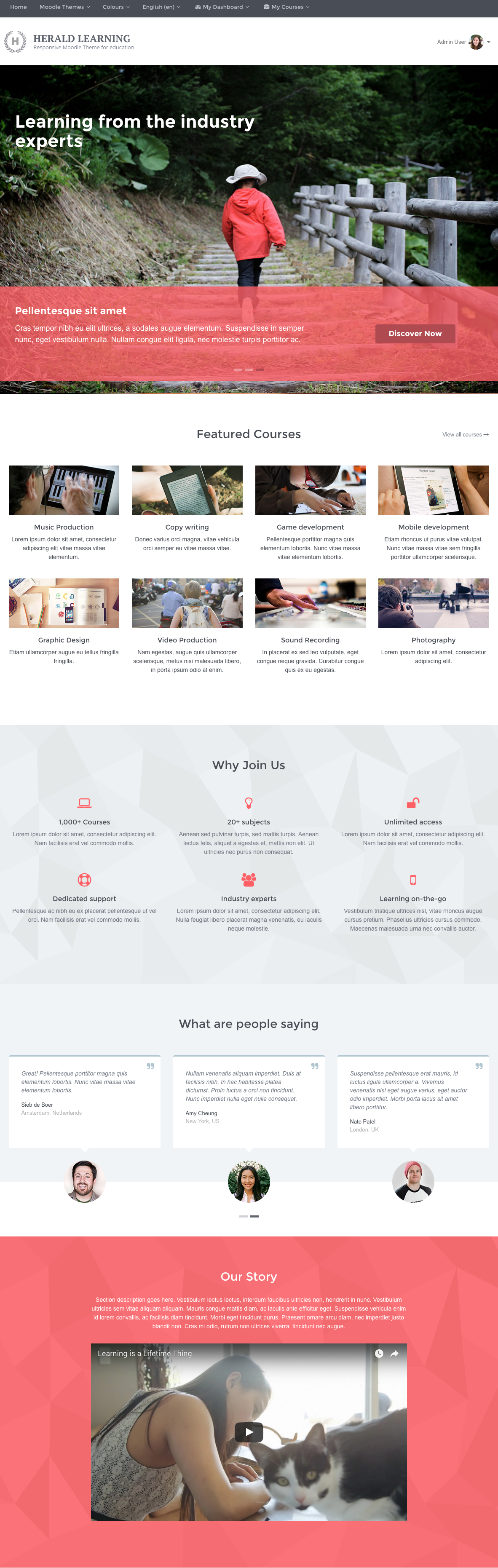
Below is a screenshot of what the Herald theme looks like after applying the example code: