Looking for a Boost-based Moodle theme? Checkout our new products.
Responsive Moodle theme Labland is designed for corporations/businesses. It comes with 4 default colour schemes. If the default colour scheme doesn’t fit your branding needs, you can write your custom CSS to override the default colour. In this tutorial we are showing you an example CSS code snippet to change the default colour scheme. You can easily use the example as a template to do your own colour customisations.
Where to enter the custom CSS?
Under the Labland theme settings there is an input field called “Custom CSS” where you can enter the CSS. By doing so you won’t lose any CSS customisations if the theme is updated as the data is stored in your database.
Example custom CSS
In the example we use three colours: 1) primary colour #9A58BA 2) secondary colour #FF6780 3) accent colour #59AFFE
/* Links */
a,
a:hover,
a:active,
a:focus {
  color: #9A58BA;
}
/* Buttons */
a.btn-primary,
.btn-primary {
  background: #9A58BA;
  border: 2px solid #9A58BA;
}
a.btn-primary:hover,
.btn-primary:hover,
a.btn-primary:active,
.btn-primary:active,
a.btn-primary:focus,
.btn-primary:focus {
  background: #834CA4; /* slightly darker than #9A58BA */
  border: 2px solid #9A58BA;
}

.btn-secondary, a.btn-secondary {
  background: #59AFFE;
  border: 2px solid #59AFFE;
}
.btn-secondary:active, .btn-secondary:focus, .btn-secondary:hover, a.btn-secondary:active, a.btn-secondary:focus, a.btn-secondary:hover {
  background: #478FD6; /* slightly darker than #59AFFE */
  border: 2px solid #59AFFE;
}

.btn-cta, a.btn-cta {
  background: #9A58BA;
  border: 2px solid #9A58BA;
}


.btn-cta:active, .btn-cta:focus, .btn-cta:hover, a.btn-cta:active, a.btn-cta:focus, a.btn-cta:hover {
  background: #834CA4; /* slightly darker than #9A58BA */
  border: 2px solid #9A58BA;
}

button,
input.form-submit,
input[type="button"],
input[type="submit"],
input[type="reset"],
input#id_submitbutton,
input#id_submitbutton2,
.path-admin .buttons input[type="submit"],
td.submit input {
  background: #9A58BA;
  border: 2px solid #9A58BA;
}
button:hover,
input.form-submit:hover,
input[type="button"]:hover,
input[type="submit"]:hover,
input[type="reset"]:hover,
input#id_submitbutton:hover,
input#id_submitbutton2:hover,
.path-admin .buttons input[type="submit"]:hover,
td.submit input:hover,
button:active,
input.form-submit:active,
input[type="button"]:active,
input[type="submit"]:active,
input[type="reset"]:active,
input#id_submitbutton:active,
input#id_submitbutton2:active,
.path-admin .buttons input[type="submit"]:active,
td.submit input:active,
button:focus,
input.form-submit:focus,
input[type="button"]:focus,
input[type="submit"]:focus,
input[type="reset"]:focus,
input#id_submitbutton:focus,
input#id_submitbutton2:focus,
.path-admin .buttons input[type="submit"]:focus,
td.submit input:focus {
  background: #834CA4; /* slightly darker than #9A58BA */
  border: 2px solid #9A58BA;
}
/* Tabs */
.nav-tabs > li.active a,
.nav-tabs > li.active a:hover,
.nav-tabs > li.active a:active,
.nav-tabs > li.active a:focus {
  border-top: 2px solid #9A58BA;
}

/* Tables */
#page #region-main .table>thead>tr>th {
    border-bottom-color: #9A58BA;
}

#page #region-main .table.table-boxed>thead>tr>th {
    background: #9A58BA;
}

/* Forms */
textarea:focus,
input[type="text"]:focus,
input[type="password"]:focus,
input[type="datetime"]:focus,
input[type="datetime-local"]:focus,
input[type="date"]:focus,
input[type="month"]:focus,
input[type="time"]:focus,
input[type="week"]:focus,
input[type="number"]:focus,
input[type="email"]:focus,
input[type="url"]:focus,
input[type="search"]:focus,
input[type="tel"]:focus,
input[type="color"]:focus,
.uneditable-input:focus {
  border-color: #9A58BA;
}

/* Topbar */
.branding {
  background: #9A58BA;
}

/* Notifications dropdown */
.site-header .top-bar .popover-region .popover-region-header-text {
  color: #9A58BA;
}
/* Messages dropdown */
.site-header .top-bar .popover-region a {
  color: #9A58BA;
}

/* Hero slideshow overlays */
.hero-overlay .overlay-upper {
  background: rgba(89, 175, 254, 0.8);
  /* #59AFFE = rgba(89, 175, 254, 1) */
  /* You can use online tool here http://www.hexcolortool.com/ to convert hext colour to rgba colour */
}
.hero-overlay .overlay-lower {
  background: rgba(255, 103, 128, 0.9);
  /* #FF6780 = rgba(255, 103, 128, 1) */
}
/* Hero slideshow promo badge */
.hero-badge {
  background: #FF6780;
}
/* Hero slideshow active slide indicator */
.hero-slider-wrapper .flexslider .flex-control-nav li a.flex-active {
  background: #FF6780;
}
/* News section */
.news-section .item-icon {
  background: #59AFFE;
}
/* review section */
.reviews-section {
  background: #FF6780;
}
/* CTA section */
.cta-section {
  background: #9A58BA;
}
/* Home course category section */
.course_category_tree .category > .info > .categoryname {
  background-color: #9A58BA;
}
/* Course blocks */
#page .block-region .block .header {
  background: #9A58BA;
}
#page .block-region .block .header {
  background: #9A58BA;
}

/* Bootstrap components */
.panel-group .panel .panel-heading .panel-title a {
  color: #9A58BA;
}
.panel-group .panel .panel-heading .panel-title a:hover,
.panel-group .panel .panel-heading .panel-title a:focus {
  color: #9A58BA;
}
.custom-quote {
  border-color: #9A58BA;
}
.custom-quote .fa {
  color: #9A58BA;
}
.custom-quote .people .name {
  color: #9A58BA;
}
.box.box-border {
  border-color: #9A58BA;
}
.box.box-theme {
  background: #9A58BA;
}
.label.label-theme {
  background: #9A58BA;
}
.panel-theme > .panel-heading,
.panel-theme > .panel-footer {
  border-color: #9A58BA;
  background: #9A58BA;
}
.panel-theme {
  border-color: #9A58BA;
}
.color-theme {
  color: #9A58BA;
}
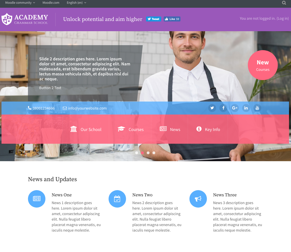
Below is a screenshot of what Labland theme looks like after applying the example code: