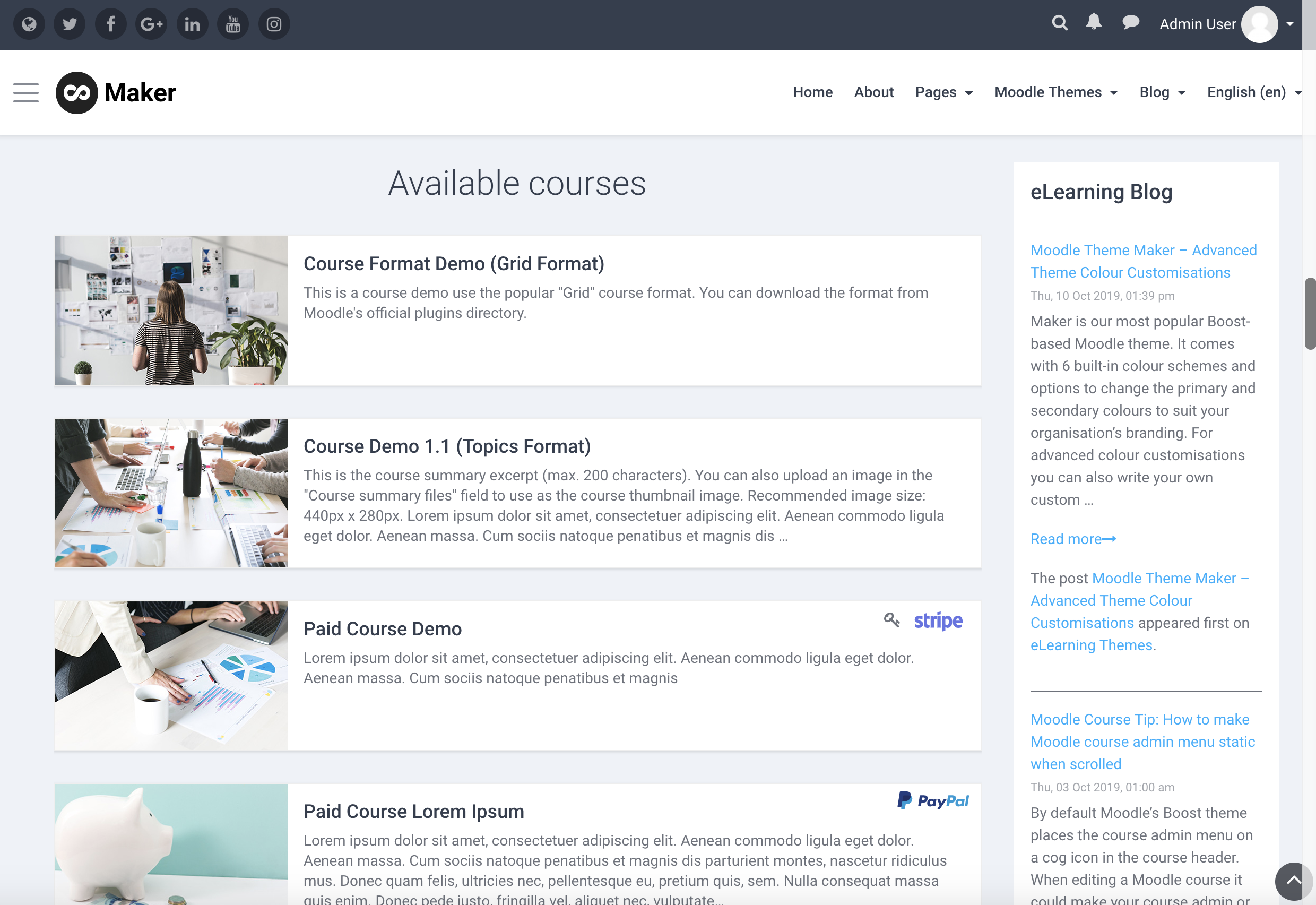
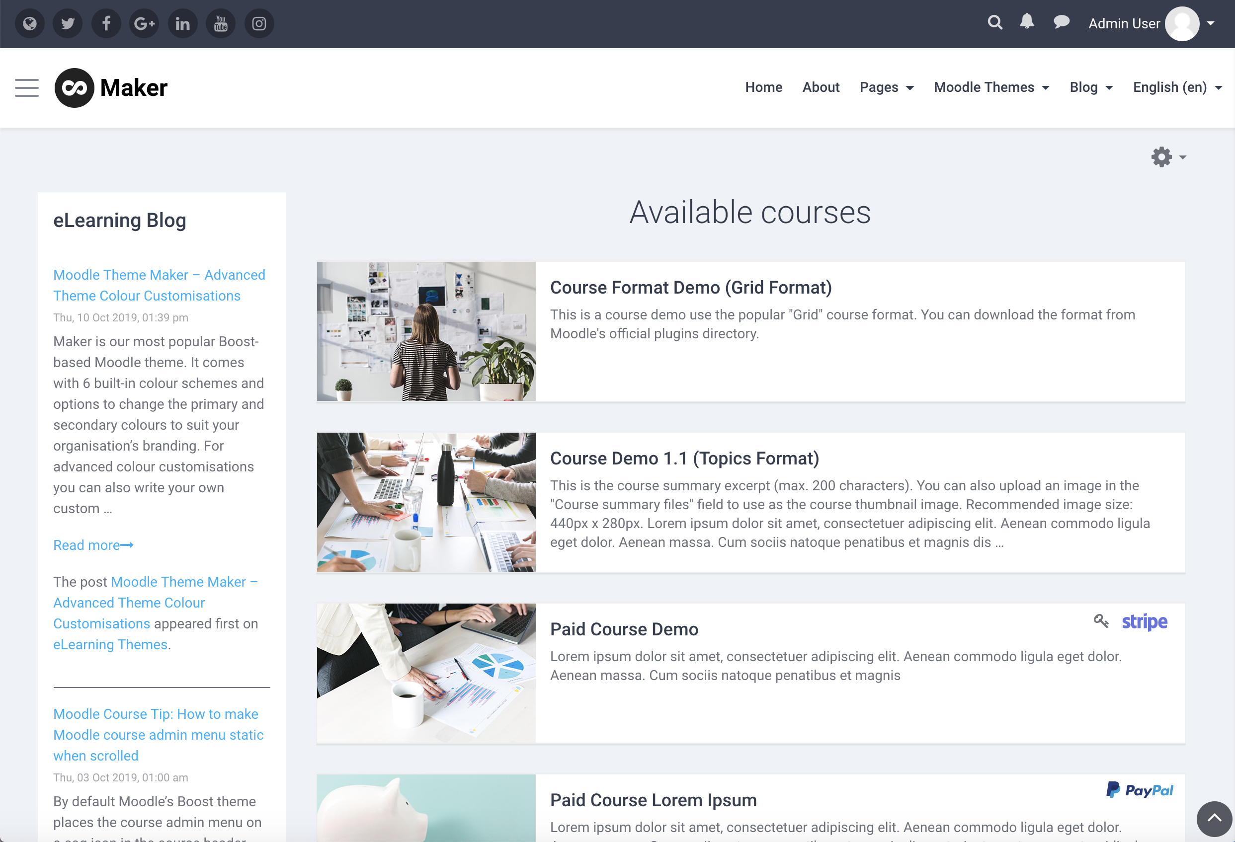
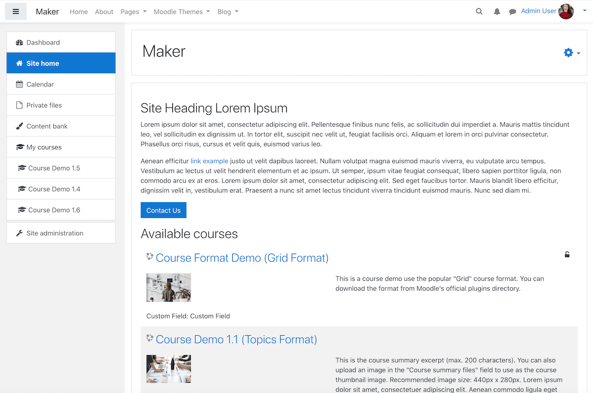
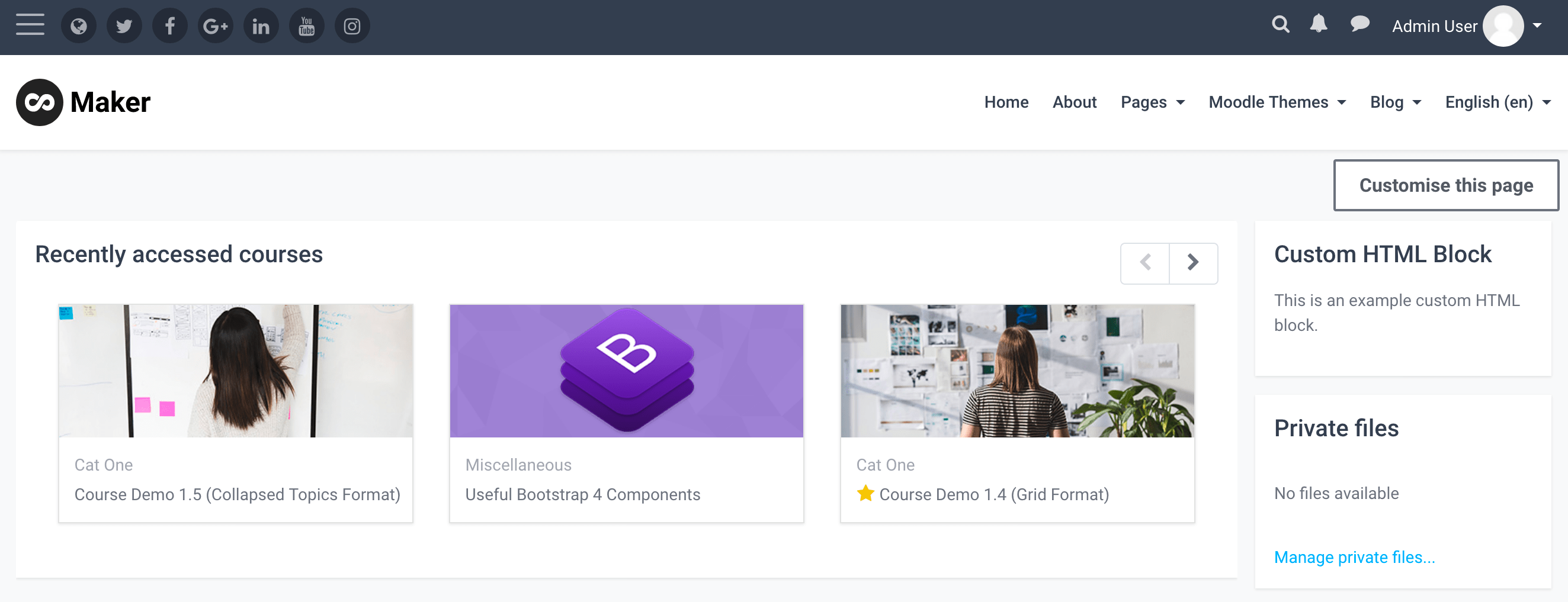
In our latest Maker and Edutor theme you have the option to position Moodle blocks before or after your Moodle course content. A course teacher can now add custom HTML blocks to create useful course information blocks or forms to enhance the course design. To get you started, we have created a demo course with some course design ideas. You can find all the code snippets used in the demo course below in this post. You can also import our demo course to your Moodle site and use the demo course as a base to build your own course.
Maker Theme Demo Course Edutor Theme Demo Course
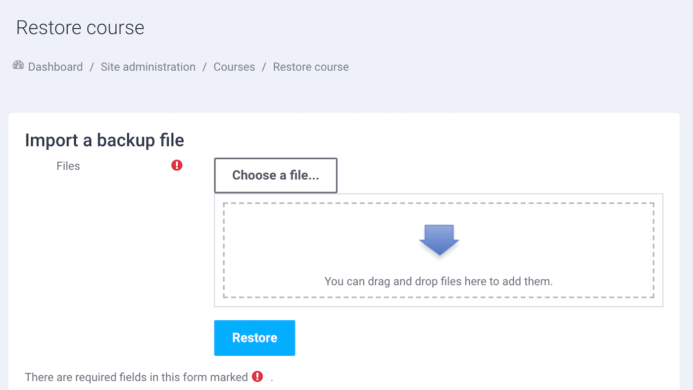
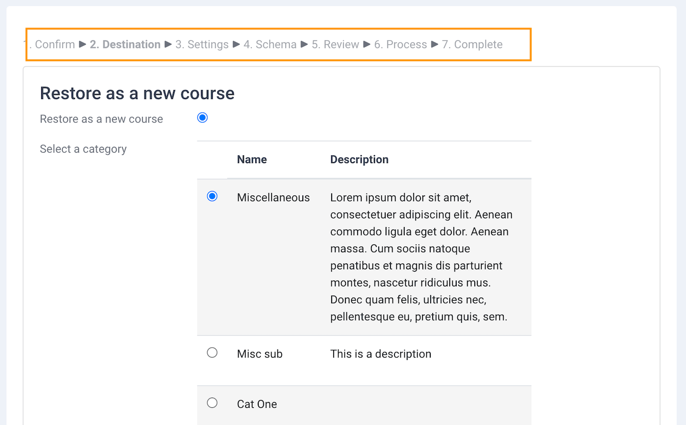
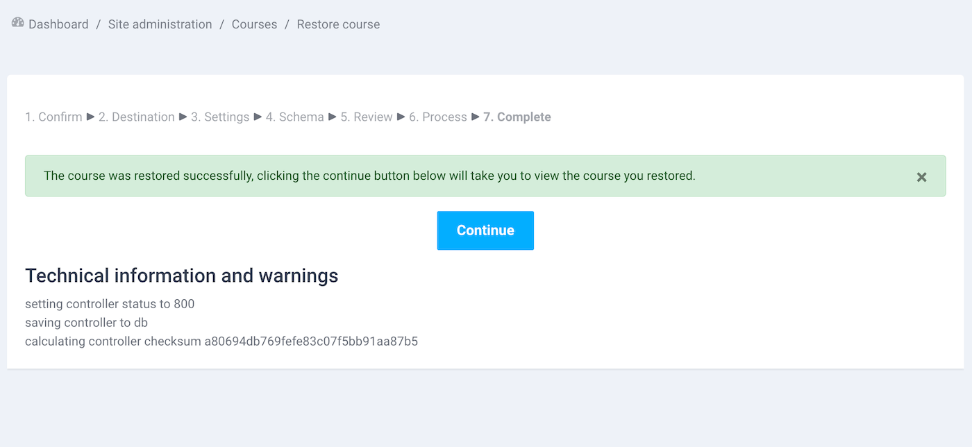
Moodle Demo Course Download:
You need to unzip the course file before importing to your Moodle site. Learn how to import a Moodle course.
Free Download (8081 downloads)
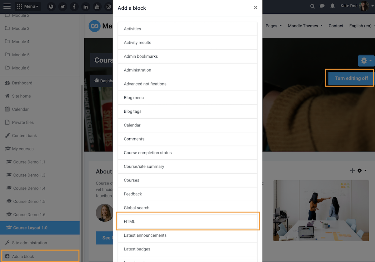
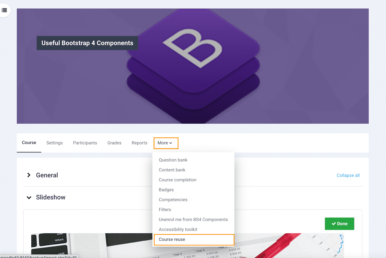
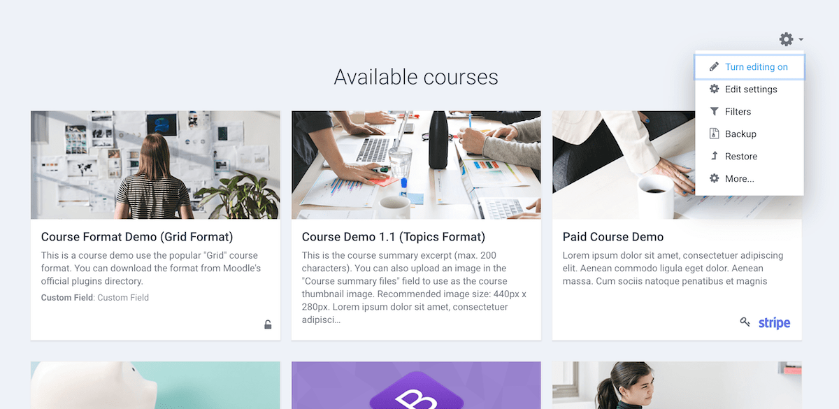
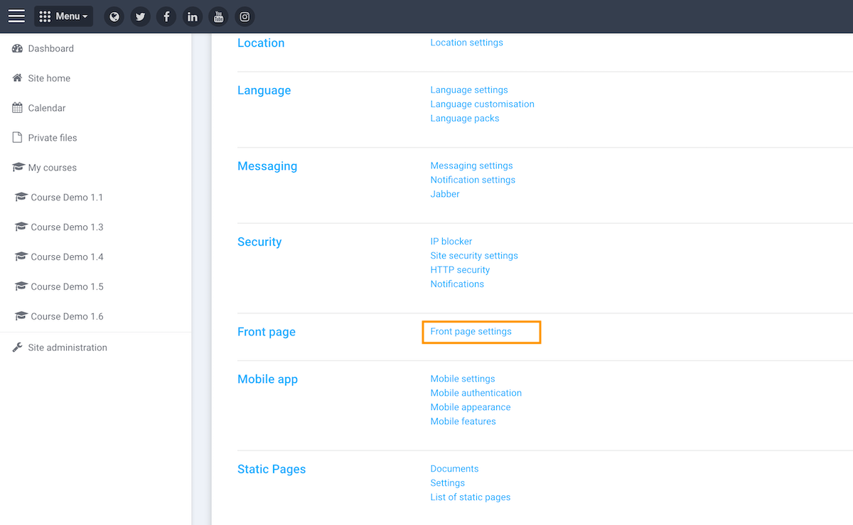
Add and position a HTML block
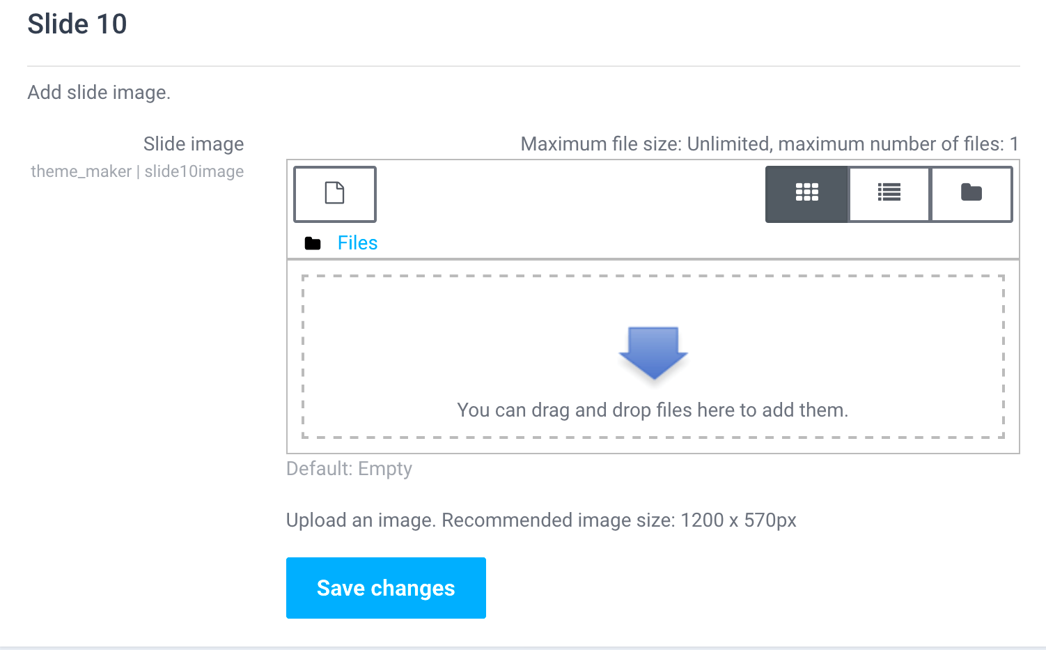
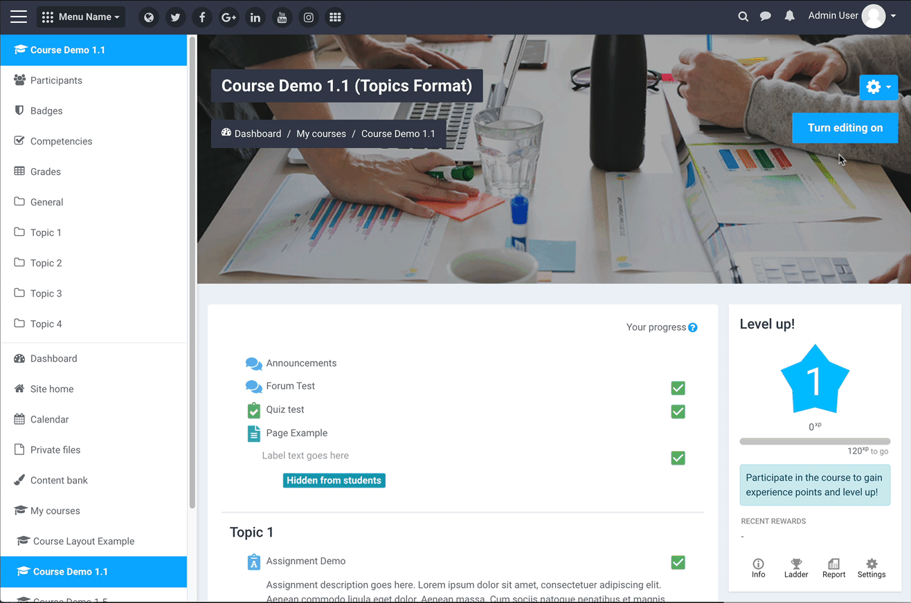
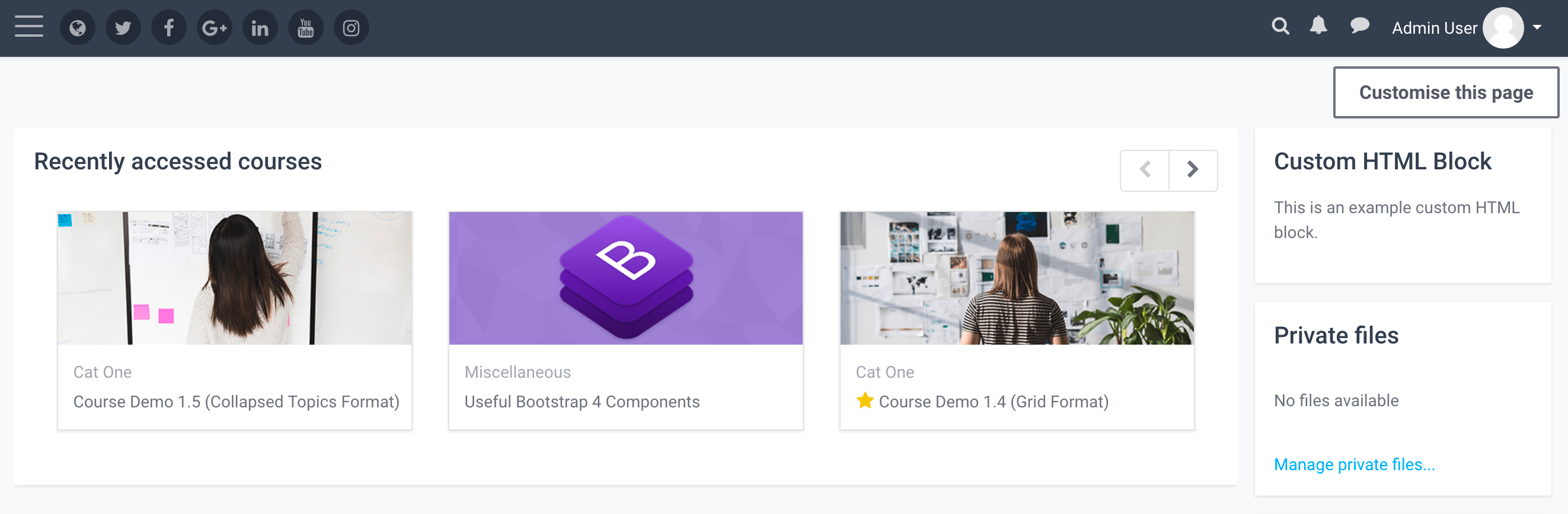
In a Moodle course you can turn editing on and add a HTML block as shown in the figure below.
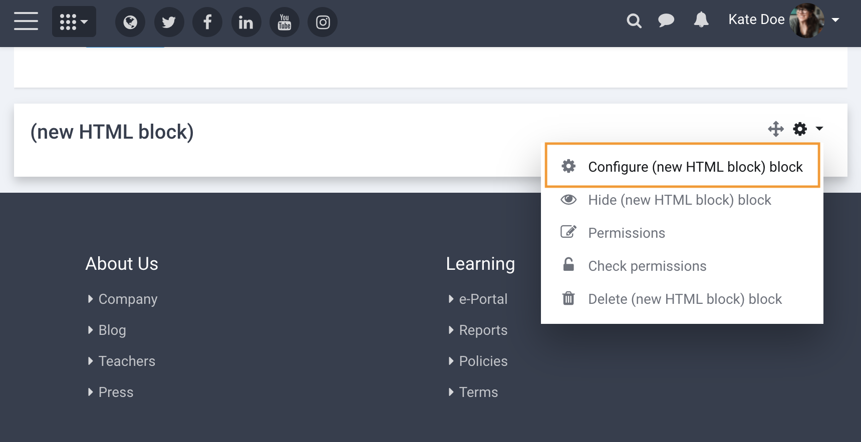
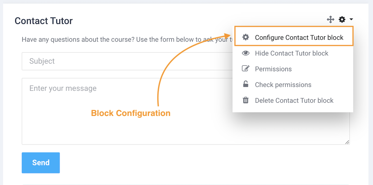
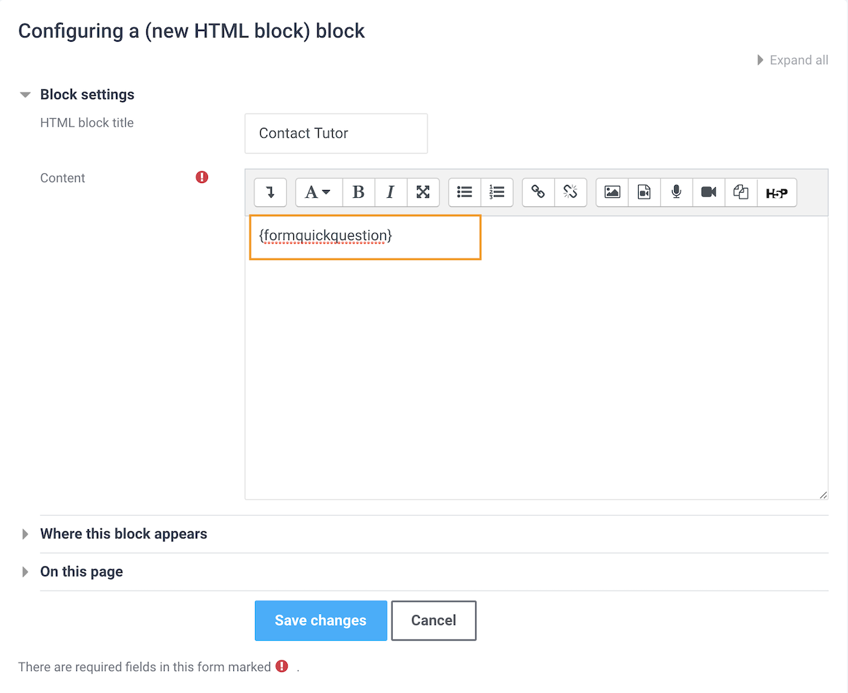
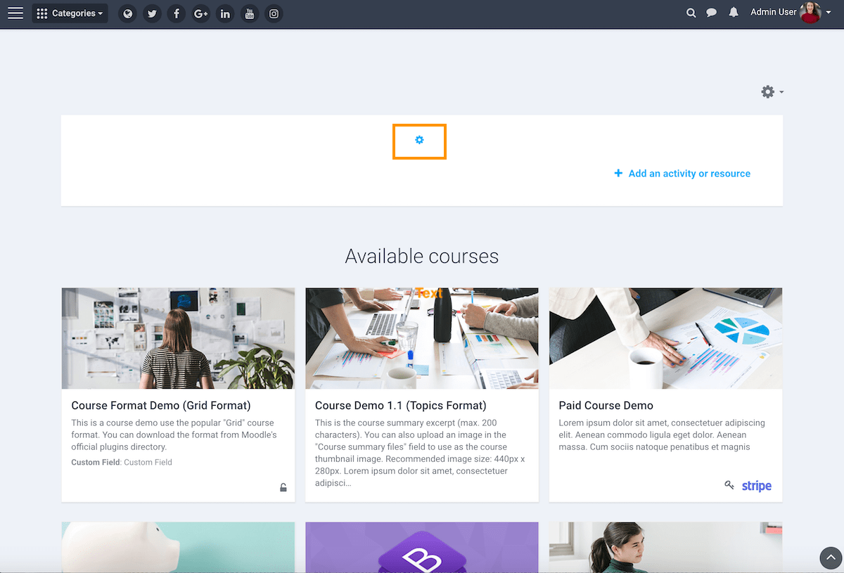
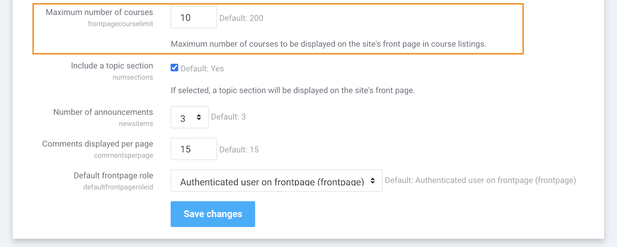
To configure the HTML block you can click the cog icon and then select the “Configure block” option via the dropdown menu.
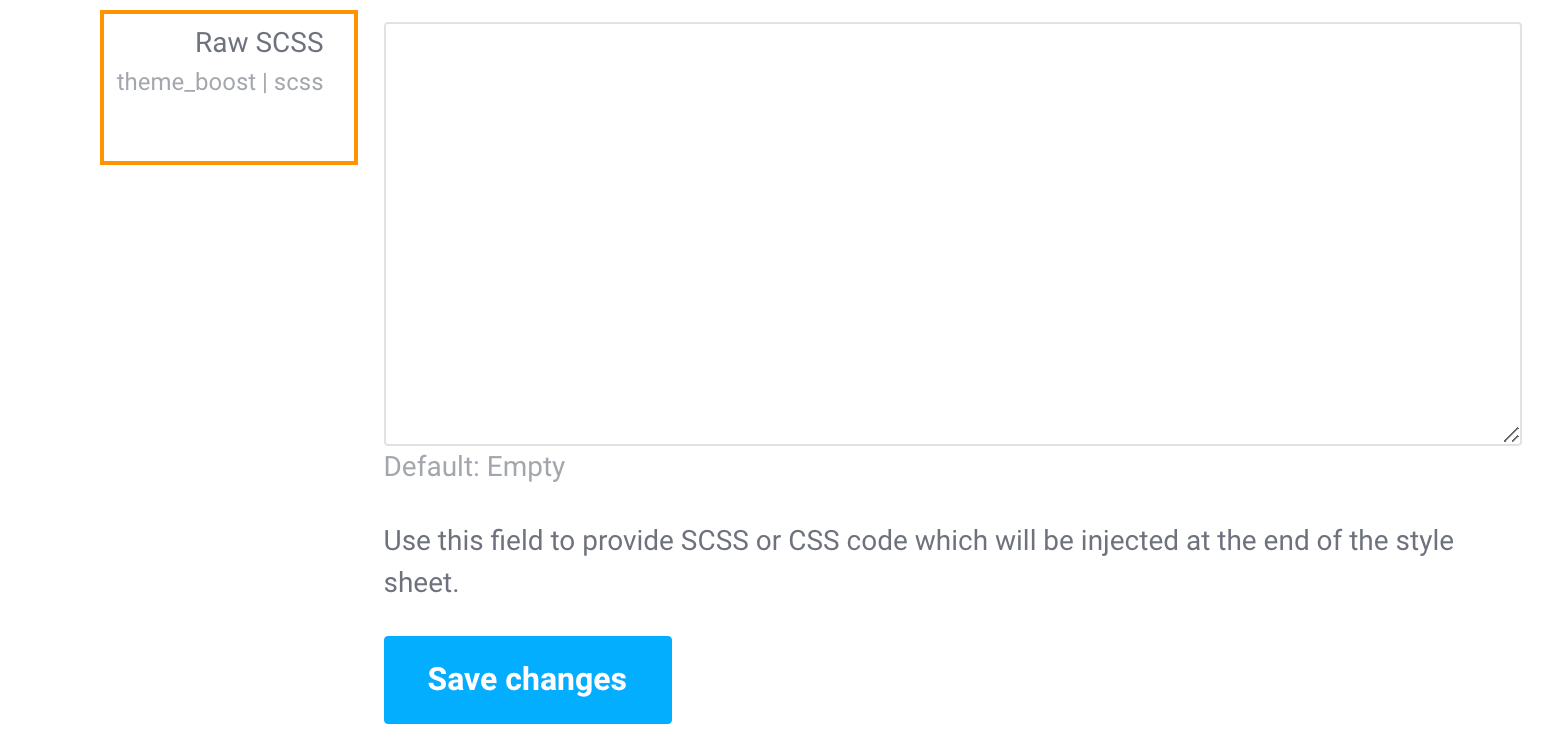
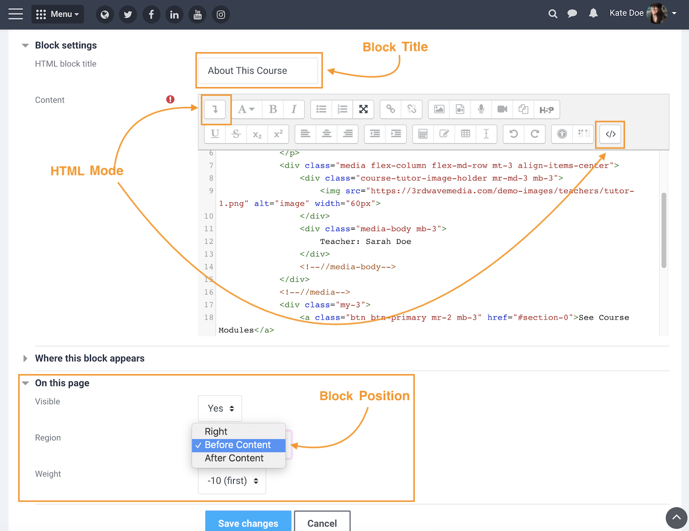
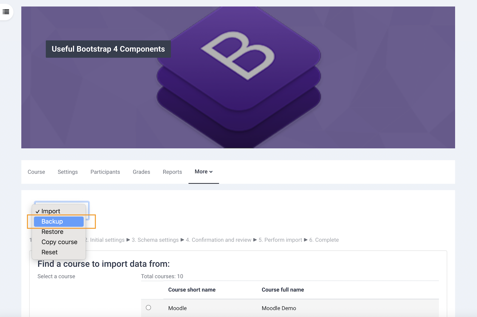
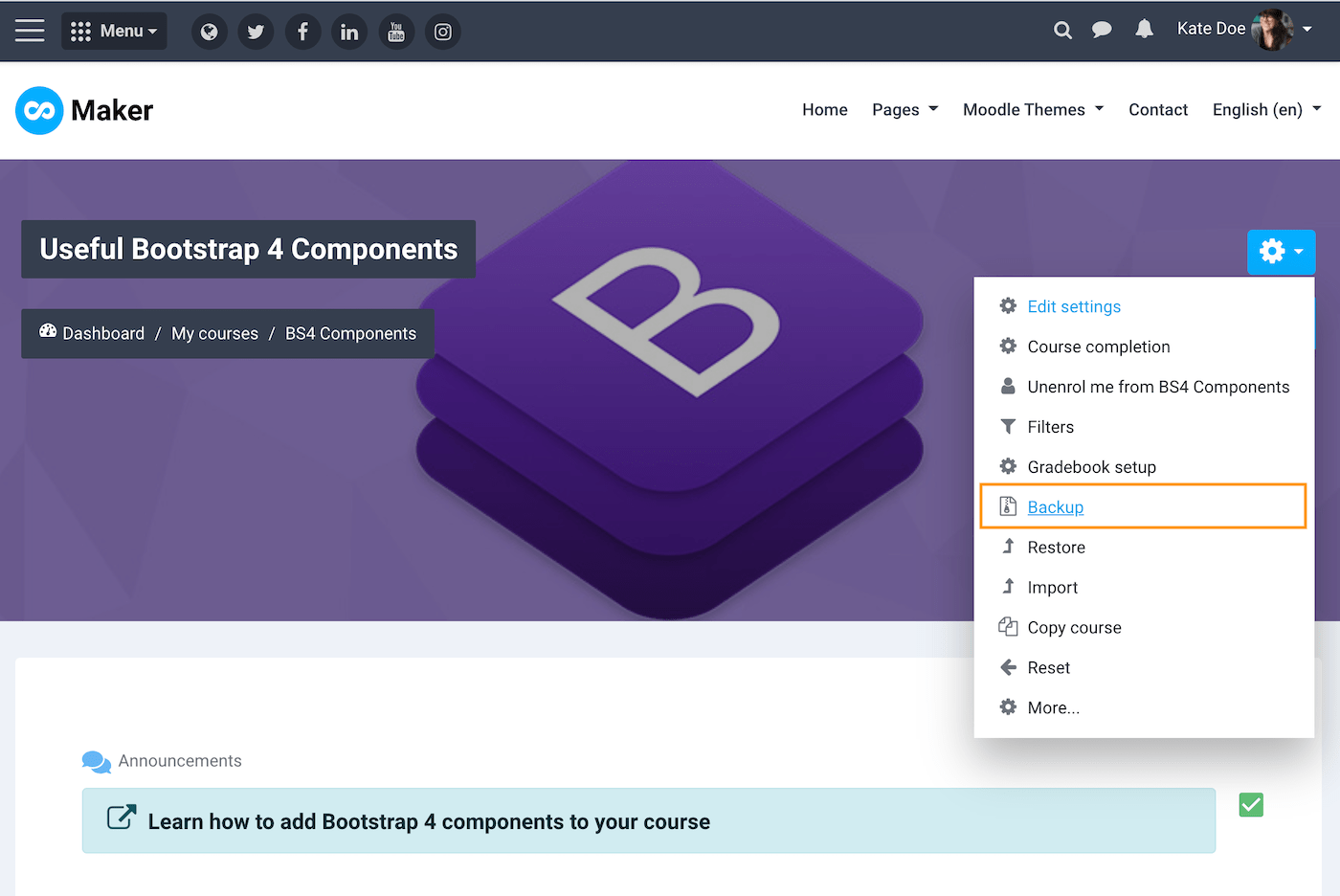
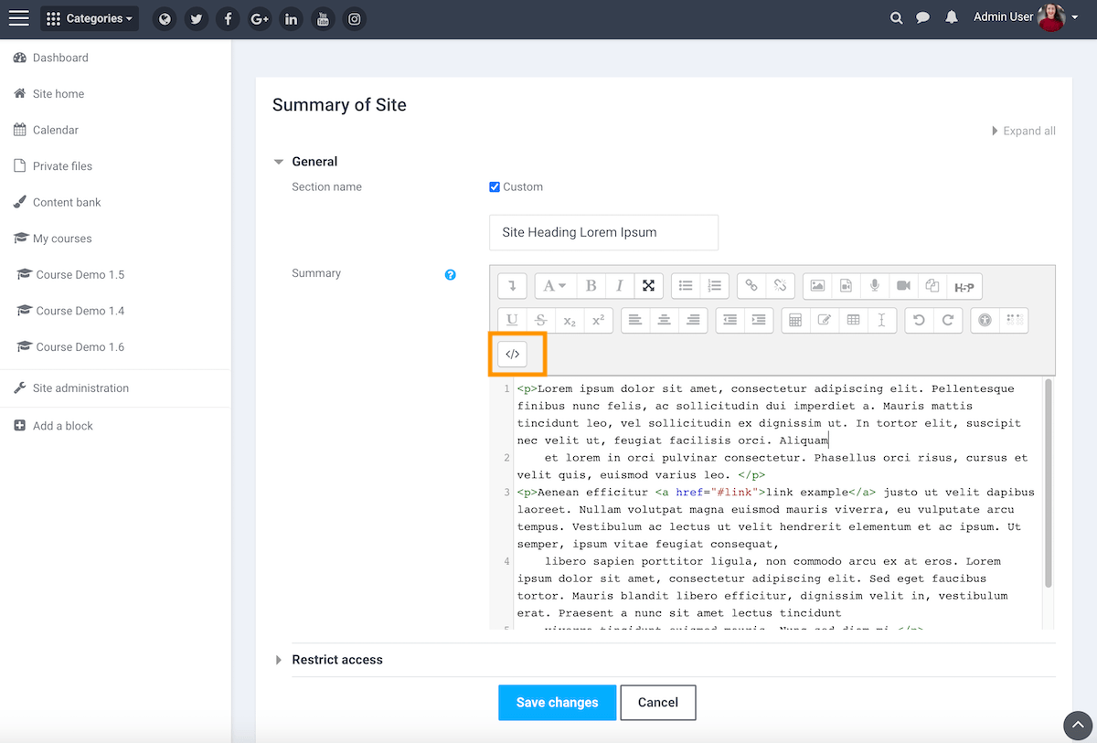
To copy and paste our demo code snippets you need to make sure your Moodle’s text editor is on the HTML code mode. You can then set your block’s position by defining its “Region” as shown in the figure below.
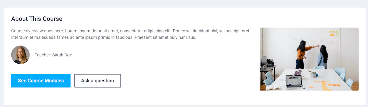
Code Snippet – About This Course
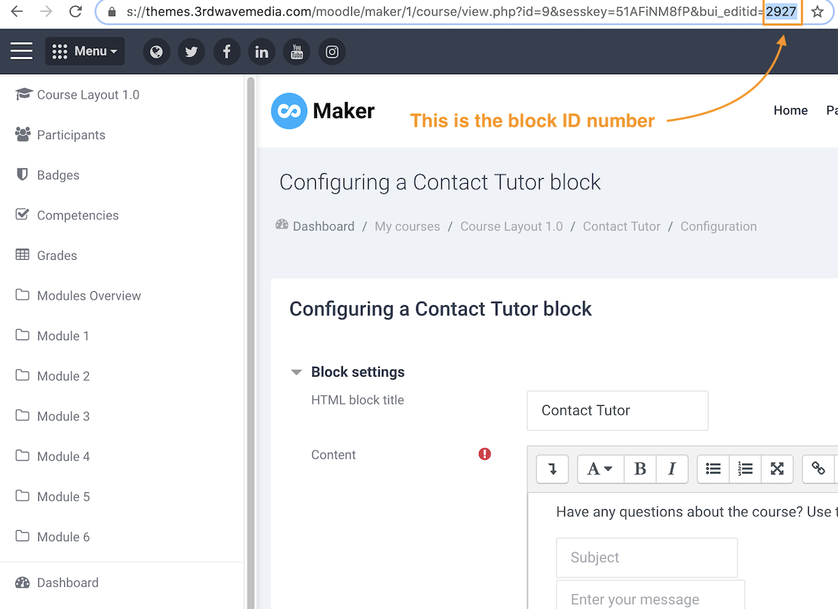
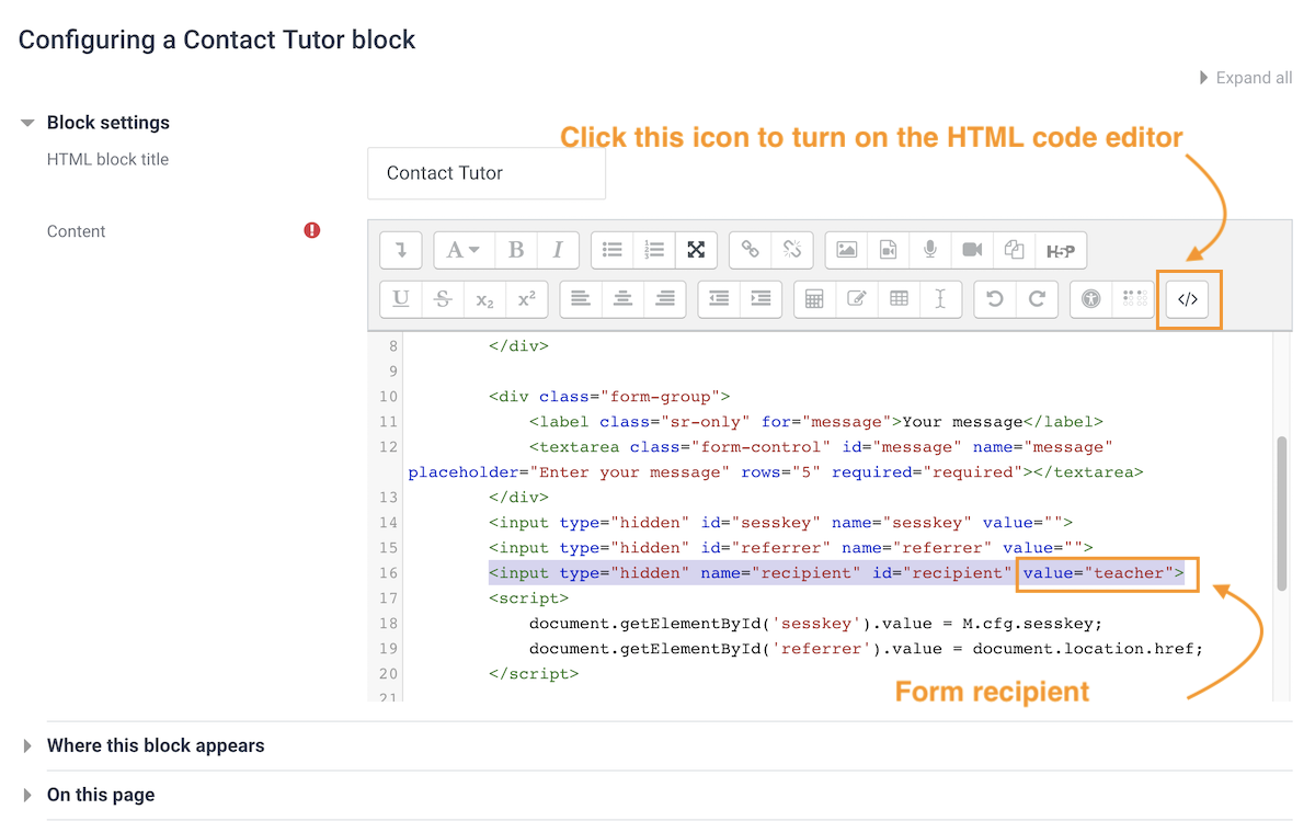
You can use this block to give a brief introduction of your course. The “See Course Modules” button is pointing to the course content (#section-0). The “Ask a question” button is pointing to the Contact Tutor block (#inst2927) on the same page. If you have added a Contact Tutor block in your course the link ID won’t be the same as our demo but you can get the ID number via the block configuration page.
<div class="block-theme-widget">
<div class="theme-media media flex-column flex-md-row">
<div class="media-body">
<p>
Course overview goes here. Lorem ipsum dolor sit amet, consectetur adipiscing elit. Donec vel tincidunt nisl, vel suscipit orci. Interdum et malesuada fames ac ante ipsum primis in faucibus. Praesent sit amet pulvinar risus.
</p>
<div class="media flex-column flex-md-row mt-3 align-items-center">
<div class="course-tutor-image-holder mr-md-3 mb-3">
<img src="https://3rdwavemedia.com/demo-images/teachers/tutor-1.png" alt="image" width="60px">
</div>
<div class="media-body mb-3">
Teacher: Sarah Doe
</div>
<!--//media-body-->
</div>
<!--//media-->
<div class="my-3">
<a class="btn btn-primary mr-2 mb-3" href="#section-0">See Course Modules</a>
<a class="btn btn-secondary mb-3" href="#inst2927">Ask a question</a>
</div>
</div>
<!--//media-body-->
<div class="course-image-thumb-holder ml-md-3">
<img src="https://3rdwavemedia.com/demo-images/slides/maker-course-1.jpg" alt="image" width="320px">
</div>
</div>
<!--//media-->
</div>
<!--//block-theme-widget-->
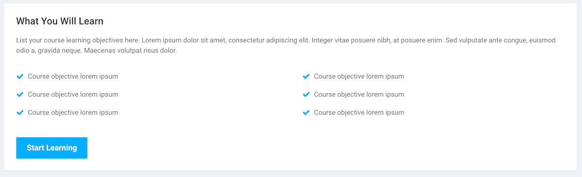
Code Snippet – What You Will Learn
You can use this block to list the course objectives.
<div class="block-theme-widget">
    <p class="mb-4">List your course learning objectives here. Lorem ipsum dolor sit amet, consectetur adipiscing elit. Integer vitae posuere nibh, at posuere enim. Sed vulputate ante congue, euismod odio a, gravida neque. Maecenas volutpat risus dolor.</p>
    <div class="text-center mb-3">
        <ul class="column-list list-unstyled mx-auto d-inline-block">
            <li><i class="column-list-icon fa fa-check mr-2"></i>Course objective lorem ipsum</li>
            <li><i class="column-list-icon fa fa-check mr-2"></i>Course objective lorem ipsum</li>
            <li><i class="column-list-icon fa fa-check mr-2"></i>Course objective lorem ipsum</li>
            <li><i class="column-list-icon fa fa-check mr-2"></i>Course objective lorem ipsum</li>
            <li><i class="column-list-icon fa fa-check mr-2"></i>Course objective lorem ipsum</li>
            <li><i class="column-list-icon fa fa-check mr-2"></i>Course objective lorem ipsum</li>
        </ul>
    </div>

    <a class="btn btn-primary scrollto" href="#maincontent">Start Learning</a>

</div>
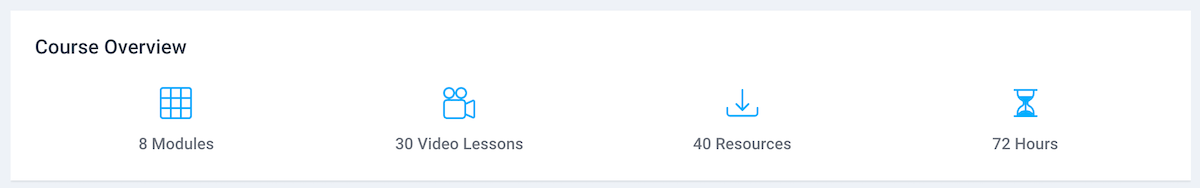
Code Snippet – Course Overview
You can use this block to give useful stats. You can change the icons used in the block to any of the 1000+ free Bootstrap SVG icons available.
<div class="block-theme-widget container">
    <div class="row theme-stats">
        <div class="item col-6 col-lg-3 mb-3 mb-lg-0">
            <div class="icon-holder"><svg width="1em" height="1em" viewBox="0 0 16 16" class="bi bi-grid-3x3" fill="currentColor" xmlns="http://www.w3.org/2000/svg">
  <path fill-rule="evenodd" d="M0 1.5A1.5 1.5 0 0 1 1.5 0h13A1.5 1.5 0 0 1 16 1.5v13a1.5 1.5 0 0 1-1.5 1.5h-13A1.5 1.5 0 0 1 0 14.5v-13zM1.5 1a.5.5 0 0 0-.5.5V5h4V1H1.5zM5 6H1v4h4V6zm1 4V6h4v4H6zm-1 1H1v3.5a.5.5 0 0 0 .5.5H5v-4zm1 0h4v4H6v-4zm5 0v4h3.5a.5.5 0 0 0 .5-.5V11h-4zm0-1h4V6h-4v4zm0-5h4V1.5a.5.5 0 0 0-.5-.5H11v4zm-1 0H6V1h4v4z"></path>
</svg></div>
            <div class="data">8 Modules</div>
        </div>
        <!--//item-->
        <div class="item col-6 col-lg-3 mb-3 mb-lg-0">
            <div class="icon-holder">
                <svg width="1em" height="1em" viewBox="0 0 16 16" class="bi bi-camera-reels" fill="currentColor" xmlns="http://www.w3.org/2000/svg">
  <path fill-rule="evenodd" d="M0 8a2 2 0 0 1 2-2h7.5a2 2 0 0 1 1.983 1.738l3.11-1.382A1 1 0 0 1 16 7.269v7.462a1 1 0 0 1-1.406.913l-3.111-1.382A2 2 0 0 1 9.5 16H2a2 2 0 0 1-2-2V8zm11.5 5.175l3.5 1.556V7.269l-3.5 1.556v4.35zM2 7a1 1 0 0 0-1 1v6a1 1 0 0 0 1 1h7.5a1 1 0 0 0 1-1V8a1 1 0 0 0-1-1H2z"></path>
  <path fill-rule="evenodd" d="M3 5a2 2 0 1 0 0-4 2 2 0 0 0 0 4zm0 1a3 3 0 1 0 0-6 3 3 0 0 0 0 6z"></path>
  <path fill-rule="evenodd" d="M9 5a2 2 0 1 0 0-4 2 2 0 0 0 0 4zm0 1a3 3 0 1 0 0-6 3 3 0 0 0 0 6z"></path>
</svg>
            </div>
            <div class="data">30 Video Lessons</div>
        </div>
        <!--//item-->
        <div class="item col-6 col-lg-3 mb-3 mb-lg-0">
            <div class="icon-holder">
                <svg width="1em" height="1em" viewBox="0 0 16 16" class="bi bi-download" fill="currentColor" xmlns="http://www.w3.org/2000/svg">
  <path fill-rule="evenodd" d="M.5 9.9a.5.5 0 0 1 .5.5v2.5a1 1 0 0 0 1 1h12a1 1 0 0 0 1-1v-2.5a.5.5 0 0 1 1 0v2.5a2 2 0 0 1-2 2H2a2 2 0 0 1-2-2v-2.5a.5.5 0 0 1 .5-.5z"></path>
  <path fill-rule="evenodd" d="M7.646 11.854a.5.5 0 0 0 .708 0l3-3a.5.5 0 0 0-.708-.708L8.5 10.293V1.5a.5.5 0 0 0-1 0v8.793L5.354 8.146a.5.5 0 1 0-.708.708l3 3z"></path>
</svg>
            </div>
            <div class="data">40 Resources</div>
        </div>
        <!--//item-->
        <div class="item col-6 col-lg-3 mb-3 mb-lg-0">
            <div class="icon-holder">
                <svg width="1em" height="1em" viewBox="0 0 16 16" class="bi bi-hourglass-split" fill="currentColor" xmlns="http://www.w3.org/2000/svg">
  <path fill-rule="evenodd" d="M2.5 15a.5.5 0 1 1 0-1h1v-1a4.5 4.5 0 0 1 2.557-4.06c.29-.139.443-.377.443-.59v-.7c0-.213-.154-.451-.443-.59A4.5 4.5 0 0 1 3.5 3V2h-1a.5.5 0 0 1 0-1h11a.5.5 0 0 1 0 1h-1v1a4.5 4.5 0 0 1-2.557 4.06c-.29.139-.443.377-.443.59v.7c0 .213.154.451.443.59A4.5 4.5 0 0 1 12.5 13v1h1a.5.5 0 0 1 0 1h-11zm2-13v1c0 .537.12 1.045.337 1.5h6.326c.216-.455.337-.963.337-1.5V2h-7zm3 6.35c0 .701-.478 1.236-1.011 1.492A3.5 3.5 0 0 0 4.5 13s.866-1.299 3-1.48V8.35zm1 0c0 .701.478 1.236 1.011 1.492A3.5 3.5 0 0 1 11.5 13s-.866-1.299-3-1.48V8.35z"></path>
</svg>
            </div>
            <div class="data">72 Hours</div>
        </div>
        <!--//item-->
    </div>
    <!--//row-->
</div>
<!--//block-theme-widget-->
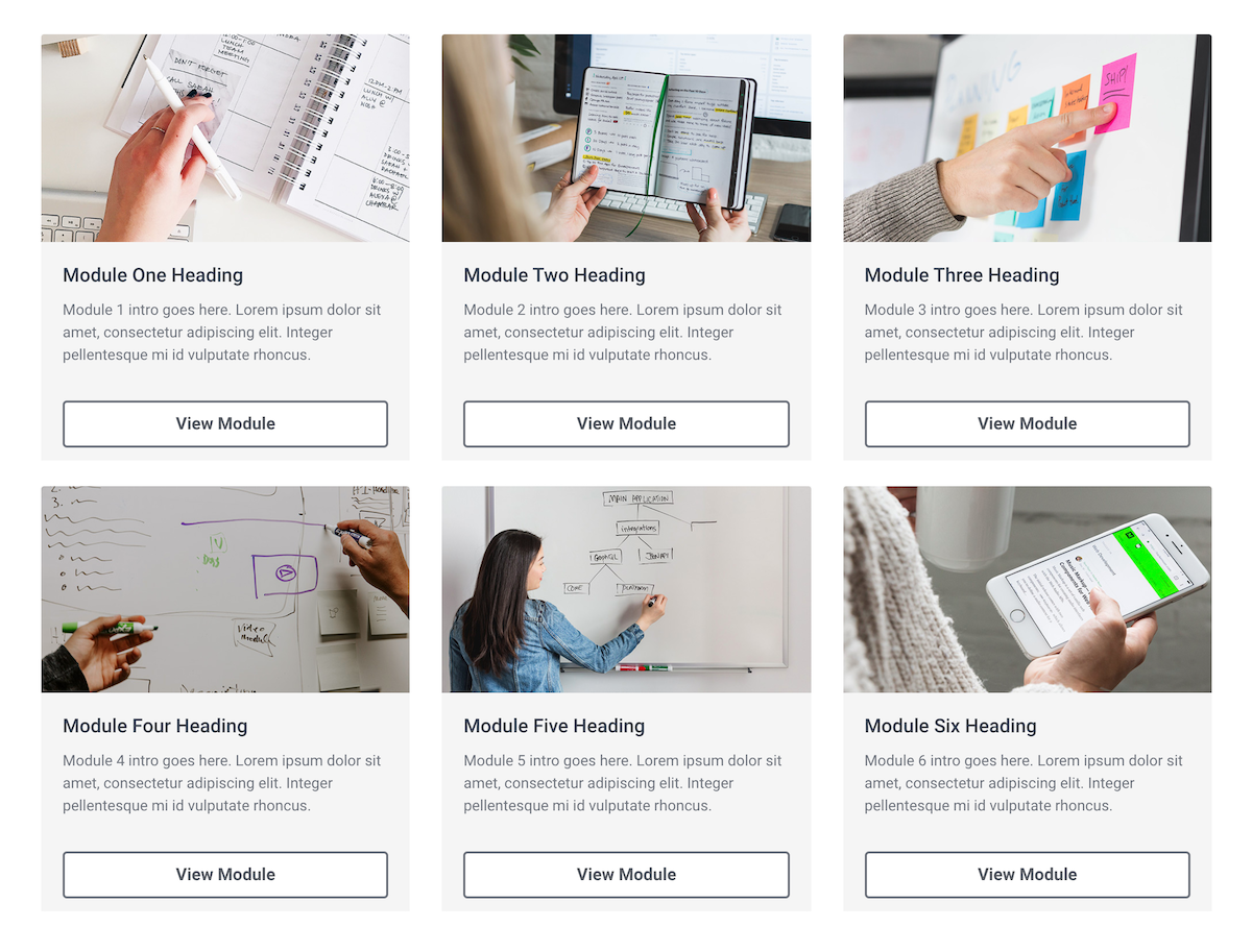
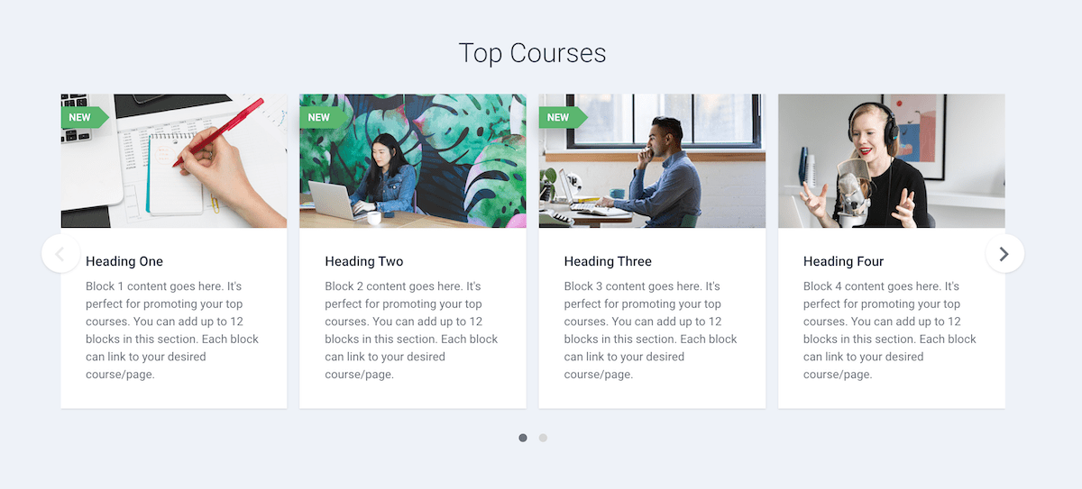
Code Snippet – Course Modules Overview
You can divide your course content into modules (using Moodle’s Topic format) and then use this block to link to each module with a quick overview.
<div class="block-theme-widget container">
    <div class="theme-cards row">
        <div class="col-6 col-lg-4 mb-4">
            <div class="card card-bg-light">
                <img src="https://3rdwavemedia.com/demo-images/slides/maker-module-1.jpg" class="card-img-top" alt="image">
                <div class="card-body">
                    <h5 class="card-title">Module One Heading</h5>
                    <p class="card-text">Module 1 intro goes here. Lorem ipsum dolor sit amet, consectetur adipiscing elit. Integer pellentesque mi id vulputate rhoncus. </p>

                </div>
                <div class="card-footer">
                    <a href="#section-1" class="btn btn-secondary btn-block rounded">View Module</a>
                </div>
            </div>
            <!--//card-->
        </div>
        <!--//col-->
        <div class="col-6 col-lg-4 mb-4">
            <div class="card card-bg-light">
                <img src="https://3rdwavemedia.com/demo-images/slides/maker-module-2.jpg" class="card-img-top" alt="image">
                <div class="card-body">
                    <h5 class="card-title">Module Two Heading</h5>
                    <p class="card-text">Module 2 intro goes here. Lorem ipsum dolor sit amet, consectetur adipiscing elit. Integer pellentesque mi id vulputate rhoncus. </p>

                </div>
                <div class="card-footer">
                    <a href="#section-2" class="btn btn-secondary btn-block rounded">View Module</a>
                </div>
            </div>
            <!--//card-->
        </div>
        <!--//col-->
        <div class="col-6 col-lg-4 mb-4">
            <div class="card card-bg-light">
                <img src="https://3rdwavemedia.com/demo-images/slides/maker-module-3.jpg" class="card-img-top" alt="image">
                <div class="card-body">
                    <h5 class="card-title">Module Three Heading</h5>
                    <p class="card-text">Module 3 intro goes here. Lorem ipsum dolor sit amet, consectetur adipiscing elit. Integer pellentesque mi id vulputate rhoncus. </p>

                </div>
                <div class="card-footer">
                    <a href="#section-3" class="btn btn-secondary btn-block rounded">View Module</a>
                </div>
            </div>
            <!--//card-->
        </div>
        <!--//col-->
        <div class="col-6 col-lg-4 mb-4">
            <div class="card card-bg-light">
                <img src="https://3rdwavemedia.com/demo-images/slides/maker-module-4.jpg" class="card-img-top" alt="image">
                <div class="card-body">
                    <h5 class="card-title">Module Four Heading</h5>
                    <p class="card-text">Module 4 intro goes here. Lorem ipsum dolor sit amet, consectetur adipiscing elit. Integer pellentesque mi id vulputate rhoncus. </p>

                </div>
                <div class="card-footer">
                    <a href="#section-4" class="btn btn-secondary btn-block rounded">View Module</a>
                </div>
            </div>
            <!--//card-->
        </div>
        <!--//col-->
        <div class="col-6 col-lg-4 mb-4">
            <div class="card card-bg-light">
                <img src="https://3rdwavemedia.com/demo-images/slides/maker-module-5.jpg" class="card-img-top" alt="image">
                <div class="card-body">
                    <h5 class="card-title">Module Five Heading</h5>
                    <p class="card-text">Module 5 intro goes here. Lorem ipsum dolor sit amet, consectetur adipiscing elit. Integer pellentesque mi id vulputate rhoncus. </p>

                </div>
                <div class="card-footer">
                    <a href="#section-5" class="btn btn-secondary btn-block rounded">View Module</a>
                </div>
            </div>
            <!--//card-->
        </div>
        <!--//col-->
        <div class="col-6 col-lg-4 mb-4">
            <div class="card card-bg-light">
                <img src="https://3rdwavemedia.com/demo-images/slides/maker-module-6.jpg" class="card-img-top" alt="image">
                <div class="card-body">
                    <h5 class="card-title">Module Six Heading</h5>
                    <p class="card-text">Module 6 intro goes here. Lorem ipsum dolor sit amet, consectetur adipiscing elit. Integer pellentesque mi id vulputate rhoncus. </p>

                </div>
                <div class="card-footer">
                    <a href="#section-6" class="btn btn-secondary btn-block rounded">View Module</a>
                </div>
            </div>
            <!--//card-->
        </div>
        <!--//col-->
    </div>
    <!--//block-theme-widget-->
</div>
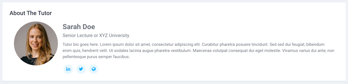
Code Snippet – About The Tutor
You can use this section to add the course teacher’s bio.
<div class="block-theme-widget container">
    <div class="theme-tutor media flex-column flex-md-row">
        <div class="course-tutor-image-holder mr-md-3 mb-3">
            <img src="https://3rdwavemedia.com/demo-images/teachers/tutor-1.png" alt="image" width="150px">
        </div>
        <div class="media-body">
            <div class="tutor-name">Sarah Doe</div>
            <div class="tutor-meta">Senior Lecture or XYZ University</div>
            <p class="mt-2">Tutor bio goes here. Lorem ipsum dolor sit amet, consectetur adipiscing elit. Curabitur pharetra posuere tincidunt. Sed sed dui feugiat, bibendum enim quis, hendrerit velit. Ut sodales lacinia augue pharetra vestibulum. Maecenas volutpat consequat
                dui eget molestie. Vivamus varius dui ante, non pellentesque purus semper faucibus. </p>
            <div class="text-center text-md-left mt-3">
                <ul class="social-list list-unstyled mb-0">
                    <li class="list-inline-item"><a href="#link"><i class="fa-brands fa-linkedin-in"> </i></a></li>
                    <li class="list-inline-item"><a href="#link"><i class="fa-brands fa-x-twitter"> </i></a></li>
                    <li class="list-inline-item"><a href="#link"><i class="fa-solid fa-globe"> </i></a></li>
                </ul>
                <!--//social-list-->
            </div>
        </div>
        <!--//media-body-->
    </div>
    <!--//tutor-block-->
</div>
<!--//block-theme-widget-->
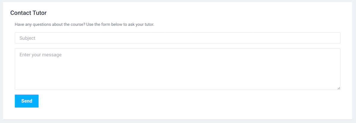
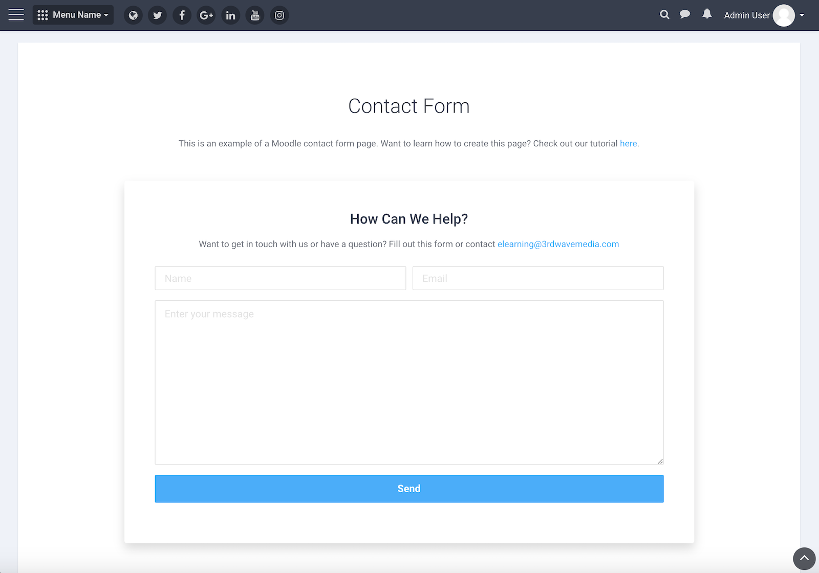
Code Snippet – Contact Tutor
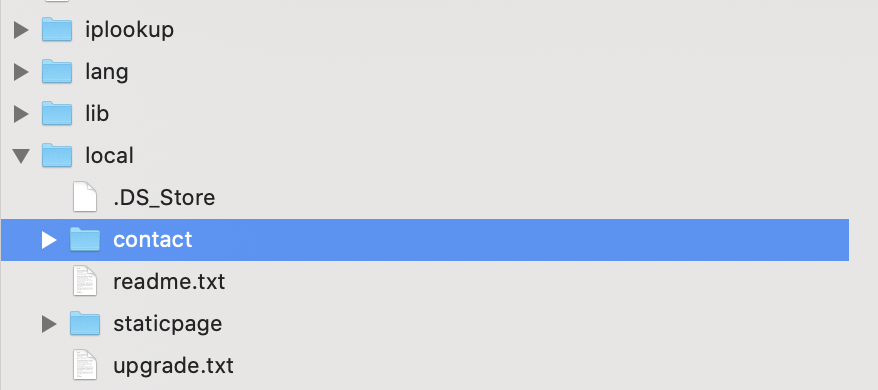
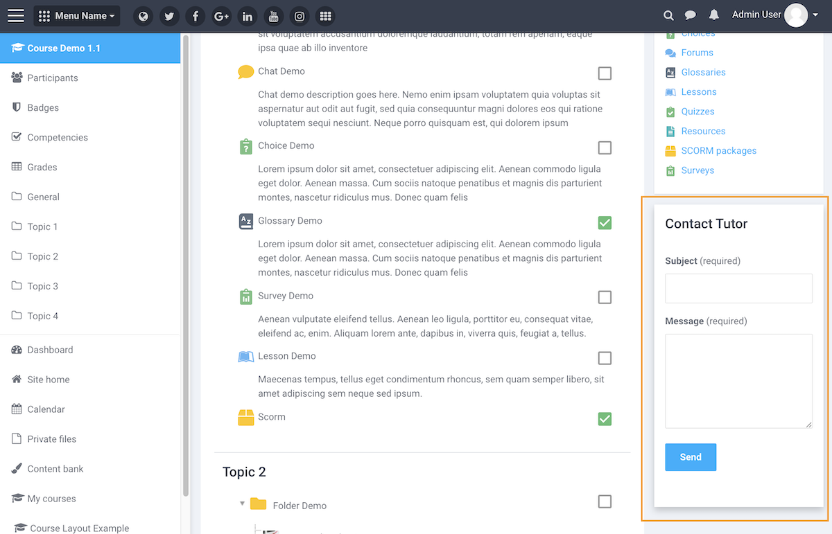
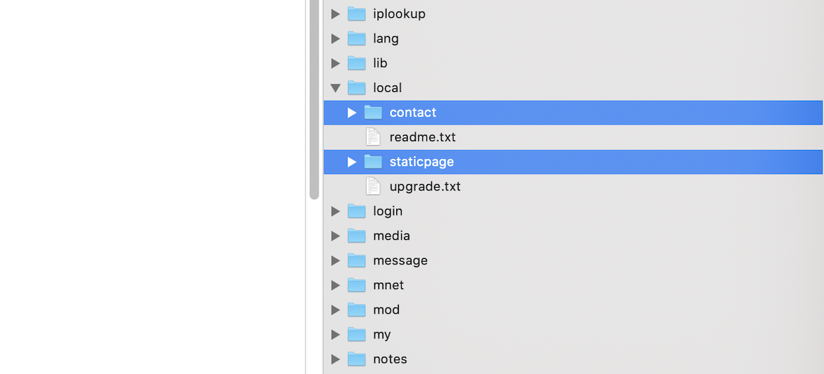
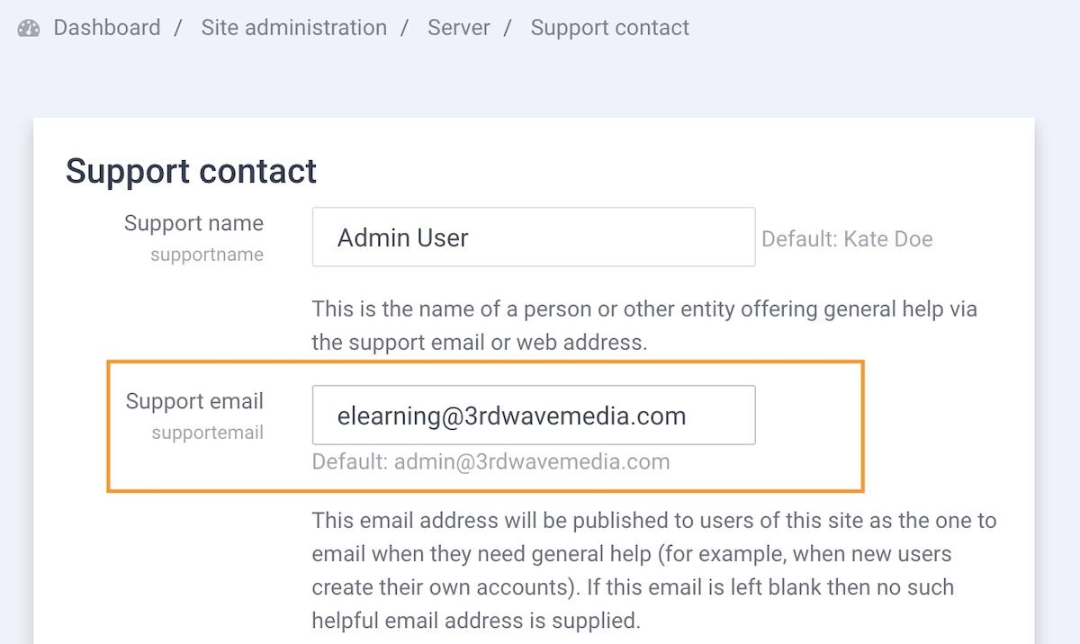
You can add a simple contact form for your learners to ask the course tutor questions without leaving the course. Learn how to set up the contact form here.
<div class="block-theme-widget container">
    <form class="contact-form" action="../local/contact/index.php" method="post">
        <p class="mb-3">Have any questions about the course? Use the form below to ask your tutor.</p>

        <div class="form-group">
            <label class="sr-only" for="subject">Subject</label>
            <input type="text" class="form-control" id="subject" name="subject" placeholder="Subject" required="required">
        </div>

        <div class="form-group">
            <label class="sr-only" for="message">Your message</label>
            <textarea class="form-control" id="message" name="message" placeholder="Enter your message" rows="5" required="required"></textarea>
        </div>
        <input type="hidden" id="sesskey" name="sesskey" value="">
        <input type="hidden" id="referrer" name="referrer" value="">
        <input type="hidden" name="recipient" id="recipient" value="teacher">
        <script>
            document.getElementById('sesskey').value = M.cfg.sesskey;
            document.getElementById('referrer').value = document.location.href;
        </script>

        <div class="form-group">
            <input type="submit" name="submit" id="submit" value="Send" class="btn btn-primary py-2">

        </div>

    </form>
    <!--//contact-form-->
    <div class="alert alert-info mt-4"><strong>Note:</strong> This contact form only works for logged in users (not guests).</div>
</div>
