
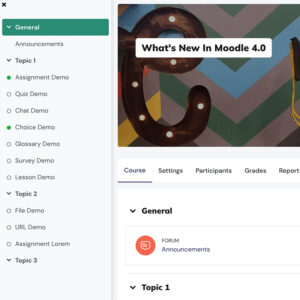
Edutor – A Premium Moodle Theme Based On Boost (Main Features & Settings)
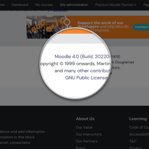
Moodle has continued to evolve with exciting new UX features and improvements. To keep pace with these changes, we’ve developed a premium theme called Edutor, built on Moodle’s core Boost theme. Edutor is fully compatible with both Moodle 4.x and …