Moodle 5.1 continues the gradual design improvements introduced in Moodle 5.0. Built on Bootstrap 5, the Moodle 5 series brings a cleaner, more flexible front-end framework that makes the interface easier to use and maintain.
It is not a complete redesign, but it does feel more polished and modern for both educators and learners. If your university, company, or training organization is still using Moodle 4.x, Moodle 5.1 is worth exploring. It offers a smoother user experience and runs on a more up-to-date code base, setting the stage for future improvements.
In this post, we will look at some of the key UI and UX updates in Moodle 5.1 and how these small but meaningful changes can make a real difference in daily teaching and learning.
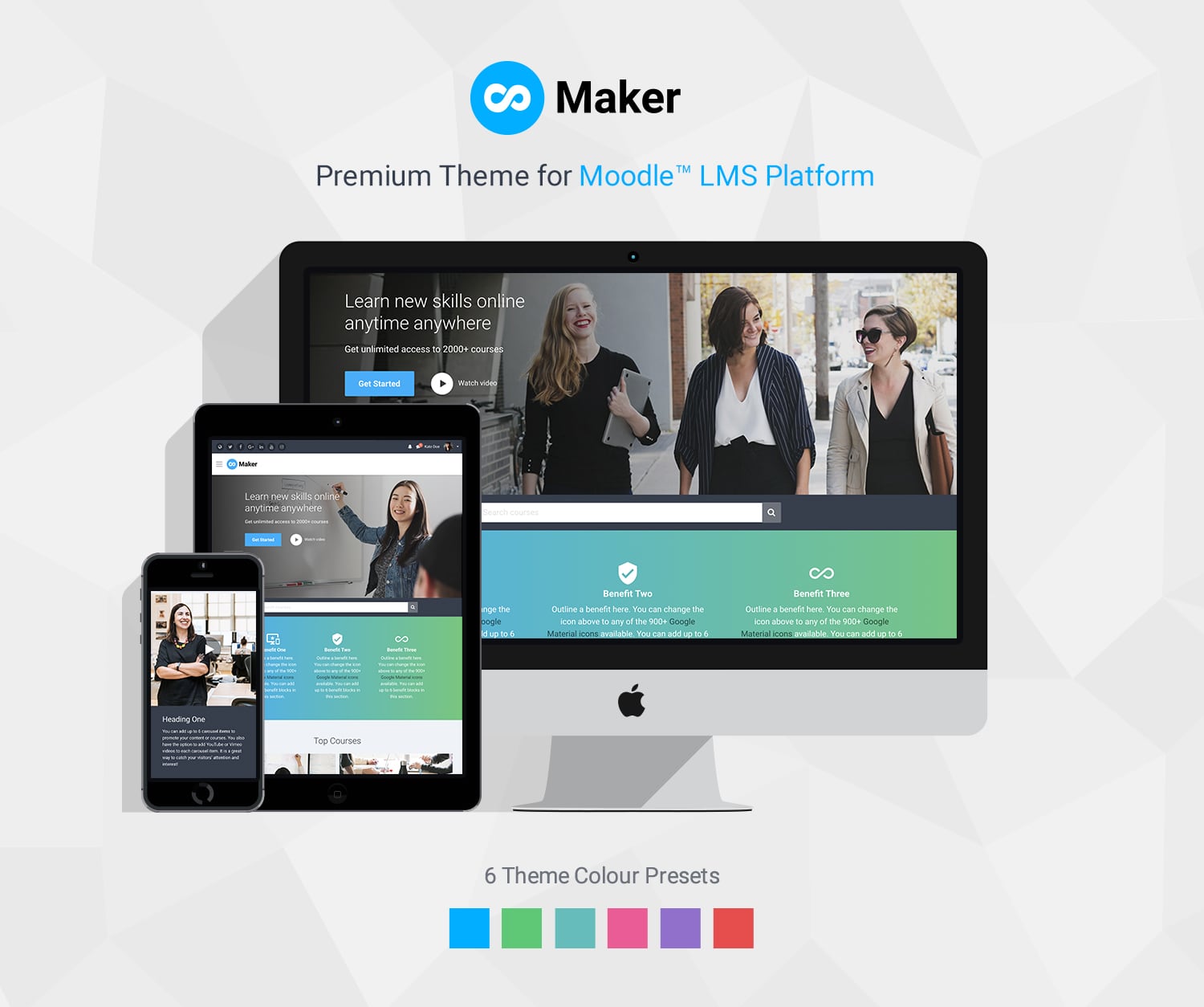
All our premium Moodle 5 themes, Lumo, Edutor, and Maker, work perfectly with Moodle 5.1.
Content Index
- New “Add Activity or Resource” Modal Window Design
- Improved Course Activities Overview Page
- AI Integration (Deepseek Added)
- TinyMCE Editor Improvements
- Other Small but Handy Improvements
- Major Change for Site Admins: Directory Restructure
- Final Thoughts
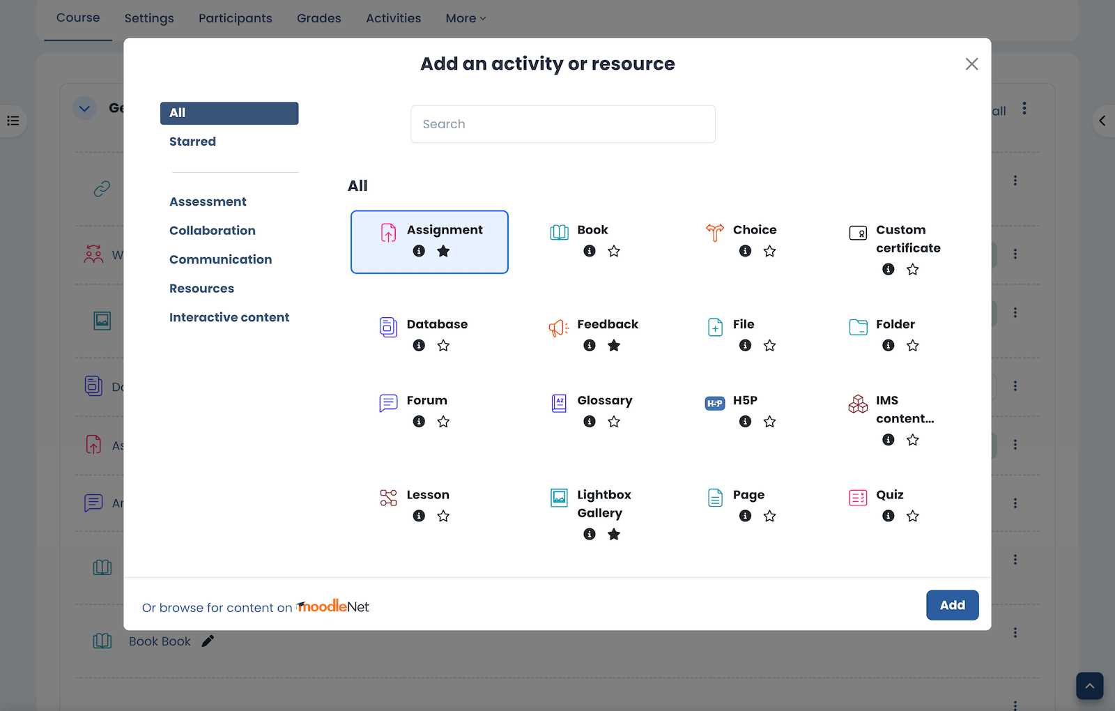
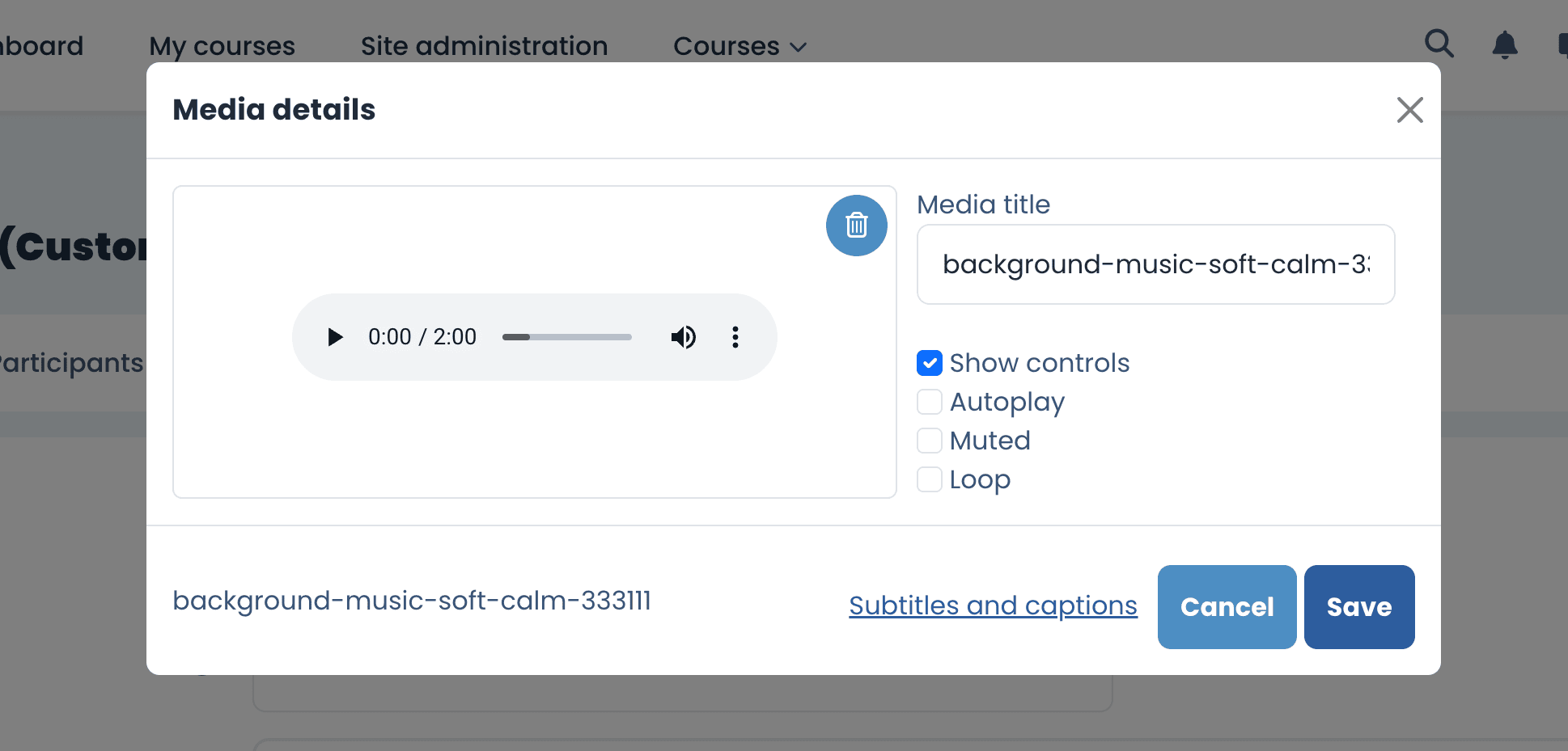
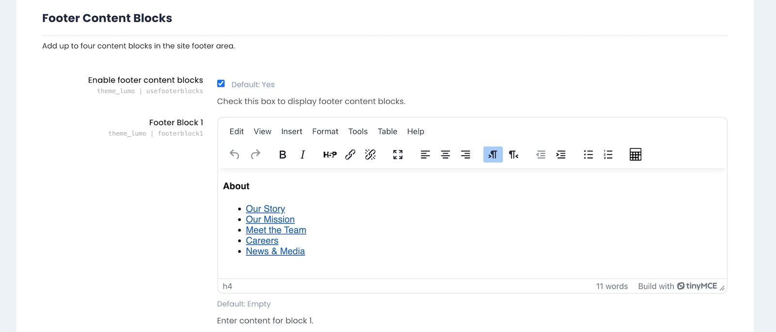
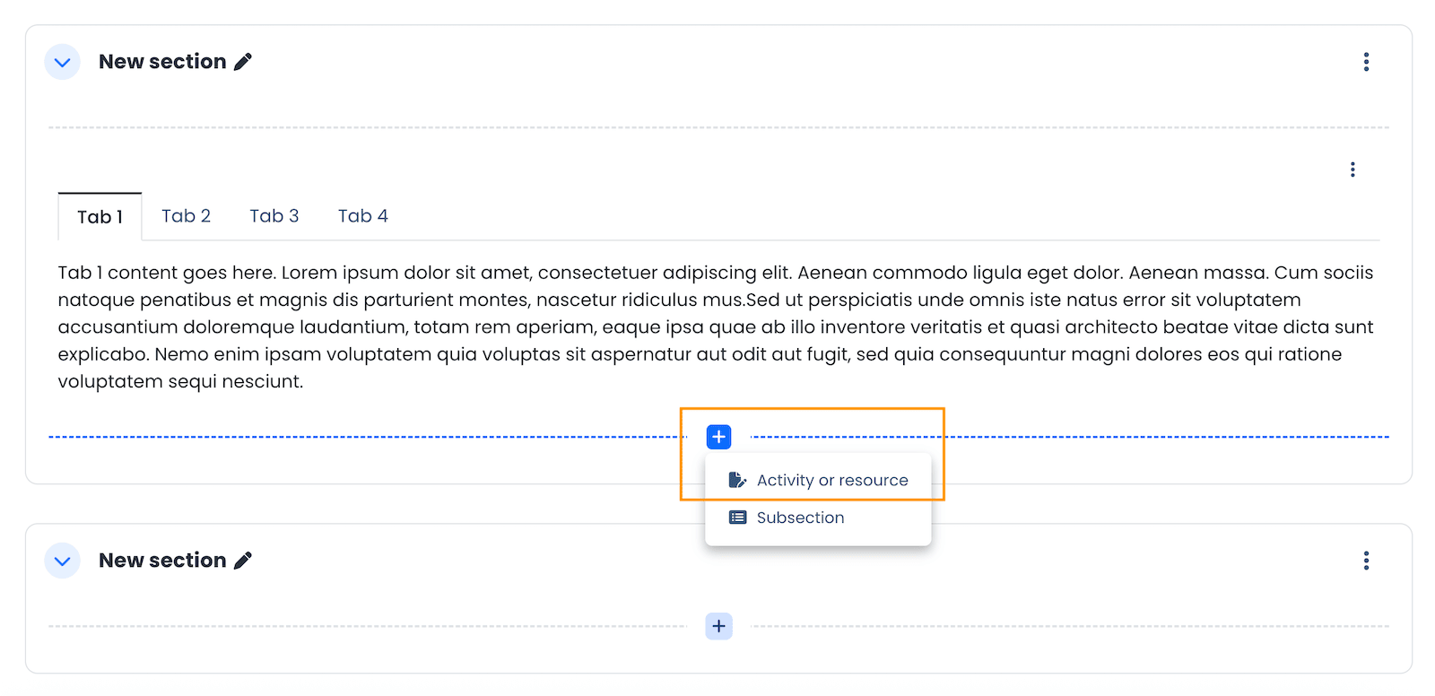
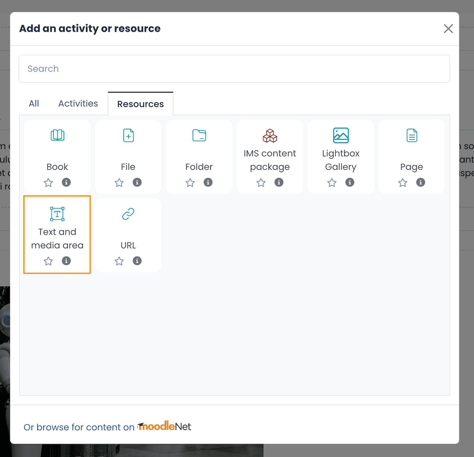
1. A Fresh “Add Activity or Resource” Modal Window Design
Moodle 5.1 has given the Add Activity or Resource window a significant UX update. The interface is now clearer, better organized, and faster to navigate, especially for course editors who add activities regularly.
New
(Moodle 5.1+)
Old
(Moodle 5.0 & 4.x)
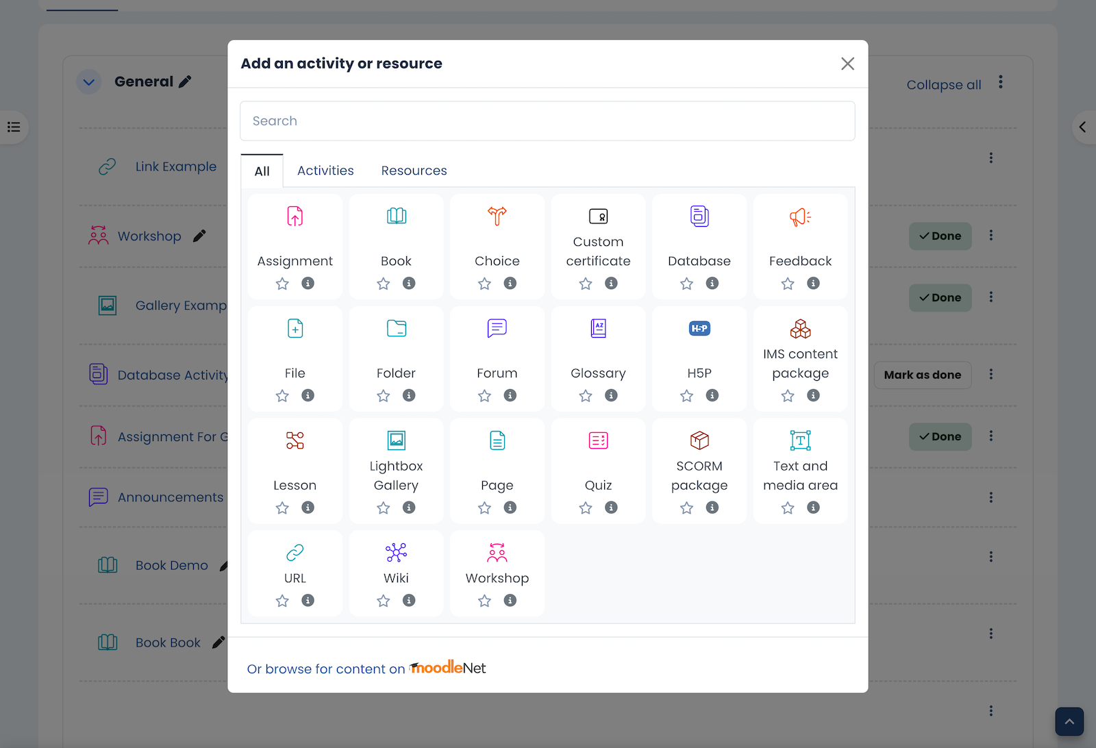
Key improvements include:
- New purpose categories to make browsing easier ( Moodle docs)
- Related activities added to categories ( Moodle docs)
- A more intuitive selection process ( Moodle docs)
- Extra information such as whether an activity is gradable ( Moodle docs)
- A new details panel for richer activity information ( Moodle docs)
Moodle Docs: Activity chooser improvements
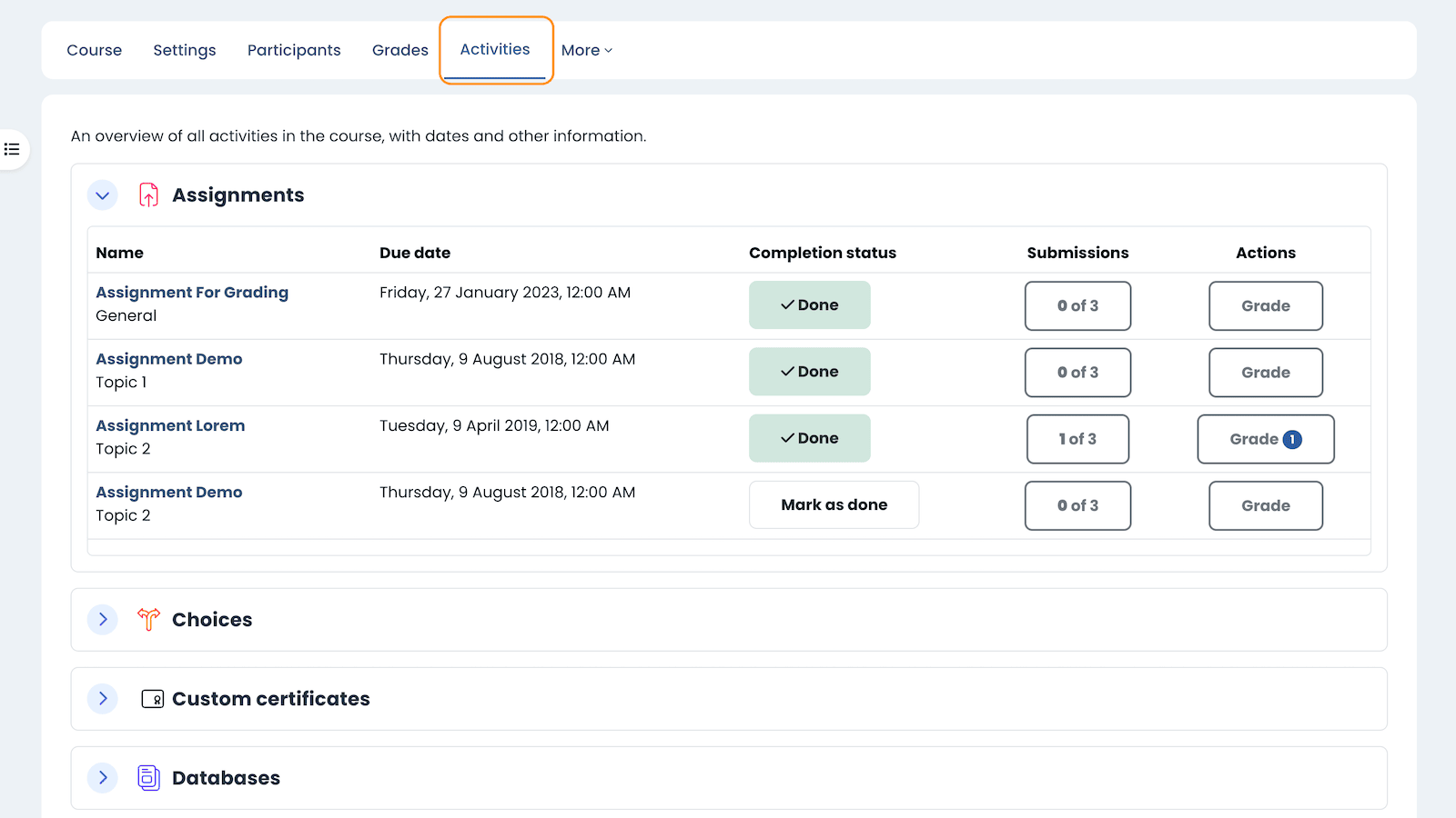
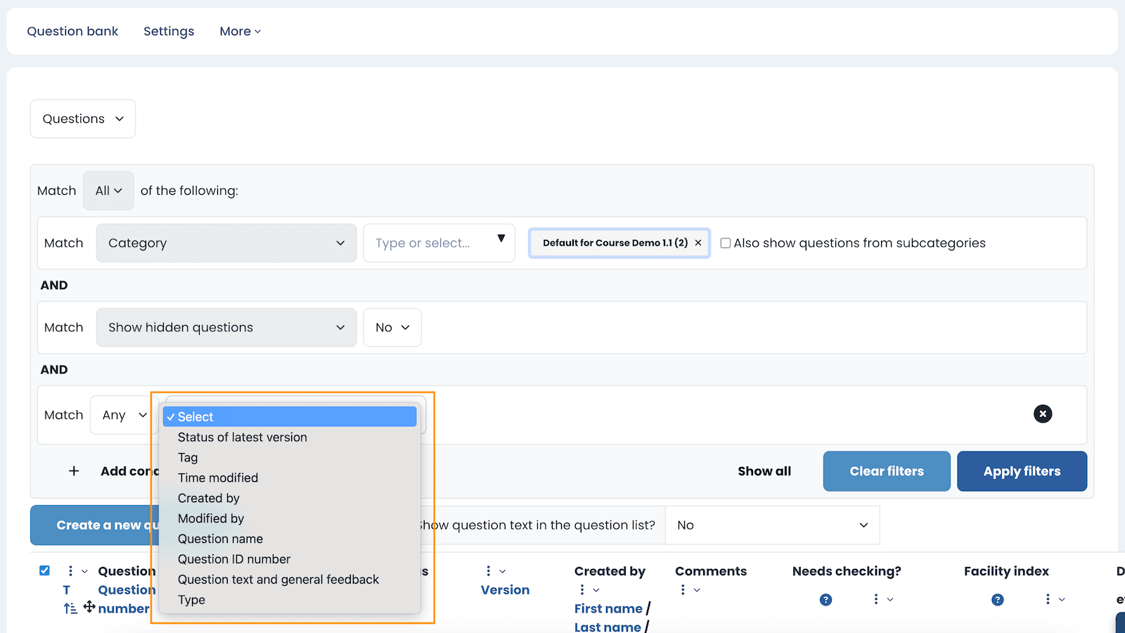
2. Improved Course Activities Overview Page
The Activities overview page, also known as the centralised course overview, was first introduced in Moodle 5.0. In Moodle 5.1 it has been expanded and polished to support more activity types and present course information in a clearer, more unified way.
To access it:
- Open a course.
- Click the Activities tab in the course navigation.
- You will see an overview of course activities grouped by activity type.
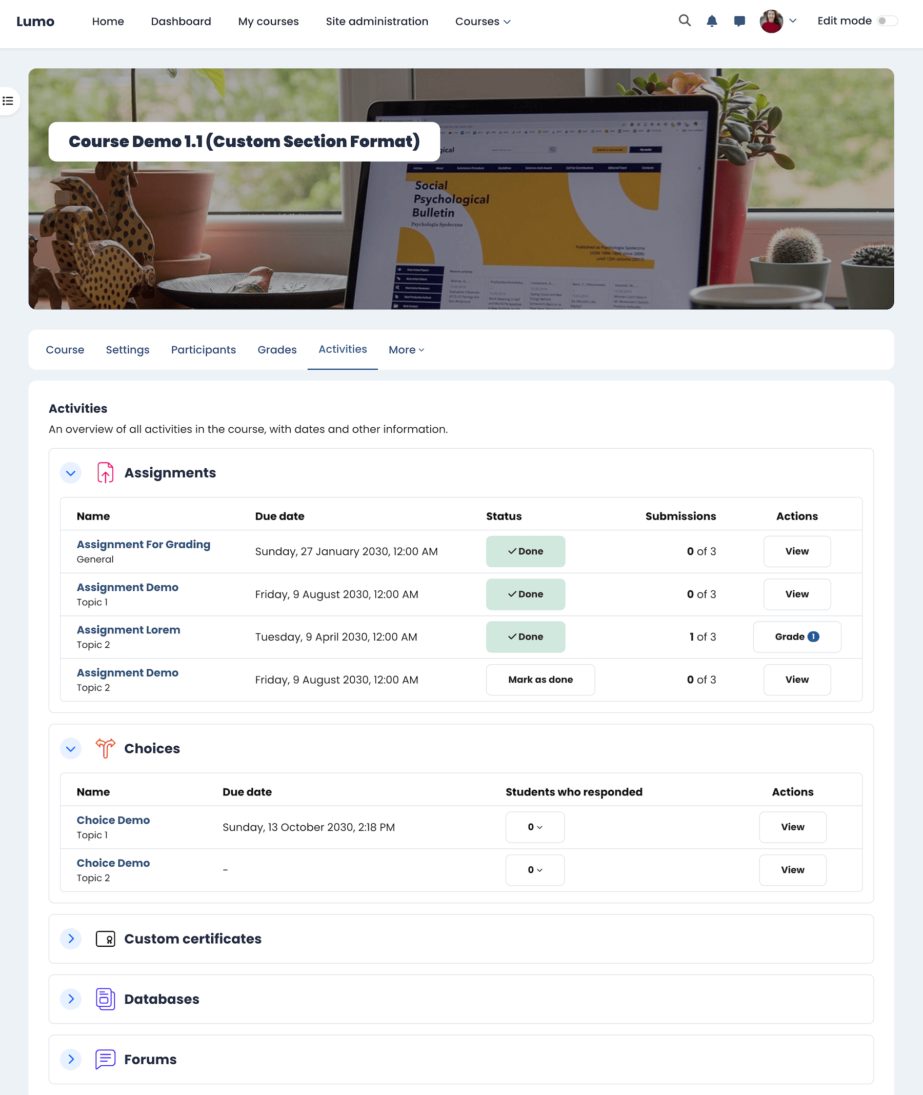
What is new in Moodle 5.1:
- The overview now supports many more activity types, including quiz, lesson, H5P, forum, workshop, choice, SCORM, glossary, database, and more.
- Teachers can view due dates and submission or grading status for activities like assignments and workshops.
- Students can quickly see due dates, completion requirements, and submission status in one place.
- The layout has been improved with better alignment and clearer date formatting.
This centralised view makes it easier for students to stay on top of their work and for teachers to track activity progress, especially in larger courses.
Moodle Docs: Activities overview | Moodle 5.1 release notes | Moodle HQ YouTube video
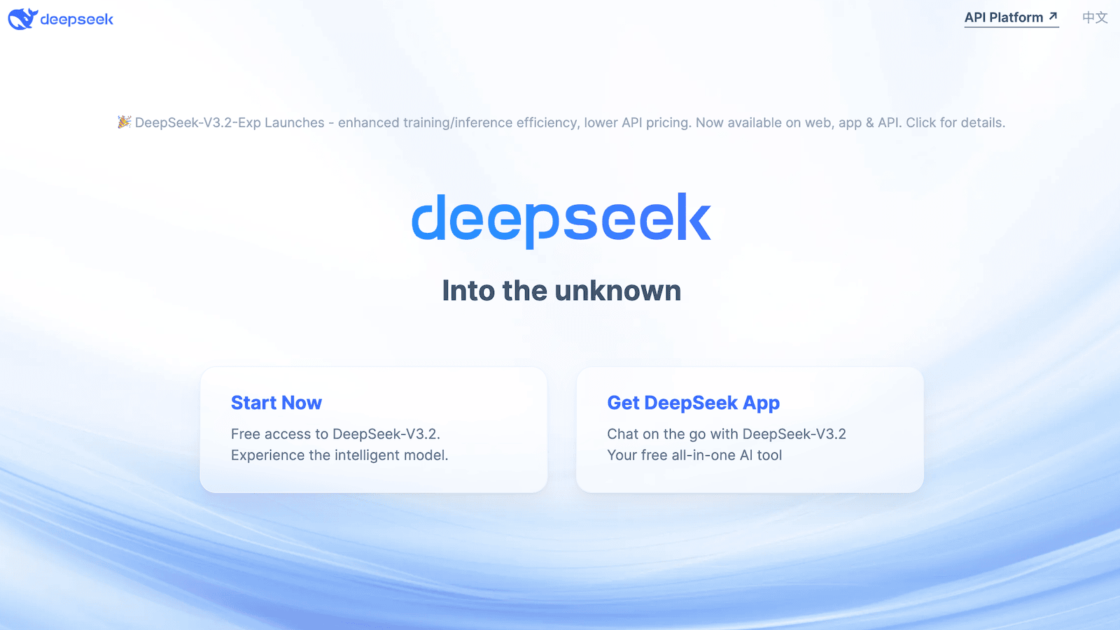
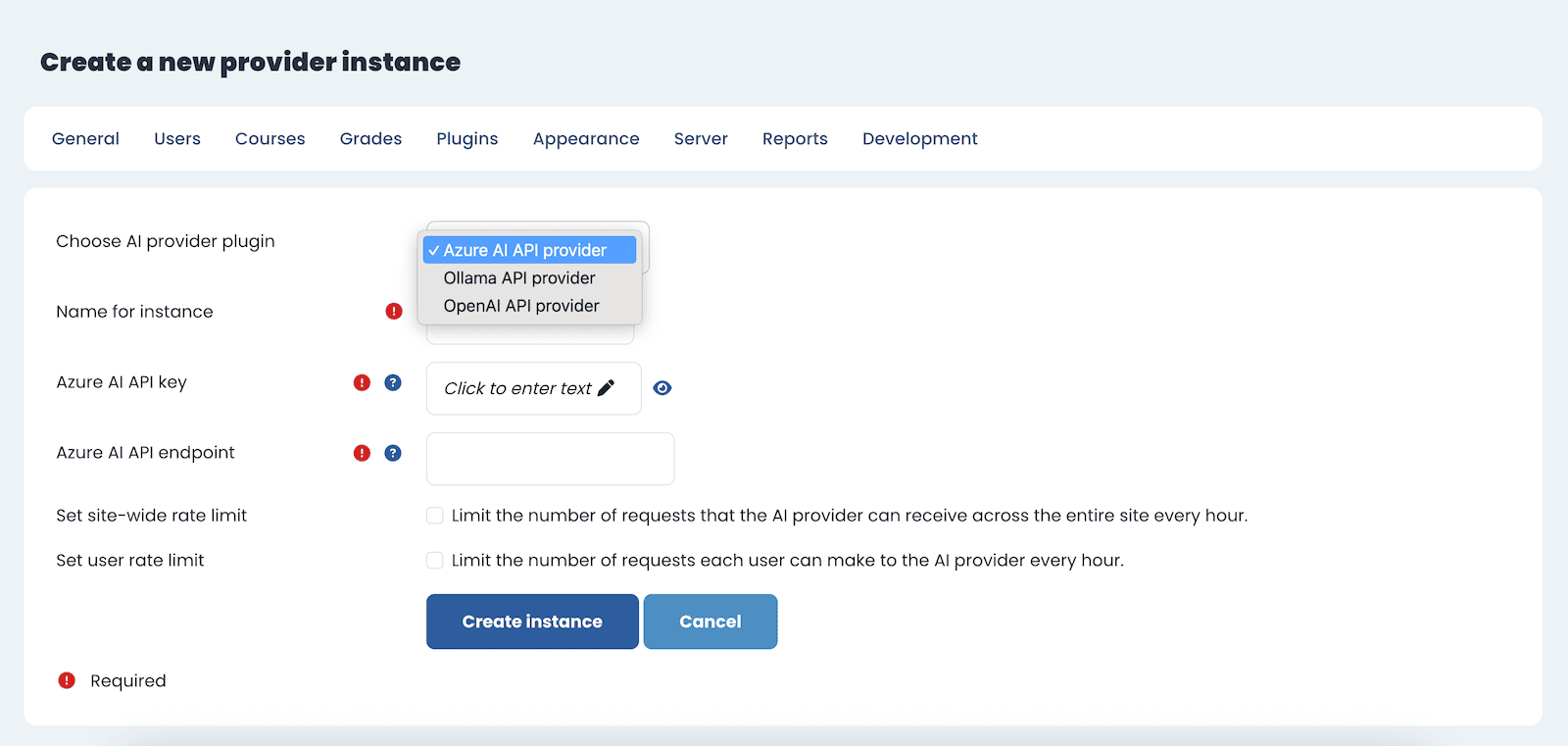
3. AI Integration (Deepseek Added)
Moodle 5.1 expands its built-in AI provider options by adding Deepseek to the list. This means institutions can integrate AI tools more flexibly, alongside providers like OpenAI.
AI features in Moodle 5.x can support:
- Text summarisation
- Generating draft content for activities
- Translation and language assistance
- Enhancing feedback workflows
While these features may not be relevant to every organisation yet, they are part of Moodle’s steady move toward intelligent learning environments.
Moodle Docs: AI new features and improvements
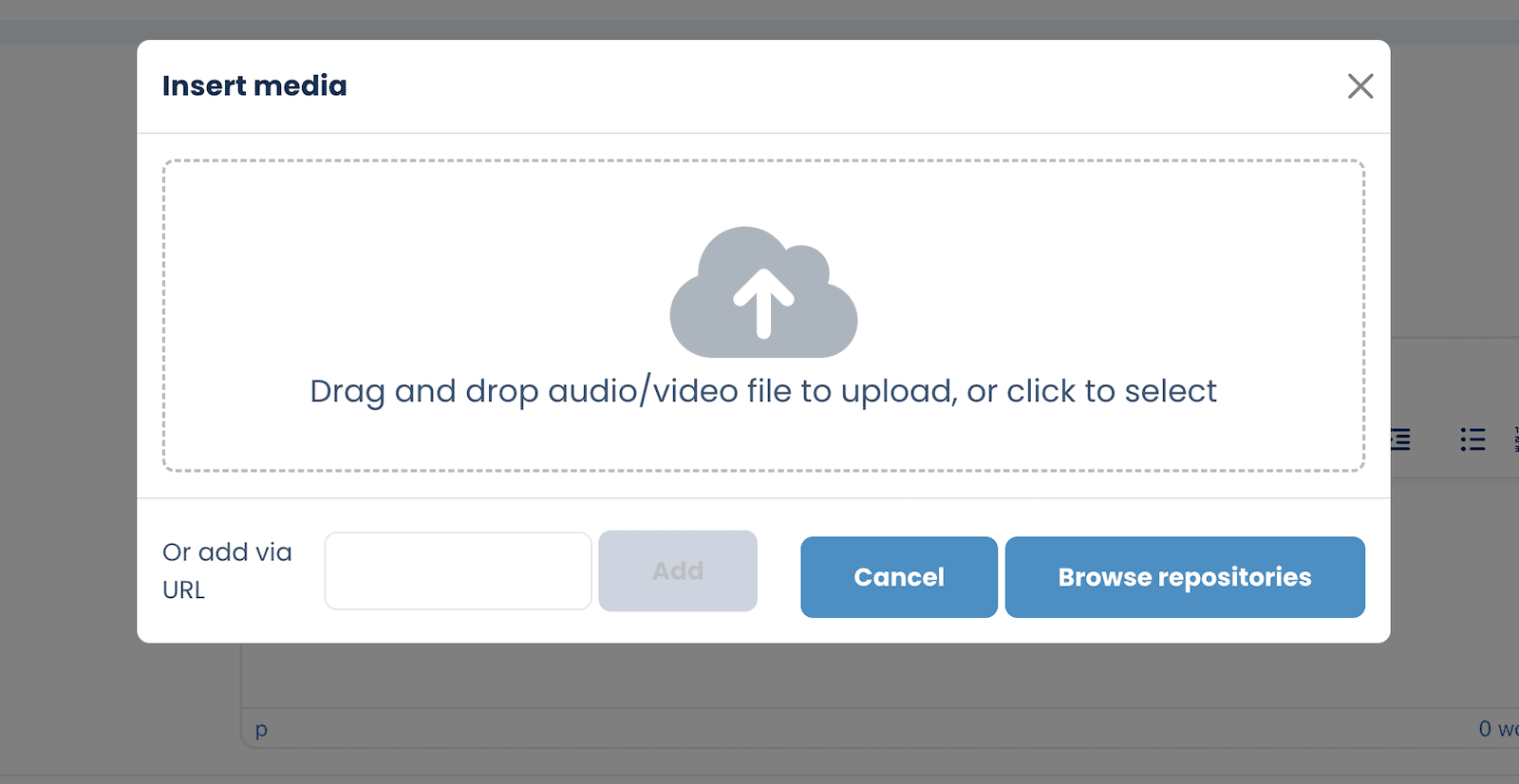
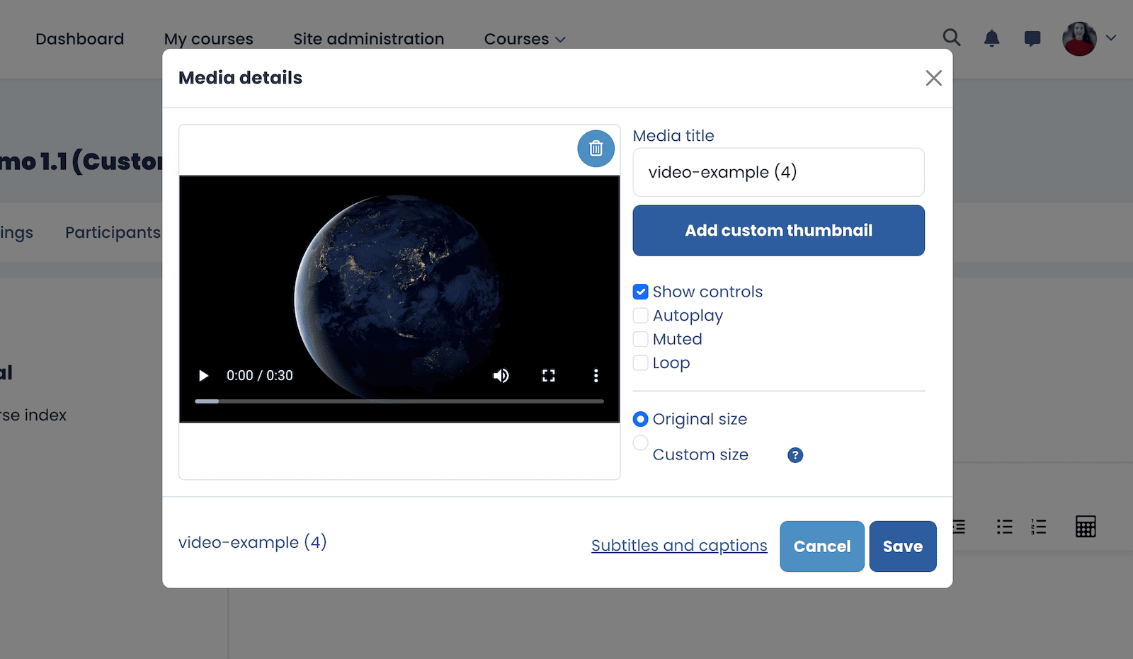
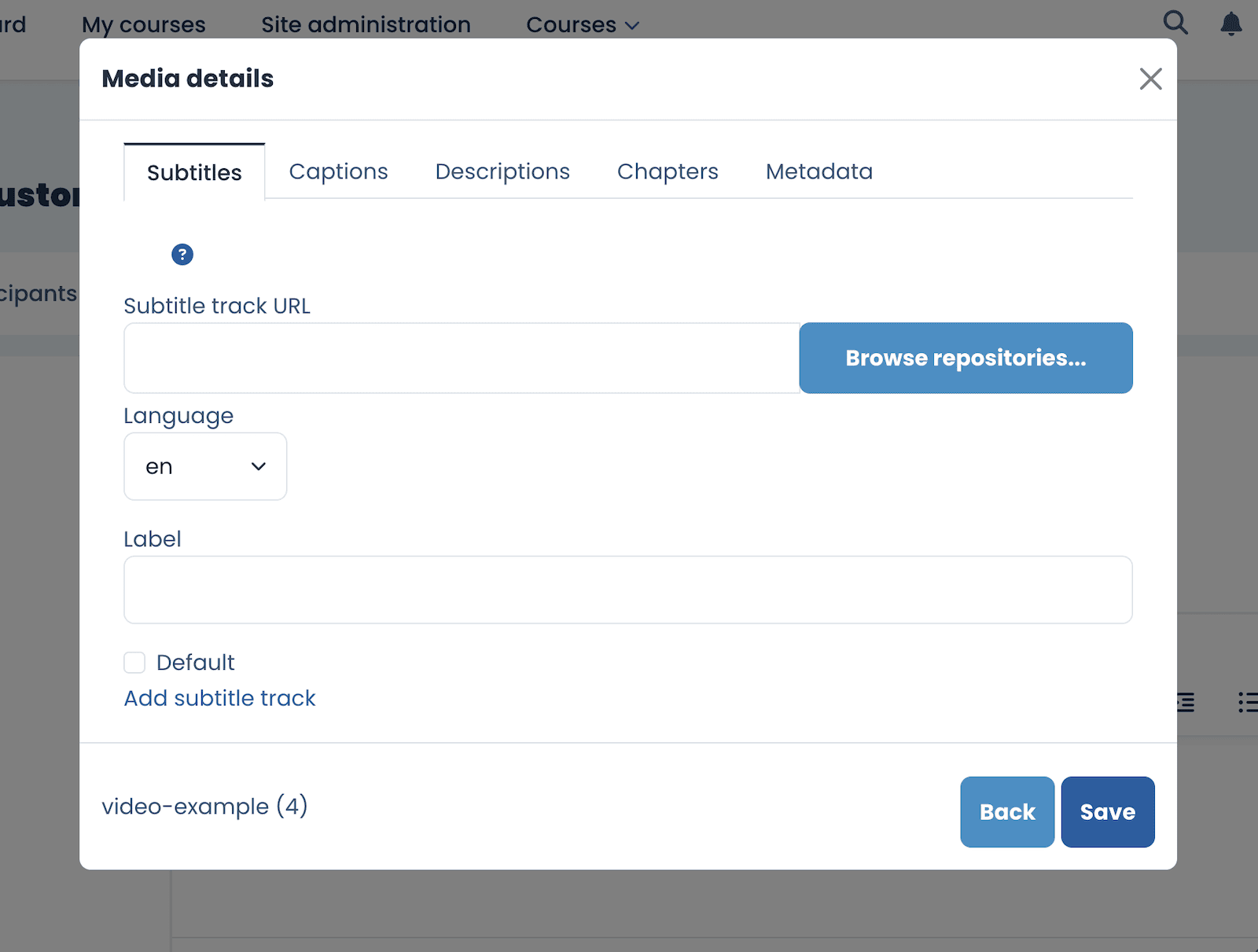
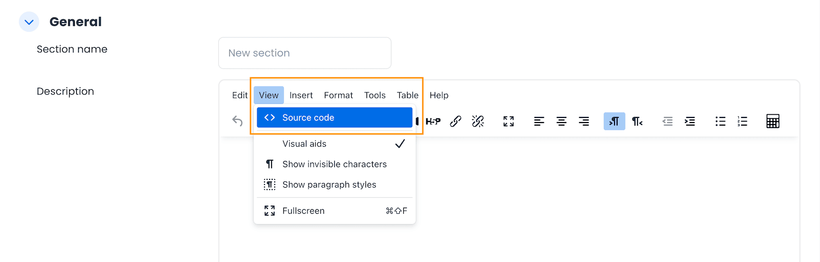
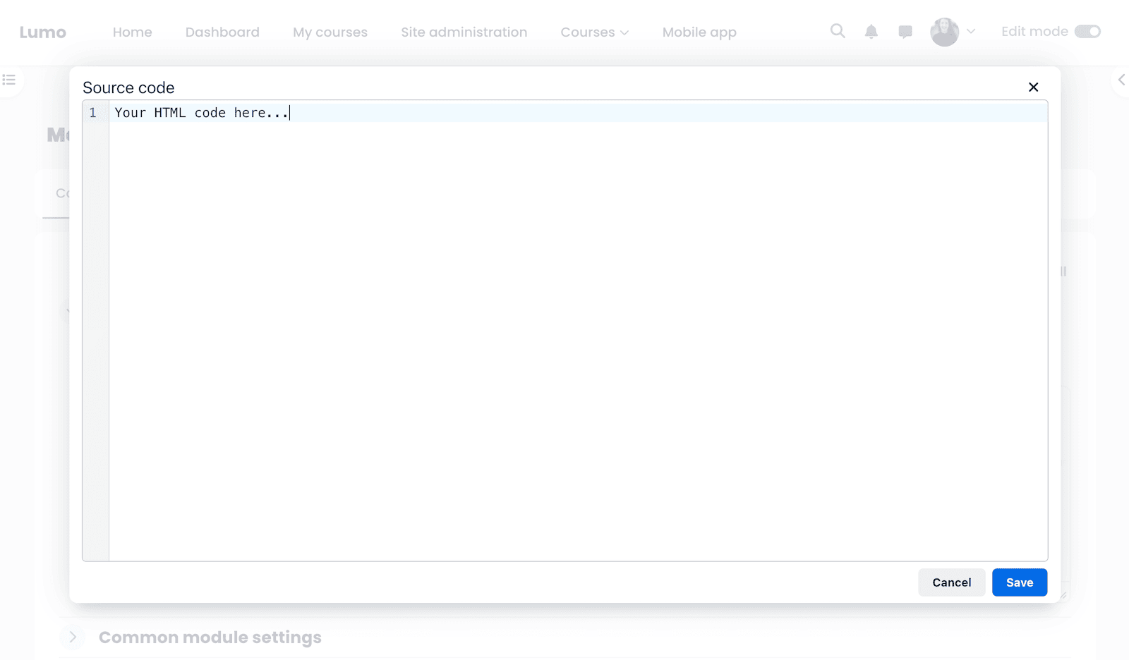
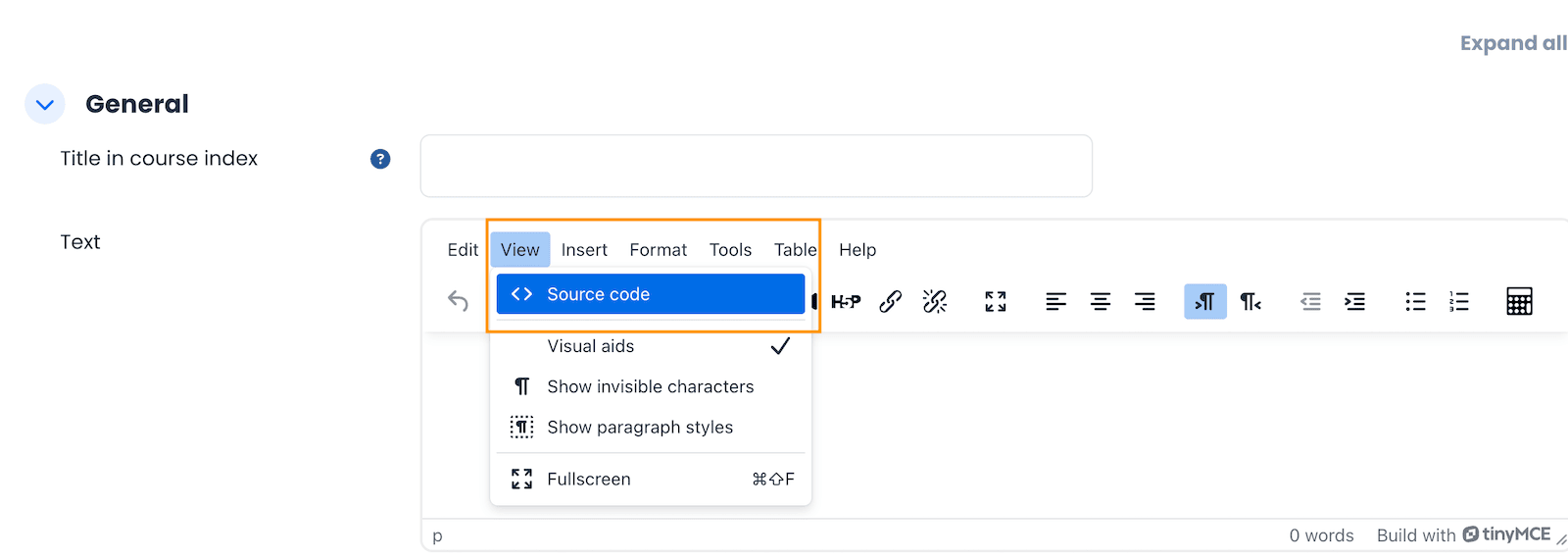
4. TinyMCE Editor Improvements
Moodle continues to modernise its editing experience. TinyMCE remains a key text editor in Moodle, and 5.1 brings several usability improvements for both teachers and students.
These include better formatting controls, cleaner toolbars, and a smoother writing experience overall. This makes it easier to add rich content in assignments, forums, pages, and other activity types.
Moodle Docs: TinyMCE improvements
5. Other Small but Handy Improvements
Moodle 5.1 also introduces a number of smaller UI and UX enhancements that make daily use more convenient.
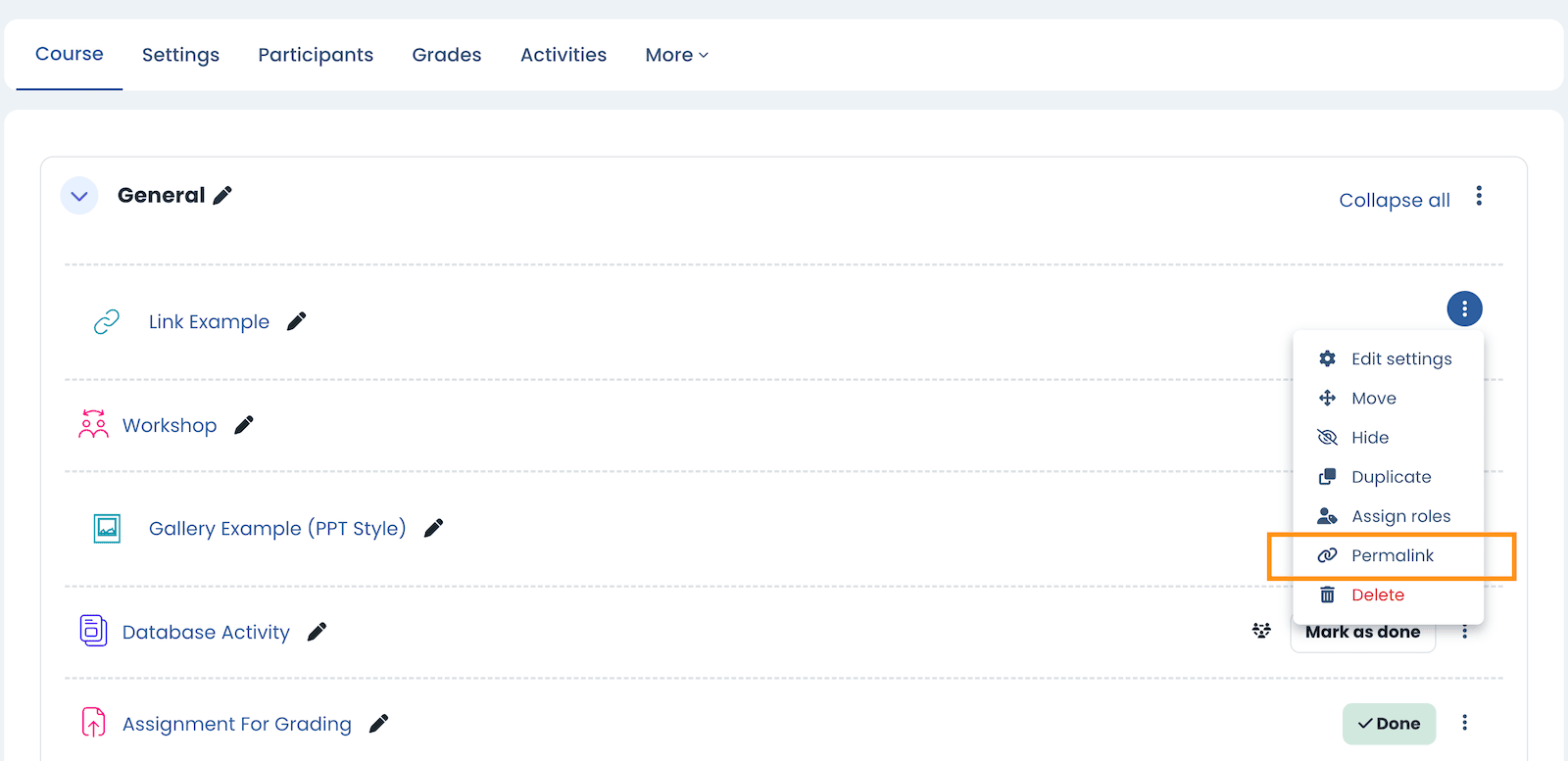
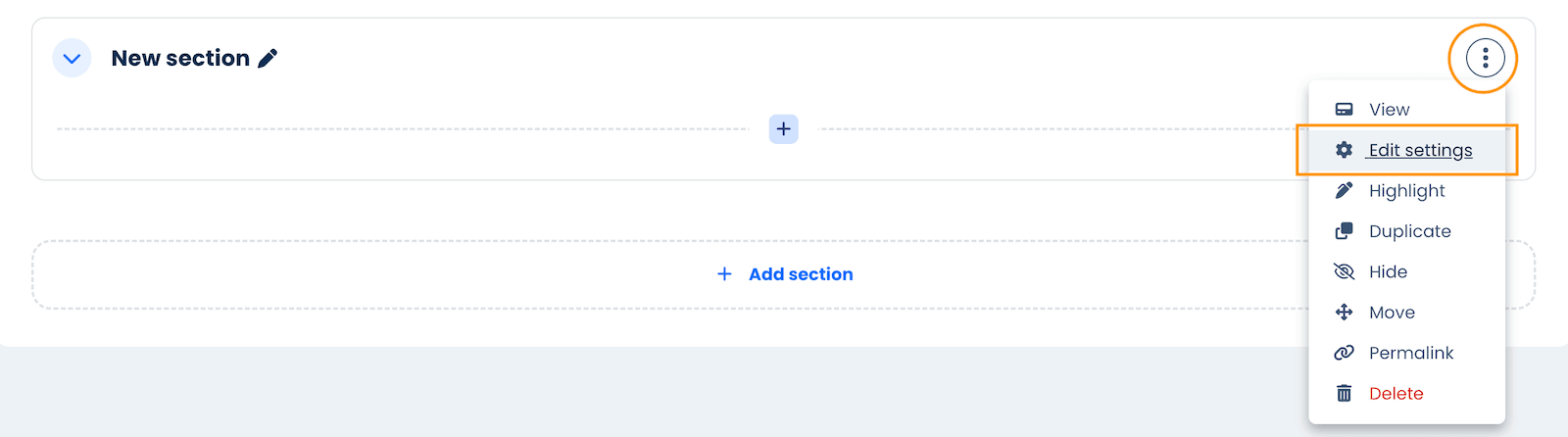
Permalink option in activity menus
When editing mode is on, you can now copy a direct link to any activity from the action menu. This makes it easy to share links in announcements, messages, or forums.
Assignments and Report Builder updates
Moodle 5.1 also includes updates to Assignments and Report Builder, making reporting and grading workflows smoother. Rather than listing everything here, you can read the full details in the release notes:
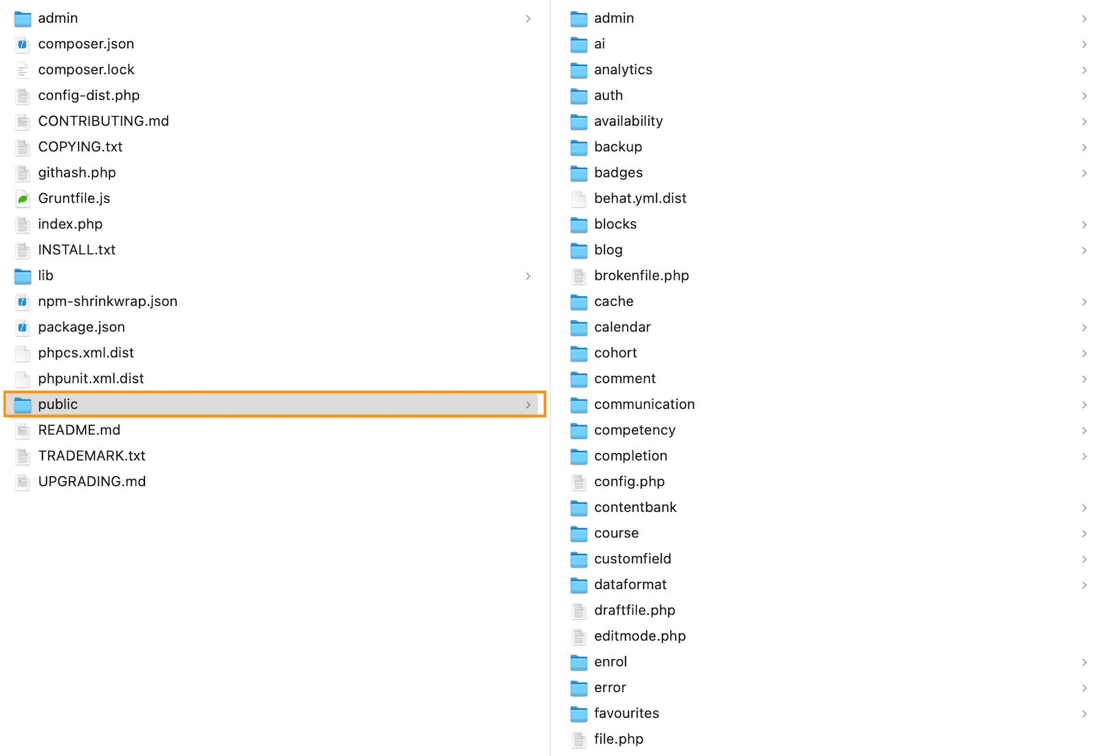
6. Major Change for Site Admins: Directory Restructure
A significant technical change in Moodle 5.1 is the introduction of a new /public directory and related file structure updates. This improves maintainability and helps Moodle follow more modern web application standards.
If you manage a Moodle site:
- Check any custom plugins or themes for compatibility.
- Review the directory restructure notes.
- Test on a staging site before upgrading your production instance.
This is a backend change, so it does not affect the day-to-day user experience but is important for administrators.
Final Thoughts
Moodle 5.1 is not a radical redesign, but it is a thoughtful step forward. The new activity chooser design, the expanded activities overview page, AI integration, and smaller UX enhancements all add up to a more modern and efficient Moodle experience.
For universities, companies, and training providers still on Moodle 4.x, now is a good time to plan the upgrade.


