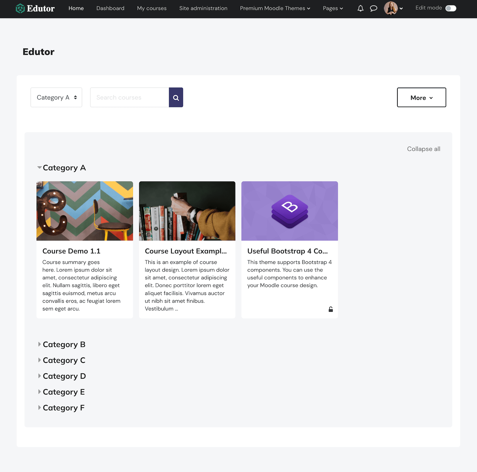
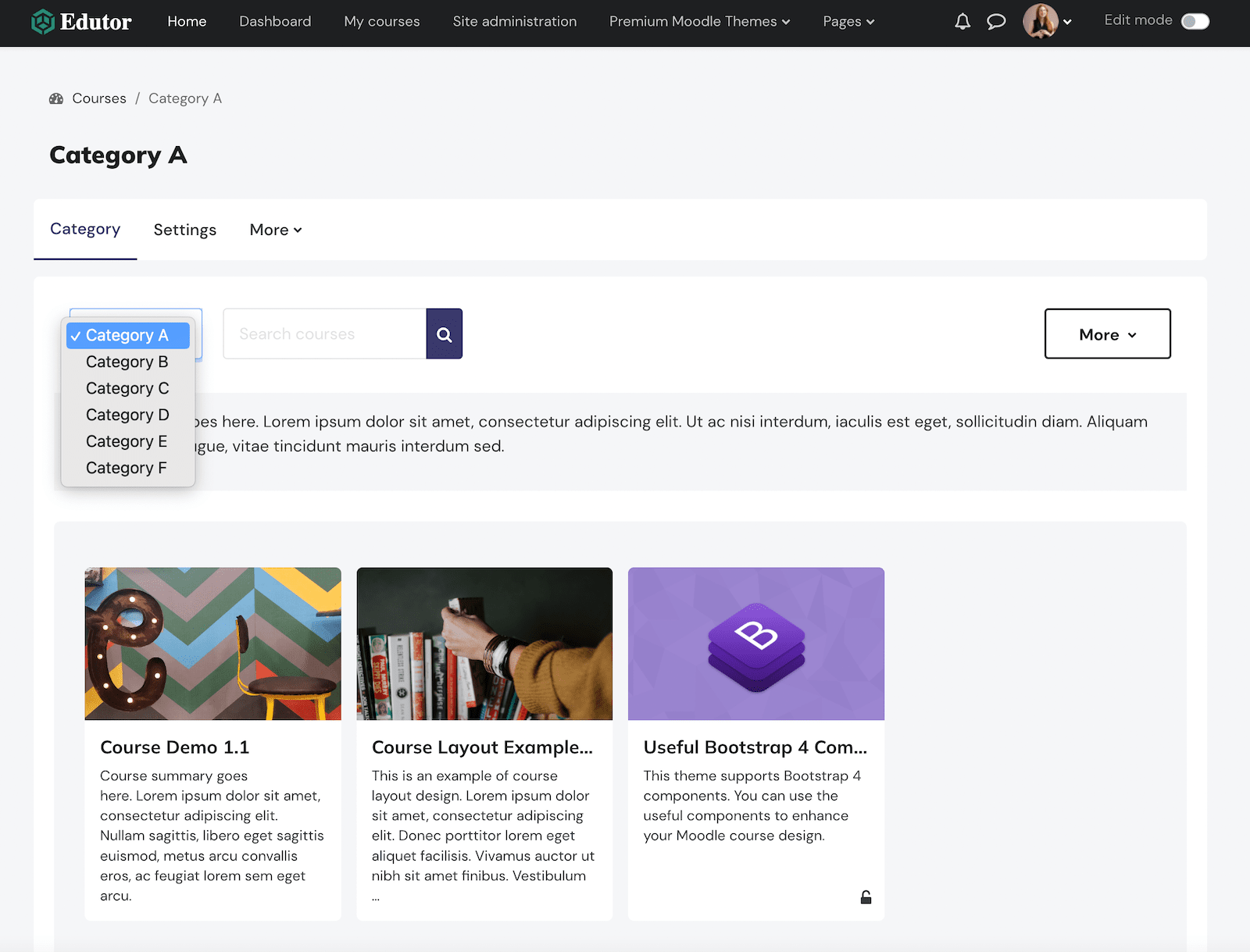
Moodle 4.x is finally here. It has a brand new look and contains lots of sought-after UX features and improvements. Now you can add a responsive custom menu which stays in the header area for desktop and mobile devices. In Moodle 3.x the custom menu is not responsive and Moodle displays all the menu items in the footer area as a flat list (in mobile view).
Custom Menu In Moodle 5 & 4.x
The screencast below was taken from our Moodle demo using the Edutor theme. As the screen viewport decreases in size, the custom menu will generate a “More” dropdown menu to hold all the menu items which are not able to fit in the space. When in mobile view, Moodle 4.x uses the mobile menu to hold all the custom menu items.

Add A Custom Menu
To add a custom menu you need to go to the “Theme settings” page: Site administration > Appearance > Themes > Theme settings
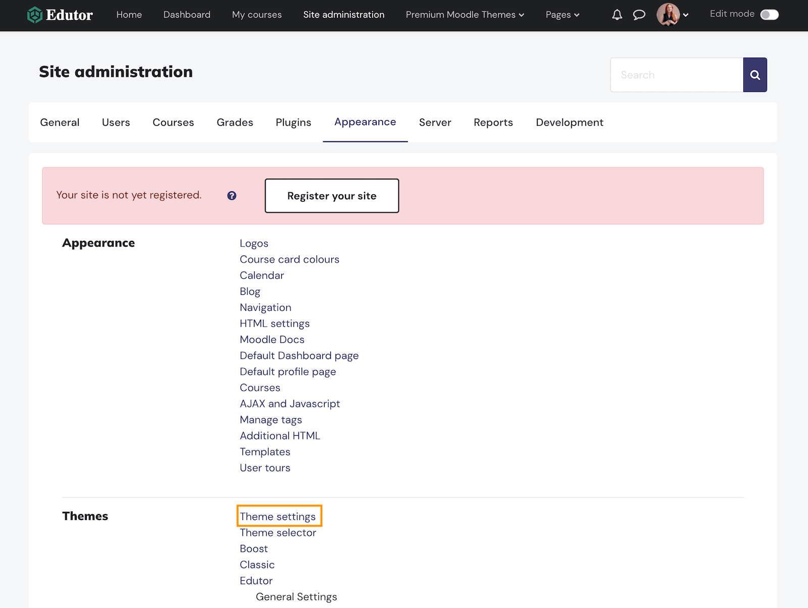
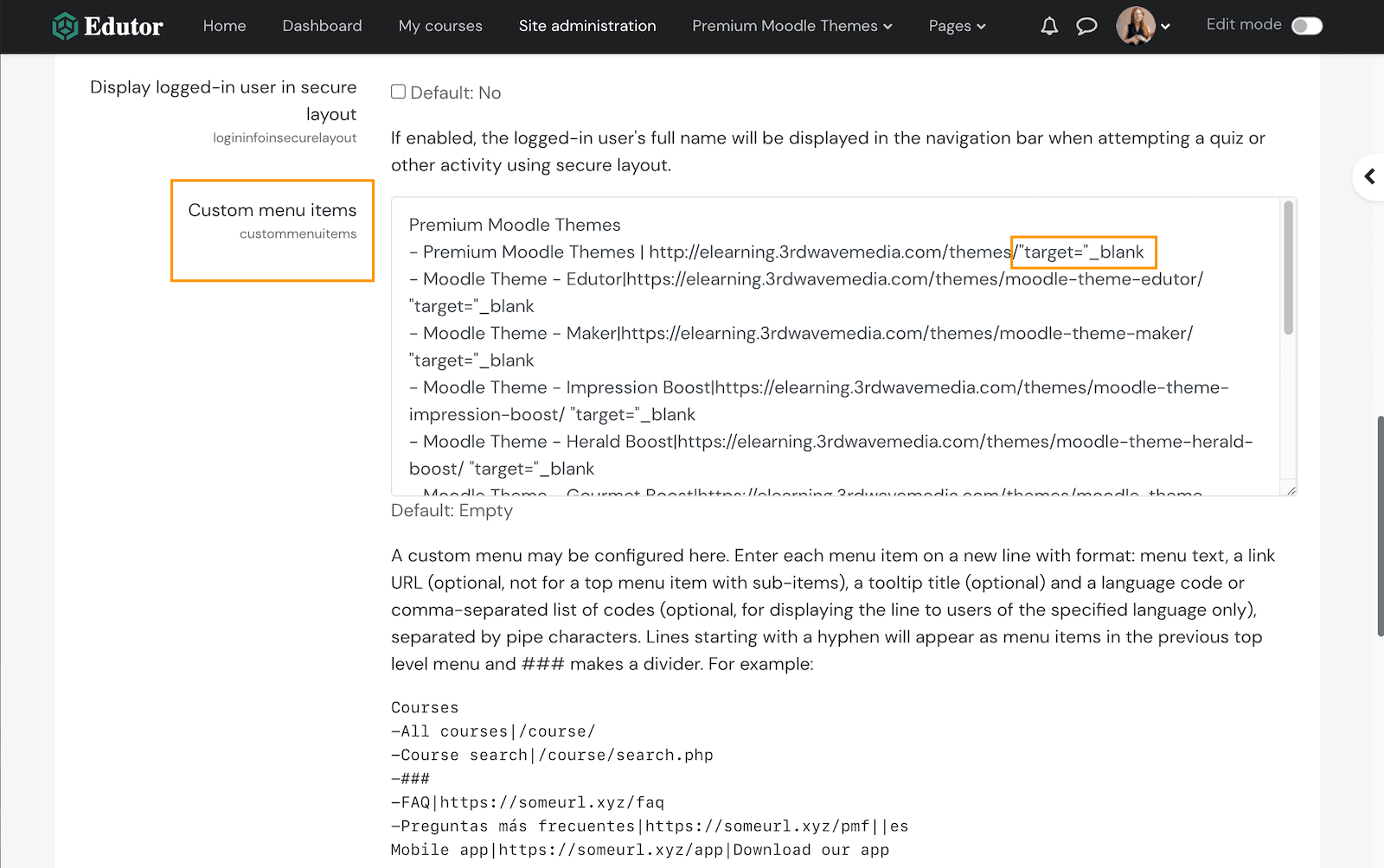
On the “Theme settings” page you can enter your menu items in the “Custom menu items” field.
If you want the menu item to open in a new browser window you can add "target="_blank at the end of the URL.
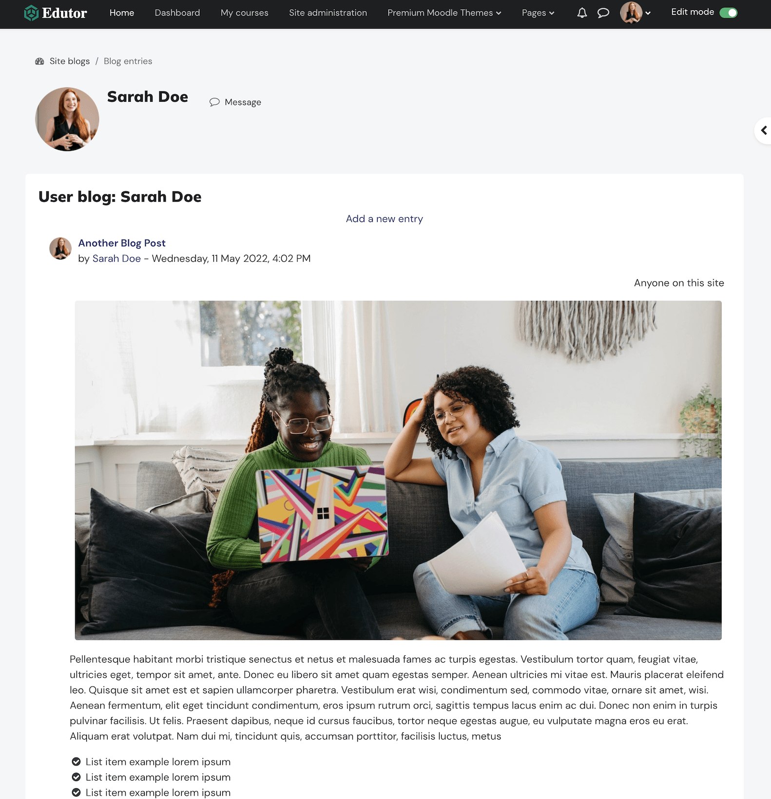
Useful Moodle Links
You can also add page links inside of your Moodle site. Below is a list of useful URLs for some popular Moodle pages:
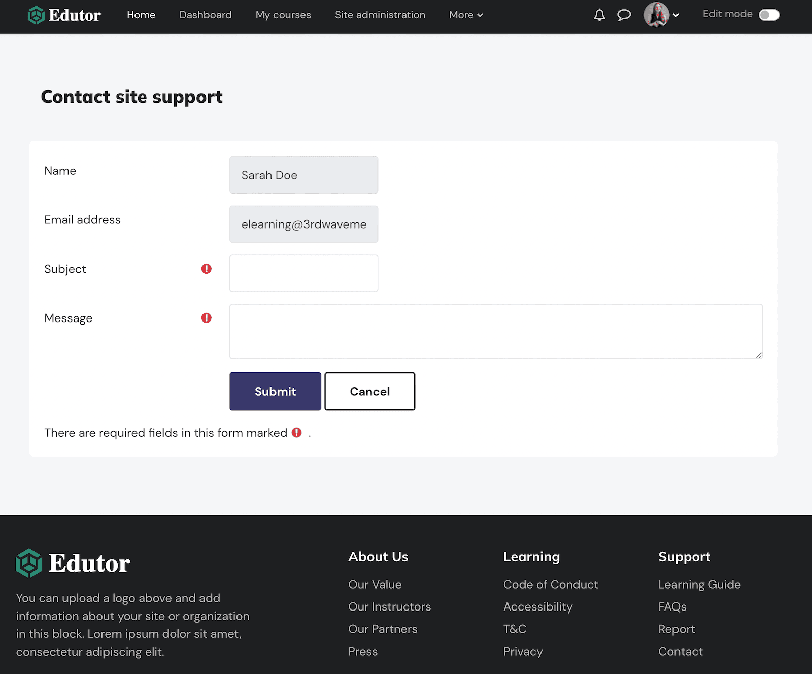
All Courses | /course
Course Category (ID:1) | /course/index.php?categoryid=1
Blog | /blog/
Contact support | /user/contactsitesupport.php
All Courses
Course Category
Blog
Contact Support