Custom CSS for Changing Moodle Theme Labland’s Colour Scheme
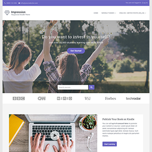
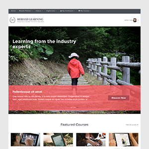
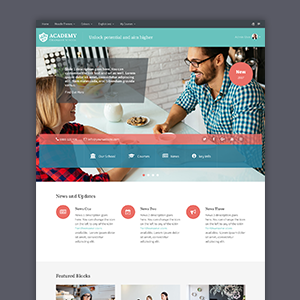
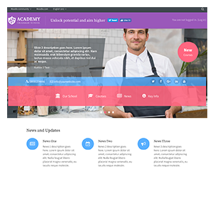
This product is deprecated and no longer available. Looking for a Boost-based Moodle theme? Checkout our new products. Responsive Moodle theme Labland is designed for corporations/businesses. It comes with 4 default colour schemes. If the default colour scheme doesn’t fit …