Moodle 4.4 has brought some great improvements to the course page design, making it even more intuitive to use. Whether you’re a student or a teacher, these new UI and UX features are designed to improve your learning and teaching experience. Let’s take a quick look!
Sectioned Course Layout
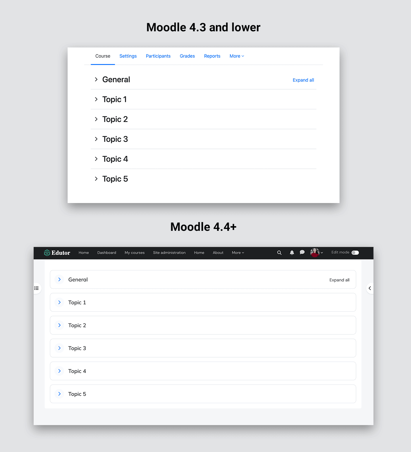
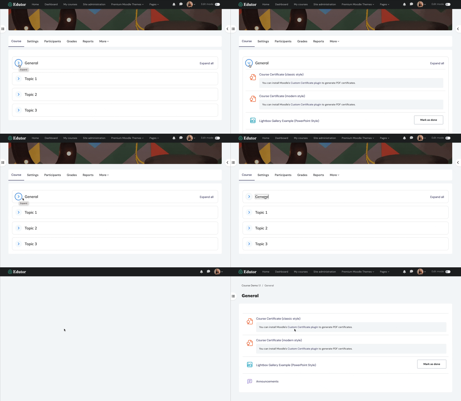
Course content is grouped into clear sections, which can be expanded or collapsed.

Clicking the section title now takes you directly to the section content on a new page. This ensures that students can focus on their desired content without any distractions.

Improved Course Activity/Resource Icons
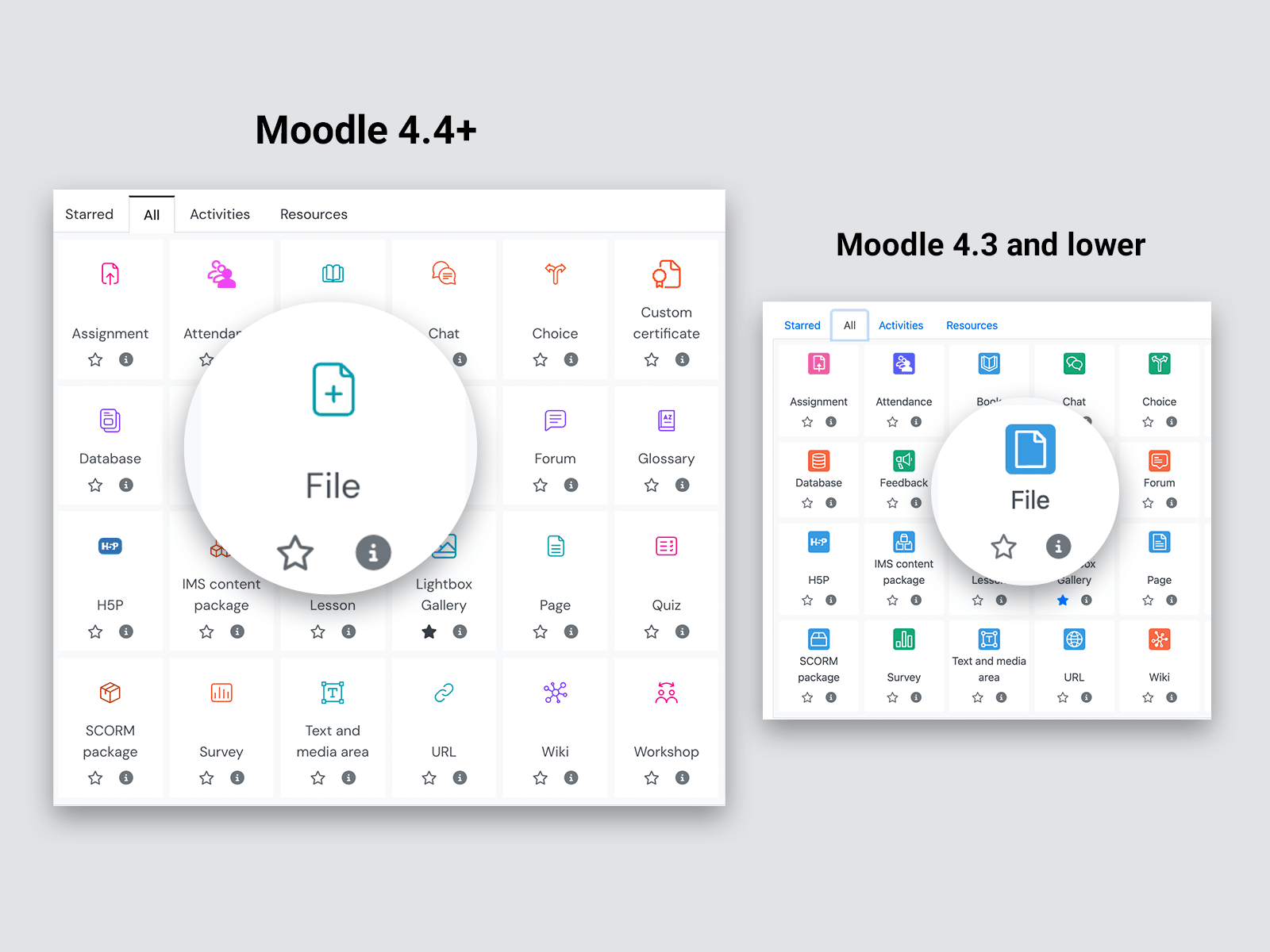
Moodle 4.4 now uses streamlined line icons for course activities and resources, enabling students to quickly identify each item and understand the required actions. This update simplifies navigation through course materials, making it easier for students to find the activities and resources they need.

New Course Format Settings
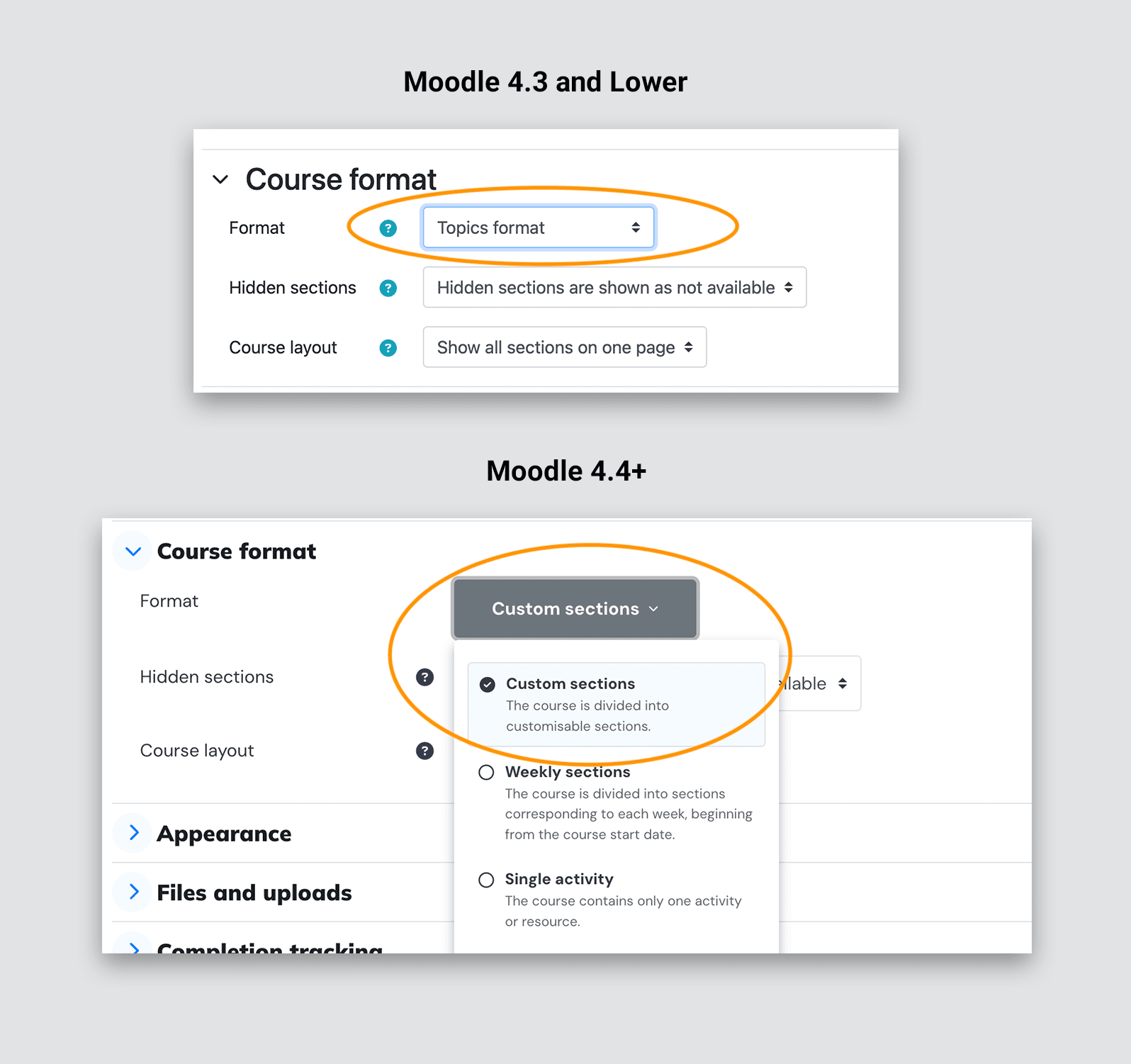
Starting with Moodle 4.4, the previous ‘Topics Format’ course format has been replaced by the ‘Custom Sections Format’.

Want to see the new features in action? You can log into our Moodle theme’s live demo here to check out the new course page features.
