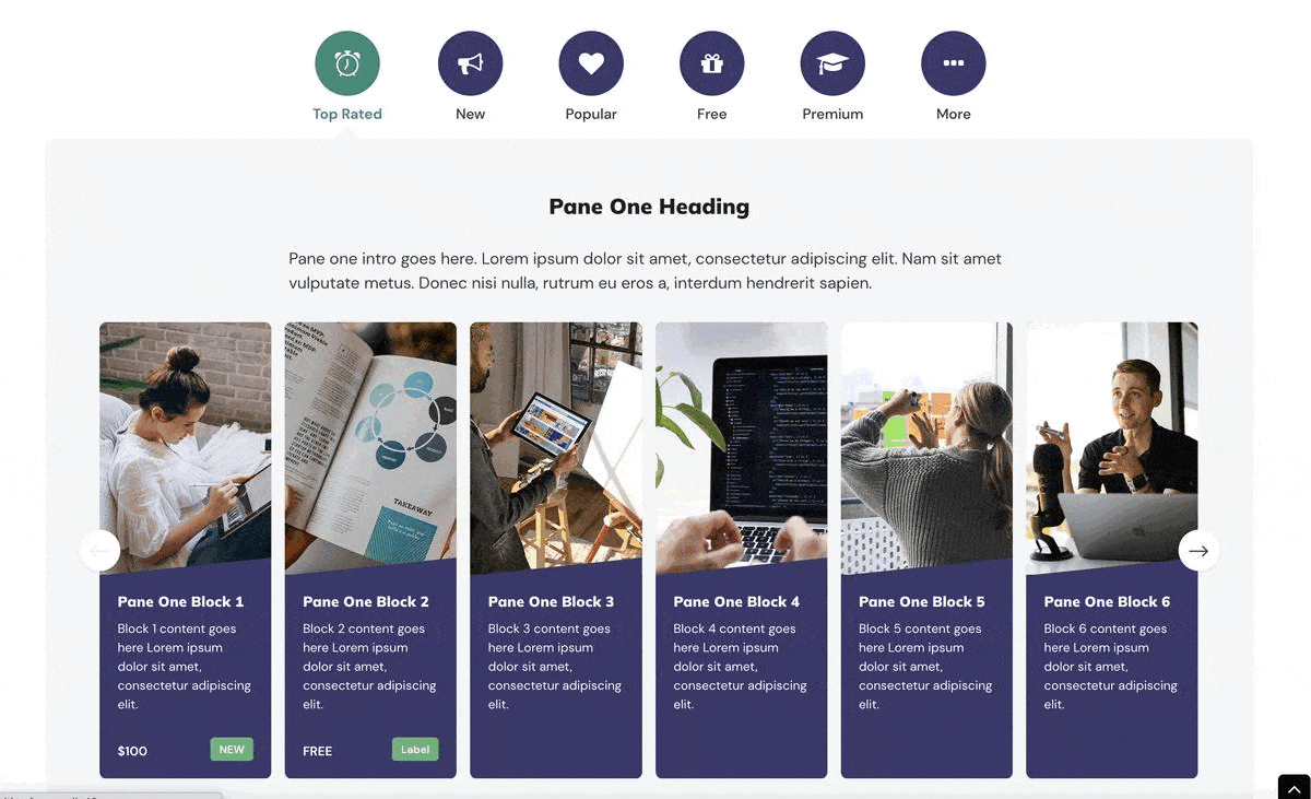
Edutor is our latest premium Moodle theme developed and designed for corporate training and university learning sites. In release v1.3 we added new theme settings for site admin to fine tune the display of the Front Page Featured Section slider. Prior to Edutor v1.3, the number of visible pane blocks in the sliders were dictated by the theme. From Edutor v1.3, site admin will be able to configure how many pane blocks are visible based on different screen sizes.
You can find the new settings here: Site administration > Appearance > Themes > Edutor > Frontpage Featured Section General
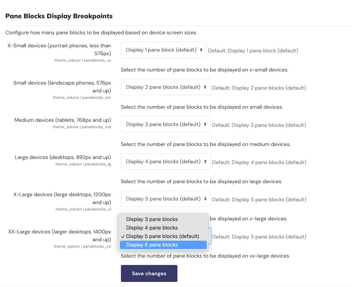
Site admin will be able to make the display of the visible pane blocks respond to different user devices. Also the maximum number of blocks visible to users on large devices (screen size 1200px and up) can be set to 6 instead of 5 (default).
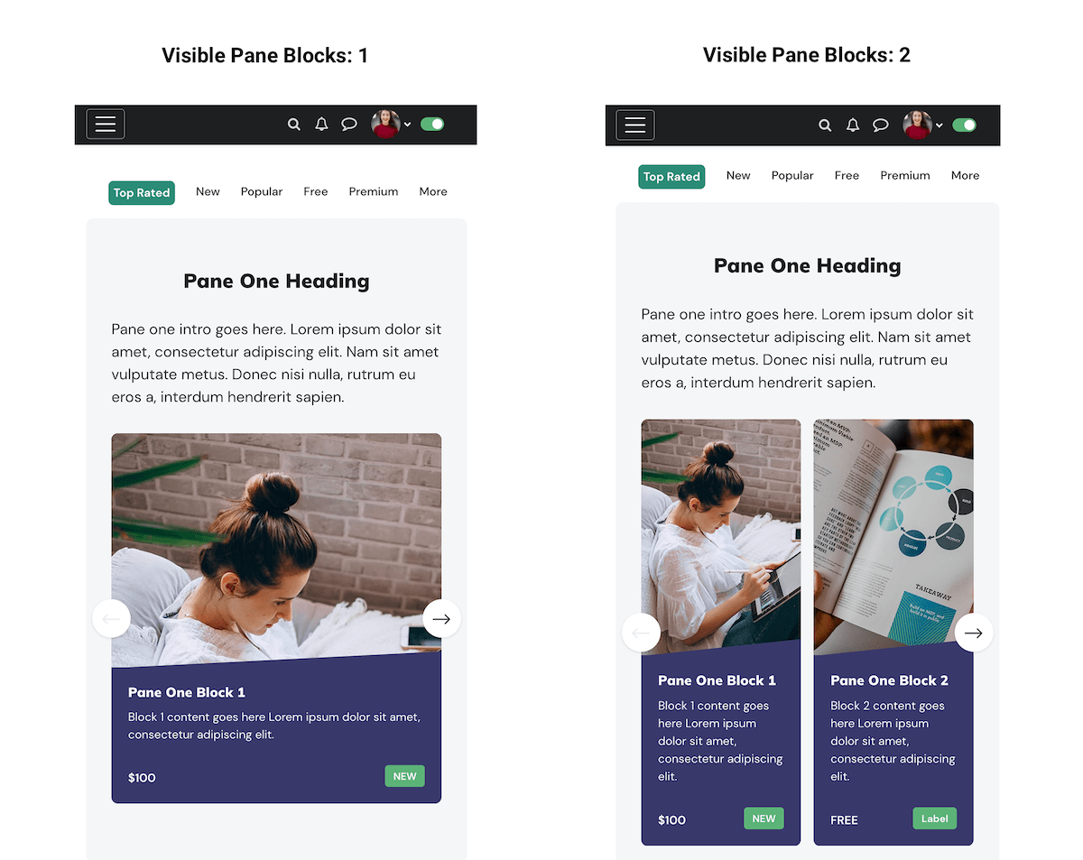
Below are some visual examples to show the display options on a mobile phone (portrait view) and a larger desktop/laptop.
X-Small devices (portrait phones, less than 576px)
XX-Large devices (larger desktops, 1400px and up)