
If you’re upgrading to Moodle 5 or starting a new Moodle project, there’s great news: Moodle 5 is now built with Bootstrap 5! (Earlier Moodle 4.x versions were based on Bootstrap 4.) This upgrade brings exciting opportunities for course creators and designers, because you can now use the latest Bootstrap 5 components inside your Moodle 5 courses to create more interactive, organized, and visually engaging content.
To help you get started, we’ve created a demo course on our Moodle 5 demo site using our premium Moodle 5 themes: Lumo, Edutor, and Maker. All three themes are built on the latest Boost theme and fully support Bootstrap 5.
In this guide, we’ll show you how to add Bootstrap 5 components to your Moodle 5 course pages. These steps work with any Boost-based Moodle 5 theme, including ours.
Why Use Bootstrap 5 Components in Moodle 5?
With Bootstrap 5 now fully integrated into Moodle 5’s front-end framework, you can:
- Create tabs, carousels, cards, alerts, and other modern UI elements without custom plugins.
- Organize content better inside your courses for a smoother learner experience.
- Make your courses look more professional and engage learners more effectively.
- Even better, if you’re using a theme like Lumo, the components will blend beautifully with the theme’s design system.
How to Add Bootstrap 5 Components to Moodle 5 Courses
You can add Bootstrap 5 components into your Moodle 5 course pages by inserting HTML code either in a Section Description or a Text & media area (formerly known as a Label). Here’s how:
1. Adding Code to a Section Description
- Log in to your Moodle site as a teacher.
- Go to your course and Turn editing on.
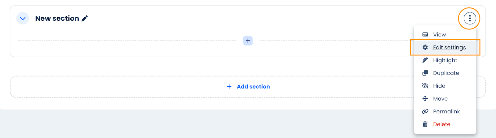
- Click the “Edit” button (three dots) to the right of the section title and choose “Edit Settings”.
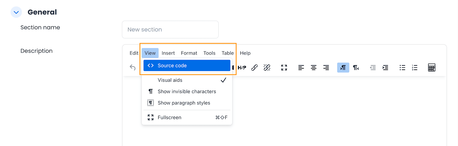
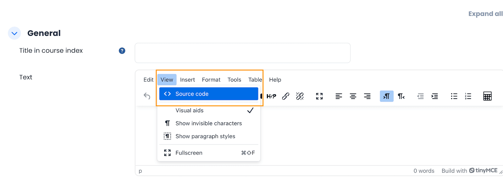
- In the Description field, click the View button and select <> Source code from the dropdown.
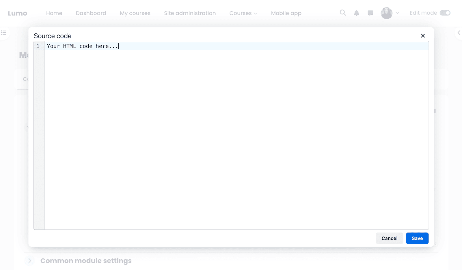
- Paste your Bootstrap 5 HTML code into the Source Code editor, save, and your component will appear directly in the course section.
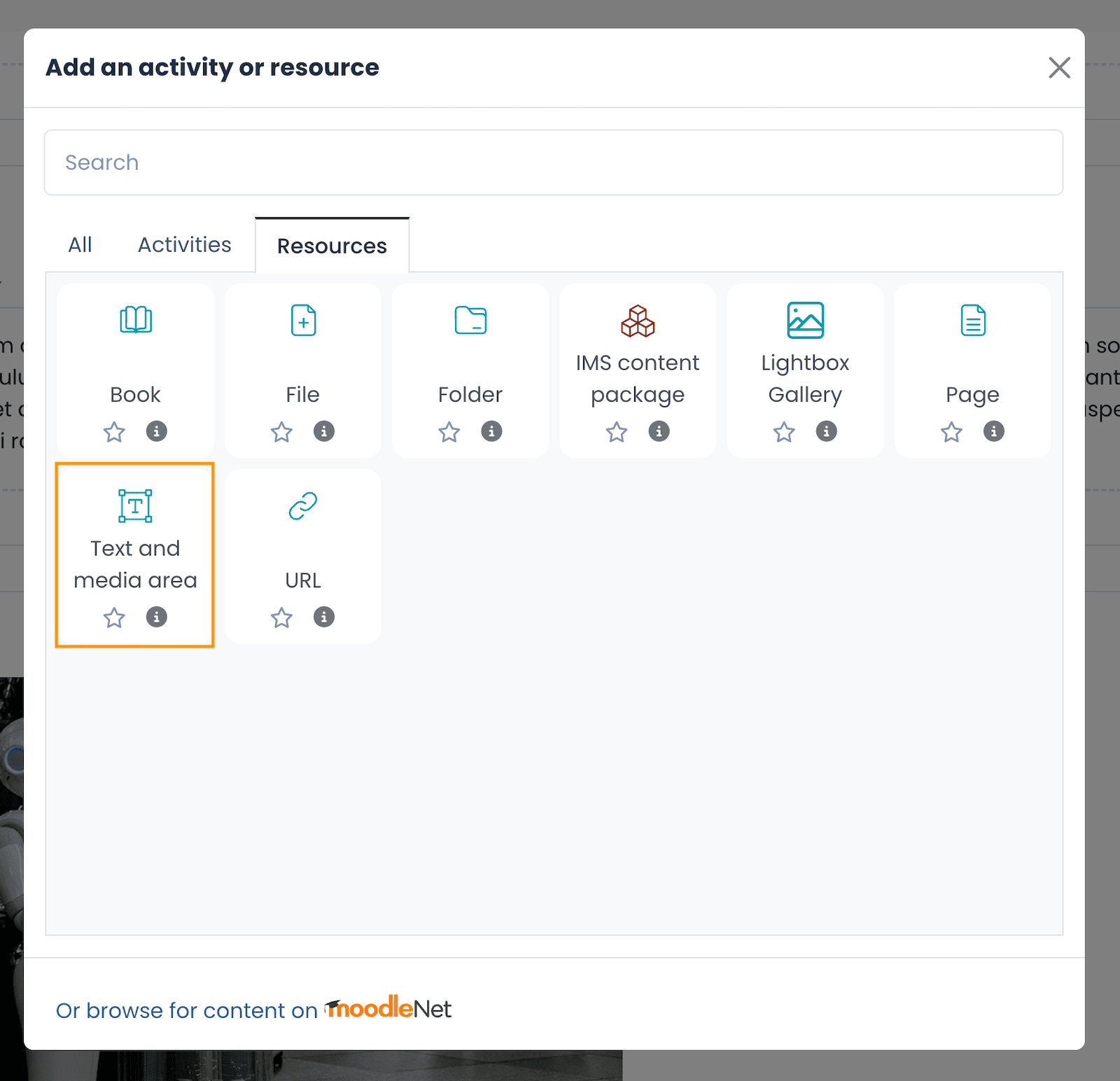
2. Adding Code to a Text and Media area
- Log in to your Moodle course as a teacher.
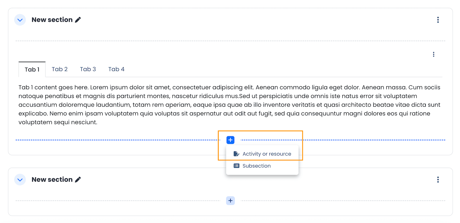
- Turn editing on, then click the + icon where you want to add the component and select Activity or Resource.
- In the pop-up, choose “Text and media area” under the Resources tab.
- In the Text input field, click the View button and select <> Source code.
- Paste the Bootstrap 5 HTML code, save the changes, and the component will be displayed on the course page.
Bootstrap 5 Components Examples (With Code)
We used a variety of Bootstrap 5 components in our demo course.
Here are some ready-to-use examples you can copy into your own Moodle 5 courses:
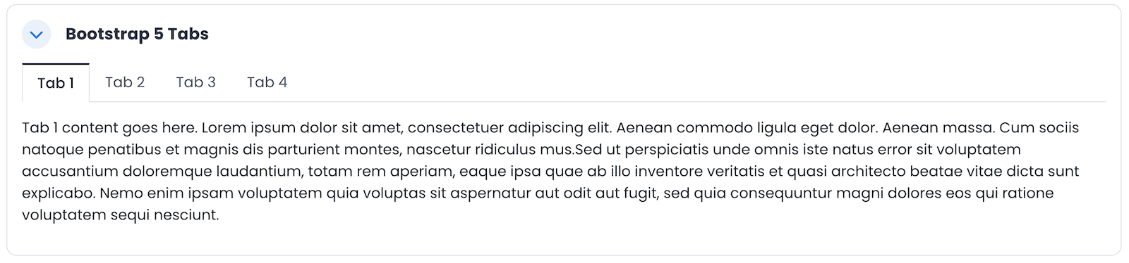
Bootstrap 5 Tabs
Tabs are perfect for organizing related content without overwhelming your learners.
<!-- Nav tabs -------------- -->
<ul class="nav nav-tabs" role="tablist">
    <li class="nav-item"><a class="nav-link active" role="tab" href="#tab1" data-bs-toggle="tab" aria-expanded="true">Tab 1</a></li>
    <li class="nav-item"><a class="nav-link" role="tab" href="#tab2" data-bs-toggle="tab" aria-expanded="false">Tab 2</a></li>
    <li class="nav-item"><a class="nav-link" role="tab" href="#tab3" data-bs-toggle="tab" aria-expanded="false">Tab 3</a></li>
    <li class="nav-item"><a class="nav-link" role="tab" href="#tab4" data-bs-toggle="tab" aria-expanded="false">Tab 4</a></li>
</ul>
<!-- Tab panes -------------- -->
<div class="tab-content">
	<div id="tab1" class="tab-pane active" role="tabpanel" aria-expanded="true">
		Tab 1 content goes here. Lorem ipsum dolor sit amet, consectetuer adipiscing
		elit. Aenean commodo ligula eget dolor. Aenean massa. Cum sociis natoque
		penatibus et magnis dis parturient montes, nascetur ridiculus mus.Sed ut
		perspiciatis unde omnis iste natus error sit voluptatem accusantium
		doloremque laudantium, totam rem aperiam, eaque ipsa quae ab illo inventore
		veritatis et quasi architecto beatae vitae dicta sunt explicabo. Nemo enim
		ipsam voluptatem quia voluptas sit aspernatur aut odit aut fugit, sed quia
	    consequuntur magni dolores eos qui ratione voluptatem sequi nesciunt.
    </div>
    <div id="tab2" class="tab-pane" role="tabpanel" aria-expanded="false">
		Tab 2 content goes here. Lorem ipsum dolor sit amet, consectetuer adipiscing elit.
	    Aenean commodo ligula eget dolor. Aenean massa. Cum sociis natoque penatibus
	    et magnis dis parturient montes, nascetur ridiculus mus.Neque porro quisquam
	    est, qui dolorem ipsum quia dolor sit amet, consectetur, adipisci velit, sed
	    quia non numquam eius modi tempora incidunt ut labore et dolore magnam
	    aliquam quaerat voluptatem.
    </div>
    <div id="tab3" class="tab-pane" role="tabpanel" aria-expanded="false">
		Tab 3 content goes here. Lorem ipsum dolor sit amet, consectetuer adipiscing elit.
	    Aenean commodo ligula eget dolor. Aenean massa. Cum sociis natoque penatibus
	    et magnis dis parturient montes, nascetur ridiculus mus.At vero eos et
	    accusamus et iusto odio dignissimos ducimus qui blanditiis praesentium
	    voluptatum deleniti atque corrupti quos dolores et quas molestias excepturi
	    sint occaecati cupiditate non provident, similique sunt in culpa qui officia
	    deserunt mollitia animi, id est laborum et dolorum fuga.
    </div>
    <div id="tab4" class="tab-pane" role="tabpanel" aria-expanded="false">
		Tab 4 content goes here. Lorem ipsum dolor sit amet, consectetuer adipiscing elit.
	    Aenean commodo ligula eget dolor. Aenean massa. Cum sociis natoque penatibus
	    et magnis dis parturient montes, nascetur ridiculus mus.
    </div>
</div>
Bootstrap 5 Carousel
Carousels allow you to display multiple images or pieces of content in a dynamic, space-saving way.

<div id="carousel-1" class="carousel slide carousel-fade"
  style="max-width: 760px;" data-bs-ride="carousel">
  <div class="carousel-indicators"><button class="active" type="button"
      data-bs-target="#carousel-1" data-bs-slide-to="0" aria-current="true"
      aria-label="Slide 1"></button> <button type="button"
      data-bs-target="#carousel-1" data-bs-slide-to="1"
      aria-label="Slide 2"></button> <button type="button"
      data-bs-target="#carousel-1" data-bs-slide-to="2"
      aria-label="Slide 3"></button></div>
  <!--//carousel-indicators-->
  <div class="carousel-inner">
    <div class="carousel-item active"><img class="d-block w-100"
        src="http://3rdwavemedia.com/demo-images/slides/lumo-slide-1.jpg"
        alt=""></div>
    <div class="carousel-item"><img class="d-block w-100"
        src="http://3rdwavemedia.com/demo-images/slides/lumo-slide-2.jpg"
        alt=""></div>
    <div class="carousel-item"><img class="d-block w-100"
        src="http://3rdwavemedia.com/demo-images/slides/lumo-slide-3.jpg"
        alt=""></div>
  </div>
  <!--//carousel-inner--> <button class="carousel-control-prev" type="button"
    data-bs-target="#carousel-1" data-bs-slide="prev"> <span
      class="visually-hidden">Previous</span> </button> <button
    class="carousel-control-next" type="button" data-bs-target="#carousel-1"
    data-bs-slide="next"> <span class="visually-hidden">Next</span> </button>
</div>
<!--//carousel-->
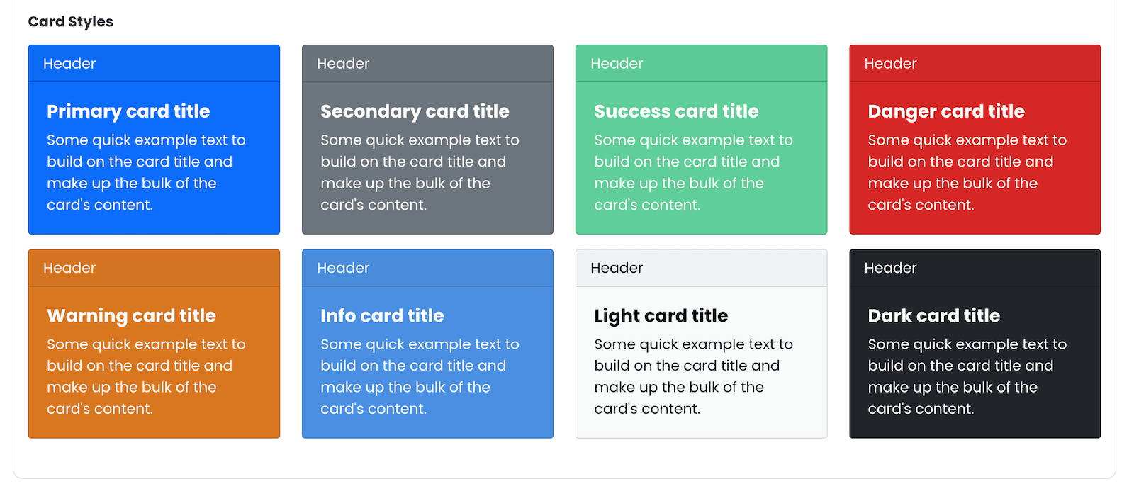
Bootstrap 5 Cards
Cards are great for grouping related content into neat, visually appealing blocks that are easy to scan.
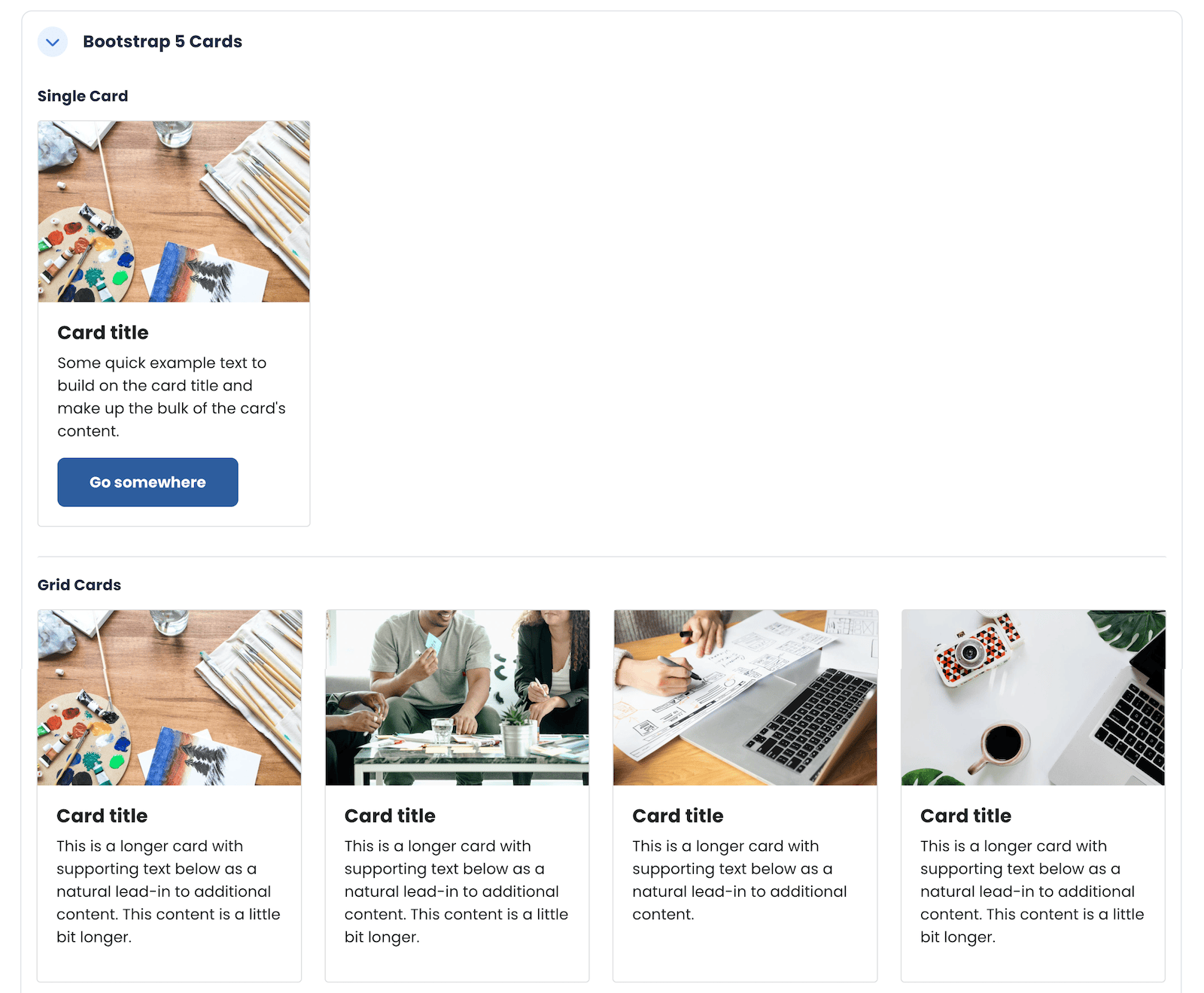
Single Card:
<h5 class="mb-3">Single Card</h5>
<div class="card" style="width: 18rem;"><img class="card-img-top"
    src="https://3rdwavemedia.com/demo-images/slides/lumo-card-1.jpg"
    alt="image">
  <div class="card-body">
    <h5 class="card-title">Card title</h5>
    <p class="card-text">Some quick example text to build on the card title and
      make up the bulk of the card's content.</p>
    <a class="btn btn-primary" href="#">Go somewhere</a>
  </div>
</div>
Grid Cards
<h5 class="mb-3">Grid Cards</h5>
<div class="row row-cols-1 row-cols-md-3 row-cols-lg-4 g-4">
  <div class="col">
    <div class="card h-100"><img class="card-img-top"
        src="https://3rdwavemedia.com/demo-images/slides/lumo-card-1.jpg"
        alt="image">
      <div class="card-body">
        <h5 class="card-title">Card title</h5>
        <p class="card-text">This is a longer card with supporting text below as
          a natural lead-in to additional content. This content is a little bit
          longer.</p>
      </div>
    </div>
  </div>
  <div class="col">
    <div class="card h-100"><img class="card-img-top"
        src="https://3rdwavemedia.com/demo-images/slides/lumo-card-2.jpg"
        alt="image">
      <div class="card-body">
        <h5 class="card-title">Card title</h5>
        <p class="card-text">This is a longer card with supporting text below as
          a natural lead-in to additional content. This content is a little bit
          longer.</p>
      </div>
    </div>
  </div>
  <div class="col">
    <div class="card h-100"><img class="card-img-top"
        src="https://3rdwavemedia.com/demo-images/slides/lumo-card-3.jpg"
        alt="image">
      <div class="card-body">
        <h5 class="card-title">Card title</h5>
        <p class="card-text">This is a longer card with supporting text below as
          a natural lead-in to additional content.</p>
      </div>
    </div>
  </div>
  <div class="col">
    <div class="card h-100"><img class="card-img-top"
        src="https://3rdwavemedia.com/demo-images/slides/lumo-card-4.jpg"
        alt="image">
      <div class="card-body">
        <h5 class="card-title">Card title</h5>
        <p class="card-text">This is a longer card with supporting text below as
          a natural lead-in to additional content. This content is a little bit
          longer.</p>
      </div>
    </div>
  </div>
</div>
Card Styles
<h5 class="mb-3">Card Styles</h5>
<div class="row">
  <div class="col-sm-6 col-md-3">
    <div class="card text-bg-primary mb-3" style="max-width: 18rem;">
      <div class="card-header">Header</div>
      <div class="card-body">
        <h5 class="card-title">Primary card title</h5>
        <p class="card-text">Some quick example text to build on the card title
          and make up the bulk of the card's content.</p>
      </div>
    </div>
  </div>
  <div class="col-sm-6 col-md-3">
    <div class="card text-bg-secondary mb-3" style="max-width: 18rem;">
      <div class="card-header">Header</div>
      <div class="card-body">
        <h5 class="card-title">Secondary card title</h5>
        <p class="card-text">Some quick example text to build on the card title
          and make up the bulk of the card's content.</p>
      </div>
    </div>
  </div>
  <div class="col-sm-6 col-md-3">
    <div class="card text-bg-success mb-3" style="max-width: 18rem;">
      <div class="card-header">Header</div>
      <div class="card-body">
        <h5 class="card-title">Success card title</h5>
        <p class="card-text">Some quick example text to build on the card title
          and make up the bulk of the card's content.</p>
      </div>
    </div>
  </div>
  <div class="col-sm-6 col-md-3">
    <div class="card text-bg-danger mb-3" style="max-width: 18rem;">
      <div class="card-header">Header</div>
      <div class="card-body">
        <h5 class="card-title">Danger card title</h5>
        <p class="card-text">Some quick example text to build on the card title
          and make up the bulk of the card's content.</p>
      </div>
    </div>
  </div>
  <div class="col-sm-6 col-md-3">
    <div class="card text-bg-warning mb-3" style="max-width: 18rem;">
      <div class="card-header">Header</div>
      <div class="card-body">
        <h5 class="card-title">Warning card title</h5>
        <p class="card-text">Some quick example text to build on the card title
          and make up the bulk of the card's content.</p>
      </div>
    </div>
  </div>
  <div class="col-sm-6 col-md-3">
    <div class="card text-bg-info mb-3" style="max-width: 18rem;">
      <div class="card-header">Header</div>
      <div class="card-body">
        <h5 class="card-title">Info card title</h5>
        <p class="card-text">Some quick example text to build on the card title
          and make up the bulk of the card's content.</p>
      </div>
    </div>
  </div>
  <div class="col-sm-6 col-md-3">
    <div class="card text-bg-light mb-3" style="max-width: 18rem;">
      <div class="card-header">Header</div>
      <div class="card-body">
        <h5 class="card-title">Light card title</h5>
        <p class="card-text">Some quick example text to build on the card title
          and make up the bulk of the card's content.</p>
      </div>
    </div>
  </div>
  <div class="col-sm-6 col-md-3">
    <div class="card text-bg-dark mb-3" style="max-width: 18rem;">
      <div class="card-header">Header</div>
      <div class="card-body">
        <h5 class="card-title">Dark card title</h5>
        <p class="card-text">Some quick example text to build on the card title
          and make up the bulk of the card's content.</p>
      </div>
    </div>
  </div>
</div>
Bootstrap 5 Tables
Tables are ideal for presenting structured information clearly, such as schedules, grading criteria, or comparisons.
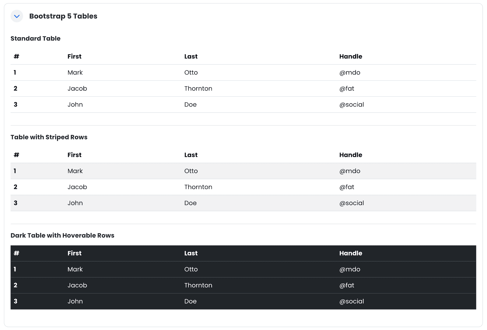
Standard Table
<h5 class="mb-3">Standard Table</h5>
<table class="table">
  <thead>
    <tr>
      <th scope="col">#</th>
      <th scope="col">First</th>
      <th scope="col">Last</th>
      <th scope="col">Handle</th>
    </tr>
  </thead>
  <tbody>
    <tr>
      <th scope="row">1</th>
      <td>Mark</td>
      <td>Otto</td>
      <td>@mdo</td>
    </tr>
    <tr>
      <th scope="row">2</th>
      <td>Jacob</td>
      <td>Thornton</td>
      <td>@fat</td>
    </tr>
    <tr>
      <th scope="row">3</th>
      <td>John</td>
      <td>Doe</td>
      <td>@social</td>
    </tr>
  </tbody>
</table>
Table with Striped Rows
<h5 class="mb-3">Table with Striped Rows</h5>
<table class="table table-striped">
  <thead>
    <tr>
      <th scope="col">#</th>
      <th scope="col">First</th>
      <th scope="col">Last</th>
      <th scope="col">Handle</th>
    </tr>
  </thead>
  <tbody>
    <tr>
      <th scope="row">1</th>
      <td>Mark</td>
      <td>Otto</td>
      <td>@mdo</td>
    </tr>
    <tr>
      <th scope="row">2</th>
      <td>Jacob</td>
      <td>Thornton</td>
      <td>@fat</td>
    </tr>
    <tr>
      <th scope="row">3</th>
      <td>John</td>
      <td>Doe</td>
      <td>@social</td>
    </tr>
  </tbody>
</table>
Dark Table with Hoverable Rows
<h5 class="mb-3">Dark Table with Hoverable Rows</h5>
<table class="table table-dark table-hover">
  <thead>
    <tr>
      <th scope="col">#</th>
      <th scope="col">First</th>
      <th scope="col">Last</th>
      <th scope="col">Handle</th>
    </tr>
  </thead>
  <tbody>
    <tr>
      <th scope="row">1</th>
      <td>Mark</td>
      <td>Otto</td>
      <td>@mdo</td>
    </tr>
    <tr>
      <th scope="row">2</th>
      <td>Jacob</td>
      <td>Thornton</td>
      <td>@fat</td>
    </tr>
    <tr>
      <th scope="row">3</th>
      <td>John</td>
      <td>Doe</td>
      <td>@social</td>
    </tr>
  </tbody>
</table>
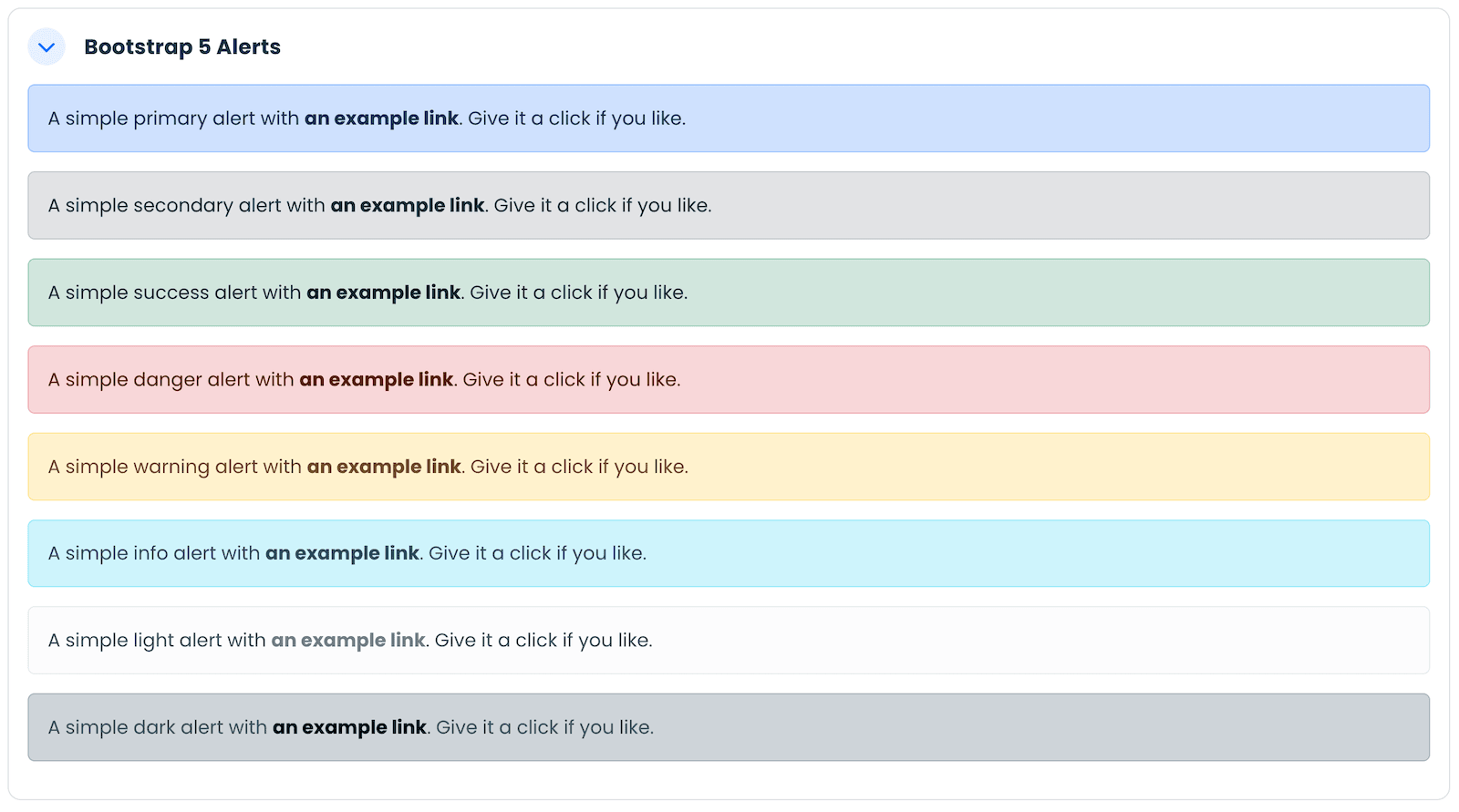
Bootstrap 5 Alerts
Alerts are a simple way to draw learners’ attention to important messages, updates, or deadlines.
<div class="alert alert-primary" role="alert">A simple primary alert with <a
    class="alert-link" href="#">an example link</a>. Give it a click if you
  like.</div>
<div class="alert alert-secondary" role="alert">A simple secondary alert with <a
    class="alert-link" href="#">an example link</a>. Give it a click if you
  like.</div>
<div class="alert alert-success" role="alert">A simple success alert with <a
    class="alert-link" href="#">an example link</a>. Give it a click if you
  like.</div>
<div class="alert alert-danger" role="alert">A simple danger alert with <a
    class="alert-link" href="#">an example link</a>. Give it a click if you
  like.</div>
<div class="alert alert-warning" role="alert">A simple warning alert with <a
    class="alert-link" href="#">an example link</a>. Give it a click if you
  like.</div>
<div class="alert alert-info" role="alert">A simple info alert with <a
    class="alert-link" href="#">an example link</a>. Give it a click if you
  like.</div>
<div class="alert alert-light" role="alert">A simple light alert with <a
    class="alert-link" href="#">an example link</a>. Give it a click if you
  like.</div>
<div class="alert alert-dark" role="alert">A simple dark alert with <a
    class="alert-link" href="#">an example link</a>. Give it a click if you
  like.</div>
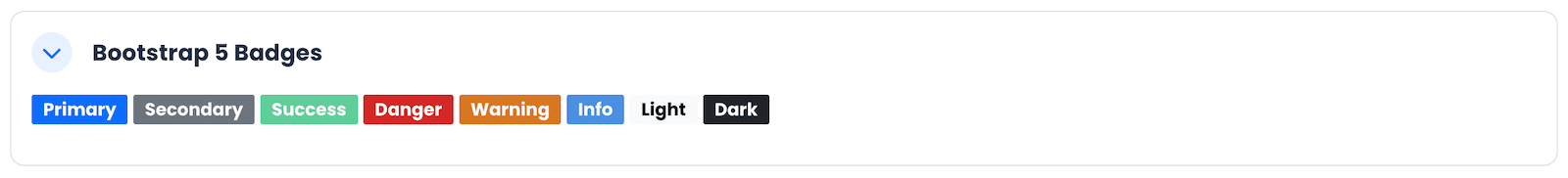
Bootstrap 5 Badges
Badges can be used to highlight new content, label categories, or show status information quickly and clearly.
<p>
 <span class="badge text-bg-primary">Primary</span>
 <span class="badge text-bg-secondary">Secondary</span>
 <span class="badge text-bg-success">Success</span>
 <span class="badge text-bg-danger">Danger</span>
 <span class="badge text-bg-warning">Warning</span>
 <span class="badge text-bg-info">Info</span>
 <span class="badge text-bg-light">Light</span>
 <span class="badge text-bg-dark">Dark</span>
</p>
Bootstrap 5 Buttons
Buttons provide a clear call-to-action for your learners, encouraging them to engage with activities and resources.
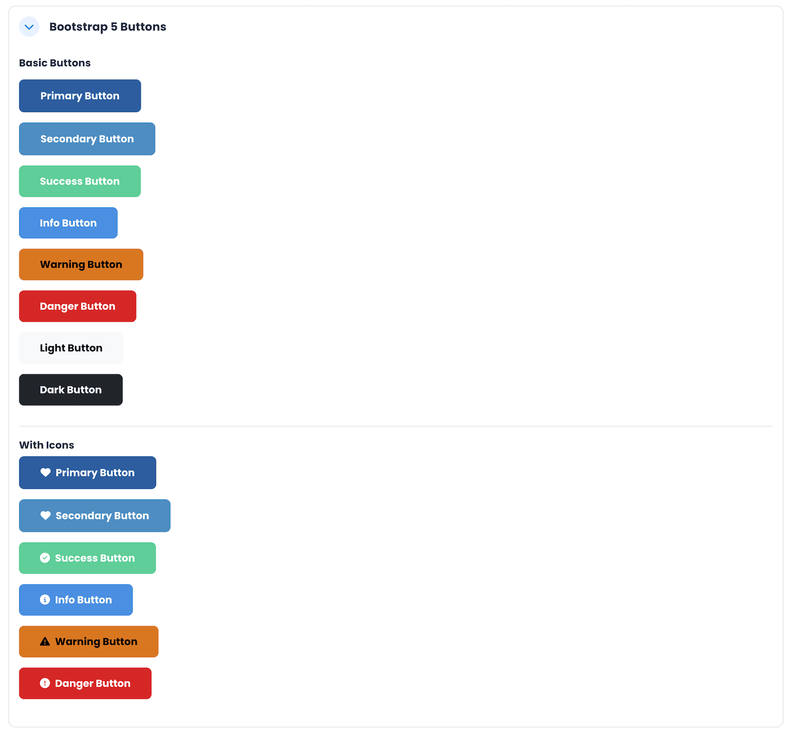
Basic Buttons
<h5 class="mb-3">Basic Buttons</h5>
<p><a class="btn btn-primary" href="http://elearning.3rdwavemedia.com/">Primary
    Button</a></p>
<p><a class="btn btn-secondary"
    href="http://elearning.3rdwavemedia.com/">Secondary Button</a></p>
<p><a class="btn btn-success" href="http://elearning.3rdwavemedia.com/">Success
    Button</a></p>
<p><a class="btn btn-info" href="http://elearning.3rdwavemedia.com/">Info
    Button</a></p>
<p><a class="btn btn-warning" href="http://elearning.3rdwavemedia.com/">Warning
    Button</a></p>
<p><a class="btn btn-danger" href="http://elearning.3rdwavemedia.com/">Danger
    Button</a></p>
<p><a class="btn btn-light" href="http://elearning.3rdwavemedia.com/">Light
    Button</a></p>
<p><a class="btn btn-dark" href="http://elearning.3rdwavemedia.com/">Dark
    Button</a>
</p>
Buttons With Icons
<h5>Buttons With Icons</h5>
<p><a class="btn btn-primary" href="http://elearning.3rdwavemedia.com/"><i
      class="fa-solid fa-heart me-2"></i>Primary Button</a></p>
<p><a class="btn btn-secondary" href="http://elearning.3rdwavemedia.com/"><i
      class="fa-solid fa-heart me-2"></i>Secondary Button</a></p>
<p><a class="btn btn-success" href="http://elearning.3rdwavemedia.com/"><i
      class="fa-solid fa-check-circle me-2"></i>Success Button</a></p>
<p><a class="btn btn-info" href="http://elearning.3rdwavemedia.com/"><i
      class="fa-solid fa-info-circle me-2"></i>Info Button</a></p>
<p><a class="btn btn-warning" href="http://elearning.3rdwavemedia.com/"><i
      class="fa-solid fa-warning me-2"></i>Warning Button</a></p>
<p><a class="btn btn-danger" href="http://elearning.3rdwavemedia.com/"><i
      class="fa-solid fa-exclamation-circle me-2"></i>Danger Button</a></p>
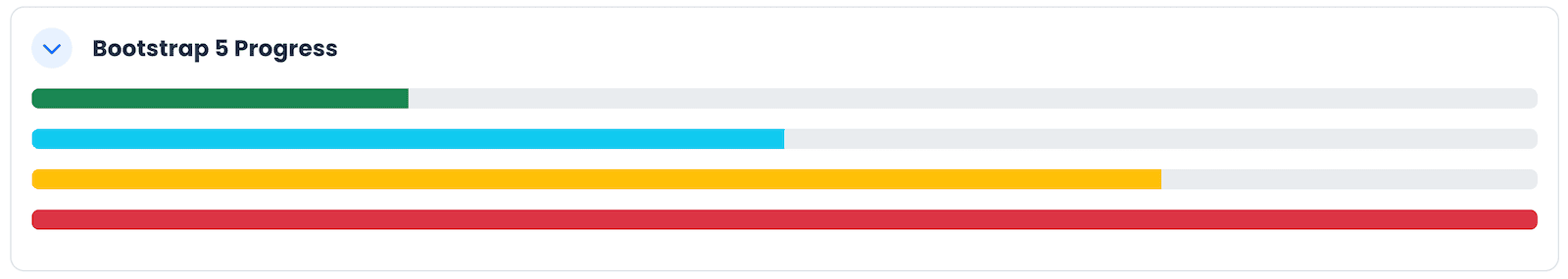
Bootstrap 5 Progress
Progress bars visually represent the completion status of tasks, activities, or learning milestones.
<div class="progress my-3" role="progressbar" aria-label="Success example"
  aria-valuenow="25" aria-valuemin="0" aria-valuemax="100">
  <div class="progress-bar bg-success" style="width: 25%;"> </div>
</div>
<div class="progress my-3" role="progressbar" aria-label="Info example"
  aria-valuenow="50" aria-valuemin="0" aria-valuemax="100">
  <div class="progress-bar bg-info" style="width: 50%;"> </div>
</div>
<div class="progress my-3" role="progressbar" aria-label="Warning example"
  aria-valuenow="75" aria-valuemin="0" aria-valuemax="100">
  <div class="progress-bar bg-warning" style="width: 75%;"> </div>
</div>
<div class="progress my-3" role="progressbar" aria-label="Danger example"
  aria-valuenow="100" aria-valuemin="0" aria-valuemax="100">
  <div class="progress-bar bg-danger" style="width: 100%;"> </div>
</div>
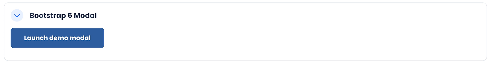
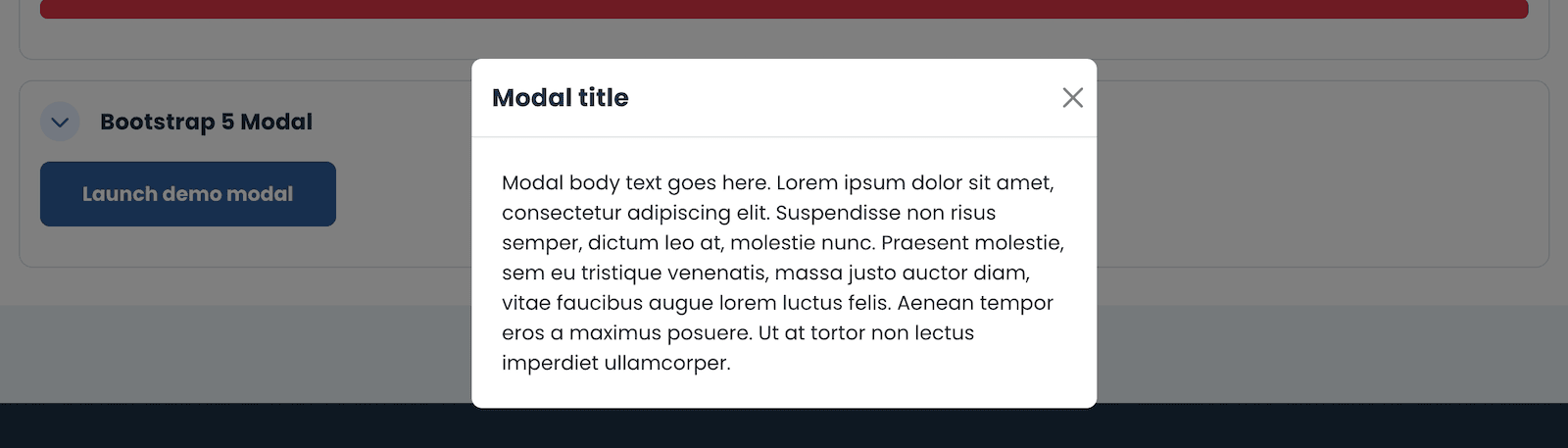
Bootstrap 5 Modal
Modals let you display additional content or actions in a pop-up window without navigating away from the course page.
<!-- Button trigger modal -->
<p><button class="btn btn-primary" type="button" data-bs-toggle="modal"
    data-bs-target="#exampleModal"> Launch demo modal </button></p>
<!-- Modal -->
<div id="exampleModal" class="modal fade" tabindex="-1"
  aria-labelledby="exampleModalLabel" aria-hidden="true">
  <div class="modal-dialog">
    <div class="modal-content">
      <div class="modal-header">
        <h1 id="exampleModalLabel" class="modal-title fs-5">Modal title</h1>
        <button class="btn-close" type="button" data-bs-dismiss="modal"
          aria-label="Close"></button>
      </div>
      <div class="modal-body p-4">Modal body text goes here. Lorem ipsum dolor
        sit amet, consectetur adipiscing elit. Suspendisse non risus semper,
        dictum leo at, molestie nunc. Praesent molestie, sem eu tristique
        venenatis, massa justo auctor diam, vitae faucibus augue lorem luctus
        felis. Aenean tempor eros a maximus posuere. Ut at tortor non lectus
        imperdiet ullamcorper.</div>
    </div>
  </div>
</div>
Final Thoughts
Using Bootstrap 5 components in Moodle 5 is a powerful way to enhance your course pages without relying on extra plugins or advanced coding. With just a few lines of HTML, you can build modern, interactive, and well-structured learning experiences that your students will appreciate.
If you’re using a Boost-based theme like Lumo, Edutor, or Maker, the Bootstrap 5 components will blend naturally with your site’s design. This ensures a consistent and professional look throughout your courses.
Ready to give it a try?
Visit our Moodle 5 demo site to explore real-life examples and see how Bootstrap 5 can transform your Moodle course pages.