Maker is our most popular Boost-based Moodle theme. It comes with 6 built-in colour schemes and options to change the primary and secondary colours to suit your organisation’s branding. For advanced colour customisations you can also write your own custom SCSS/CSS code to fine tune the theme appearance.
In this post we’d like to share some useful SCSS/CSS code snippets you can use to tweak your theme’s colour schemes further. The colours used in the code snippets are there as placeholders. You can change them to your desired colour hex code to make them consistent with your design.
Site Top Bar
Default Styling

Custom CSS/SCSS to override the default styling:
/* Top Bar Background Color */
.page-header .top-bar { background: purple; }
What you get after applying the custom code:

Search Section
Default Styling

Custom CSS/SCSS to override the default styling:
/* Search Section Background Color */
.search-courses-section { background: purple; }
What you get after applying the custom code:

Benefits Section
Default Styling
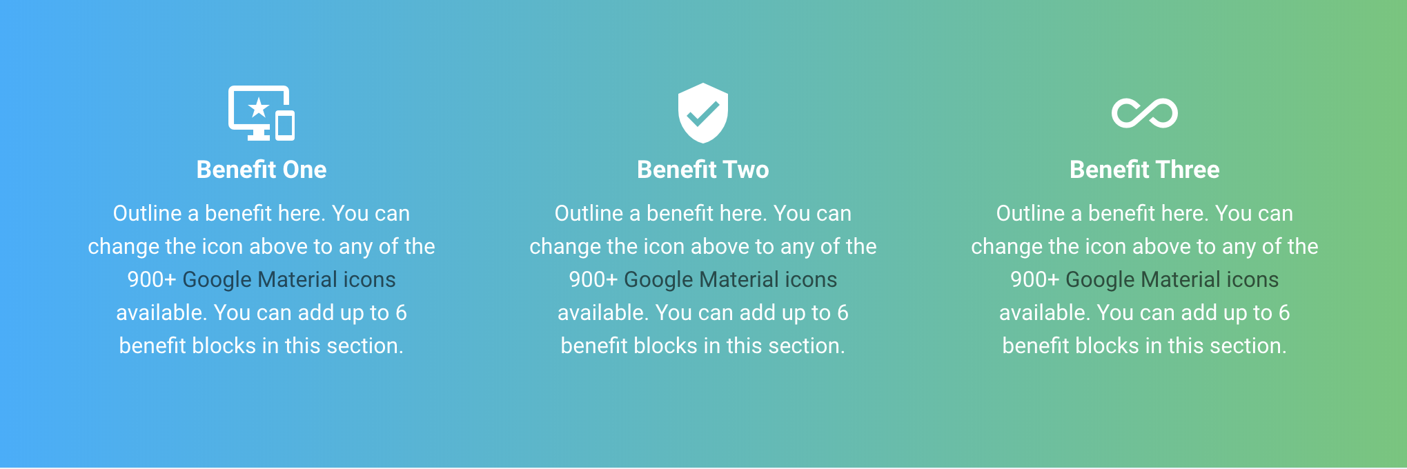
Custom CSS/SCSS to override the default styling:
/* Benefits Section */
.benefits-section .icon-holder { color: purple; } /* material icon color */
.benefits-section .item-title { color: purple; } /* title text color */
.benefits-section .item-desc { color: purple; } /* content text color */
.benefits-section .item-desc a { color: white; } /* content text link color */
.benefits-section .item-desc a { text-decoration: underline; } /* content text underline */
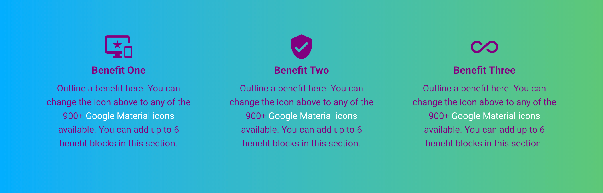
What you get after applying the custom code:
Promo Section
Default Styling

Custom CSS/SCSS to override the default styling:
/* Promo Section Background Color  */
.promo-section .item-content { background: purple; }
What you get after applying the custom code:

Call To Action Section
Default Styling

Custom CSS/SCSS to override the default styling:
/* Call To Action Section */
.cta-section .cta-title { color: purple; } /* section title color */
.cta-section .cta-content { color: purple; } /* content text color */
.cta-section .cta-content a { color: white; } /* content text link color */
.cta-section .cta-content a { text-decoration: underline; } /* content text link underline */
What you get after applying the custom code:

Footer Section
Default Styling
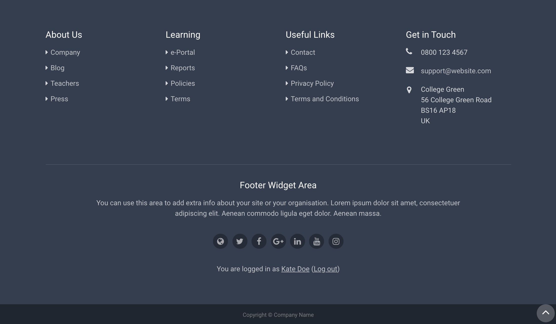
Custom CSS/SCSS to override the default styling:
/* Footer Section */
#page-footer { background: purple; } /* footer background color */
#page-footer .footer-bottom-bar {background: black} /* bottom copyright bar */
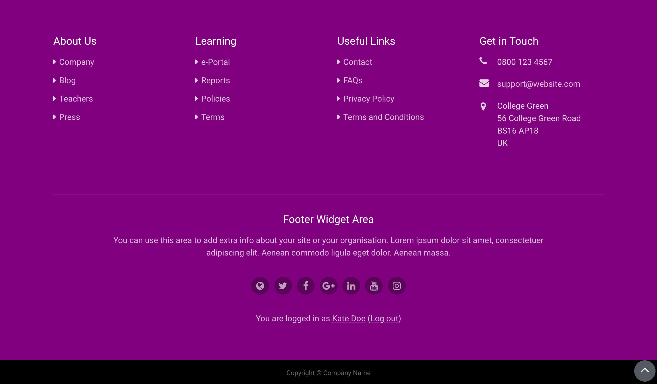
What you get after applying the custom code:
Code Snippets
Below are all the code snippets from the examples above:
/* Topbar */
.page-header .top-bar { background: purple; }

/* Benefits Section */
.benefits-section .icon-holder { color: purple; }
.benefits-section .item-title { color: purple; }
.benefits-section .item-desc { color: purple; }
.benefits-section .item-desc a { color: white; }
.benefits-section .item-desc a { text-decoration: underline; }

/* Promo Section  */
.promo-section .item-content { background: purple; }

/* Call To Action Section */
.cta-section .cta-title { color: purple; }
.cta-section .cta-content { color: purple; }
.cta-section .cta-content a { color: white; }
.cta-section .cta-content a { text-decoration: underline; }

/* Footer Section */
#page-footer { background: purple; }
#page-footer .footer-bottom-bar { background: black; }