Looking to customize the footer area of your Moodle site? If you’re using the Lumo Moodle Theme, customization is straightforward. Lumo is a modern, premium Moodle 5 theme built on Boost, and it gives you an easy way to create custom footer menus using its built-in Footer Content Blocks.
Update: If you’re looking for more HTML examples or want to learn how to format text, links, and footer content in Moodle, check out our new guide:
How to Use Simple HTML to Add Content in Moodle (Lumo Theme Examples)
In this quick step-by-step guide, we’ll show you how to set up footer menus that help users navigate your site more easily and give your Moodle site a more polished, professional look.
Whether you’re running a university site or a training platform for your company, this is a simple way to improve the user experience while keeping your site clean and well-organized.
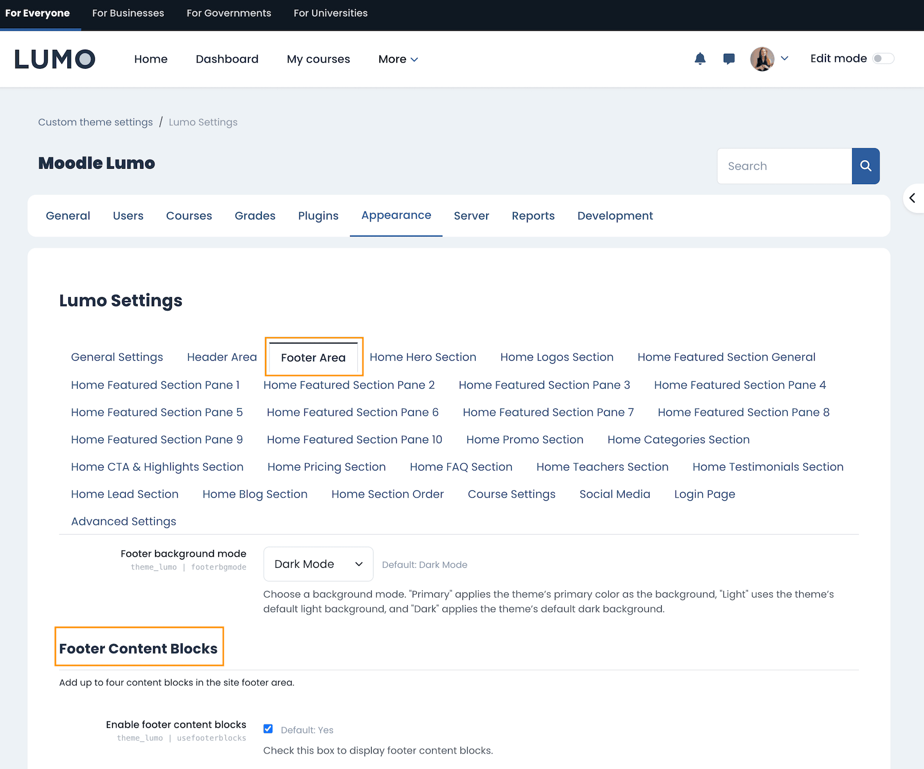
Step 1: Open Lumo’s Footer Settings
Log into your Moodle site as an administrator and go to:
Site administration > Appearance > Themes > Lumo > Footer Area
This is where you’ll find the settings to add and manage content in the footer section of your site.
Step 2: Add HTML to Footer Content Blocks
Scroll down to the Footer Content Blocks section. Lumo supports up to four separate content blocks that are displayed side by side in the footer. These are perfect for adding footer menus.
You can enter plain text or HTML markup directly into any content block.
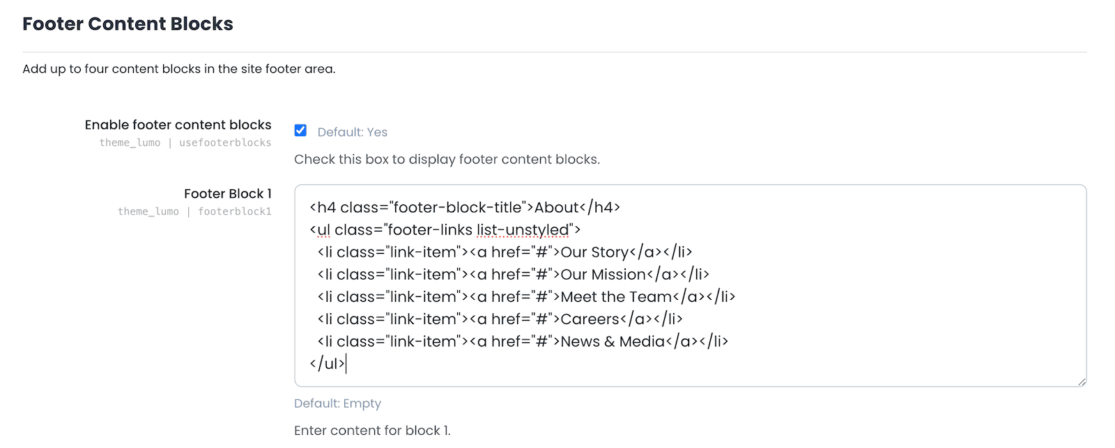
HTML Code Snippets for Footer Menus
Below are example HTML snippets you can use to create simple footer menus. Make sure to update the menu titles and links (“#”) to match your site’s content.
Footer Content Block 1 (Example: About)
<h4 class="footer-block-title">About</h4>
<ul class="footer-links list-unstyled">
  <li class="link-item"><a href="#">Our Story</a></li>
  <li class="link-item"><a href="#">Our Mission</a></li>
  <li class="link-item"><a href="#">Meet the Team</a></li>
  <li class="link-item"><a href="#">Careers</a></li>
  <li class="link-item"><a href="#">News & Media</a></li>
</ul>
Footer Content Block 2 (Example: Categories)
<h4 class="footer-block-title">Categories</h4>
<ul class="footer-links list-unstyled">
  <li class="link-item"><a href="#">Business</a></li>
  <li class="link-item"><a href="#">Technology</a></li>
  <li class="link-item"><a href="#">Design & Creativity</a></li>
  <li class="link-item"><a href="#">Health & Wellness</a></li>
  <li class="link-item"><a href="#">Language Learning</a></li>
</ul>
Footer Content Block 3 (Example: Support)
<h4 class="footer-block-title">Support</h4>
<ul class="footer-links list-unstyled">
  <li class="link-item"><a href="#">Help Center</a></li>
  <li class="link-item"><a href="#">FAQs</a></li>
  <li class="link-item"><a href="#">Contact Us</a></li>
  <li class="link-item"><a href="#">Report a Problem</a></li>
  <li class="link-item"><a href="#">Accessibility</a></li>
</ul>
Footer Content Block 4 (Example: Community)
<h4 class="footer-block-title">Community</h4>
<ul class="footer-links list-unstyled">
  <li class="link-item"><a href="#">Learner Stories</a></li>
  <li class="link-item"><a href="#">Events & Webinars</a></li>
  <li class="link-item"><a href="#">Forums</a></li>
  <li class="link-item"><a href="#">Newsletter</a></li>
  <li class="link-item"><a href="#">Become an Instructor</a></li>
</ul>
After you’ve added your menus to the relevant blocks, save the settings. Your custom footer menus will now appear live at the bottom of your Moodle site.
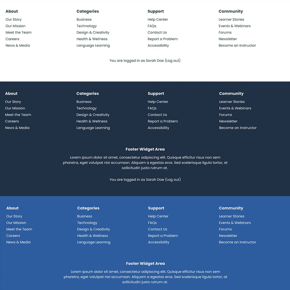
Footer Menu Displayed on the Page
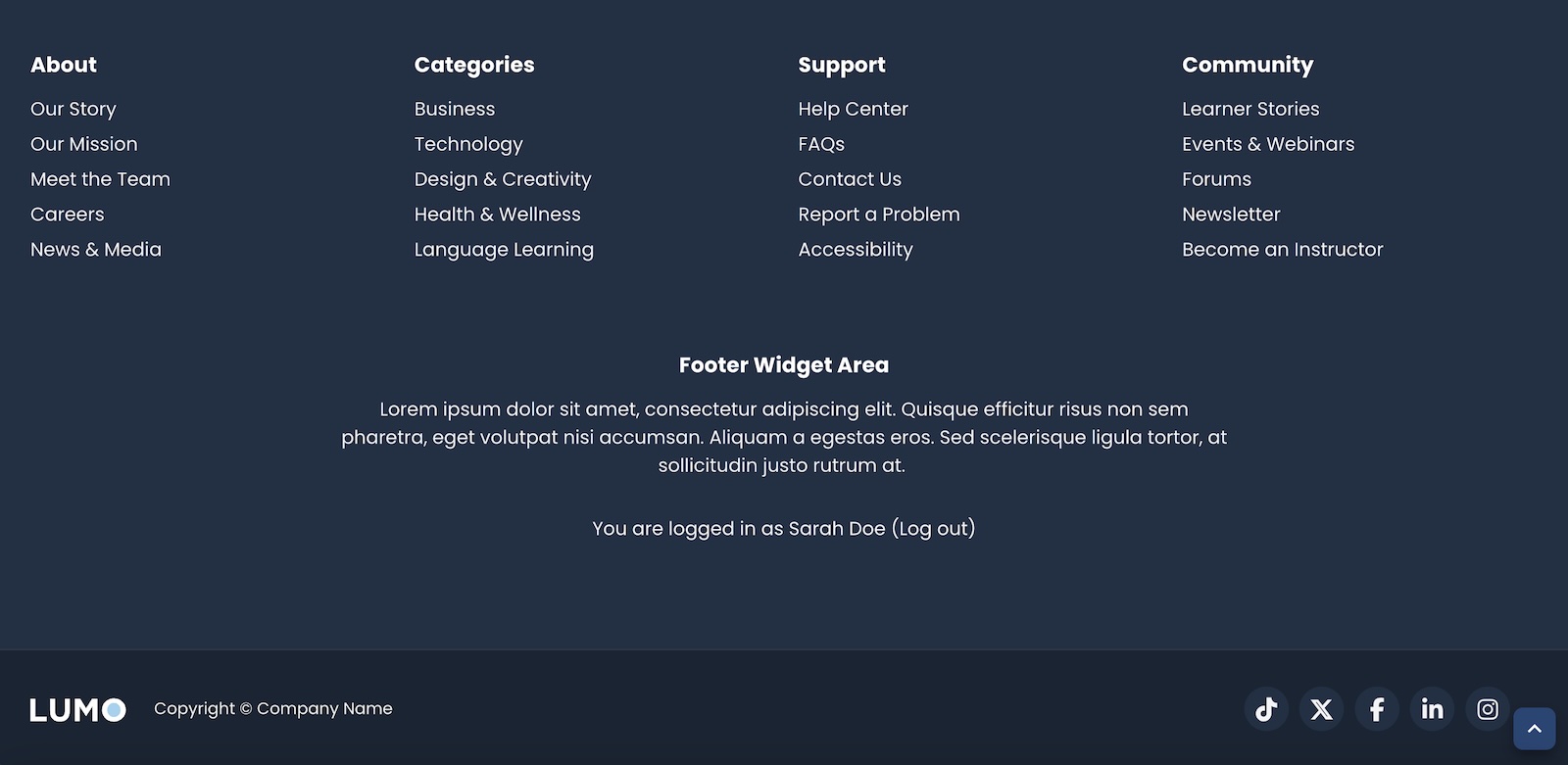
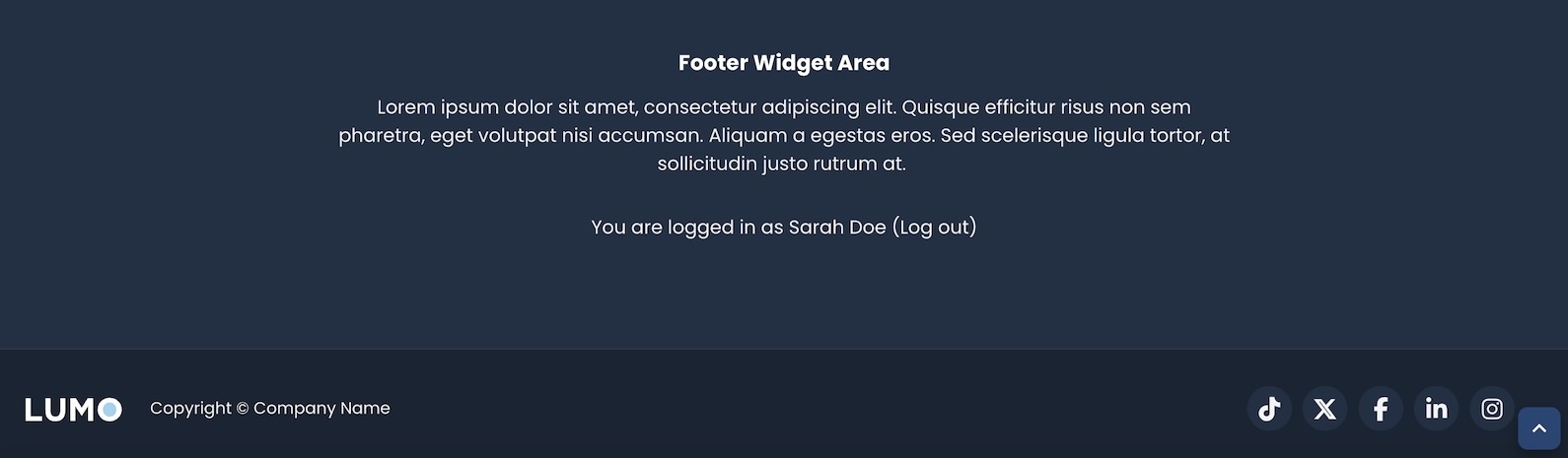
Bonus: Add Extra Info with the Footer Widget Area
If you want to include other types of information in your footer, such as a short description, contact details, or a newsletter signup, you can use the Footer Widget Area. This section sits below the four footer content blocks and allows you to add a title and custom HTML content for extra flexibility.
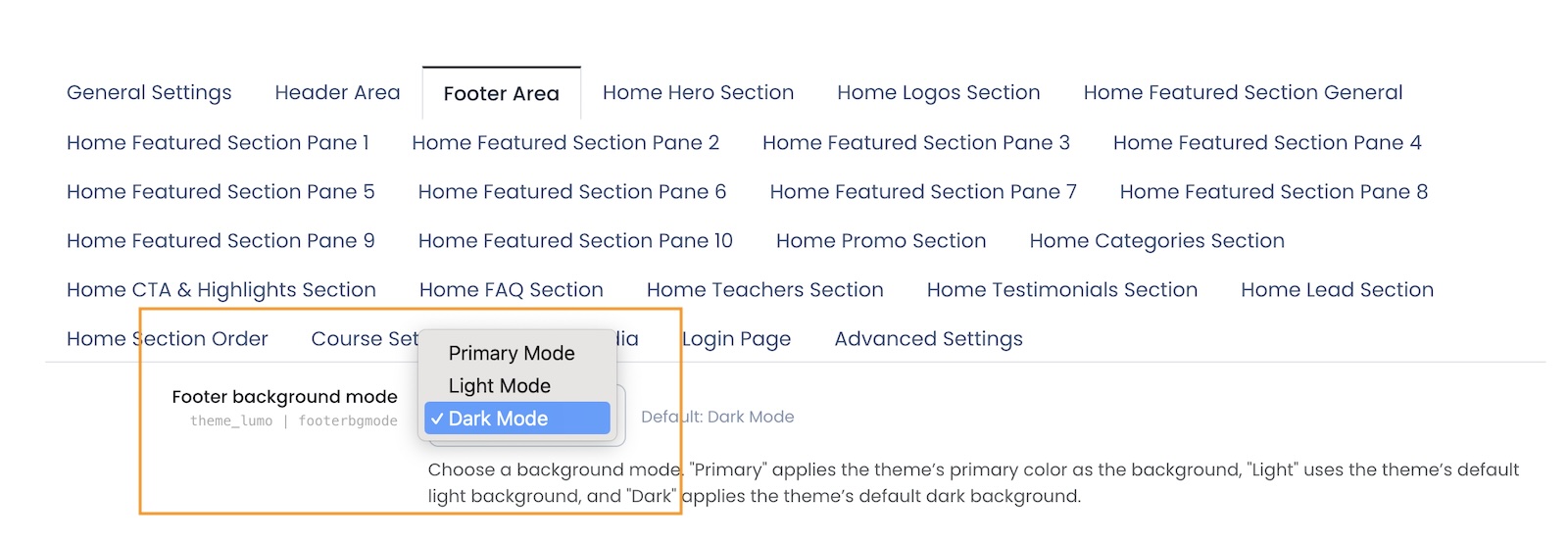
Customize the Footer Background Color Mode
Lumo also gives you control over your footer’s background color to better match your site’s branding or design style. You can choose from three built-in background modes:
- Primary mode – Uses your theme’s primary brand color
- Dark mode (default) – A sleek dark background, ideal for modern or high-contrast designs
- Light mode – A clean and minimal light background, perfect for a fresh, open look
You can select your preferred background mode in the same Footer Area settings page in the Lumo theme options.
Footer Background Mode Settings
Footer Background Mode Examples
Explore More Features of the Lumo Theme
Lumo isn’t just about looks – it’s packed with practical customization features to help you create a powerful and user-friendly learning platform. From flexible homepage layouts to branding options and footer menus, Lumo makes Moodle look modern and work smarter.
Want to see what else Lumo can do? Check out the full feature list here:
Lumo – A Modern, Premium Moodle 5 Theme Based on Boost (Top Features & Customization Options)